We’re always on the look-out for the latest design trends, and we always find plenty of inspiration at the 2016 Stockholm Furniture & Light Fair. This trade fair is the world’s largest event for Scandinavian furniture and lighting design. It’s a creative hub to showcase future trends, new concepts and the latest innovative ideas in design.
Stockholm Furniture & Light Fair is the largest event for Scandinavian furniture and lighting design.
Trend Spotting at the 2016 Stockholm Furniture Fair
Our own designers Natalie and Lynda with concept designer Josefin walked the length and breadth of the halls to discover the latest design trends in commercial interiors.
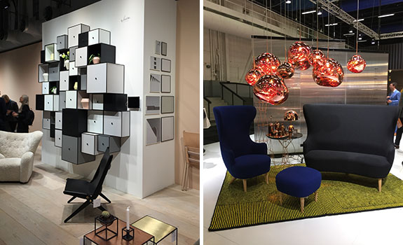
Opulence was a prominent theme throughout the fair, with lots of metallics on display in warm palettes of gold and copper. The trend was applied to accessories ranging from vases and bowls to light fittings. The grouping of metallic items enhanced this luxurious look, with surface pattern kept to a minimum with smooth and brushed finishes. Designers showcasing this trend included KH, Per Söderberg and Tom Dixon.
Colour
In contrast to the glamour of opulence, another big design trend was the 2016 Pantone Colour of the Year: Rose Quartz and Serenity. These two colours were everywhere, from office furniture to accessories to lighting and flooring. Brands like Standard Issue by Frank and Massproductions used the trend to colour block products and create bold interiors.
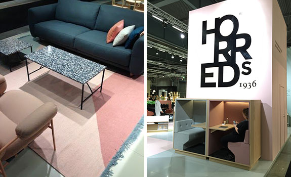
The Pantone Colours of the Year (Rose Quartz and Serenity) were everywhere, from office furniture to flooring.
Grey tones and coal were a huge hit. Neutral greys and black coal are embedded into the Scandinavian design scene and are still very current, with a trend for progressively darker tones emerging. Friends and Founders and String used multitudes of monochrome black and grey in their interiors, with black as a contrasting colour within pastel interiors.
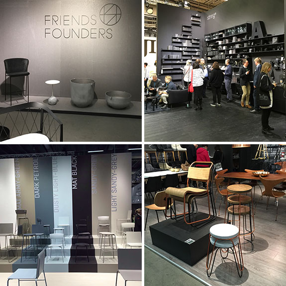
Neutral greys and black coals were spotted, along with tonal colours and craftsman themes.
Around the show, the design team reported the use of tonal colours being applied to products. A great example of this was Randers + Radius‘ seating series, which ranged from matte black to dusty light blue to light sandy grey.
Textures and Materials
Craftsmanship was another common theme, with brands showing raw materials and highlighting the design process within their displays. Textiles and textures were used to create cosy interiors with an emphasis on rugs to zone flooring and the application of layering and detail to throws, cushions and screens.
Follow Interface’s board Event | Stockholm Furniture Fair on Pinterest.
Inspiring Our Guests
Our Interface stand was positioned amongst influential and trend setting brands including industrial designer Tom Dixon and Danish furniture and accessories brand Hay. The stand attracted visitors from across Scandinavia, Europe and the Far East.
Some of the most popular features at our colourful stand were the inspiration boards created by Interface concept designer, Josefin Carne. The eight mood-boards of differing colour palettes were displayed around the stand and featured tactile elements for visitors to touch and feel. The boards sparked lots of discussion and positive feedback.

Inspiration boards created by concept designer Josefin Carne.
“The boards show how well our products work together and with other materials such as ceramic tiles and fabrics. In interior design, the carpet is never alone; a mix of colours and textures are essential to create a wellbeing environment,” said Josefin.
Learning From Nature
In addition to design trends research and inspiration, we kicked off the week by hosting a press event with Exploration Architecture’s biomimicry expert Michael Pawlyn and discussed how we can build a world of sustainable beauty by learning from nature. Michael continued his program across three events throughout the design week. He also spoke at the Interface showroom in Stockholm’s design district about the ways biomimicry is being applied to create innovative architecture.
Sustainable Eating
No show is complete without food! The Scandinavian Interface marketing team ensured the visitors were nourished throughout the show by collaborating with local food producer Oumph! to serve lunch every day. Oumph! is a clever new plant-based ingredient with a similar texture to meat. It’s the company’s mission to decrease their climate impact, whilst increasing health for their customers – a sustainable mission we fully support.


