Designed by Andrew Tu’inukuafe and the Creative Spaces team, the Lion’s new HQ in Freemans Bay, Auckland is a solid example of design’s ability to speak the language of a brand and its space. We sat down with Andrew to discuss the project.
What was the overall the design objective and brief for the Lion’s HQ project?
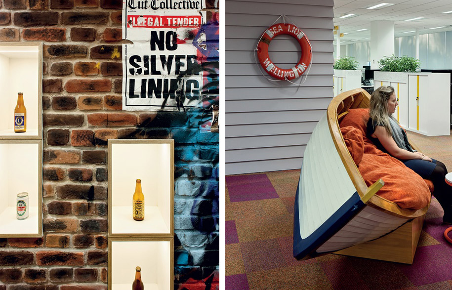
Lion wanted their office to reflect the values of the company, and encapsulate their brand essence; creating a workplace that provided the optimal environment for collaboration and innovation. There was a requirement for a menu of workspace options to provide choice of where and how people could work, catering for different work styles and personalities. They wanted a New Zealand flavour, without being kitsch, lots of colour and talking points.
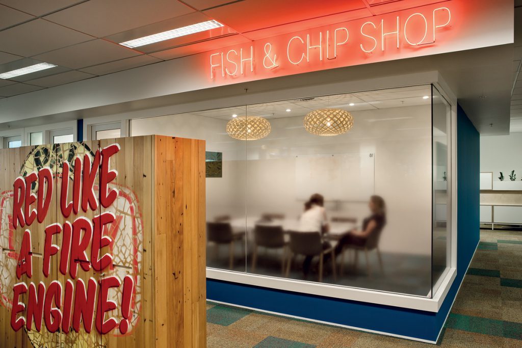
Lion have a dynamic group of people working with their diverse range of brands. It became essential that the workplace should reflect the diversity of both whilst still maintaining a highly functional space.
Once you had received the brief from the client, how did you approach this design? What was your way of thinking?
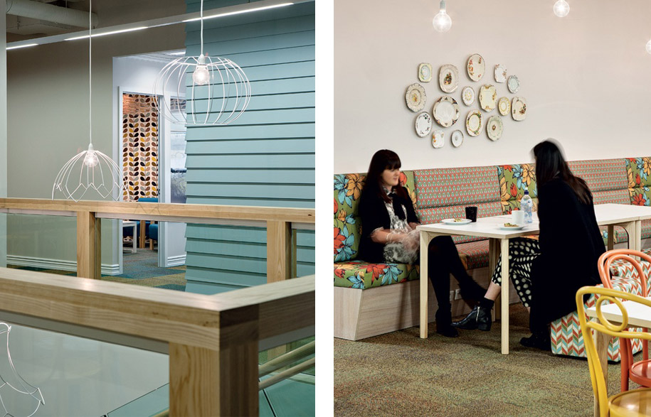
The initial idea was to make it “Like Home”, and over time this theme evolved to ‘There’s no place like Home’ which then became ‘There’s no place like Lion’. Theming over the two floors was developed into the North and South Islands bringing together iconic Kiwi places and traditional life experiences that epitomise the company’s products and where these products will be consumed. There are seven different themes: Beaches & Baches, Harbours & Travel, Outdoor Activities, City Laneways & Bars, Vineyards, Sportsfields and Deep South Adventures.
The floor plates of Napier Street are large and deep, so it was essential that the occupants didn’t feel overwhelmed by the scale of the building interior. The spaces are broken down with colour and materials into manageable chunks.
How did the Interface carpet tiles contribute to this, e.g. What was your inspiration behind selecting a Cubic Colour range ?
We specified Cubic Colours as the collection was inspired by the natural world from soft neutrals to bold vibrant colours of Sunflower, Painted Desert, Kaleidoscope, Lime, Teal, Parrot, Carnival, Magenta, Violet, Northern Lights.
The Colours were chosen to best represent the seven different themes, but there was always the challenge that the spaces needed to be seamlessly integrated and the randomly dispersed colours and patterns of Cubic Colours collection integrated seamlessly.
Beaches and Baches took inspiration from the sea and sand: Fresh blues highlighted with strong yellows and oranges.
Harbours and Travel took inspiration from the rusted wharfs and stacks of aging suitcases: Soft green and purple highlighted with strong burnt oranges and deep blues. Outdoor Activities took inspiration from the lush New Zealand forest: Soft green highlighted by strong fresh green.
City Laneways and Bars took inspiration from the foggy Wellington winter day: Neutral greys defined with blacks and deep purples. Vineyards took inspiration from the grape and rich red wine: Light neutral and strong reds and purples. Sportsfields took inspiration from the frosty winter rugby field: Icy greens highlighted by strong teals.
Deep South Adventures took inspiration from the snow-capped Southern Alps: Light blues highlighted by strong dark blues.
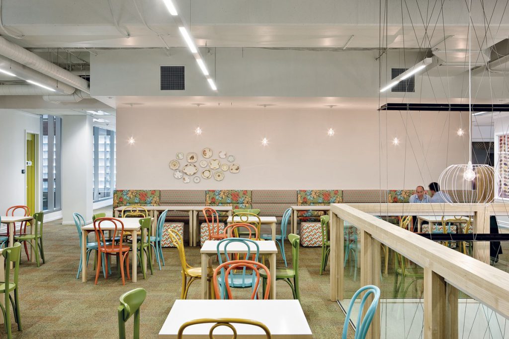
There are over 30 different colours of paint; the strong hues are generally used on the doors with softer pastels on the walls so the spaces do not compete with each other. It is this, along with the carpet, which guides the user from theme to theme, with natural blended transitions between them.
Photography // Simon Devitt – simondevitt.com/