After going virtual last year due to the pandemic, NeoCon was back in full swing in 2021, and several new trends—along with fresh twists on existing movements—in commercial interior design were on display in Chicago. Experts in new design directions at Interface took note. Nine new trends stood out.
Curves, curves, curves.
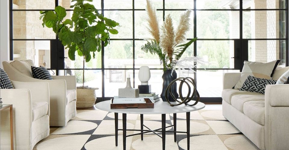
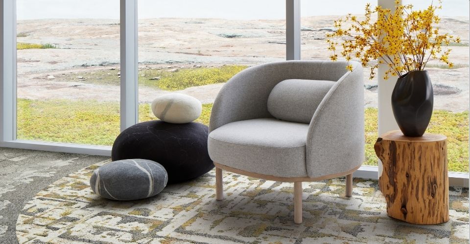
Among the clearest design motifs that dominated show spaces this year were flowing lines and curvilinear forms that can be used to add a sense of softness and new dimension to healthcare and office spaces. “Rounded archways, curved sofas, chairs with rounded backs, and oval benches and coffee tables continued to be prevalent as they have been in the recent past,” says Katherine Cohen, manager of visual merchandising and photography for Interface. “The use of curves in wall graphics and circular or organic amoeba-shaped rugs contributed to this trend,” says Andy Porter, custom design manager at Interface, who notes that the FLOR® brand’s Lunaire™ rug reflects this emphasis on curves and that Interface’s modular products can be custom cut with rounded lines to respond to this design direction.

The Lunaire rug from FLOR features curved shapes like those seen in many NeoCon 2021 showrooms.
Accent on comfort.
The curved lines and forms seen throughout the show reflect the broader trend in commercial spaces toward a sense of residential comfort. “One of the most interesting introductions to market this year was a lightweight Pod Tent from Steelcase that’s made of a durable fabric with aluminum framing and comes in different sizes,” says Porter. “These privacy pods offer a sense of visual separation in open workspaces that workers are likely to appreciate after spending so much time at home during the pandemic—in areas with a lot of visual noise, they bring a welcome respite, a bit of comfort.” He also noted that a change in modular carpets within such comfort zones can enhance distinctly defined areas like these. “The tents add definition to open spaces with enclosures that aren’t cubicles and don’t really feel like barriers, but instead are well-designed, inviting, and fun and offer a place to camp out,” adds Cohen.
Warm, complex colors and pared-back palettes.
In keeping with the movement toward comfort, a fresh wave of complex colors in soft shades are poised to add extra warmth to a variety of indoor environments. “The mix of colors we saw came off as what I would call a ‘desert palette,’” says Cohen. “While oatmeal-colored linens used to reign supreme as the go-to-neutral shade, warm terracotta or salmon tones are replacing oatmeal as new “neutrals” for upholstery.” Porter also points to a new family of greens—“mint, bayleaf, and rich zucchini tones”—as an emerging color shift. Cohen concurs and predicts that the various pale greens, reminiscent of Sherwin Williams’s Evergreen Fog color, will likely have a big moment next year. She also saw quite a few hints of soft lavender. “Purple is being forecast as a fresh color in fashion and interior design next year, and there was a toe-dip into this trend with lilac hues so pale they were almost white,” she says, noting that many of the newer colors were presented as “monochromatic blends of shades of a color like celery along with mint, forest green, and emerald, or salmon, blush, and rust.” Among the many Interface products that echo these color trends are Panola Mountain™ from the new Granite Mountain™ collection in the Green Lichen, Blush Lichen, and Rust Lichen colorways, which mix several shades of a hue in one pattern, as well as the Up At Dawn™ pattern in the Rhodium colorway from the new Rising Signs™ collection or FLOR’s You’re So Vein™ pattern in Spice Silver.

The Panola Mountain style from Interface’s new Granite Mountain collection incorporates soft green shades, which are an emerging color trend.
An emphasis on mobility and resilience.
New tools, like Steelcase’s lightweight kettlebell-like Flex Mobile Power units, were among the devices that offered increased resilience and flexibility to open office spaces, notes Cohen. “There was also a rise in semi-permanent small spaces that offered a bit of acoustical privacy or pergola-style structures that offer a sense of enclosure,” adds Porter, noting that many Interface products are available with a TacTiles® installation system that supports this trend and can address the need for changing floor scapes in spaces designed for flexibility.
Green and not-so-green organic elements.
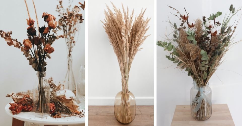
A new extension of the biophilic qualities that have been commonly deployed in commercial settings over recent years was an emphasis not only on green walls and living plants but also on dried plants and floral arrangements. “Dried plants, especially pampas grass, with its sandy gray coloring and large billowing plumes of fluff like ostrich feathers add extra dimension to the warm neutrals we’re seeing now,” adds Porter.

Dried flowers and plants were common showroom accessories at NeoCon 2021.
New takes on sustainable style and solutions.
Sustainability remains a solid theme in commercial settings. “There was more sustainable messaging than ever,” says Cohen. And manufacturers sought creative ways to keep the sustainability story fresh. “I saw a growing number of ways to recycle materials,” says Porter, who points to the Bit Stool from Allsteel made from single-use industrial and household plastics. “They had a unique terrazzo quality that almost looked like confetti,” he says.
With Interface’s entire flooring portfolio carbon neutral through its Carbon Neutral Floors™ program, it’s no wonder that both Cohen and Porter were pleased to note other companies displaying carbon neutral products at NeoCon, like Keilhauer’s Swurve chair. “At Interface, we are aiming to reverse global warming, but we know we can’t do it on our own. It’s always great to see other interiors companies innovating with the environment in mind,” said Porter.
Layered Patterns and Prints.
A handful of patterns and prints stood out as style setters this year. “A lot of fabrics featured funky cutout shapes that looked like someone went wild with a scissors and mixed them together as collages,” says Cohen, who notes FLOR’s Terrain™ product as a reflection of this trend. “Others were woven or printed with scribbled lines like cave markings and there were also some Madras prints.”

FLOR’s Terrain style, which takes inspiration from abstract art, is reminiscent of a collage.
Warm Materials.
The spirit of warmth and texture also came through in materials. “There was lots of wood with reeded qualities, like rattan, bamboo, and wicker, in lighter colors—there were no dark woods,” says Cohen. Metals were also warm with a continued emphasis on brass hardware. “I saw lots of little pops of gold in accents and accessories,” adds Porter.
Retro and Residential Touches.
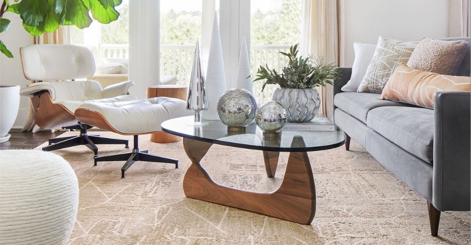
An extension of strong residential sense of softness and comfort, both Porter and Cohen saw reassuring nods to the past, with furnishings that echoed mid-century style. “Some of the showrooms featured Scandinavian-inspired furnishings with rounded forms and blond wood and gorgeous fabrics like velvet that exuded a subtle nostalgic retro feeling,” says Porter. “The curved elements and warm tones evoked a sense of belonging or being enveloped in comfort,” adds Cohen.
Whether they emphasize nature, nostalgia, comfort, or warmth, the new directions in furnishings and finishes on view at NeoCon 2021 clearly reflect the pandemic’s impact on commercial design. There’s no question that show attendees and exhibitors were thrilled to be back in Chicago, and with the next NeoCon just six months away, the experts at Interface are eager to see which of these trends are here to stay and which will evolve with the changing world around us.
One response to “Nine Notable Trends at NeoCon 2021”
Great Article