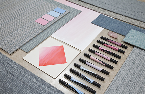
It’s always daunting to start a new year, but Pantone‘s color selections are a reminder of the softness that comes with new beginnings and to be gentle with ourselves during this new transition and our first trips back to the office post-holiday vacation.
This year is truly memorable as far as “Colors of the Year” go because Pantone has selected not one, but two colors to represent the color trend for the year. Serenity is an opally blue (minus the iridescence) has a naturally breezy essence that renders it both muted and saturated while Rose Quartz is on the paler side of pink with a sugary sweet touch. Together they create an effortless palette that is a reminiscent of more mindful times.

Pair blush tones with pale cool neutrals in the form steel gray & iron blue and accompany with patinaed or matte finish copper tones for a touch of authenticity.
For me personally, the palette takes me back to my spring semester abroad in Provence (anyone else having similar sentiments out there?). A special moment in life where creativity reigned supreme and my only woes were whether or not I could muster the courage to order my chocolate croissant in French from the local patisserie. Rose scented macaroons, dried lavender bundles hanging in the markets of Arles, chunky limestone homes and the rosy peak of Roussillon across the Luberon Valley at sunrise. Honestly, could you imagine a more restful paradise?
Soft blush tones have been trickling into the commercial interior design community for a few years now in the form of upholstery and high luster rose gold finishes, so it’s time to start thinking about its more permanent home. Pastel colors are transitioning into the realm of neutrals while we continue to emphasize highly saturated and neon color accents. Pair blush tones with pale cool neutrals in the form steel gray & iron blue and accompany with patinaed or matte finish copper tones for a touch of authenticity. Picture floor to ceiling glass with natural light flooding in across bleached wood floors, an upholstered felt blush mid-century modern sofa decorated in slubby oversized knits and chunky hand woven tapestries. YUM!
The human mind craves real experiences – so create a serene oasis that is more about the tactile world than the digital one.

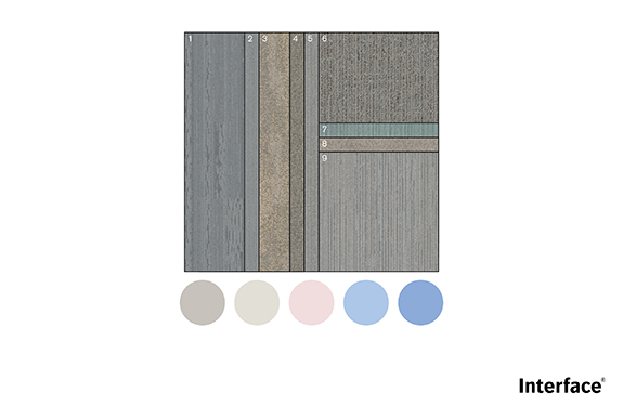
Incorporate the Pantone Colors of the Year into your next project using these Interface carpet tile products: 1) SH901: Capri 2) PO801: Marseille 3) NF401: Linen 4) EM551: Oldtown 5) On Line: Cloud 6) Platform: Pearl Gray 7) FLOR Reverb: Glacier 8) UR302: Ash 9) On Board: Eucalyptus
In the bustle of our modern lives and with all the stresses and hurriedness that accompanies them, it is important to surround yourself with objects that carry thoughtful intentions. Whether it’s variable shades of blue, hand sculpted ceramics (bonus points for sourcing locally) or a well-worn and mended chambray shirt, this year’s palette is about the “less is more” philosophy and returning to a peaceful state of mind. Or a summer abroad in France, same thing.
Until next year my color loving friends, au revoir!