It’s clear that hybrid work is here to stay and will continue to influence our workplaces of the future. As a result, commercial furniture and product manufacturers showed their willingness to embrace this new frontier with fresh introductions at NeoCon 2022. Amid the new products on display, several themes—some recurring, others new—stood out. The design pros at Interface observed seven dominant trends worth noting.

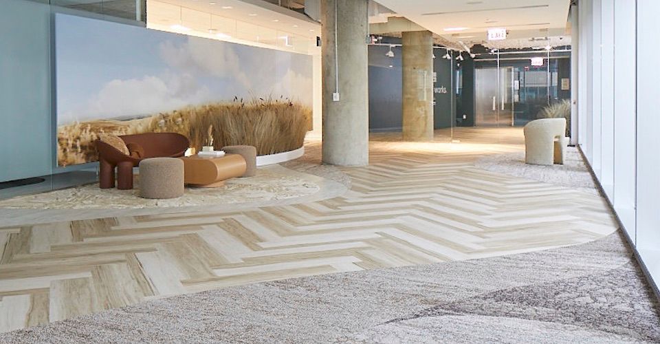
The Interface showroom featured curved, organic paths made of carpet tile and LVT.
Comfort is key.
An emphasis on rounded forms and curved lines brought a continued sense of softness to commercial furnishings and flooring, reflecting a growing trend toward relaxed comfort that became a dominant byproduct of the work-at-home experience in recent years. A twist this year was the presence of quilted fabrics and padded forms that are making waves as fashion statements this season. “We saw a lot of ‘puffy’ qualities that echo the padded Bottega Veneta bags and puffy designer sandals and slides you see in popular culture now,” says Katherine Cohen, manager of visual merchandising and photography for Interface.
“In terms of fabric, the quilted look was often in a solid color,” adds Kelly Ghobadpoor, Interface’s custom product designer for living and hospitality, who agrees that curved organic lines in furnishings and products remained dominant. “Not only did we see curved lines in individual pieces of furniture, but also curved furniture arrangements,” she says. This trend toward organic shapes can also translate to the floor—in fact, Interface’s own showroom featured new carpet tile and LVT collections installed in a complex, undulating design.
Au naturel.
As an extension of the emphasis on biophilic design in recent years, the designers noted that the design industry’s enthusiasm for nature-inspired elements continues to evolve. “In the recent past, we saw a lot of organic textures in rugs and textiles made of natural materials like jute and sisal,” says Jacob Martinson, lead concept designer for Interface. “But this year we saw new knotted and woven textures like macrame pushing that trend further. Overall, there seems to be an interest in taking the idea of nature and randomness to a new level.”

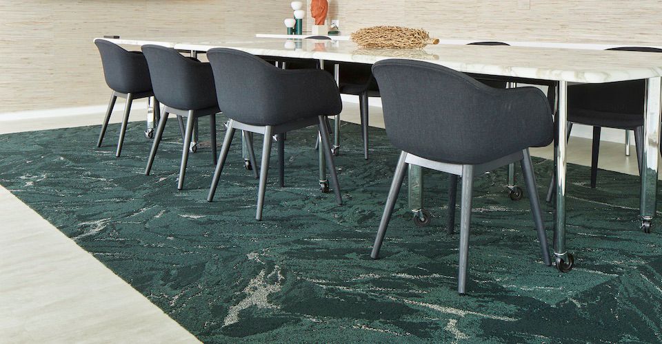
Various shades of green, like those shown in this Zera carpet tile, were on display in many showrooms during NeoCon.
Warm neutrals paired with earthy pastels.
Similar to some of the dominant colors seen in furnishings, fabrics, and finishes last year, a preferred palette of soft, earthy tones remained in the spotlight this year. “There were definitely multiple shades of green along with contrasts of terracotta and dusty rose,” notes Ghobadpoor. “However, a lot of the colors were desaturated and very pastel this year,” adds Martinson. Interface leaned into both of these color themes as it prepared for NeoCon 2022. “We painted a wall in our showroom in a Benjamin Moore color called Tarrytown Green, which is a variation on the trend toward more earth-driven shades,” notes Cohen. “Some beautiful warmer accent hues, like eggnog, pearl, and cedar also emerged this year and the contrast with these brown tones made the greens feel fresh and beautiful.”

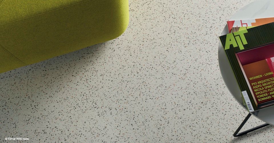
Terrazzo-inspired looks, such as this norament pado rubber flooring, were popular at NeoCon 2022.
More texture, less pattern.
Complementing the nature-inspired organic textures that continue to evolve in fabrics and flooring, a wider range of textures emerged in a variety of surfaces. “There was a strong terrazzo trend, not only in flooring but in tabletops and wall covering as well,” says Ghobadpoor, who saw the presence of a few tropical and geometric patterns but observed a much stronger emphasis on texture. “I saw a surprising amount of felt used in interesting ways to achieve different textures as well as a lot of distressed concrete, including some wall surfaces with natural elements emerging out of concrete—the juxtaposition between the materials looked almost post-apocalyptic,” adds Martinson.

The Check It Out carpet tile from FLOR reflects the current checkerboard trend seen in various textiles.
On board with checkerboard motifs.
Among the few patterns that were on view at NeoCon this year, checkerboard prints and wovens stood out. “The checkerboard trend was big,” says Cohen, who worked with a team of designers to incorporate FLOR’s Check It Out™ line of carpet tiles in a private office vignette in the company’s showroom. “The checkerboard pattern was a fashion talking point this year and, in line with that trend, Maharam recently released a rug with square patterns designed in the 1950s by Alexander Girard,” says Martinson. However, the checkerboard patterns of 2022 don’t have to be high contrast; today’s patterns are often more tonal. “I saw a checked Wolf Gordon fabric in the Haworth showroom that showcased shades of eggnog, which was super warm and kept the pattern from feeling too in your face,” shares Cohen.
Scandinavian-inspired materials and shapes.
“We saw a lot of light woods and furniture with Scandinavian profiles,” says Ghobadpoor. “Warm metals with matte finishes rather than shiny ones were also prevalent.” Martinson agrees with this observation, noting that he often saw pastel colors paired with Scandinavian-style furniture, while metals often had brushed finishes or were powder-coated with warm green, rust, or terracotta colors.
Home sweet office.
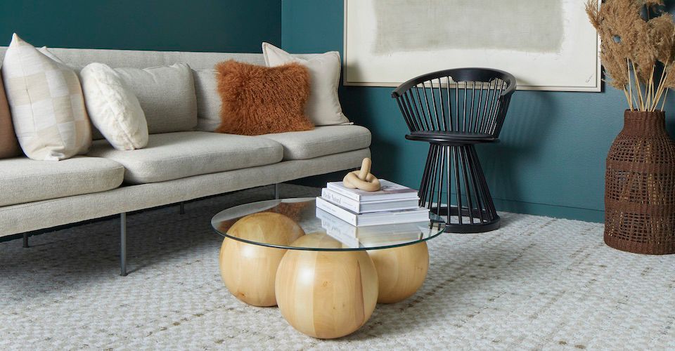
The designers also saw an increase in residential influences transforming office settings, as the shift to hybrid work seems to be driving a desire for more inviting corporate environments following the pandemic. “There was definitely a greater emphasis on the ‘resimercial’ idea,” says Martinson. “Offices are now incorporating richer textures and function more like home than ever before.”
NeoCon 2022 felt like the return to (almost) normal that the design industry has been waiting to experience, and the Interface design team was more than ready to be inspired during the show. Now, it’s time for the fun part—digesting these trends and incorporating them into new designs for Interface customers! Did you see any other themes during NeoCon? If so, let us know in the comments below.
One response to “Seven Design Themes on Display at NeoCon 2022”
I’m really enjoying the direction design is moving in. This looks simultaneously chic and functional – something we’ve been missing in the past few years. I’m going to use this to help with my boutique redesign. Thanks for the inspo!