Color trends come and go, but neutral hues are always perennial favorites in both residential and commercial settings. Still, preferences in neutral colors — like taupe, gray, beige, and tan — also experience nuanced shifts in popularity. And lately, designers and manufacturers have observed a clear movement toward warmer neutrals, particularly in the workplace.
Unlike the stark black and white and cool gray tones that have prevailed in recent years in many commercial environments—from hotels and restaurants to retail and residential common areas—layers of complex earthier neutral colors, such as sandy tan, rusty brown, and sulfury gold, have now begun to hold stronger sway in commercial contexts. Given the global changes we’ve experienced over the past couple of years, the shift is hardly surprising. “The warmer grays really bring more of a feeling of welcoming, which I think in today’s climate everyone is drawn to more than ever,” says Katherine Cohen, manager of visual merchandising and photography for Interface®. “We are seeking colors that are healing and energizing. Some of the interest in warm neutrals can be attributed to the desire for warmth and security given the uncertainty and stress caused by the pandemic. Warmer tones elicit feelings of calm. In a world where our senses are often overloaded, it’s a nice pause. The warmer grays also offer designers the ability to create beautiful neutral spaces that feel clean without feeling sterile.”
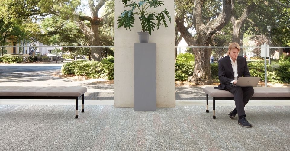
Warm neutral tones, as seen in Up at Dawn from Interface’s new Rising Signs collection, resonate in today’s workplace.
To bring that grounding sense of calm to commercial settings, designers often see the floor as the ideal place to start. “A warm neutral carpet is great as a field over an area of large square footage,” says Jordan Hall, a designer with Chicago-based firm Eastlake Studio. And the carpet styles in Interface’s new Rising Signs™ collection reflect the qualities and neutral color variations the designer favors, especially for workplace environments. “There’s definitely a shift toward a more homey, residential vibe in offices and product lines that offer more color ways, including “greige” options that combine warm and cool tones, help in areas where there’s a combination of floor types, such as polished concrete and carpet, as well as a mix a finishes and furniture,” Hall says. In neutral environments, the designer believes that a varied mix of patterns and textures is also key. “We always present clients with two schemes of warmer versus cooler colors as well as organic versus angular patterns,” she says.
After ordering samples from Interface’s new Rising Signs™ collection for a current office project, Hall was especially drawn to the Play the Angle™ and Spandrel™ patterns in the Sulfur color. “They’re good for large areas and the patterns add dimension without being too busy. With multiple patterns that work well together, the carpets in the collection are also great for achieving a gradient effect with an ashlar install that allows you to transition with different patterns from one area to another, such as from offices to corridors to conference rooms. Choosing a mix of patterns and colors from one collection allows you to create interest and at the same time keep things cohesive.” The designer also appreciates the carpets’ pragmatic ease of maintenance, stain resistance, and environmental qualities, including the fact that they are included in Interface’s Carbon Neutral Floors™ program.
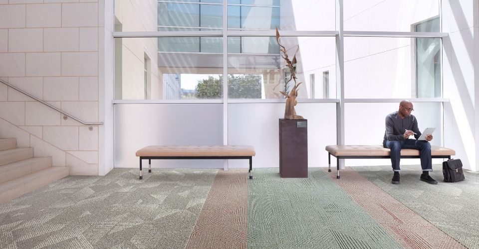
Interface’s new Rising Signs collection features nature-inspired colors, including warm neutral tones like Sulfur and Rhodium as well as Krypton, a minty green. Art shown is “Upward” by Richard Hunt.
Taking cues from the patterns and colors of nature, many of the new carpets in the Rising Signs collection also bring an uplifting biophilic air to commercial interior spaces. “Our vice president of global product design, Kari Pei, was inspired entirely by the outdoors with this new collection,” says Cohen. “Earthy, calming neutrals, like Rhodium and Sulfur, and softer patterns, such as Up At Dawn™ and Binary Code™, inspired by the sacred geometry of nature, infuse a biophilic perspective.” Paired with livelier accent hues and some angular architectural patterns, such organic patterns and neutral tones can bring a balanced yet dynamic ambience to commercial settings that promote both physical and psychological well-being. “Large-scale geometric shapes and eye-catching jewel tones make a striking impression,” says Cohen. “The bold, architectural lines of the Upward Bound™ or Proportional™ patterns, for example, evoke the angularity of fire escapes or the monumental majestic curves of tension bridges that connect us to one another and to the airy outdoors. Right now it seems like most designers are really embracing layering a range of earth tones and patterns together to create multidimensional spaces.” Hybrid patterns, such as Karmic Relief™ or Angle Up™, manage to bridge the difference between the hard and soft lines of the collection’s range of patterns and offer fluid transitions between layers of character and color.
To up the residential quotient and add an extra layered effect to office environments or amenity spaces, Hall likes to incorporate a pop of saturated color or spirited pattern in flooring and often turns to FLOR™ products to introduce some zest to a space. “Some funky patterns or a strong color that aligns with a brand or logo in a feature room or an area rug can inject a lively finishing touch,” says the designer. FLOR’s commercial products with bolder colors and patterns, such as Electric Avenue™ in Aquamarine, Palm Reader™ in Kale, or Remembrance™ in Fuchsia, offer such dialed-up points of contrast. Yet, FLOR also offers a wide range of neutral products—such as Memory Lane™, with its rows of textured grooves that add an air of relaxed sophistication to a room, Pleats and Thanks™, a sisal-inspired rug with pleated breaks that create a seamless diamond pattern, and Finer Things™, a Berber-inspired rug with a hardworking design that’s ideal for spaces with heavy traffic—in hues that dovetail seamlessly with warm neutral movement.
Finer Things from FLOR is available in three warm tones — Sand, Taupe and Cream.
“Warmer colors make us feel more connected to nature,” says Cohen, who sees the warm neutral trend continuing to grow in the years ahead. “These tones always take me to a very serene space, almost a spa-like mentality that you can bring into any interior.”
One response to “Warm Neutrals Bring a Sense of Calm to Changing Environments”
Could we get the product data sheets in PDF?
Thx