The reveal of an influential brand’s Color of the Year is always hotly anticipated in designers’ calendars. However, an unpredictable and turbulent 2021 meant the interior design community was extra excited to hear what color trends will be gracing mood boards over the coming year. Looking at forecasts from Pantone, PPG and Sherwin-Williams reveals that each of their 2022 Color of the Year selections reflect the world around us, including people’s desire to escape the pandemic-related stress of the past two years. While all three of the tones illustrate emerging trends, one serves as a bit of a bolder take than many within the A&D community anticipated. But what do these colors mean for the design of commercial spaces in 2022?
Pantone’s Very Peri
Pantone’s 2022 Color of the Year, Very Peri, came as a surprise choice to many designers, who did not expect the selection of such a vivid tone. According to Pantone, the vibrant blue-purple shade symbolizes ‘”transformative times” while displaying “a carefree confidence and a daring curiosity that animates our creative spirit, inquisitive and intriguing.”
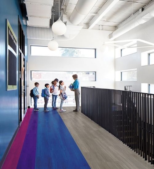
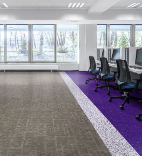
Because it can be intimidating to integrate a bold color like Very Peri into a space, simple accents like flowers, vases and pillows can go a long way. When it comes to flooring, Katherine Cohen, Interface’s manager of visual merchandising and photography, suggests pairing it with calmer colors to balance out the bright purple.
“Tones like Very Peri are great choices for zone creation and for wayfinding since they can be used alongside more neutral shades, like cool grays or dusty blues,” said Cohen. “Another option is to choose a style like those in Interface’s Aerial™ Flying Colors collection, which features a hint of purple within a pattern that is more subdued and not overwhelming.” In this context, the carpet tile provides a pop of color that creates interest and engagement and could add a much-needed playful twist to commercial spaces.
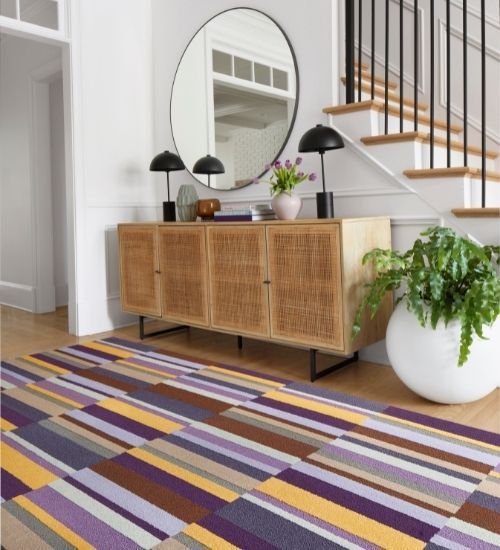
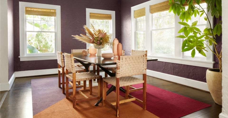
While Very Peri is definitely a statement color, it reflects a growing interest in integrating a range of purple tones into interiors. Shades from plum to lilac are increasingly popular, so designers can opt for more muted takes on purple and still feel confident their work is on trend. “Don’t be afraid to bring purple into a space,” advises Cohen. “While eggplant is a ‘safer’ option that can come across as a neutral because it is so earthy, area rugs can serve as a toe-dip into the trend.”
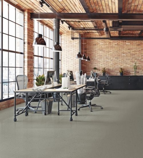
Interface Studio Set LVT
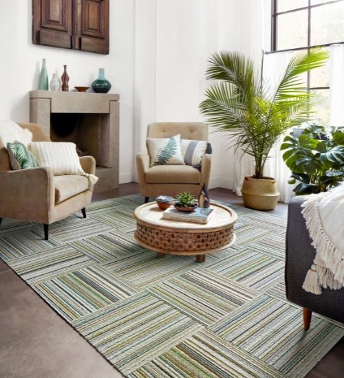
Parallel Reality by FLOR
Interface Stargazing LVT and Look Both Ways LVT
Made You Look by FLOR
PPG’s Olive Sprig and Sherwin-Williams’ Evergreen Fog
Following the uncertainty of 2021, paint brand PPG revealed its Color of the Year as Olive Sprig, describing the soothing gray-green shade as “elegant, grounded, versatile and highly-adaptable, representing regrowth and mimicking nature’s resiliency.” Based on the concept of a horizon, Olive Sprig symbolizes reflection as well as looking forward to what might change over the next 12 months.
With strong similarities to PPG’s Olive Sprig, Sherwin Williams’ 2022 Color of the Year is Evergreen Fog, a very calming, versatile green shade with gray and blue undertones, to represent new beginnings. The color complements neutrals very well, and Sherwin-Williams explained that the shade helps designers deliver a “modern, organic” feel within the spaces they create.
“After the stress of pandemic, people are ready for a fresh start, so it’s no wonder that both PPG and Sherwin-Williams selected subtle, relaxing green tones as their colors for 2022,” said Cohen. “Olive Sprig and Evergreen Fog both speak to a larger green trend that is gaining momentum in design. These tones were on display at NeoCon 2021, and we expect interest in various shades of green to continue for the foreseeable future.”
Given green’s ongoing rise across both commercial and residential spaces, the versatility of tones like Olive Spring and Evergreen Fog are contributing to their appeal. Both colors are flexible hues that can be adapted to most environments and can be used to infuse an organic liveliness into corporate, healthcare and education spaces. Of course, biophilic design continues to play an important part within commercial projects as companies focus on elevating employee wellbeing, and these two shades of green embody these principles beautifully as well.
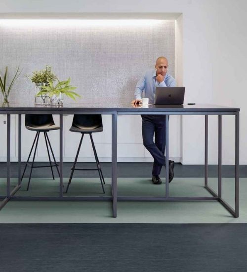
norament kivo
Like Minded by FLOR
Interface Brushed Lines LVT
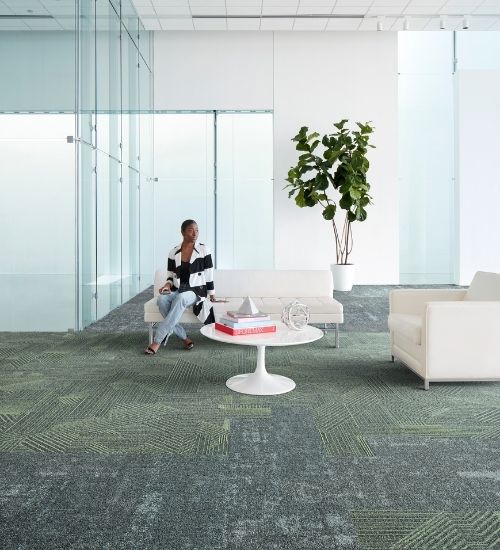
The Rising Signs Collection by Interface
2022 and Beyond
Looking at these 2022 color selections, it’s clear that the trend towards soft, versatile, earthy shades that support our connection to nature are here to stay. However, powerful tones that represent our transformed way of life are also making a mark. It’s important to not be put off by these more intense shades; in fact, they provide an opportunity to inject a sense of vibrancy and life into commercial settings. While it’s impossible to predict the future, it’s likely that all three colors – Very Peri, Olive Sprig, and Evergreen Fog, will evolve throughout the coming year and have a lasting impact on design that extends beyond 2022.