Who said you can’t make a huge impact in a small space?
In downtown Akron, Ohio, “The Rubber Capitol of the World,” sits the former 1871 B.F. Goodrich complex and what is left of the once booming manufacturing facility. Within the remaining buildings is the headquarters of GPD Group, an interdisciplinary architecture and engineering firm that has called this historic complex home since 1988. Over the years, we’ve had plenty of opportunities to re-use and adapt our 90,000 square foot complex.
Design Scope
Our most recent opportunity was a small remodel of a 3,000-square foot space for our marketing department that supports our 12 offices nationwide.
Over time, we’ve established corporate design standards with a grey and purple color palette and angled walls for visual direction. These standards have proven very impactful for our associates and clients to know that they are in a GPD environment. And, this type of design is especially successful when we are occupying partial floors within a corporate building.

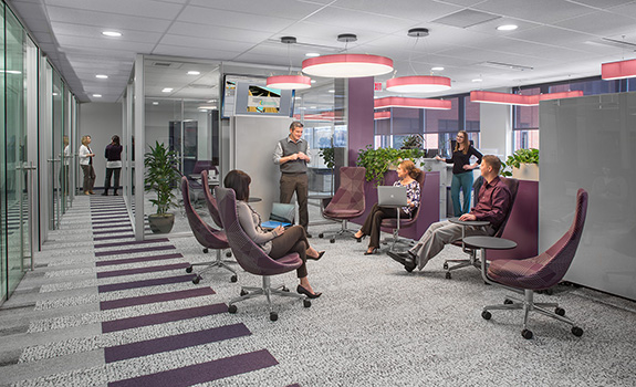
GPD Group designed a more open and creative environment for its marketing department while keeping in line with the company’s design standards and color palette of gray and purple.
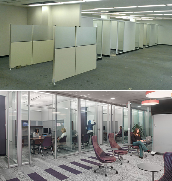
For this project, our company President tasked us with addressing the needs of today’s work place and proposing a more open and creative environment. All while keeping in line with our design standards. As a designer on the GPD team, I had the opportunity to be a part of taking a dark, isolated space and transforming it to an open layout with multi-functional furniture and fresh finish choices for our associates.
Working within a small space
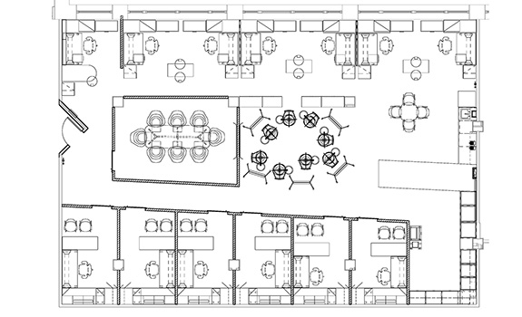
With such limited space, we wanted to change the perception our company had about the modern work environment. The design scope needed to address six key requirements: private offices, a conference room, work stations, a production area, a flexible team space and a kitchenette.
Getting to work
We started by eliminating walls within the space and constructing necessary walls out of glass to transfer the most natural light into the space, centralizing private offices in the corridor with glass fronts to create an open plan. The offices and individual work stations were smaller than typical GPD spaces, so we selected multifunctional fixtures and furniture to maximize storage and work surfaces.

Capturing natural light, framing pleasant views and specifying materials that are reminiscent of natural surfaces, like Interface’s Human Nature™ Skinny Planks™, were key parts of the vision of the space.
The large collaboration space has multiple seating options and large, moveable magnetic marker boards to encourage impromptu creative meetings. With so many functions required for each associate, we really focused on materials and furniture with multiple purposes. Our team looked to specify finishes and furniture separate from our national standards. This included open mobile and stationary workstations with plenty of work surfaces, as well as pieces with upholstered tops to function as seating and storage in one to allow for impromptu meetings.
“I saw a big difference between the meetings that we conducted in the conventional college classroom type space vs. the ‘collaborative space’ …. People relaxed more, put down their guard and spoke more freely.” –Darrin Kotecki, GPD Group President
Inspiring creativity
We were inspired by how ideas flow more freely in an open space and how our minds and bodies respond to being in or around nature. Capturing natural light, framing pleasant views and specifying materials that are reminiscent of natural surfaces were key parts of our vision of the space. We incorporated research in key areas of ergonomics, biophilia and office well-being for our associates. This combines to create an open culture for the associates’ creative growth within their personal work and with others.

Before and after: The combinations of updated finishes and furniture helped to show the GPD Group associates, their executive board and their clients how to create healthy and functional work spaces.
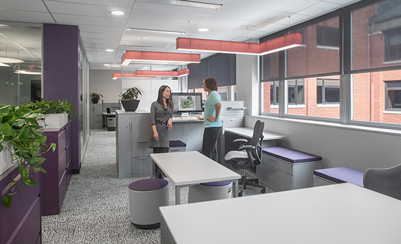
Almost every surface, whether horizontal or vertical, can be utilized for individual or group work, to pin up sketches, draw concepts and discuss designs. We equipped workstations with the most ergonomic sit-to-stand desks, monitor arms, task lighting and task chairs.
Private offices utilized every surface to be the most efficient and flexible space for the individual. The private office furniture systems took advantage of every vertical and horizontal surface to create ultra-efficient offices. And, the moveable wall system created better use of space through easy reconfiguration.
Results
Within the first few months, the associates noticed a complete 180-degree experience from their past offices and workstations.
The initial thoughts were that it would be too open to complete tasks that need your full attention while others were meeting. Or that the space had too much glass and would cause distractions and not enough privacy when needed. One associate felt that there was too much natural light and it would cause work issues with the technology.

Floor plan of the GPD Group remodel project for its 3,000 square foot marketing department
Most, if not all, of these concerns never came to fruition after months of being in the space. In fact, the energy in the space is greater and more open to all the new creative ideas we were designing for.
“It is easier to approach colleagues because you can see and hear them from your own seat. There are more collaborative spaces, so it’s easy to gather and discuss things on a whim.” Maria Krause, Marketing Coordinator
Key takeaways from this project
Each piece of the design had a large part in how we could provide the most functional and inspiring space possible. Using well-designed products and materials took the interior to an inspiring level. The combinations of updated finishes and furniture helped to show our associates, the executive board and our clients how we can create healthy and functional work spaces.
The team was able to incorporate the needs of the marketing department by meeting all of their requirements, which has led to a new and improved working environment and demeanor. The marketing space – though different in detail from other GPD spaces – can easily be identified through use of similar colors, angles and design details. All the standards exist in the new space, but they have been updated to reflect a more contemporary and open office.
“We are rocking! It is way better to be creative in an environment that supports creativity and allows us to produce some great work.” Mike Morrison, Director of Marketing
The project was such a success that many of these features will be implemented into remodels in our other offices nationwide. And, while it was an upgrade in our Akron marketing office, it is now a showcase for potential clients.
One response to “Small Space, Big Impact”
Love the tablet armchairs – whose are these?