Same, but different. The lines that define interior spaces, aesthetics, color and materials are being blurred more than ever. What we spotted at Milan Design Week bleeds into NeoCon and beyond: the continued blending of workplace design with residential, hospitality and more. The latest looks celebrate our differences in a unifying mashup.
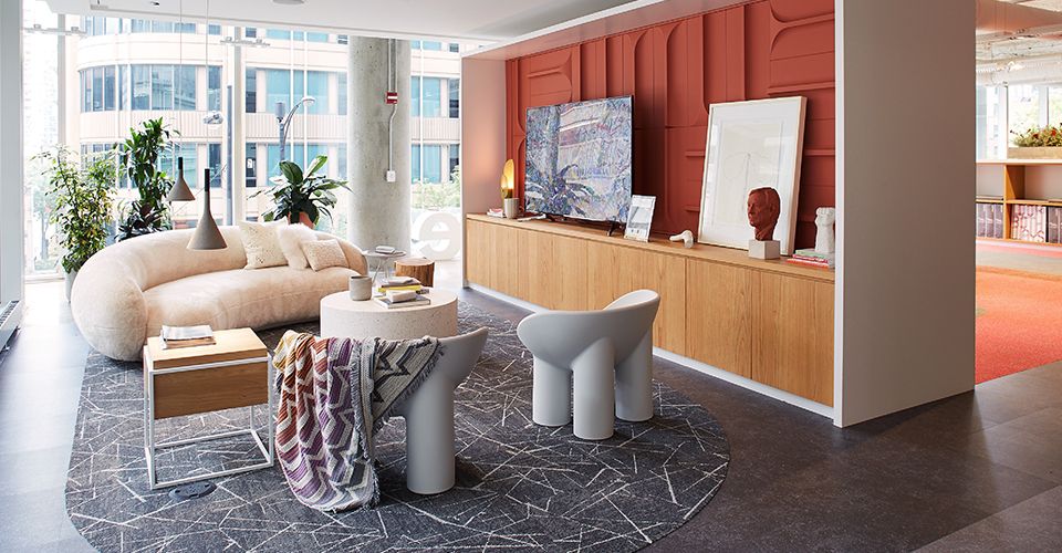
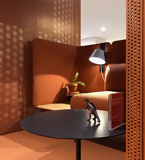
Interface’s Chicago showroom featured colors and textures that evoked the design trends we saw at NeoCon 2019 — namely, terra cotta.
Better together
Whether it was materials recycled into new aggregates or larger companies showcasing their ever-expanding portfolios, NeoCon was all about combining efforts. Herman Miller said it best with their “All Together Now” campaign that mirrored what we saw in Milan — but they weren’t the only ones playing with this theme. At Teknion, Steelcase and Knoll, we saw a combined use of all their brands in different spaces and configurations ranging from workplace to healthcare to lounge and so on.
As far as spaces go? It’s all about the style mix. Today’s workplace design is incorporating more residential influences, while hospitality is being inspired by co-working spaces and wellness trends. The result of this hybridization is an incredible mashup of materials, furniture, textiles and especially brands in order to achieve the perfect harmony of finishes.
Shades set the tone
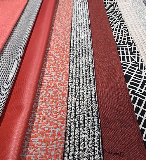
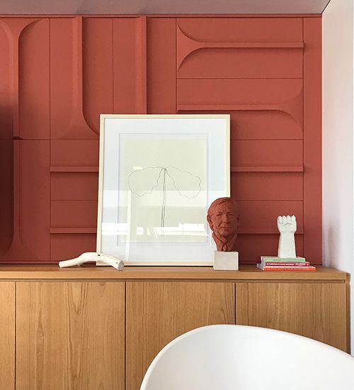
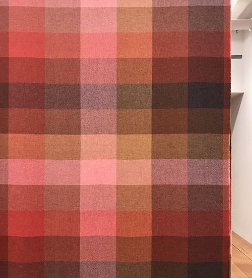
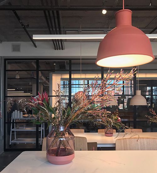
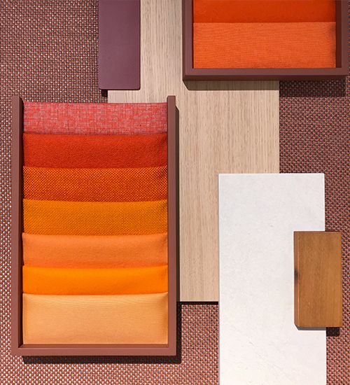
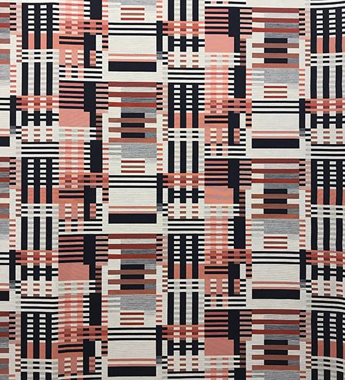
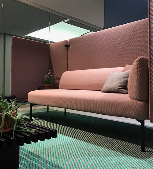
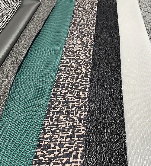
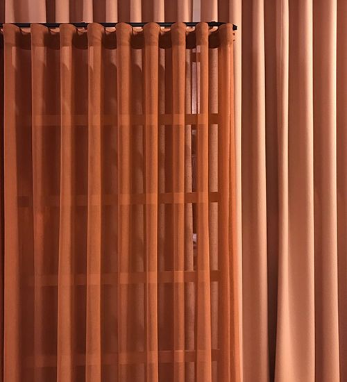
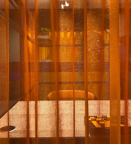
Maybe it’s the 100th anniversary of the Bauhaus movement, or the 70s-dinner-parties-set-in-sunken-living-rooms vibe, but orange is back. From bright clementine to sun-baked terra-cotta and sienna, orange hues are everywhere. These warm ochre colors celebrate neutrals and pair nicely with blush, which is finding its way into interiors as a scaled-back accent amid a field of neutral textures.
Luna Textiles
Interface
Maharam
Haworth
Muuto
Andreu World
Designtex
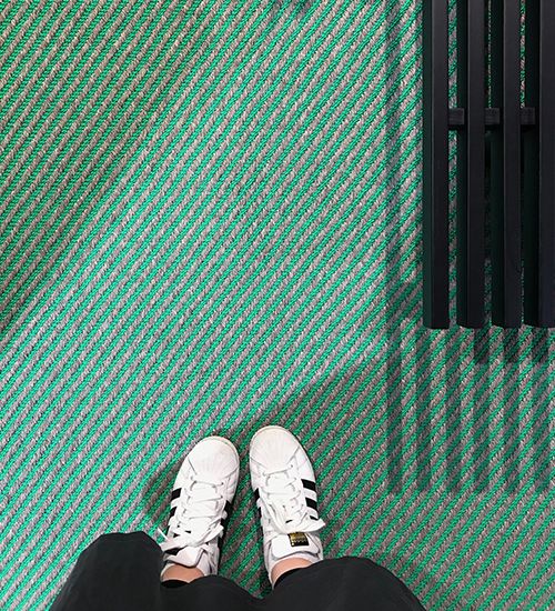
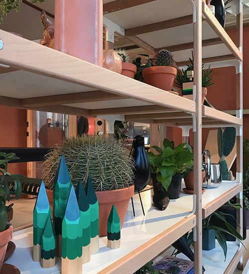
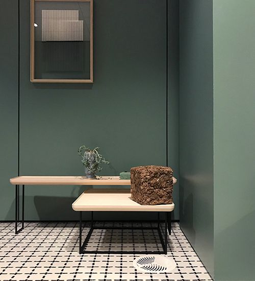
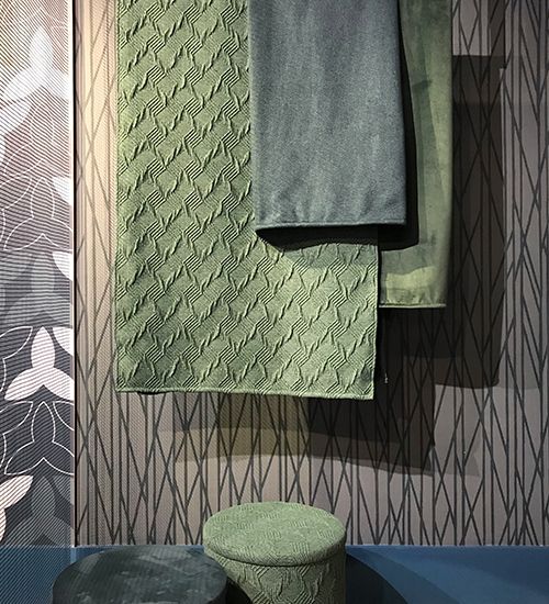
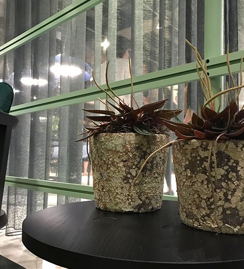
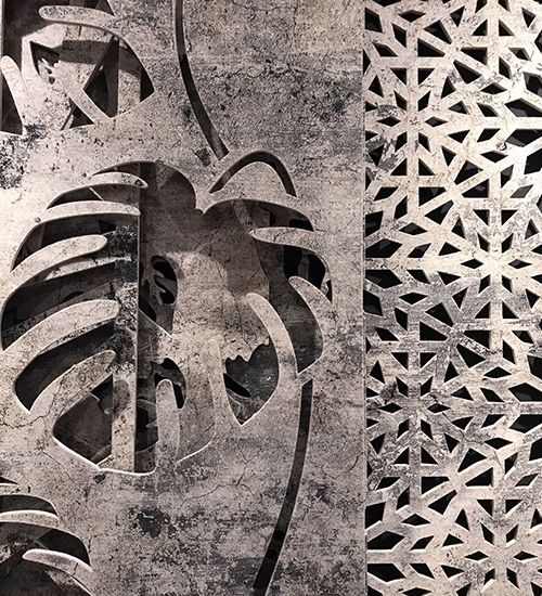
Also sprouting up at NeoCon? Mineral tones inspired by botanical color. Jade green, malachite and sage set a tonal color palette (as seen in the vignettes at the Herman Miller showroom). The drama was high at NeoCon this year—contrasting materials and finishes, dimly lit accent lighting all worked together to create moody interiors.
Haworth (and the author’s sneakers)
Herman Miller
Haworth
Haworth
Luna Textiles
Carnegie
Buzzispace
Layers are in
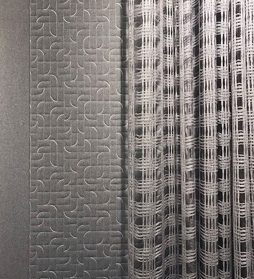
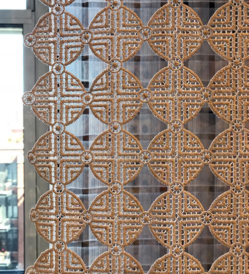
When it comes to materials, one thing is clear: transparent layers are in. A trend first noted in fashion weeks has shown up in interiors at NeoCon with layered translucent curtains. Multiple colors were overlaid on top of each other to create tonal variations and a unique depth of shade. These sheer textiles give a softer approach to space definition in common areas and personal workstations.
Haworth
Luum
Carnegie
Buzzispace
Buzzispace
From exhibitor partnerships to mixed materials and colors, all that we love about design was on display at NeoCon — all together. It was the perfect combination of summer design trends that are sure to mix and mingle for the rest of 2019 and beyond. See anything intriguing at this year’s NeoCon? Share your finds with us!
Cheers,
Gretchen
Featured Image © Aquafil
One response to “Design Trends that Mixed and Mingled at NeoCon 2019”
The design trends explained at neocon are really great! I like the lines and layers idea a lot. I got to learn a lot from you post. I also liked all the images shared by you. I am mesmerized after looking at the various designs shared by you.Thank you for sharing this post with us.