After the glitter settles on another year, we step hurriedly into January hoping to leave some habits behind and embrace all things shiny and new. Right on cue, Pantone marks the start to a new year with a new Color of the Year. In 2019, we are celebrating and surrounding ourselves with the bright and vibrant optimism of Living Coral.
Pantone Color Institute makes a selection for their featured color based on a variety of cultural and material factors — everything from art and design to politics is used to identify the color influences for the year ahead.
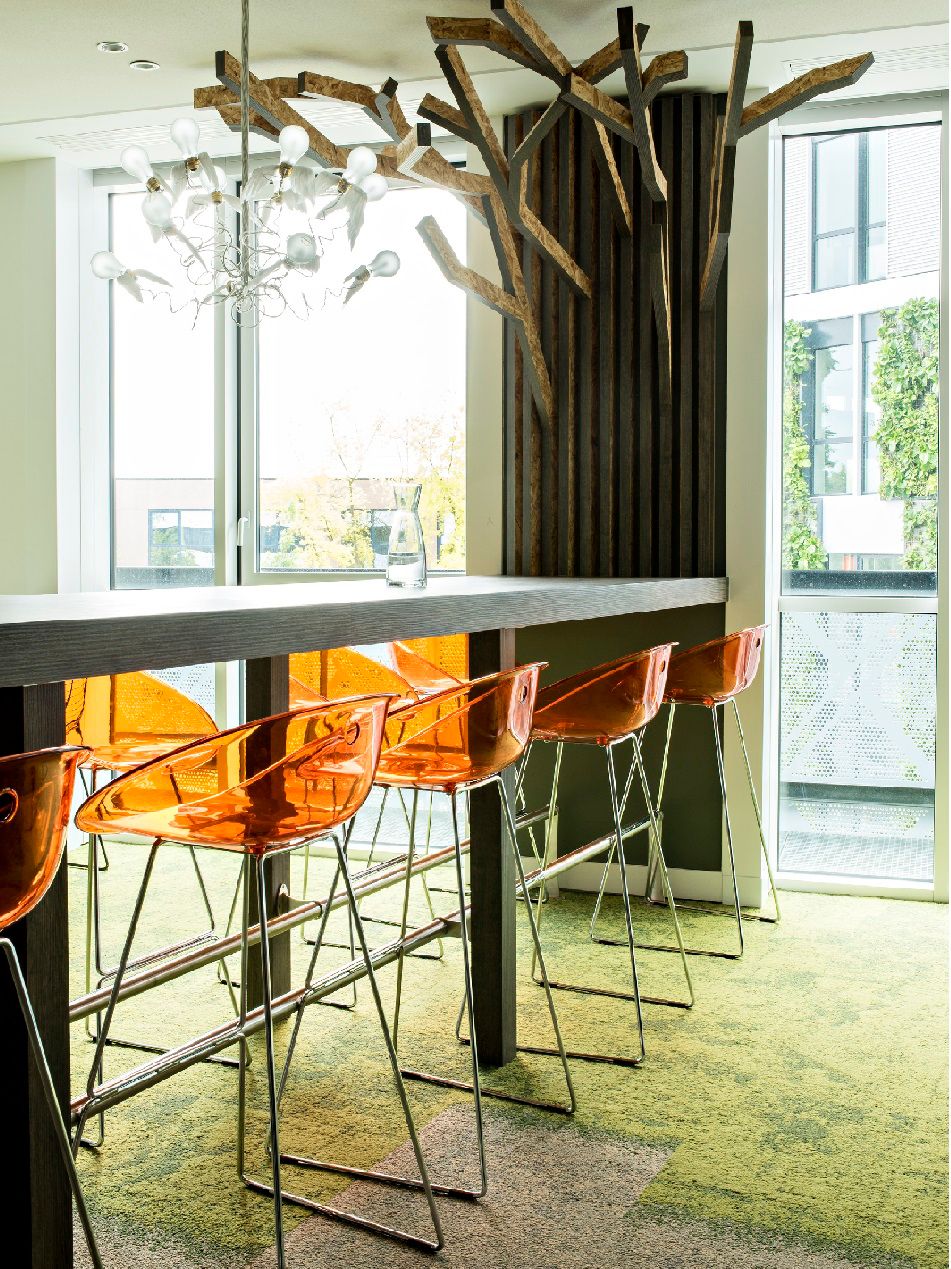
Living Coral, positive influence
Living Coral undoubtedly references (in a not so subtle way) the current state of ecological debate. A color so beautiful and saturated, it epitomizes resiliency against incredible odds.
Living Coral is a visual representation of healthy ecosystems: colonies working together to create unimaginable beauty and color. On an environmental note, take a closer look at the work Mote Marine Laboratory & Aquarium is doing to restore coral reefs along the Florida coast.
Living Coral is a color rooted in true optimism. The design world is experiencing a boost of positivity when it comes to shape, pattern, material and especially color. Living Coral is the most recent example of the fresh and playful palettes that have been emerging in the last few years. Hinging on overall warmer trends in color (like Terra Cotta and earthy neutrals), it finds a perfect place as an accent to other warm finishes.
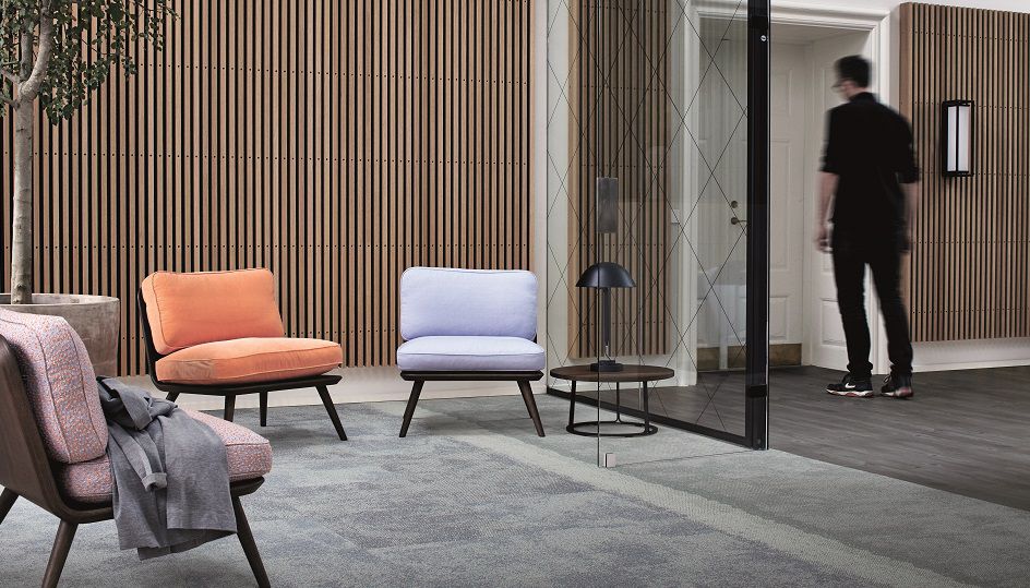
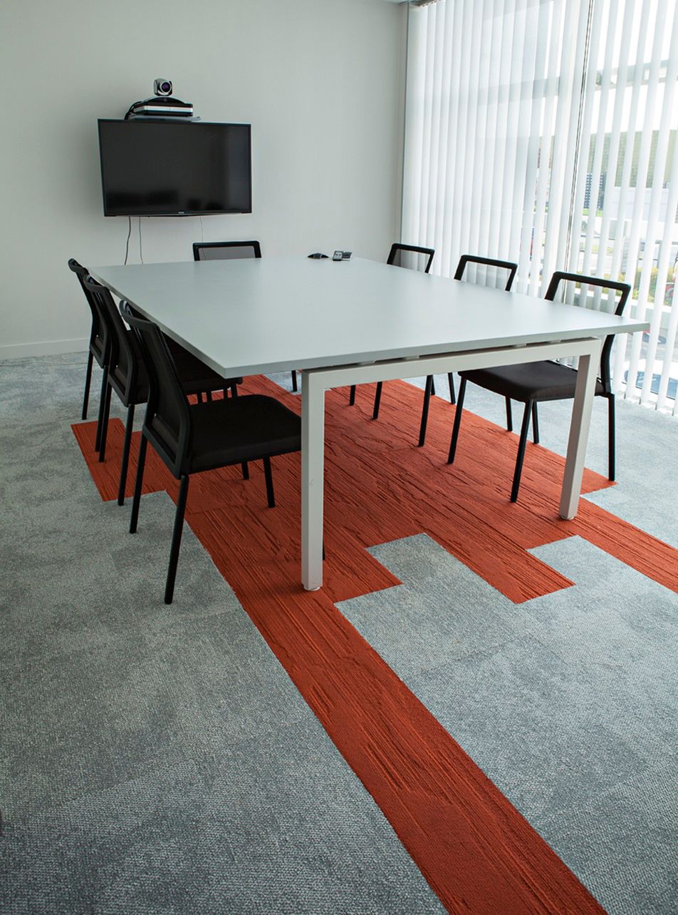
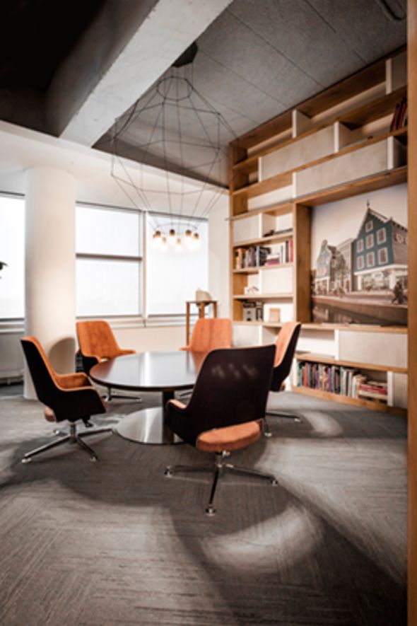
Living Coral in application
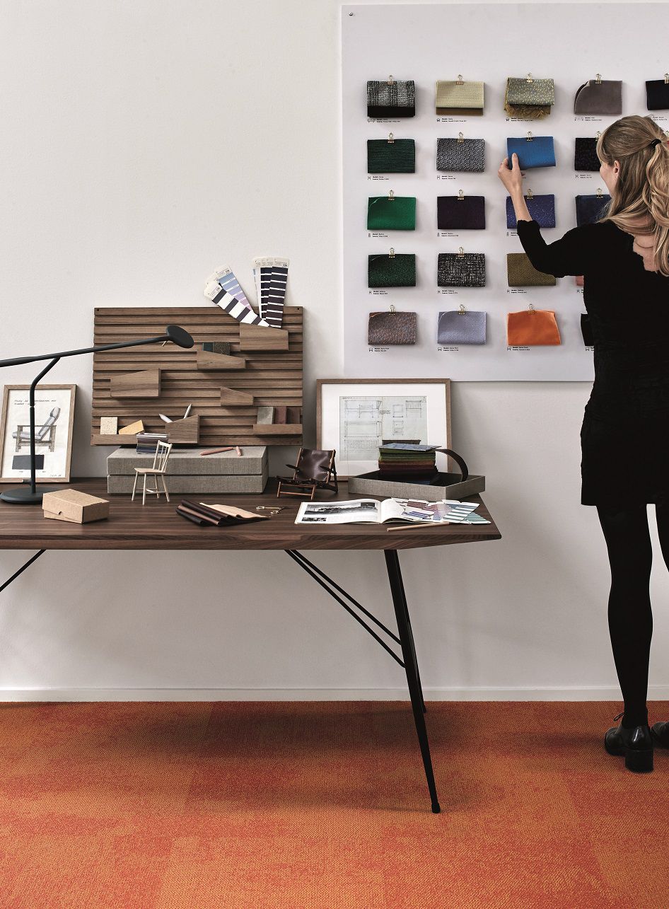
Texture and materiality have proven to be an ongoing trend in the built environment. When considering Living Coral within your space, channel soft, dewy and youthful textures and explore how they contrast with existing finishes. Glossy versus matte. Sheer vs. opaque. Chalky vs. vivid. Velvet vs. felt.
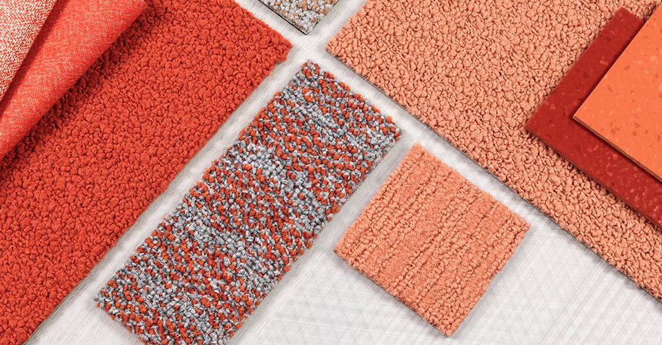
For the perfect neutral pairing, invite Living Coral to live amongst rich walnut browns, terra cotta ceramics from Eny Lee Parker and the ever-present blush. Mix and match more saturated oranges in Tangerine and Clementine, even Poppy, with modern and curvilinear accents from Hay for a bolder approach.
Living Coral comes into existence at a moment when the world is shifting its attention to much-needed positivity. Exceptionally curated spaces with perfect neutral accoutrements have quickly become the norm, helping us reshape our ethos toward mind and body wellness.
Image credit: ©Architecte: Avantpropos Architectes; maitre d’oeuvre: Demathieu Bard Construction Nord
Image credit: ©Architecte: Jean-Philippe Bridot
Maybe I’m feeling nostalgic with all these youthful (yet sophisticated) color palettes, but I’m certain that I had a pair of GAP chinos one summer in this same sorbet-infused hue. So, keeping in line with the methodology of trends (past, present and future), what goes around comes back around.
Until next year color lovers.
XOXO, Gretchen