NeoCon 2023 felt like a pre-pandemic trade show, with attendance up and brands showing out! This year, Interface partnered with outside design pros as well as our own internal design experts to analyze what materials, shapes, colors, patterns and textures are popular in commercial spaces today. Take a look at the insights each designer shared below!
Dan Mazzarini – Principal, Creative Director at BHDM Design
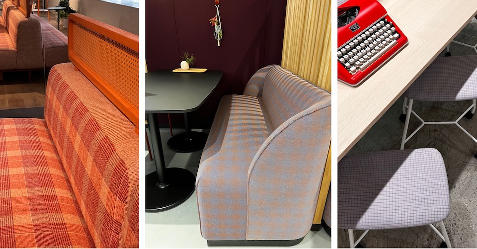
According to Dan Mazzarini, principal, creative director at BHDM Design, several showrooms at NeoCon brought the outside indoors through the idea of “work as a picnic,” and this theme was one of his favorite trends at the show. “I loved this notion of picnic – a more lighthearted approach to the workplace,” Mazzarini says. “Returning to the office can be a challenge, so thinking outside the box and offering people a unique place to work feels really fresh.”
While the picnic inspiration was visible through plaid and gingham patterns, other elements also conveyed this playful concept. “From fabrics and rugs to furniture systems with canopies and single desks that feel more like an adult jungle gym, park-like – and picnic-like – references caught my eye,” Mazzarini shares. “[It] feels like a picnic to me, and a great way to casualize the workplace, and create opportunities for spontaneous interaction and connections to nature in a more meaningful way.”
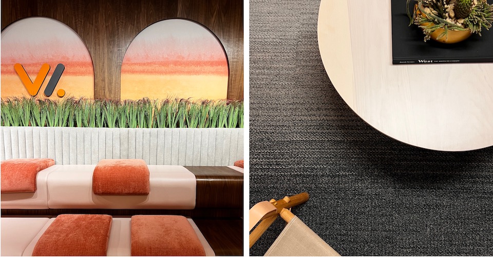
Ombre looks also stood out to Mazzarini at NeoCon 2023. “[Ombre] was apparent in lots of ways; from flooring (including Woven Gradience™ patterns from Interface) to wallcoverings, fabrics and systems, natural looking gradation was another way for companies to incorporate biophilic reference and graphic interest to their products,” Mazzarini explains.
Jane Hallinan, IIDA, LEED® Green Associate, WELL AP – Interior Designer, Perkins Eastman
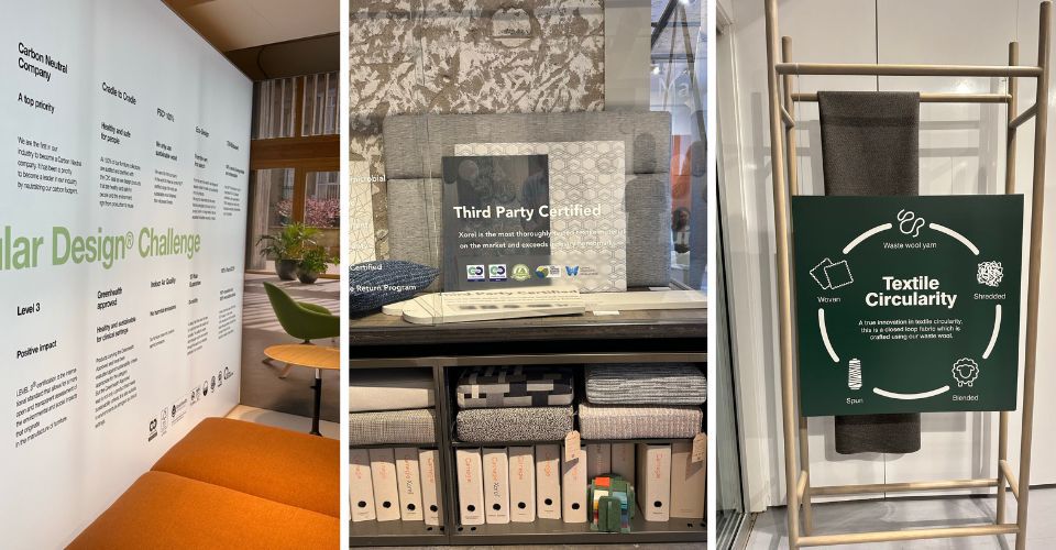
Perkins Eastman Interior Designer Jane Hallinan noted an uptick in bold sustainability statements from NeoCon 2023 exhibitors, which is a helpful development for designers who are passionate about sustainability and healthier materials.
“ ‘Green’ at NeoCon, to me, used to mean there were so many plants filling the showrooms that you could barely tell what the new products were,” Hallinan says. “This year, I noticed a significant increase in prominent surfaces that promote industry-recognized ecolabels and certifications that their company and products comply with…the increased availability of ecolabels and certifications allows me to more easily and purposefully specify manufacturers and products that prioritize ingredient transparency, ethical supply chains, and support human and environmental health.”

Photos by Jane Hallinan
According to Hallinan, the future was top of mind at the show, and this led her to ask brands how they are innovating with respect to their production. “I think that we’re on the cusp of some really incredible transformations!” Hallinan explains. “At Perkins Eastman, and across the industry, it is the responsibility of all interior designers to continue the feedback loop and let manufacturers know that ingredient transparency and reducing carbon emissions is important to our industry. It is our obligation to the health, safety and welfare of our clients to express this to prioritize this in our projects and to remain curious but diligent to identify greenwashing.”
Katherine Cohen – Associate Creative Director, Interface
Interface Associate Creative Director Katherine Cohen saw designers using color in new ways during NeoCon 2023 – especially in commercial office vignettes. She shared there is a playful element being infused into the workplace, and people are willing to take on a little more risk in their designs.
“Monochromatic palettes were popular this year, with similar color furniture placed on a similar color rug. It can be different shades of those tones, but monochromatic from the lamp, the table, the chairs, to the rug, and all solid colors. I thought that was really interesting,” Cohen says. “In fact, I was a bit surprised to see all the white furniture with white rugs for commercial projects – just that people were not scared or shy of white, especially knowing the foot traffic that NeoCon would receive.”

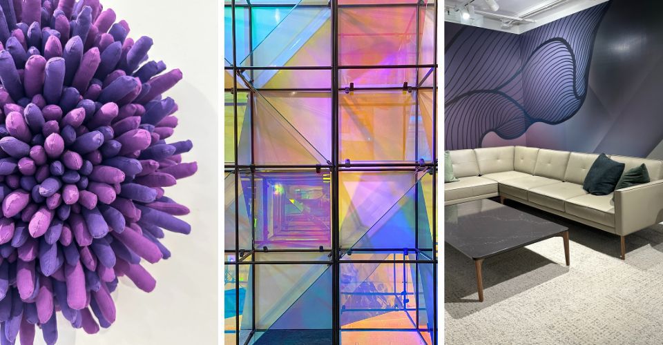
Purple and iridescent elements were on display at NeoCon 2023.
Pastel tones and purple shades were also big at NeoCon. “We are seeing colors that are not traditionally associated with office environments being incorporated into the workplace,” Cohen says. “There seems to be a push for sophisticated pastels, which I find really calming and beautiful, and I love how iridescent glass accents are being used to bring pastel rainbows into spaces. Purple also made a statement at the show – I saw everything from lilac to aubergine shades – and that is not something you typically encounter in workspaces.”
Color trends can represent long-term shifts or seasonal forays, and while it isn’t clear yet which colors seen at NeoCon 2023 will last, Cohen is confident that the lines between residential and commercial designs will continue to blur for the foreseeable future: “We’ve entered a new era in workplace design – one that doesn’t take itself so seriously – and I’m excited to see where this journey takes us!”

