There’s one event in a designer’s calendar that generates a great deal of anticipation and spurs excitement for the year ahead – Colors of the Year releases. And in a year where people have returned enthusiastically to commercial environments, designers have been bringing the outside in with projects inspired by both the natural environment and warmth within.
Some colors of 2023 released so far, Pantone’s Viva Magenta and Benjamin Moore’s Raspberry Blush, suggest show-stopping reds are strong as ever. In contrast, Sherwin-Williams’ Redend Point brings an almost nostalgic earthy neutral. With different tones and different levels of potential impact and versatility, these three colors present exciting new opportunities for commercial spaces.
Pantone: Viva Magenta
Viva Magenta certainly made an impact on the design community, taking many of us by surprise and demonstrating Pantone’s eagerness to celebrate the “vim and vigor” of the natural environment. The tone stands out, both from more traditional biophilic-inspired colors but also from the larger red family, and Pantone presents it as a “new signal of strength” in what for many is a difficult time. It was chosen to represent a “joyous and optimistic celebration”, one which encourages people to experiment and express themselves in new and exciting ways.
There is a real sense that the handbrake is off with this color, particularly from an interior design perspective. You can see the influences coming through from fashion and makeup, and it’s easy to imagine it taking center stage in a residential interior, drawing the eye to feature spaces.
From a commercial perspective, it presents more of a challenge. We need to take care when including such a bold color in commercial or workplace design, but Viva Magenta is about pushing the boundaries and we expect it to help create new spaces and encourage new ways of working in these environments. It could be used to empower a breakout or project area, one where people have permission to abandon a corporate style and be braver and more creative.
The color could also be toned down and paired with shades of brown to ground it, giving it a more biophilic feel.
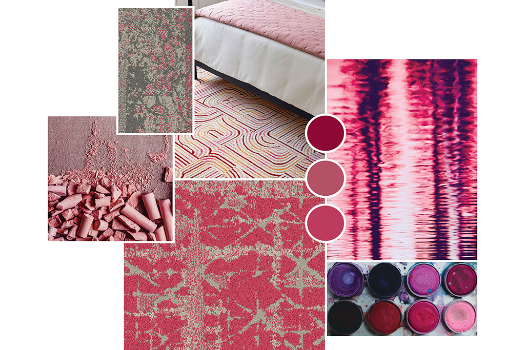
Interface’s Ferris color Glacier, Leaps and Bounds from FLOR® color Berry, and Seeing Stars from FLOR®.
Benjamin Moore: Raspberry Blush
Taking a different approach to the brighter side of red is Benjamin Moore’s Raspberry Blush, a vivacious shade of coral tinged with pink. Inspired by the communicative properties of color, shape, and sound, Raspberry Blush stands out in its own form of “electric optimism”, which is why Benjamin Moore partnered with with electro-funk duo Chromeo to highlight the optimistic tone of the palette and the dynamic role color, like music, plays in self-expression.
Warm neutrals can bring with them an ability to tie together spaces. Both Viva Magenta and Raspberry Blush achieve this by standing out from the crowd. While the former draws more from biophilic design to overwhelm, Raspberry Blush focuses on powering and lifting the space as a whole, building on its own boldness to develop a definitive charisma.
Raspberry Blush also sits very well with the grounded colors that Interface has been predicting would dominate commercial design. Accented with light greys and off-beiges, Benjamin Moore’s full 2023 Color Trends palette was chosen for their “distinct presence and personality”. Each of the eight prominent shades, from Conch Pink to Savannah Green, bring inspiration and creativity, while encouraging a push beyond the traditional to experience exceptional color.
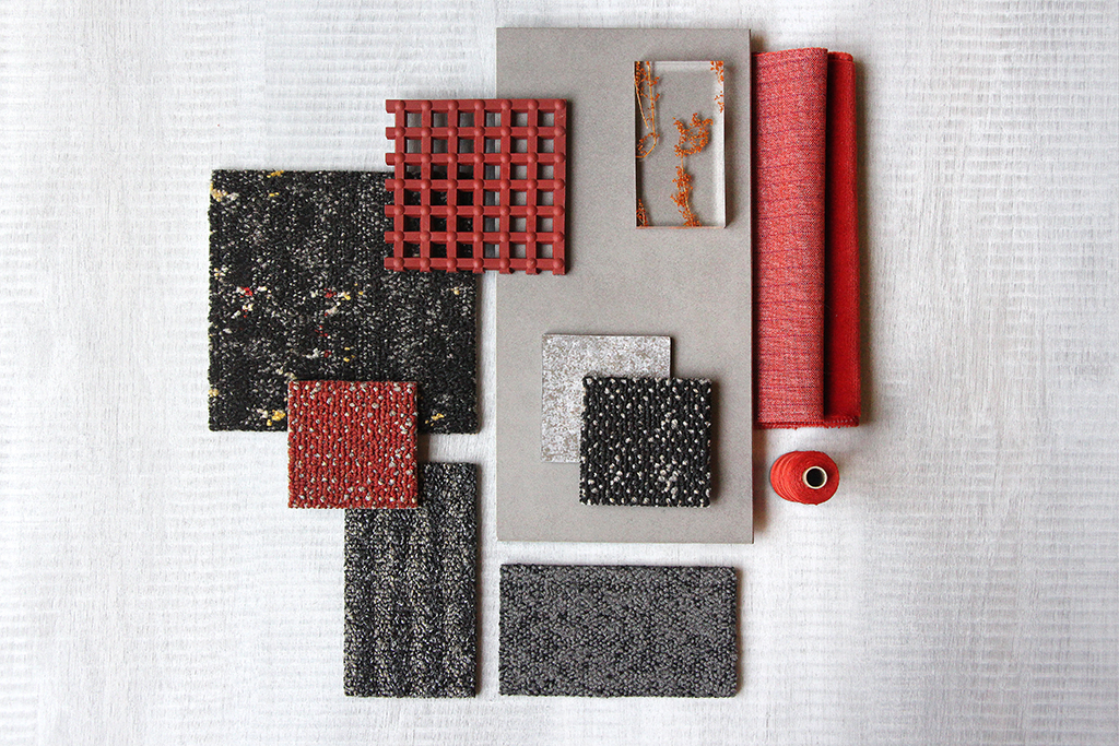
Step in Time™ carpet tile from Interface’s Look Both Ways collection is available in colors like Coralite and Sienna.
Sherwin-Williams: Redend Point
Redend Point from Sherwin-Williams echoes a familiarity that comes from our connection to the world around us. Pulling destinations away from the horizon and into our grasp, this soft clay tone can both highlight and serve as a primary focus. Like Viva Magenta, Sherwin-Williams’s Color of the Year is also one which celebrates the natural environment. By tapping into a natural earthy tone it can help foster connections not only between humans and nature, but between individual people, too.
With this color, Sherwin-Williams came up with perfect example of a design trend we first highlighted in a late 2021 article Warm Neturals Bring a Sense of Calm to Changing Environments. Katherine Cohen, manager of visual merchandising and photography for Interface®, then rightfully pointed out that “warmer grays really bring more of a feeling of welcoming, which I think in today’s climate everyone is drawn to more than ever. We are seeking colors that are healing and energizing. Some of the interest in warm neutrals can be attributed to the desire for warmth and security given the uncertainty and stress caused by the pandemic. Warmer tones elicit feelings of calm. In a world where our senses are often overloaded, it’s a nice pause.” As the pandemic period has fazed into a new kind of normal with which many of us are still struggling to adjust, it only makes sense that warm neutrals have a stronger pull now, even over a year later.
Commercially, Redend Point has the ability to harness a “beauty beyond ourselves”, bringing a constant to spaces that mends well both with Interface’s neutral and accentual color lines. With an unknown yet familiar place that invites us to arrive with compassion, it is “subtle, warm and restorative”, uplifting to spirits with a theme as heartening and intriguing as it is versatile and usable.
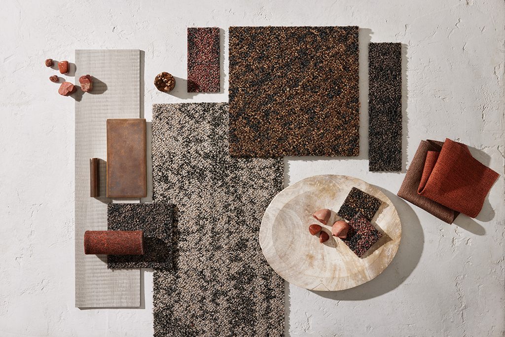
The HiFi™ carpet tile collection from Interface features warm neutral, soothing tones like Metal Leaf and Rubylith.
Viva Magenta, Raspberry Blush and Redend Point all bring warmth to spaces in different formats. They demonstrate how designers are ready to push the boundaries of style and apply understated neutral tones in a fresh way. This comes at a time when we continue to break new ground for commercial design and expand the potential of basic tones. We’re looking forward to exploring how these colors can contribute to the commercial spaces of 2023.
Want to talk about the design of your new space? Get in touch.