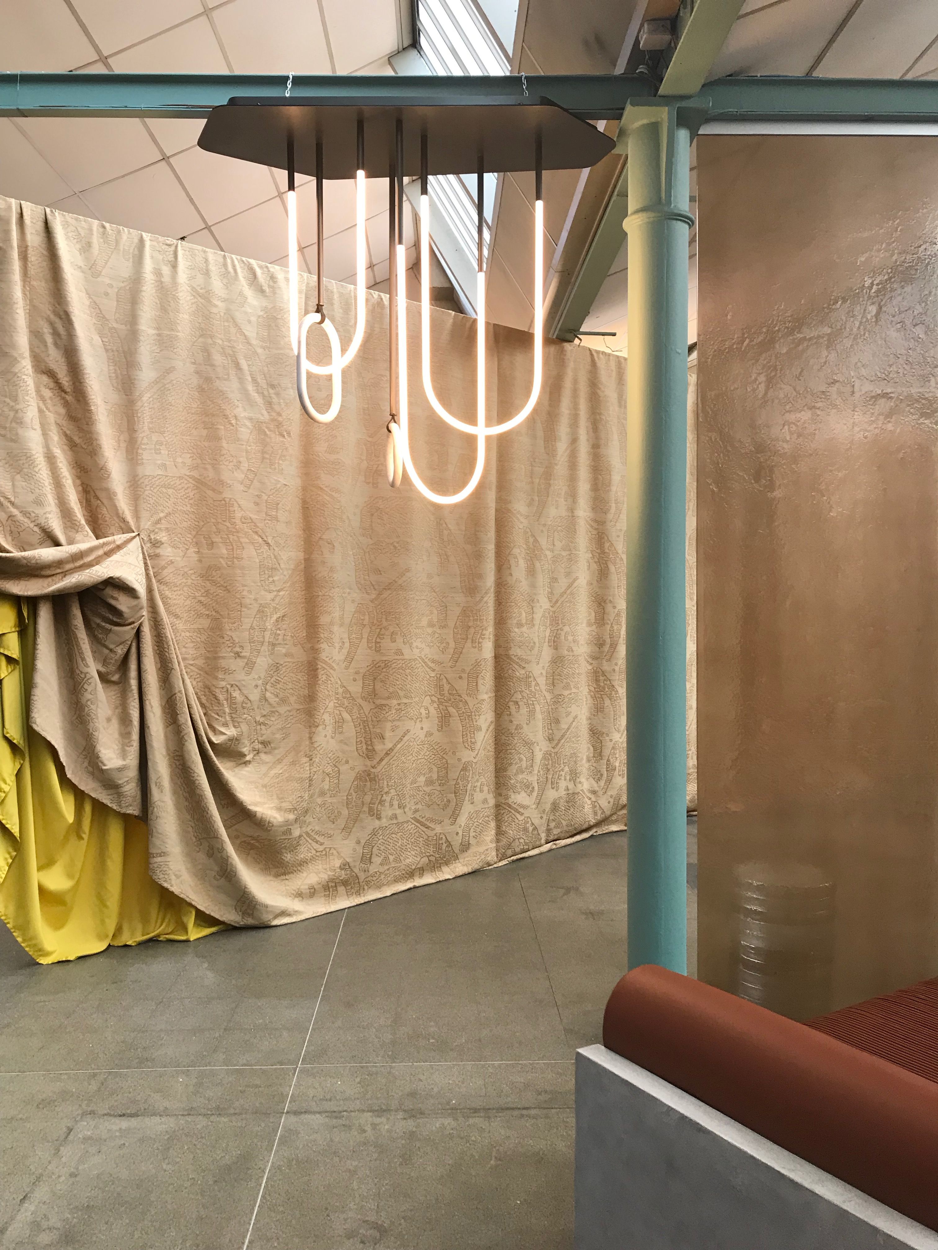
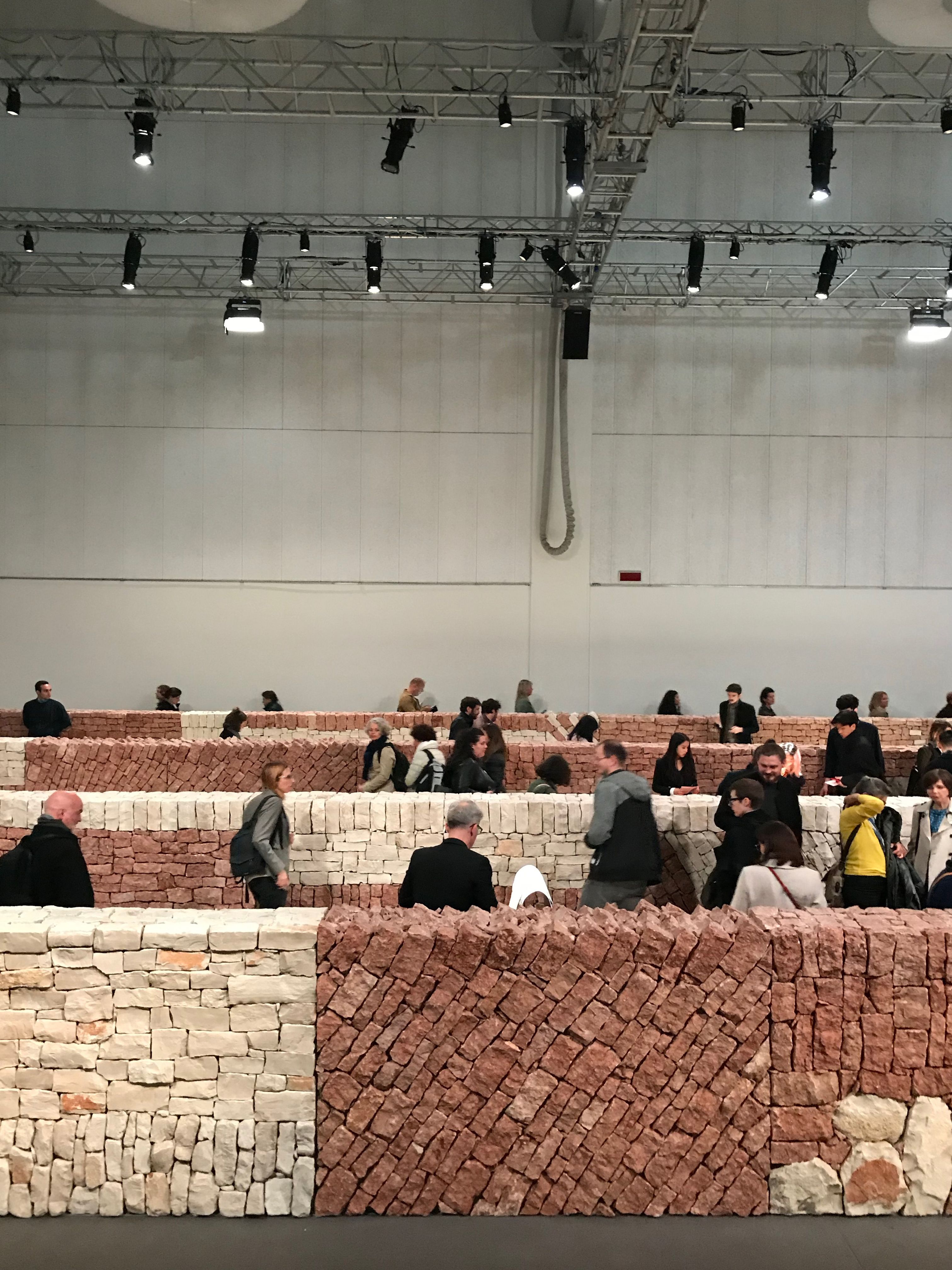
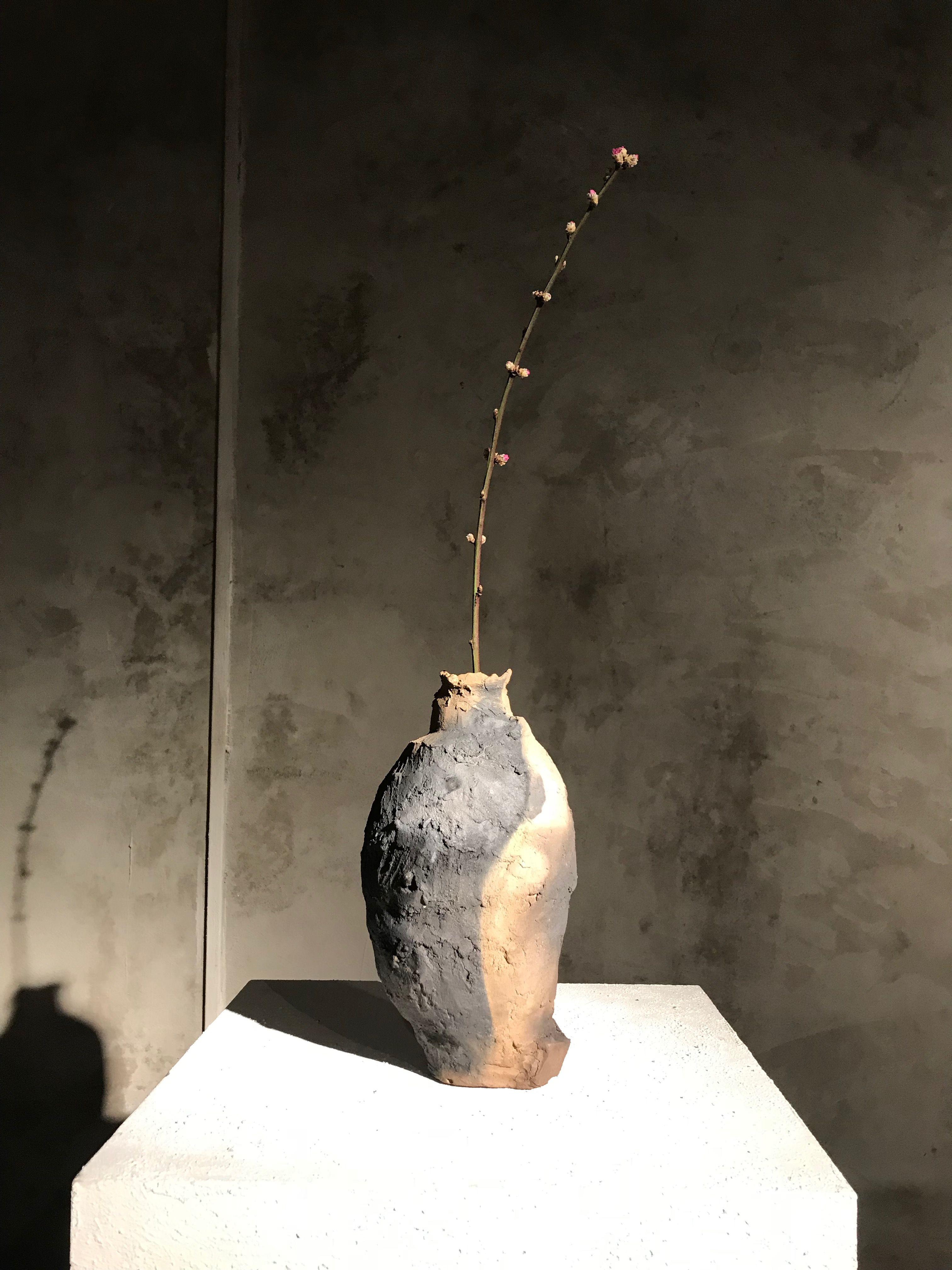
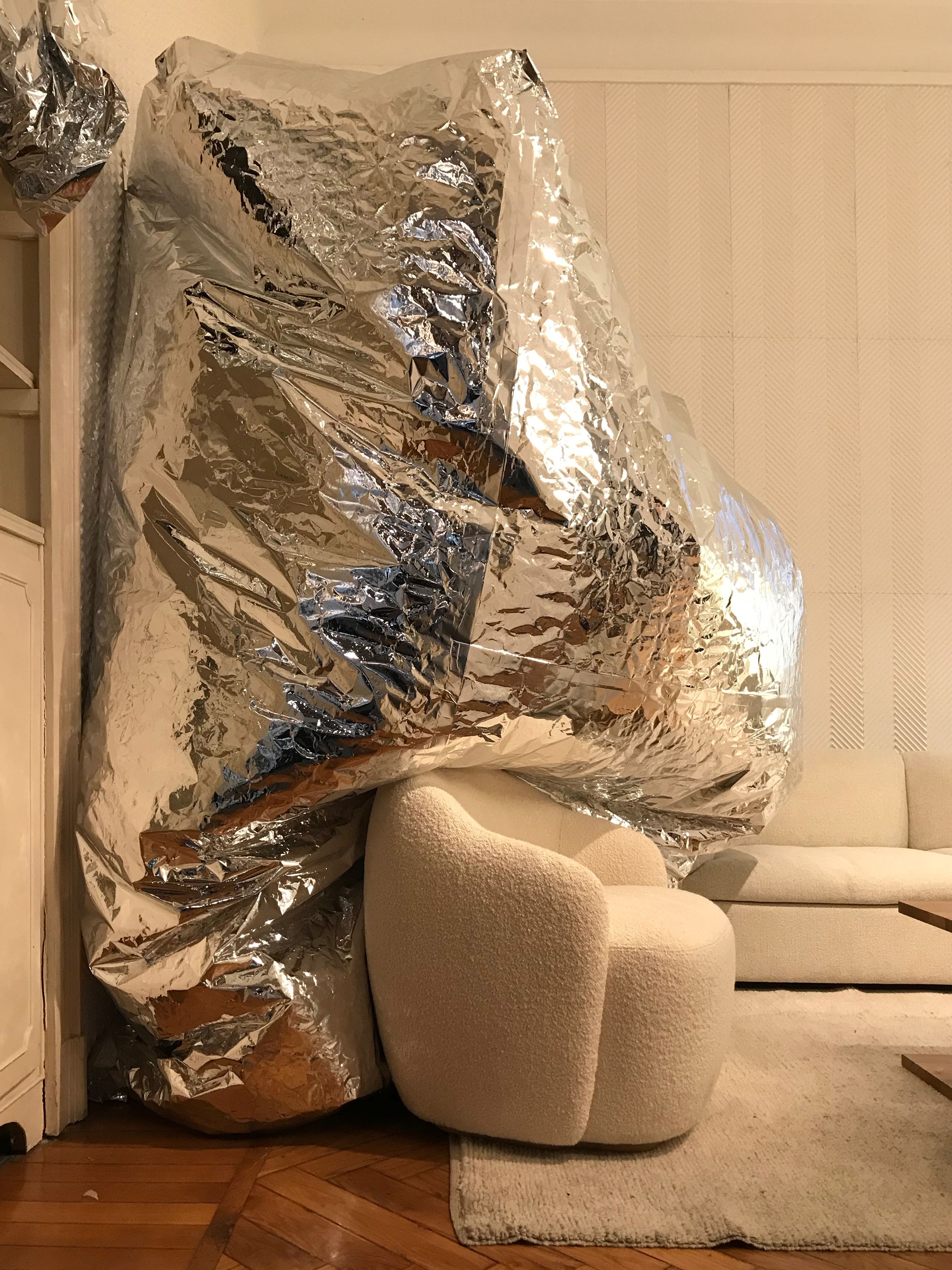
Mid-April marks a shift in the design calendar. Brands begin promoting their latest campaigns. Emerging designers present new and compelling ideas to challenge the status quo. It’s Milan Design Week, the most influential design showcase of the year — a week-long spectacle overflowing with inspiration and innovation. What’s shown in Milan inspires and evolves over the next twelve months into new products, color direction, merchandising and styling.
This year, I had the pleasure of traveling to Milan with two experienced attendees who gave me the low-down on how to tackle the city’s most visually inspiring spots without that FOMO feeling. The three of us took to the city in light layers and chic-yet-comfortable sneakers to visit as much of the show as possible in five days. Honestly, I’m still experiencing Aperol Spritz withdrawals.
But, I’ve pulled together each of our notes and distilled the central themes and trends we experienced throughout Design Week. I’m sure we’ll be seeing plenty of them pop up later.
Color
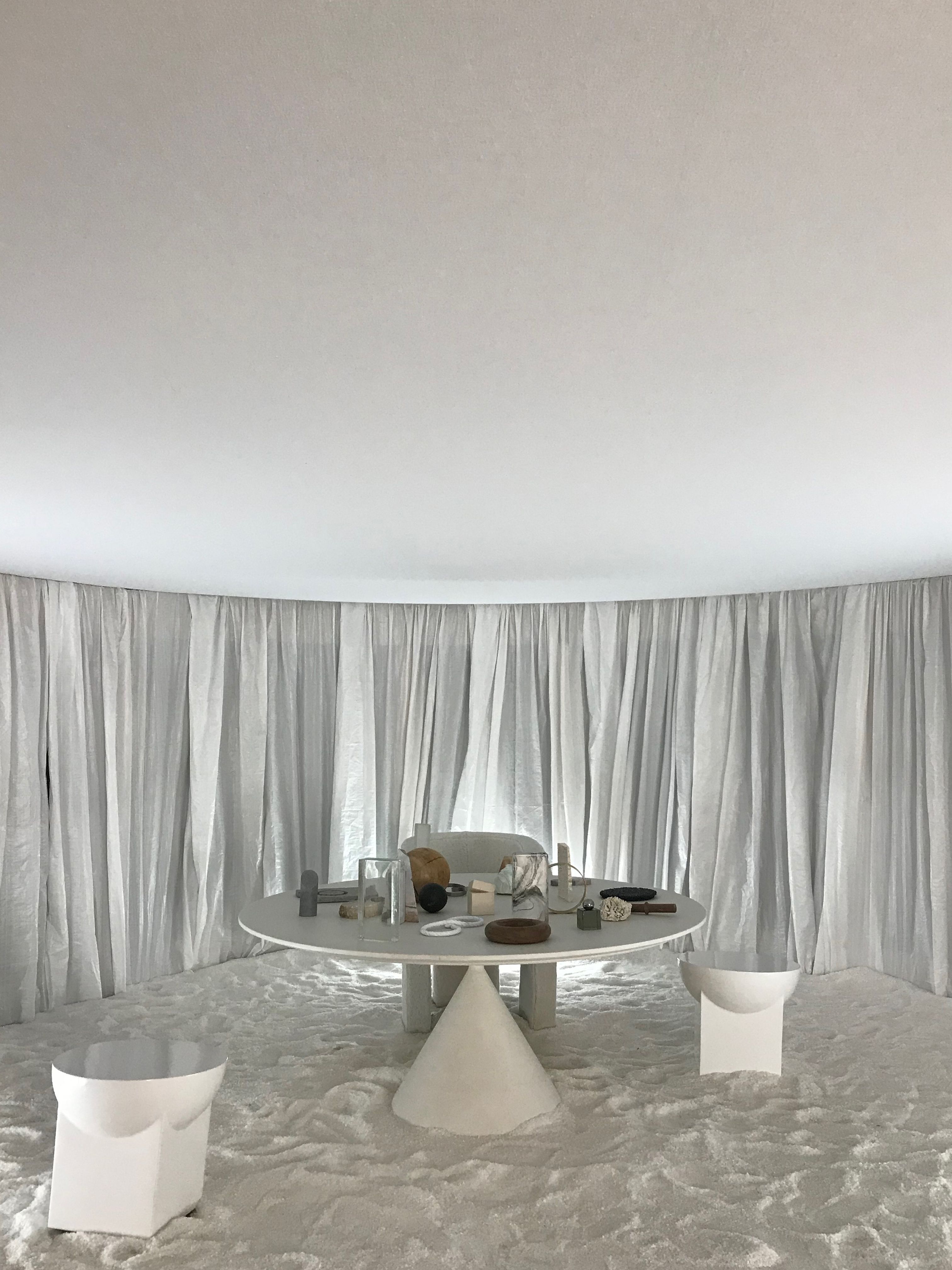
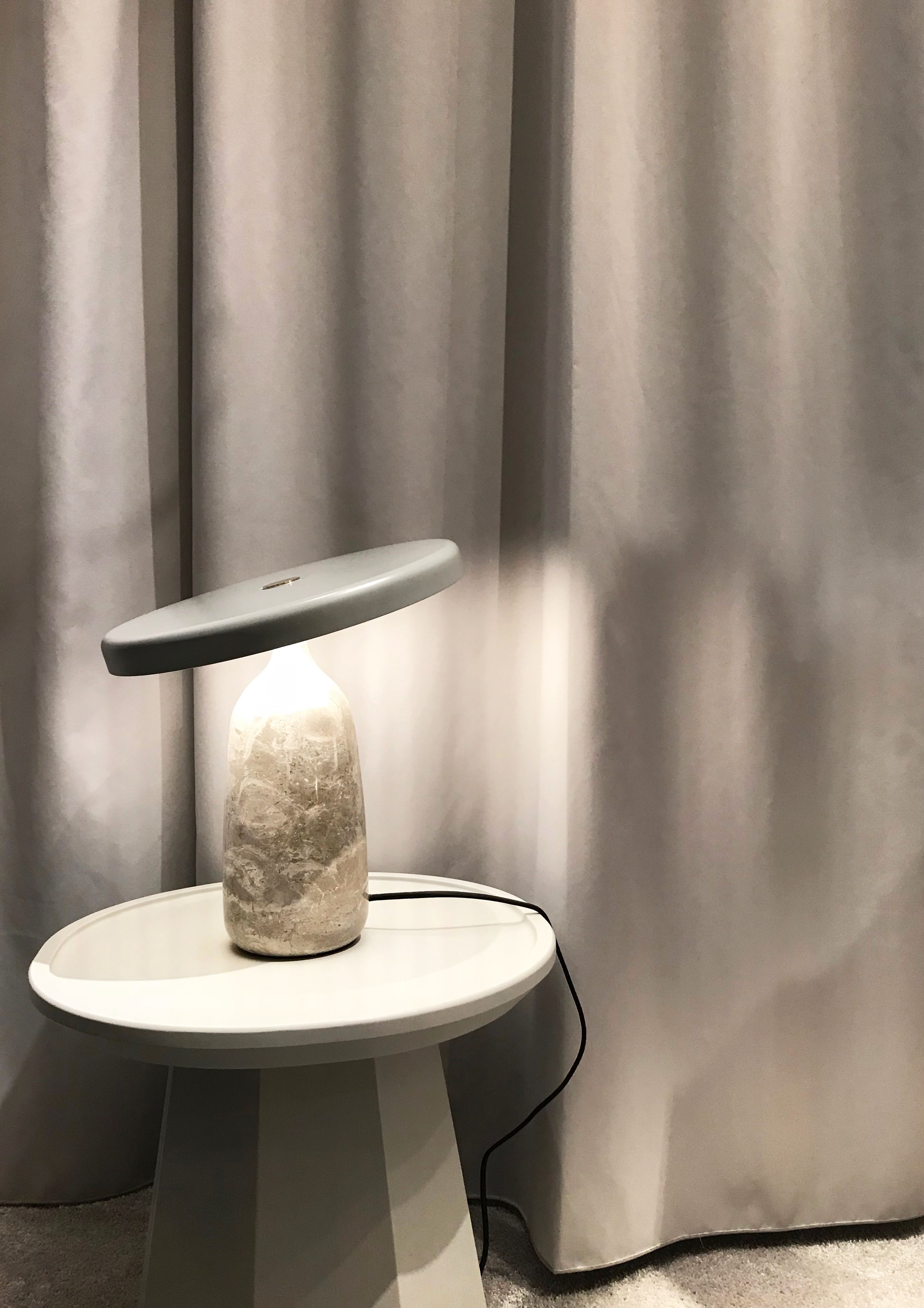
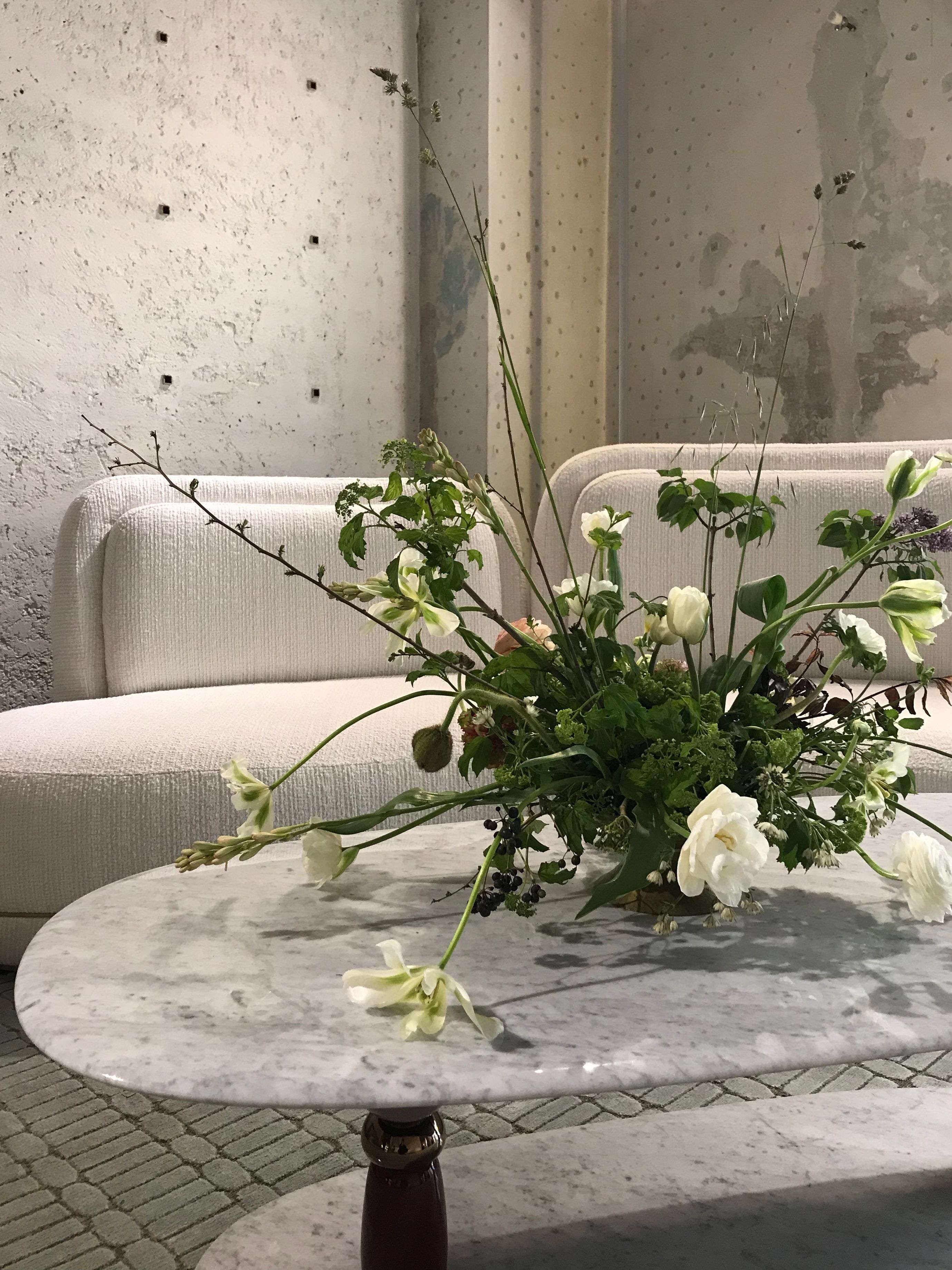
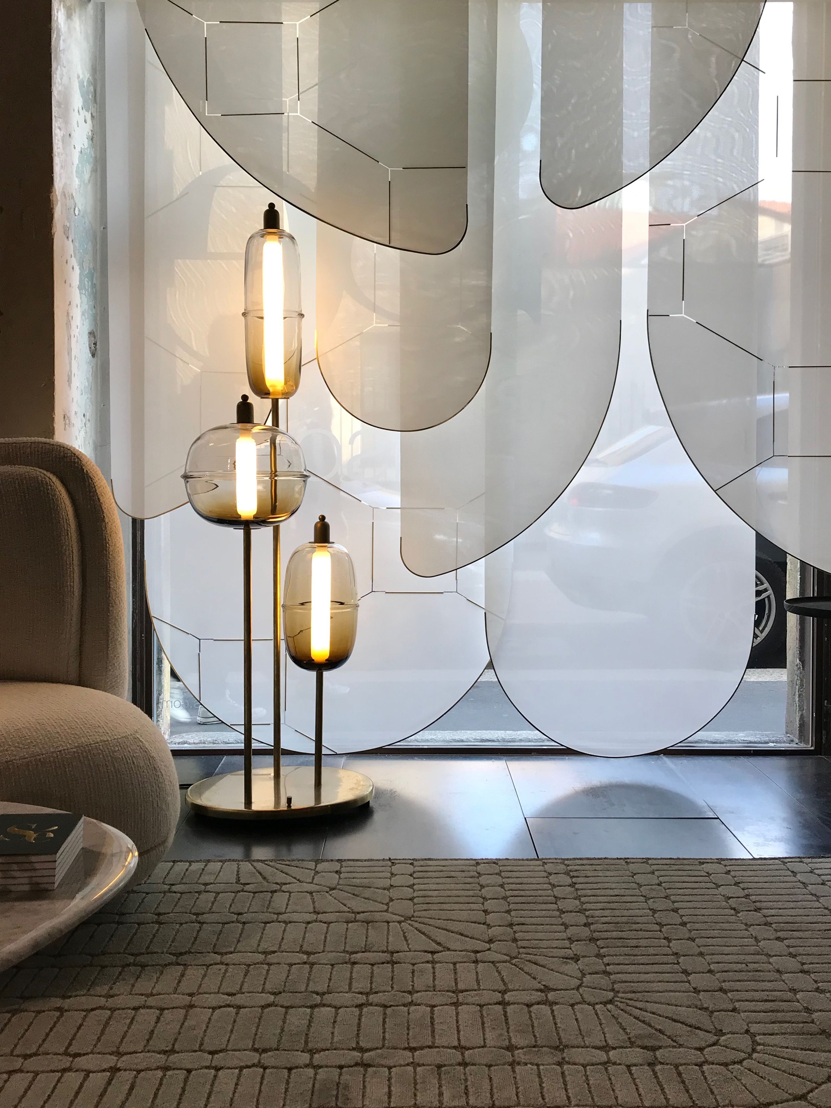
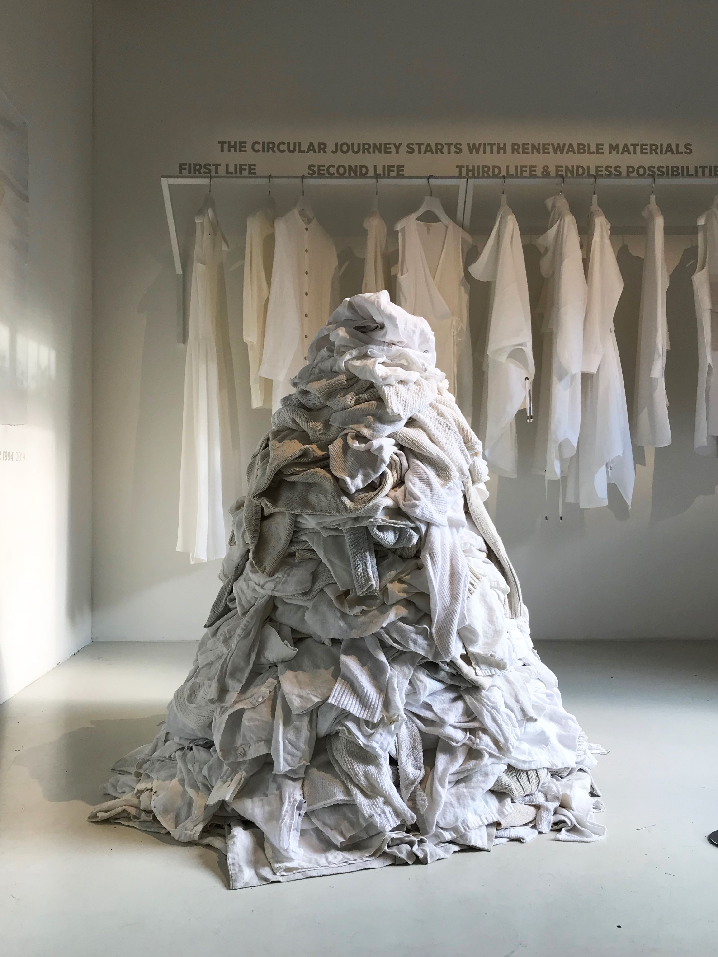
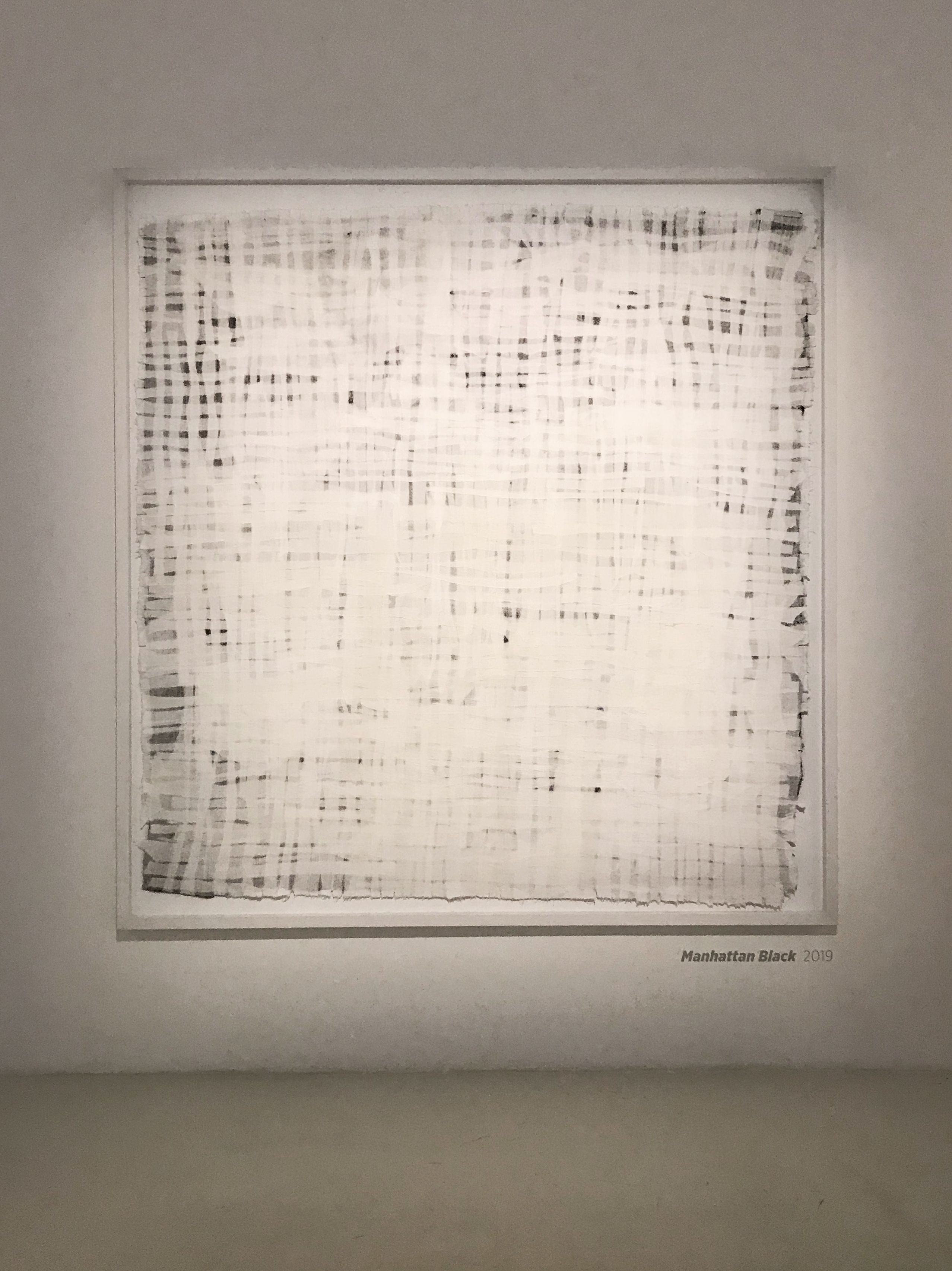
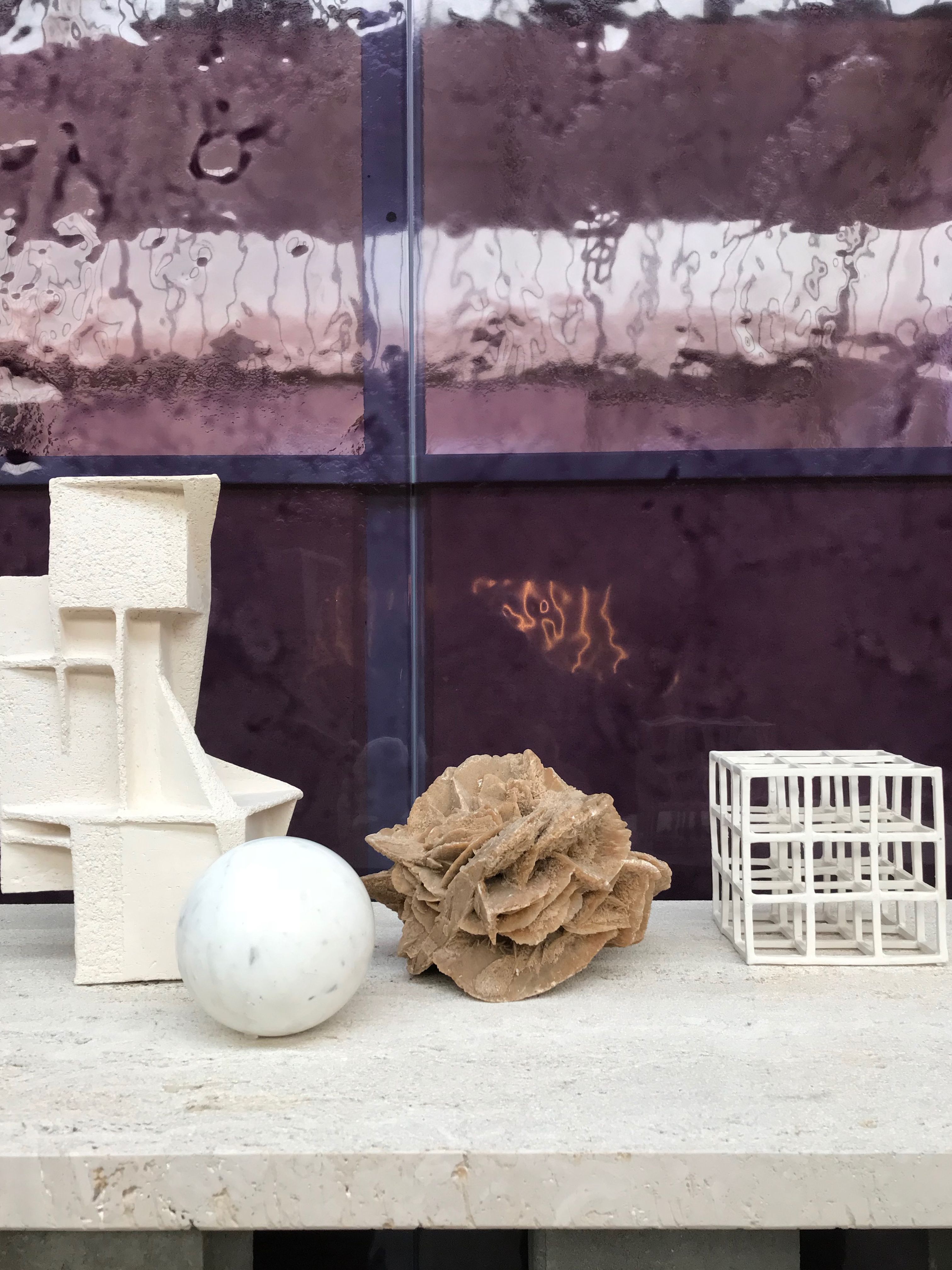
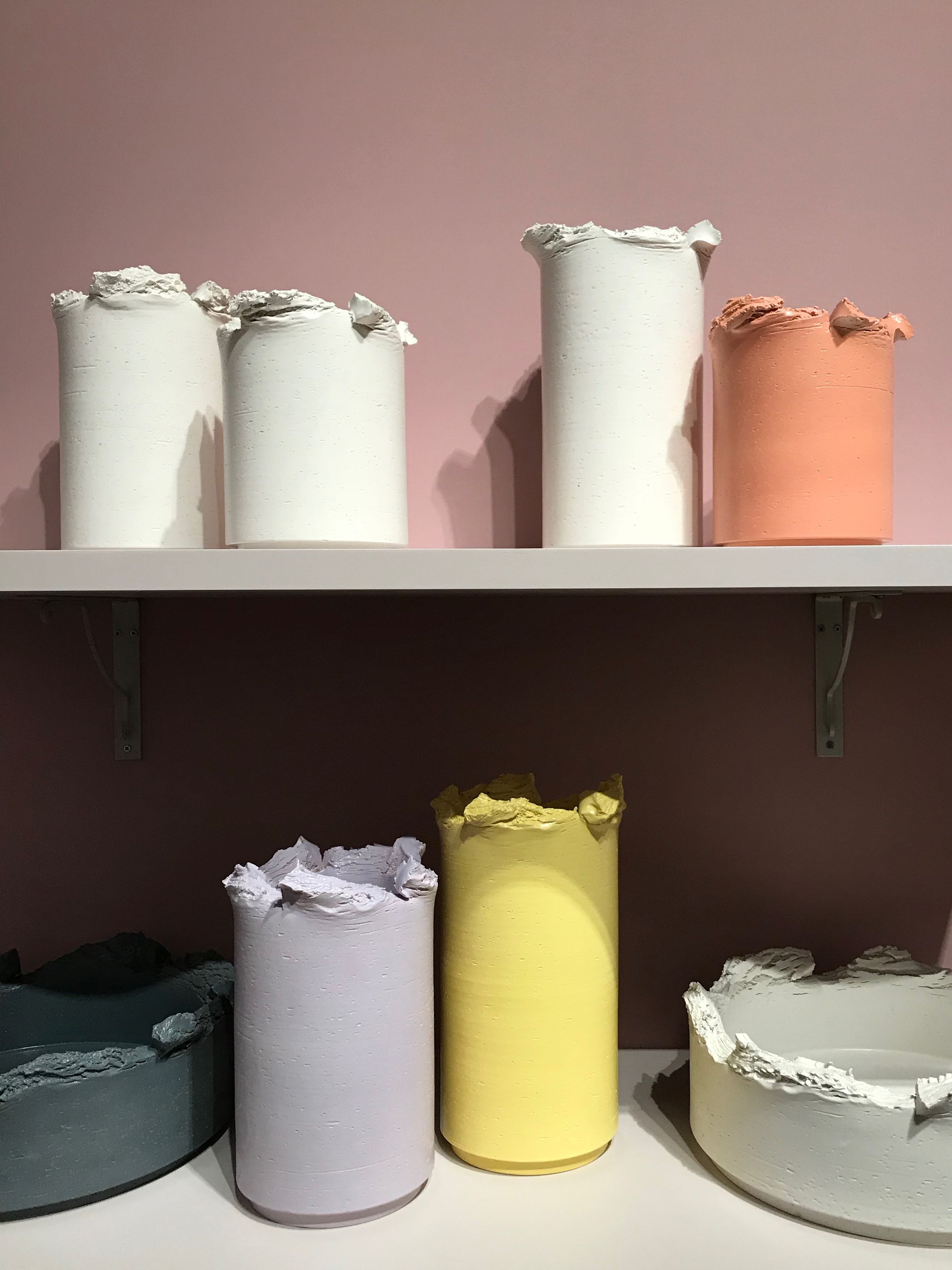
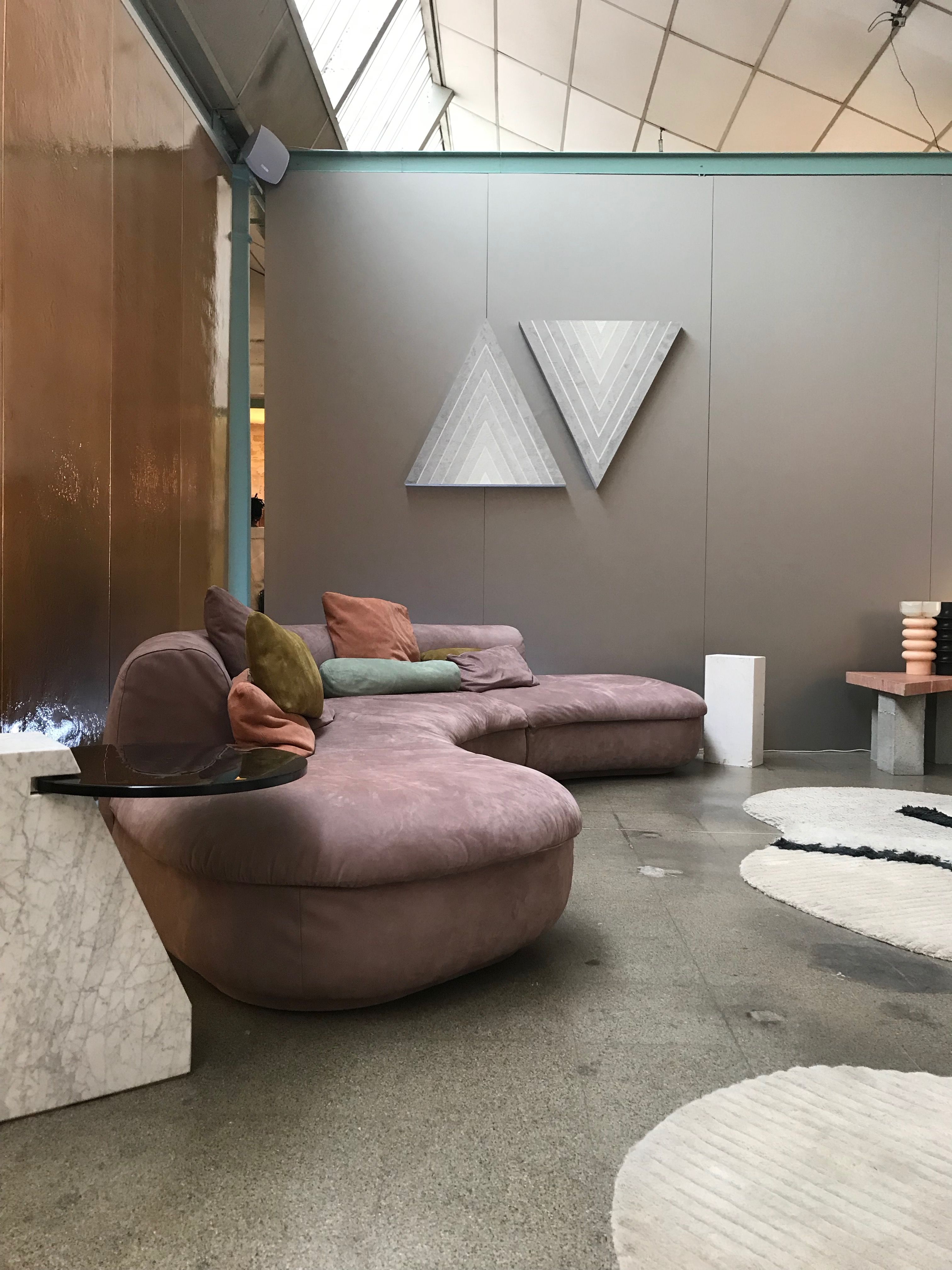
Color is the most natural place to begin. Overall, softened color palettes popped up across the show. White on white was a common pairing for styling, mixing monochromatic tints of white/bone/ivory with one another in an array of materials.
Marie Schumann
Les Arcanistes | Studiopepe
Normann Copenhagen
Loewe
Spazio Rossana Orlandi
Spazio Rossana Orlandi
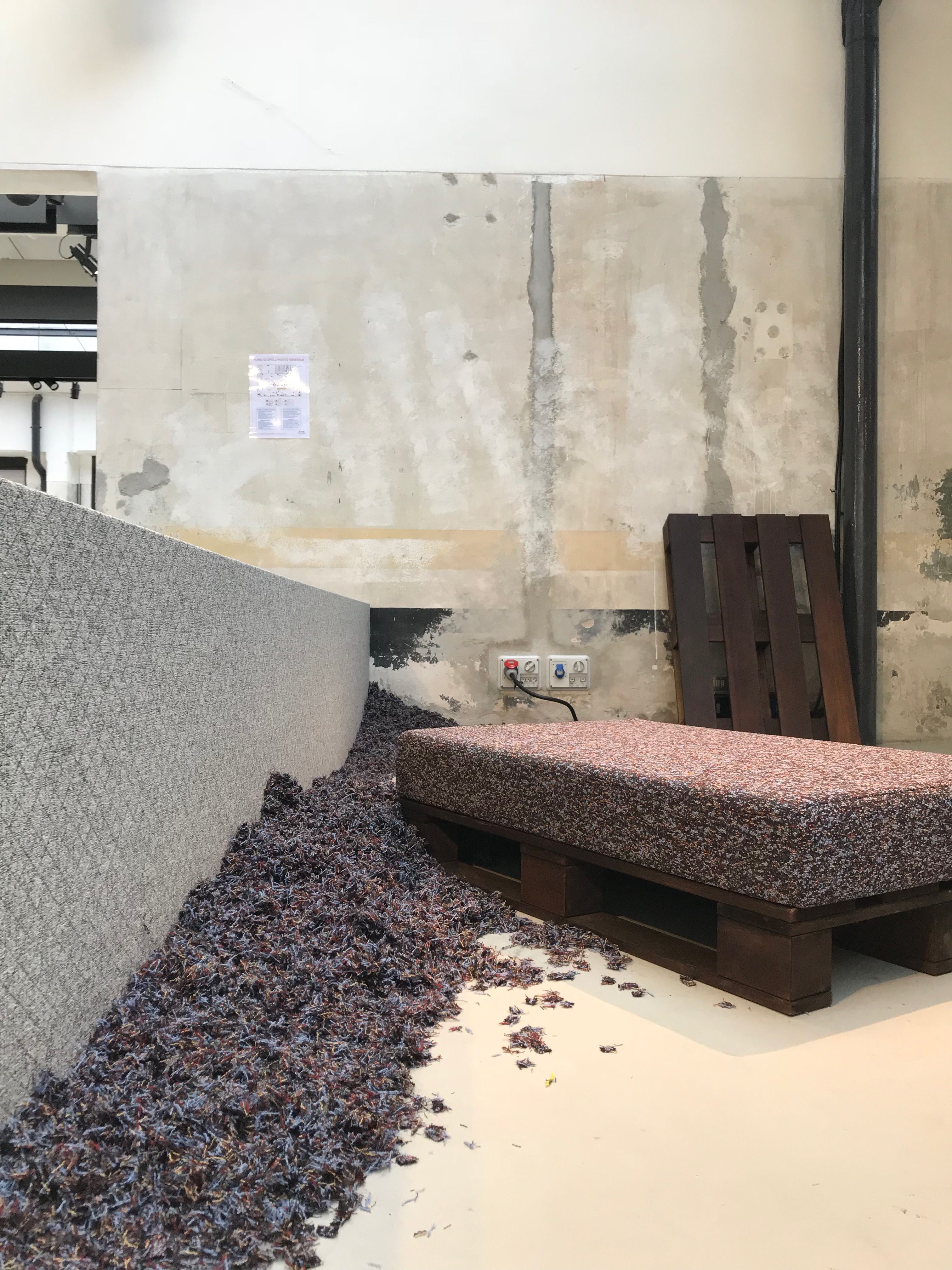
Waste No More | Eileen Fisher
Waste No More | Eileen Fisher
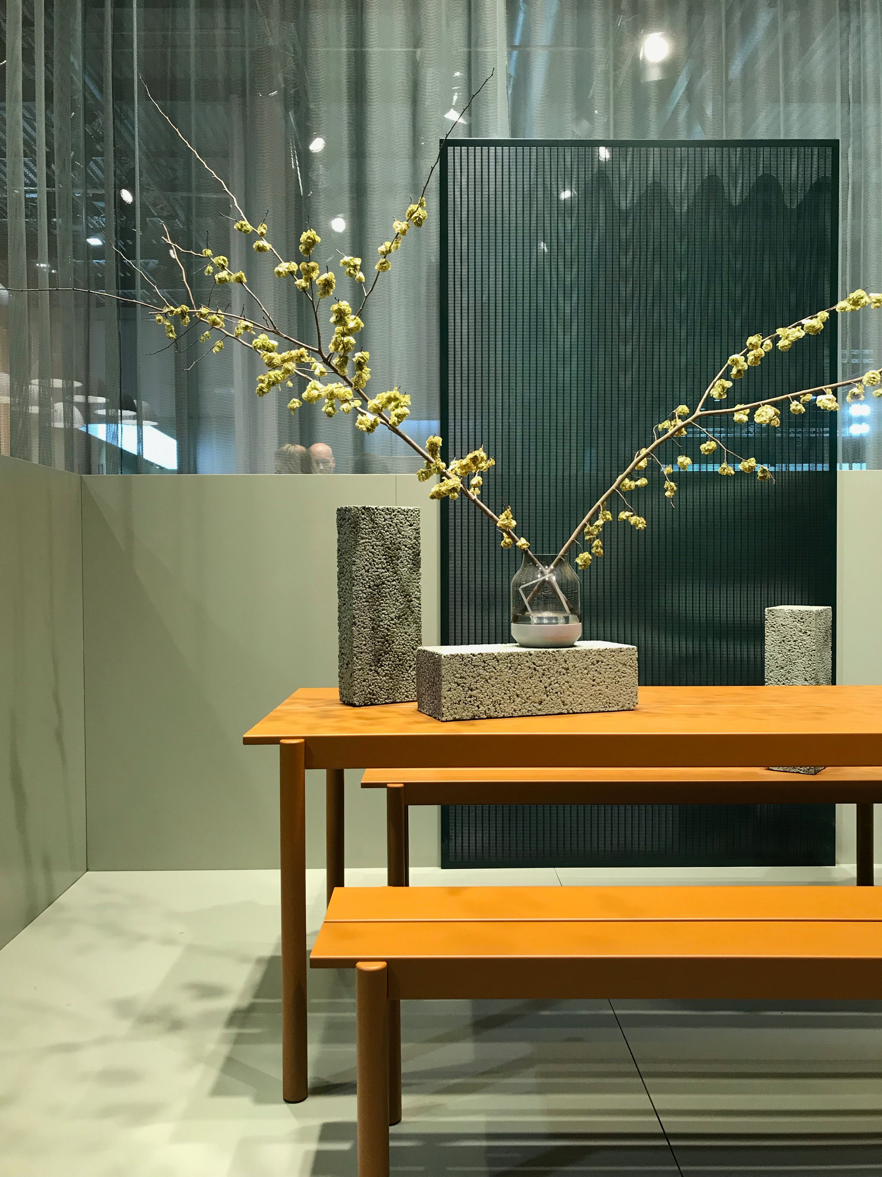
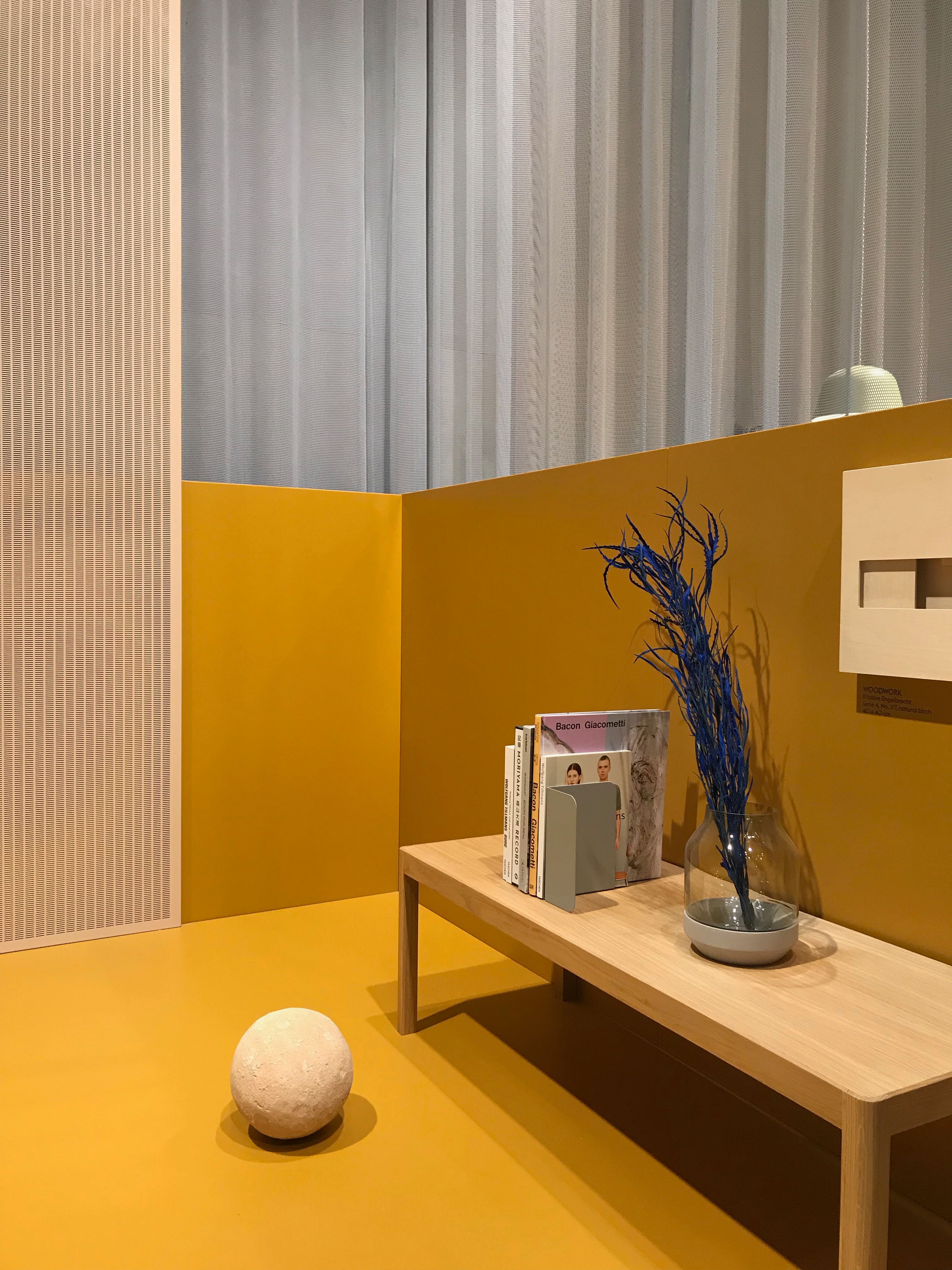
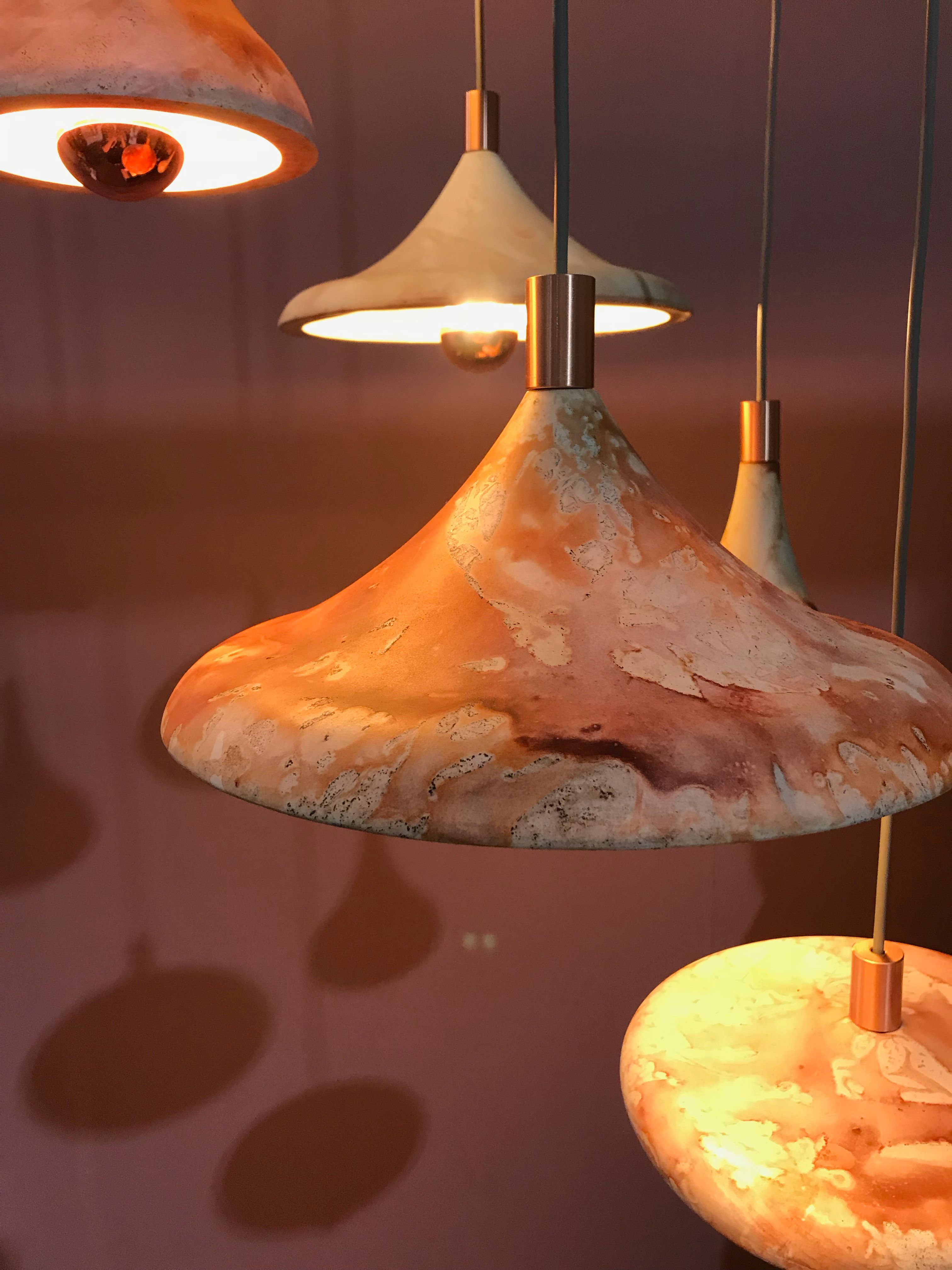
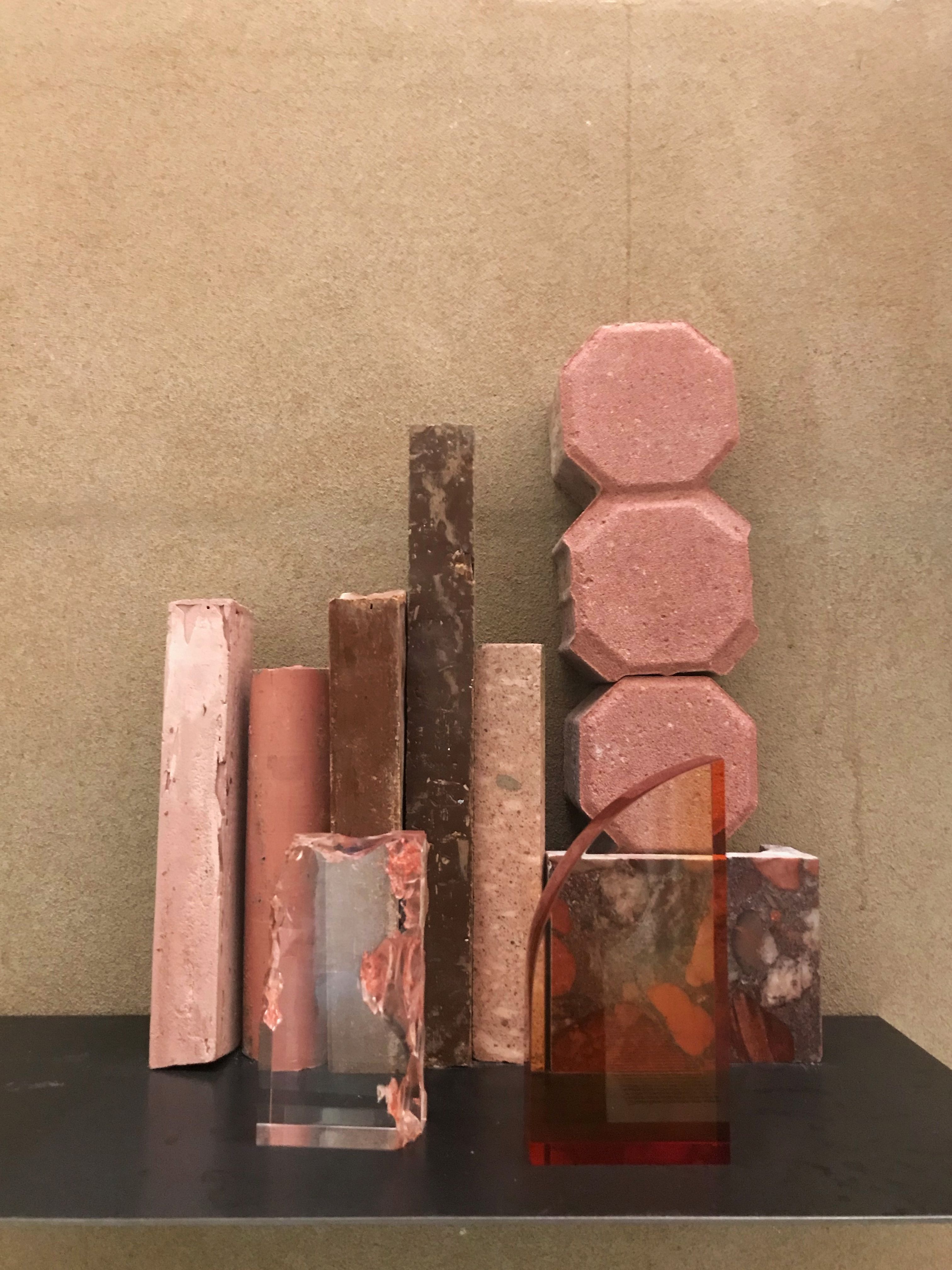
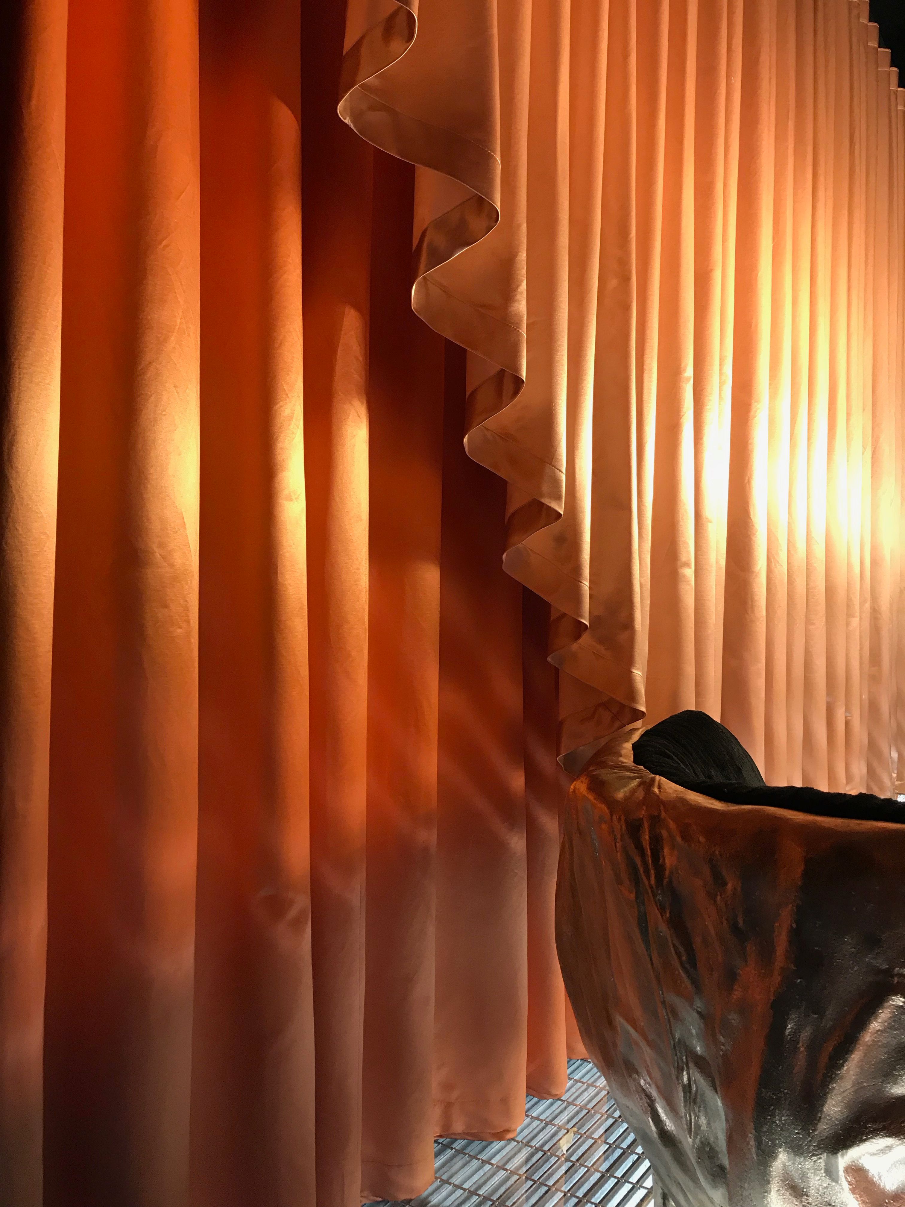
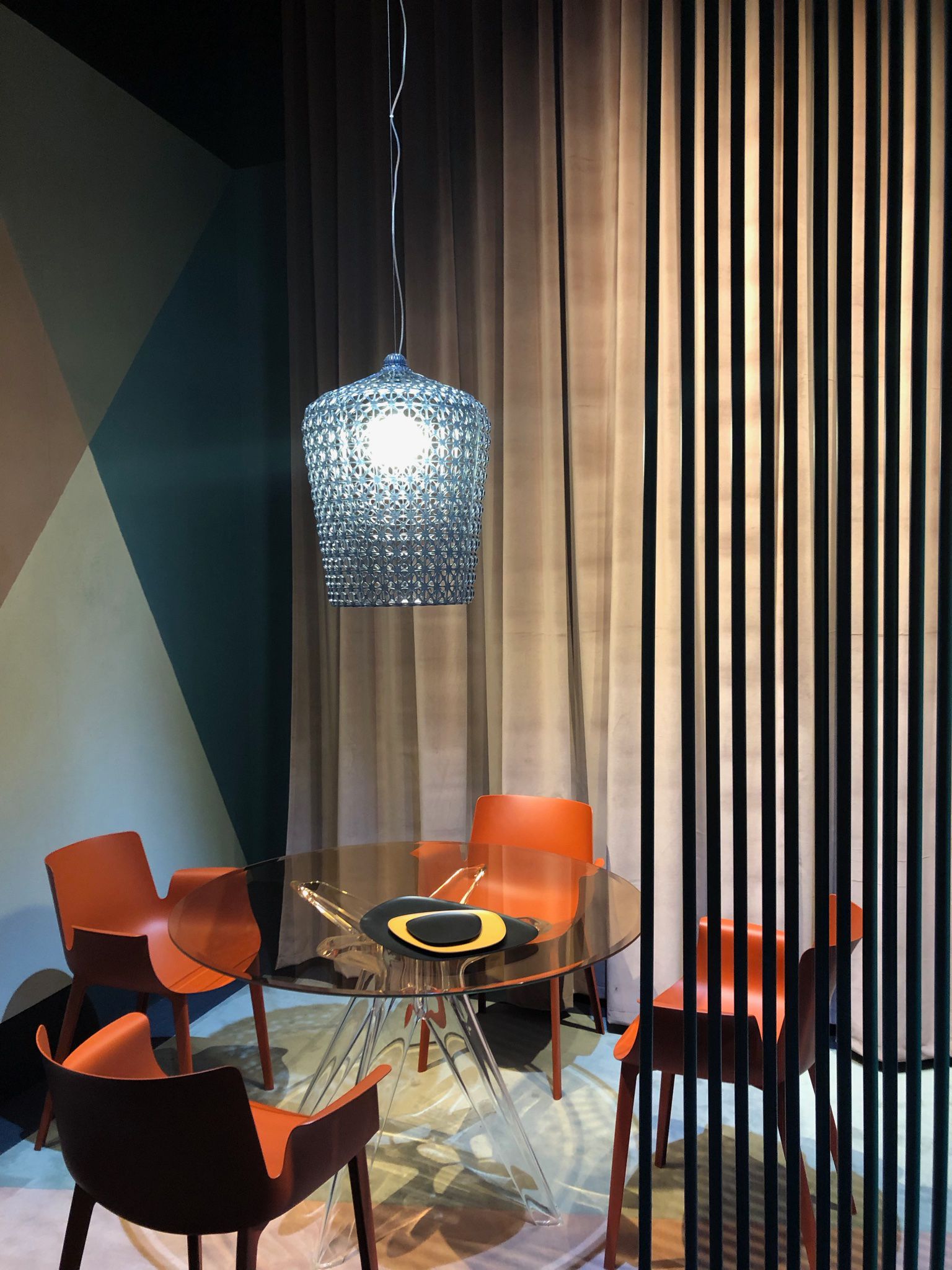
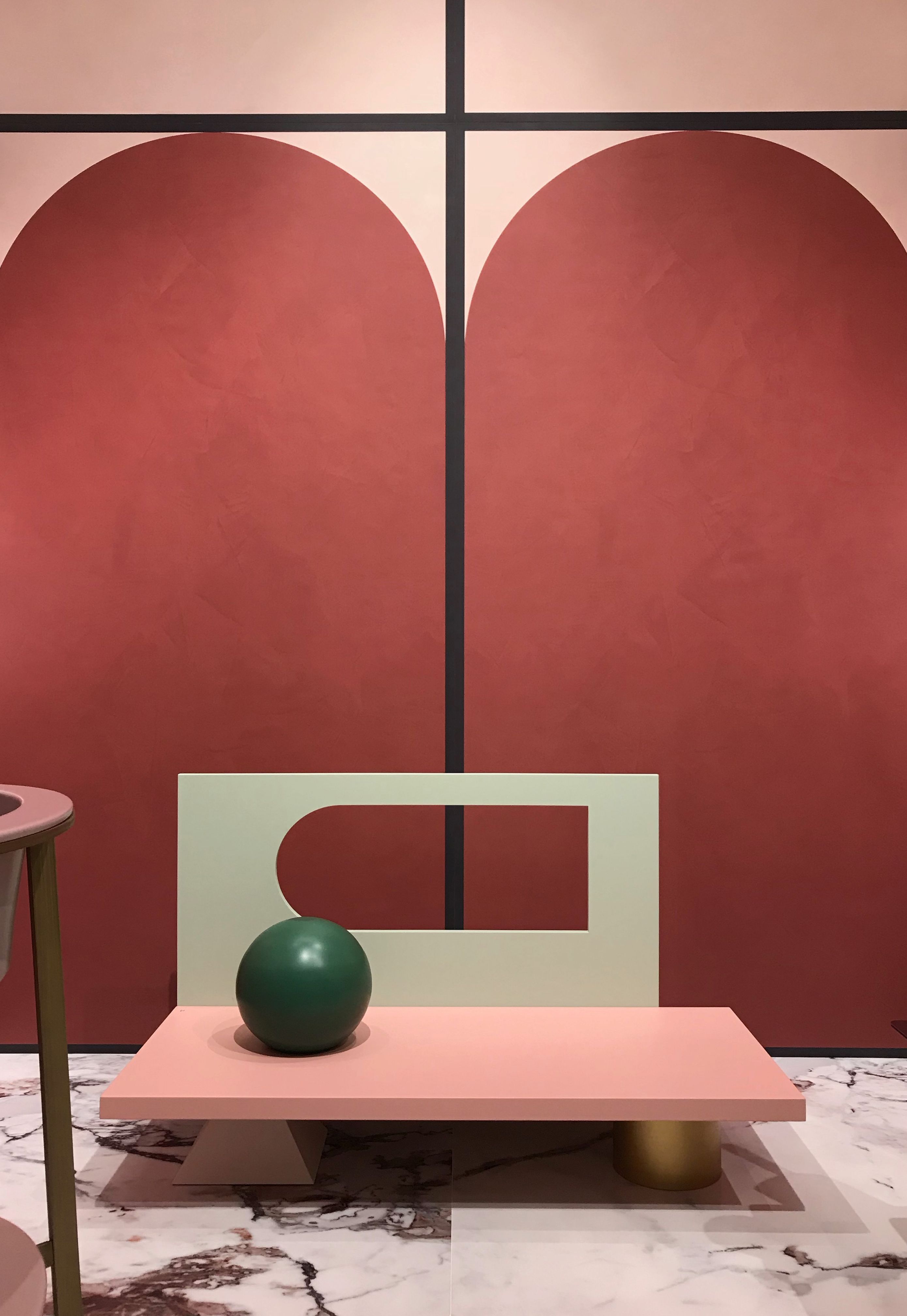
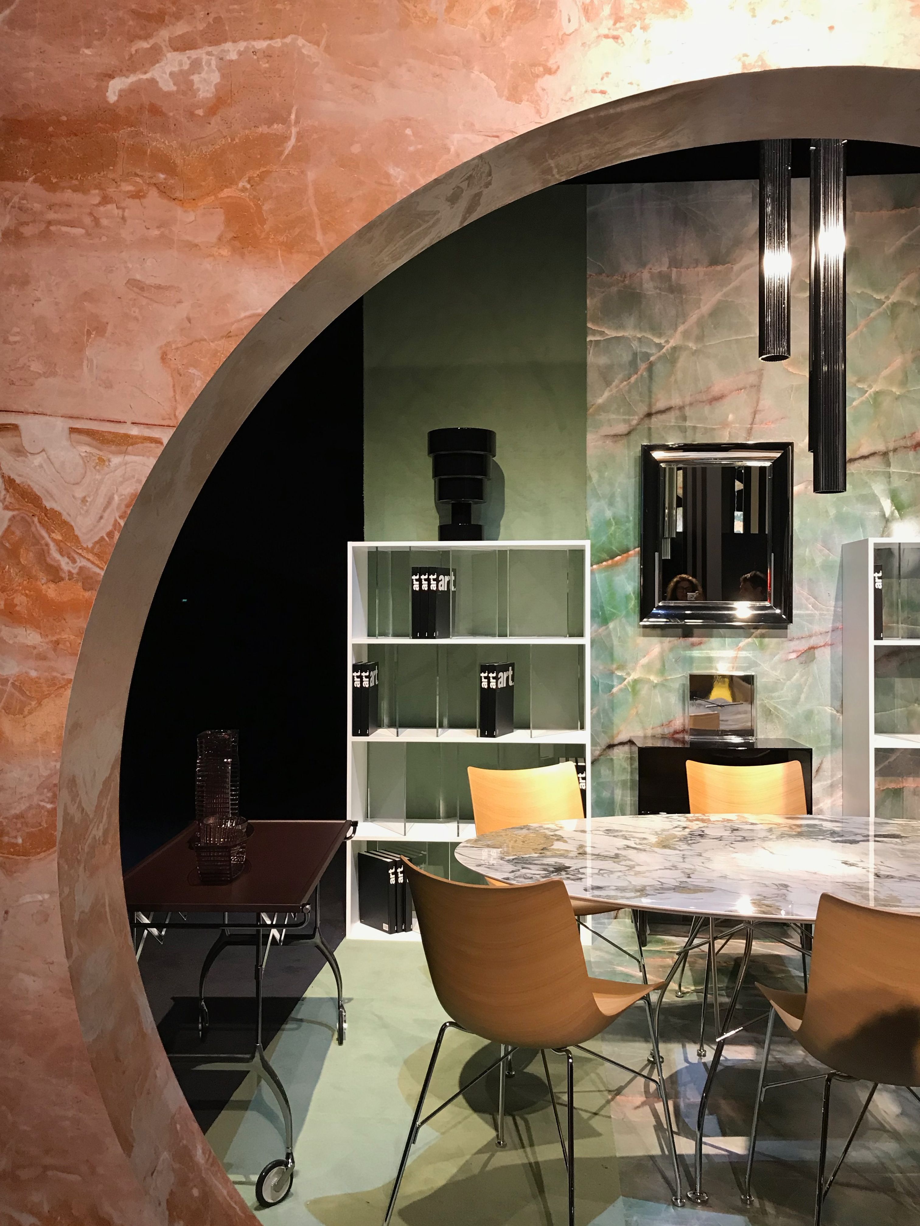
Blush remains more prevalent than people choose to believe but abandons its softer side in exchange for more masculine pairings of burgundy and terra cotta. Some palettes drew on more saturated pigments, pushing burnt oranges and teals to a brighter poppy and truer shade of blue – usually contrasted together.
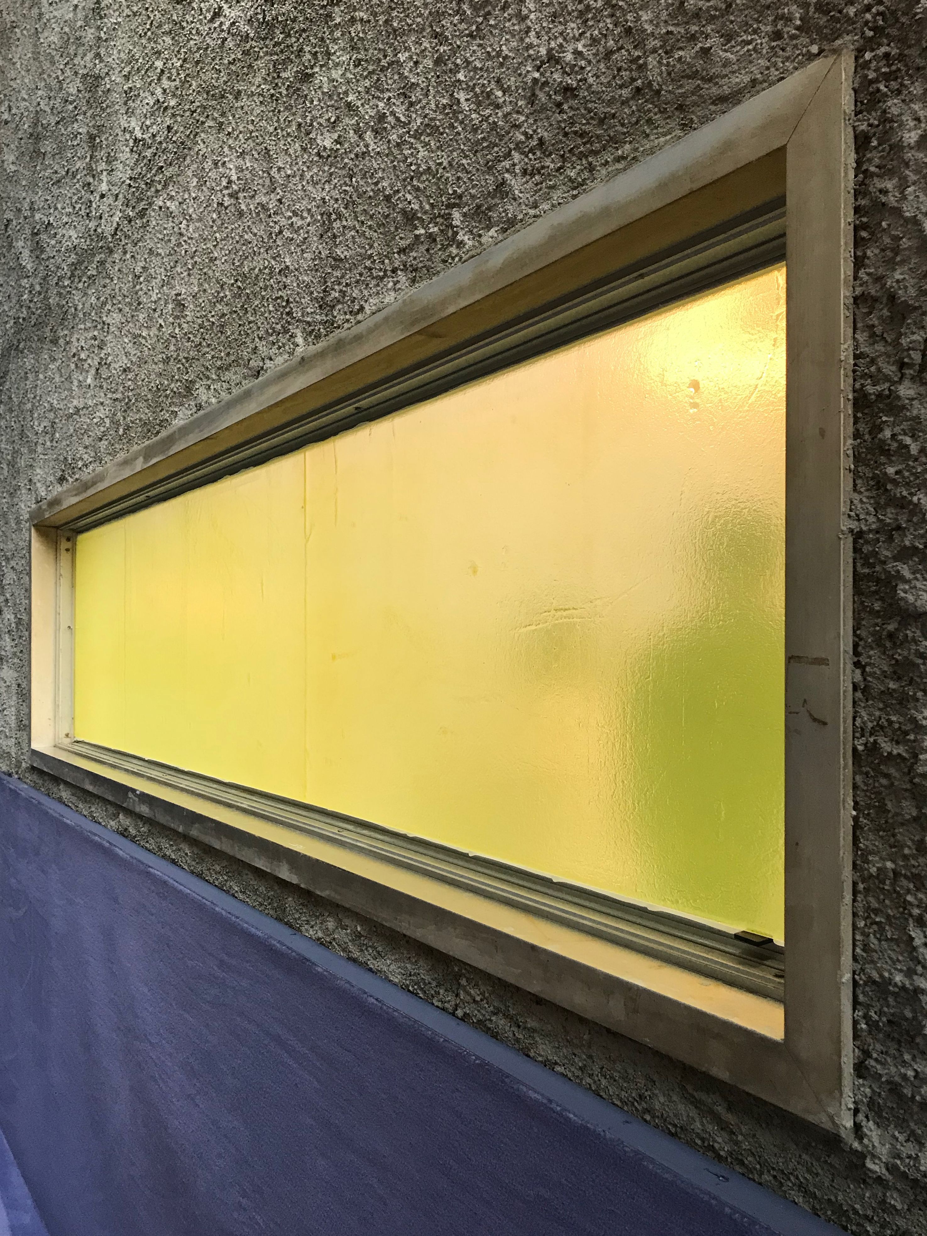
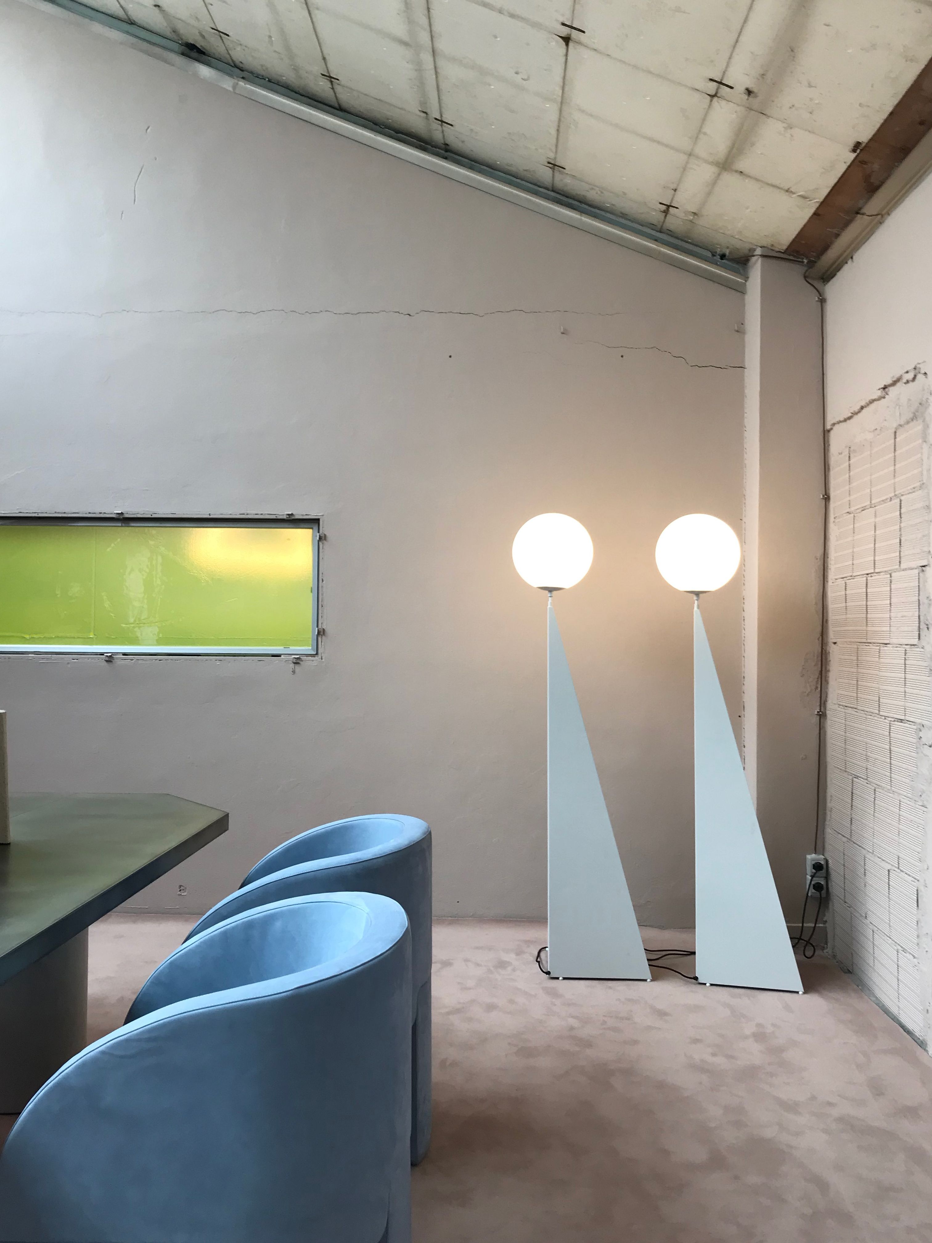
Outliers in the color realm? Accents of citrus and acidic yellow-greens frequently mixed with light milky-blue lavenders – possibly taking inspiration from the setting of April in Milan.
muuto
muuto
Studiopepe
Studiopepe
Bitossi
KAE
Studiopepe
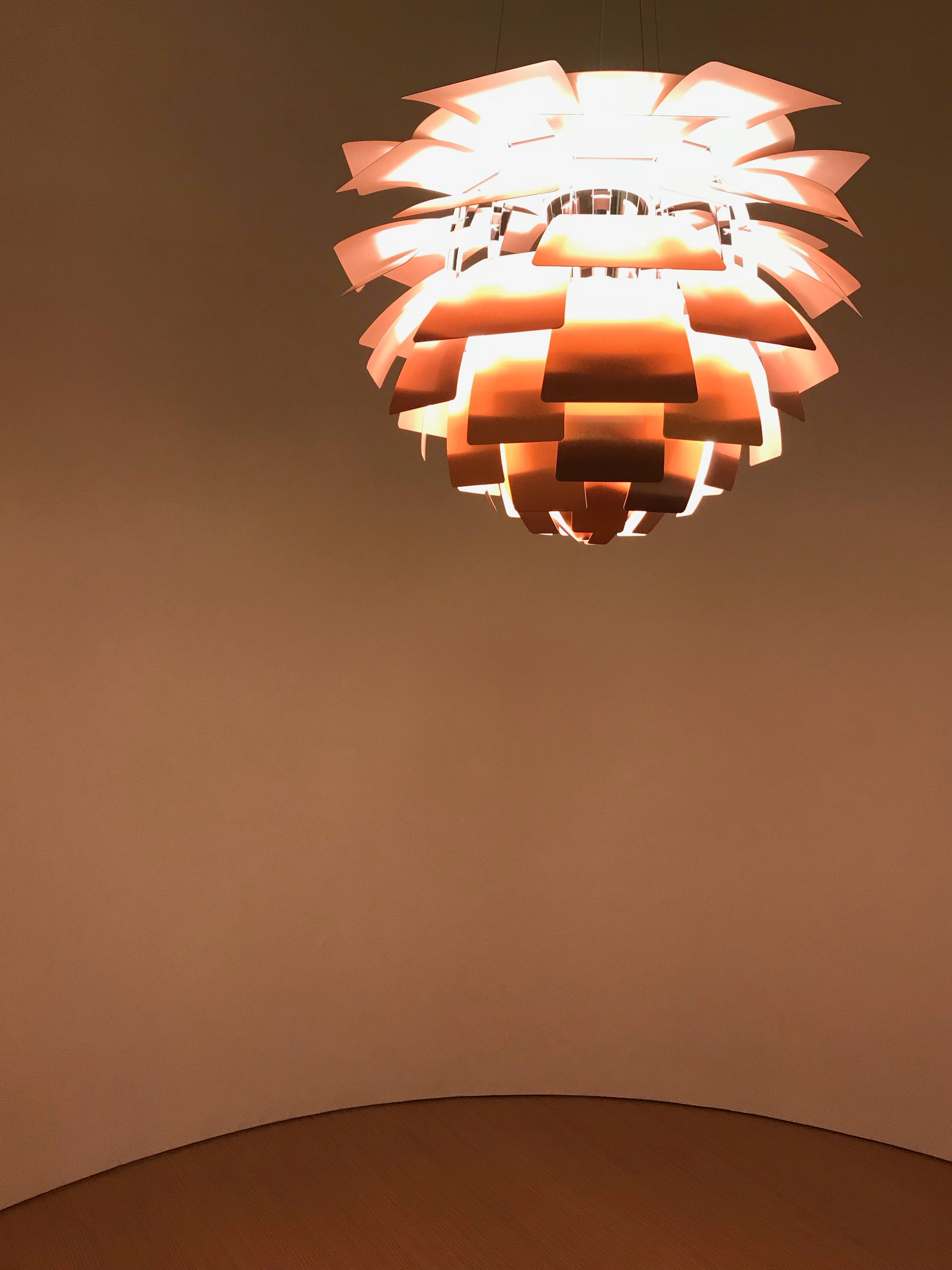
Louis Poulsen
Dimore Studio
Kartell
Material & pattern
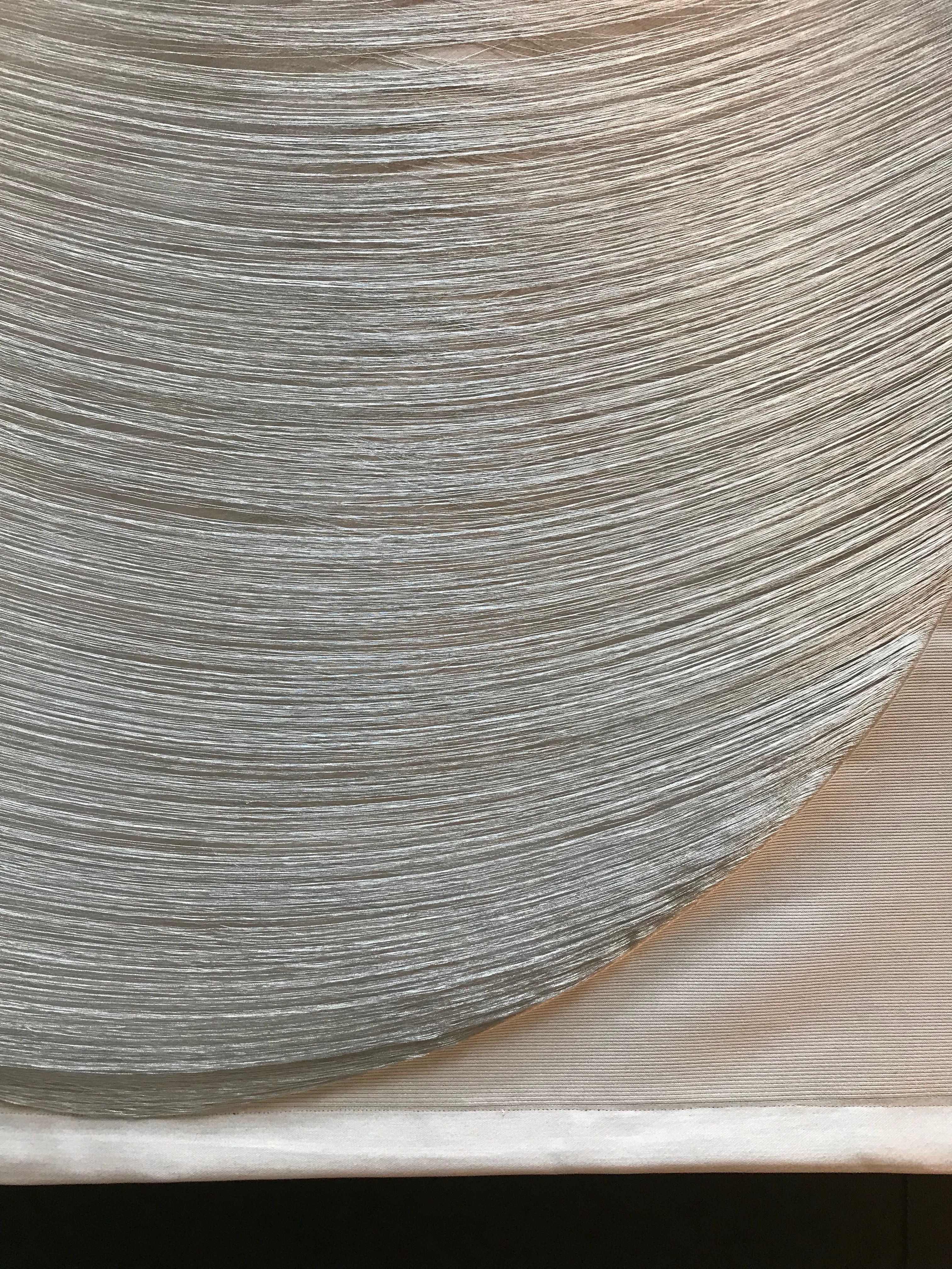
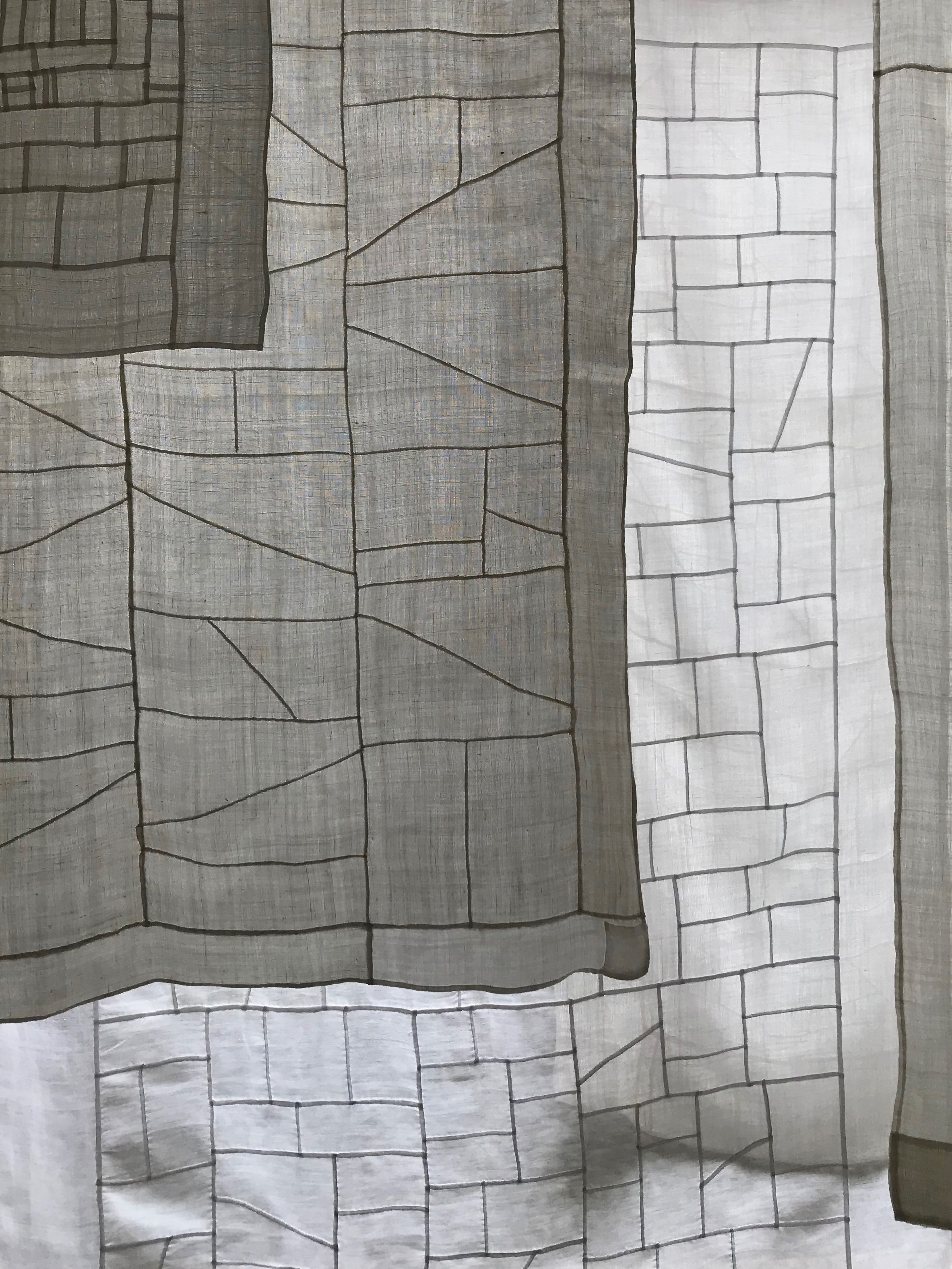
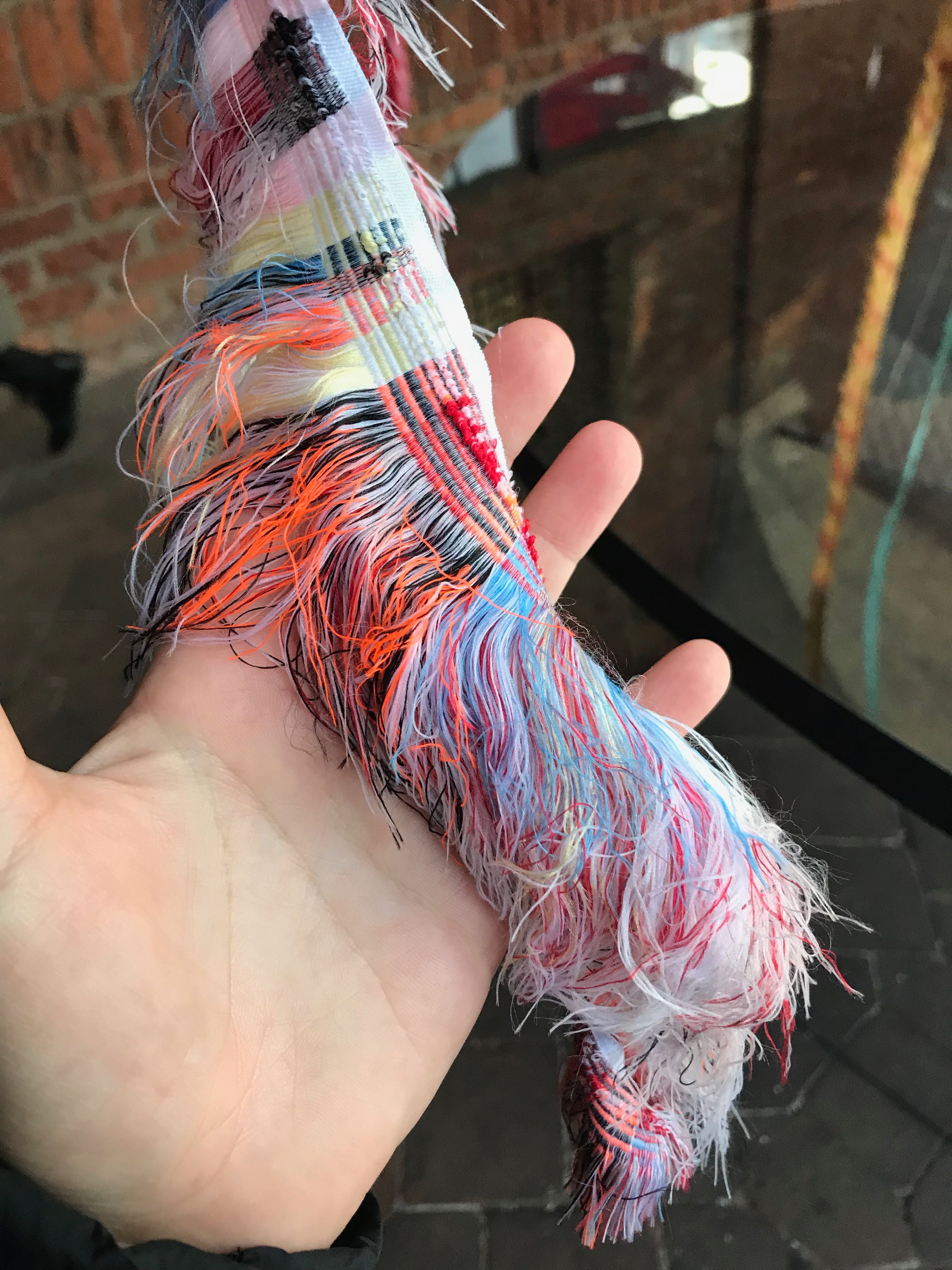
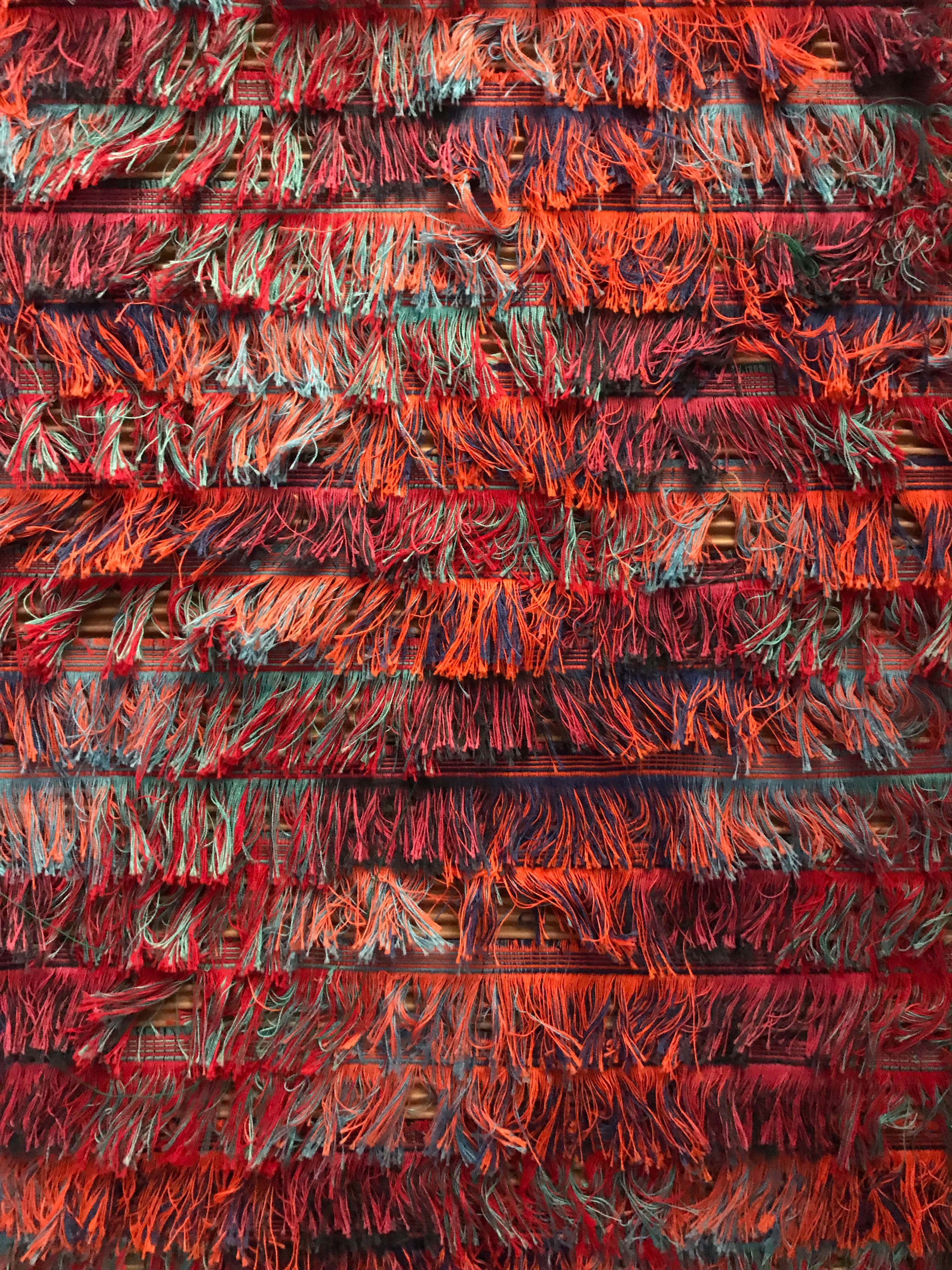
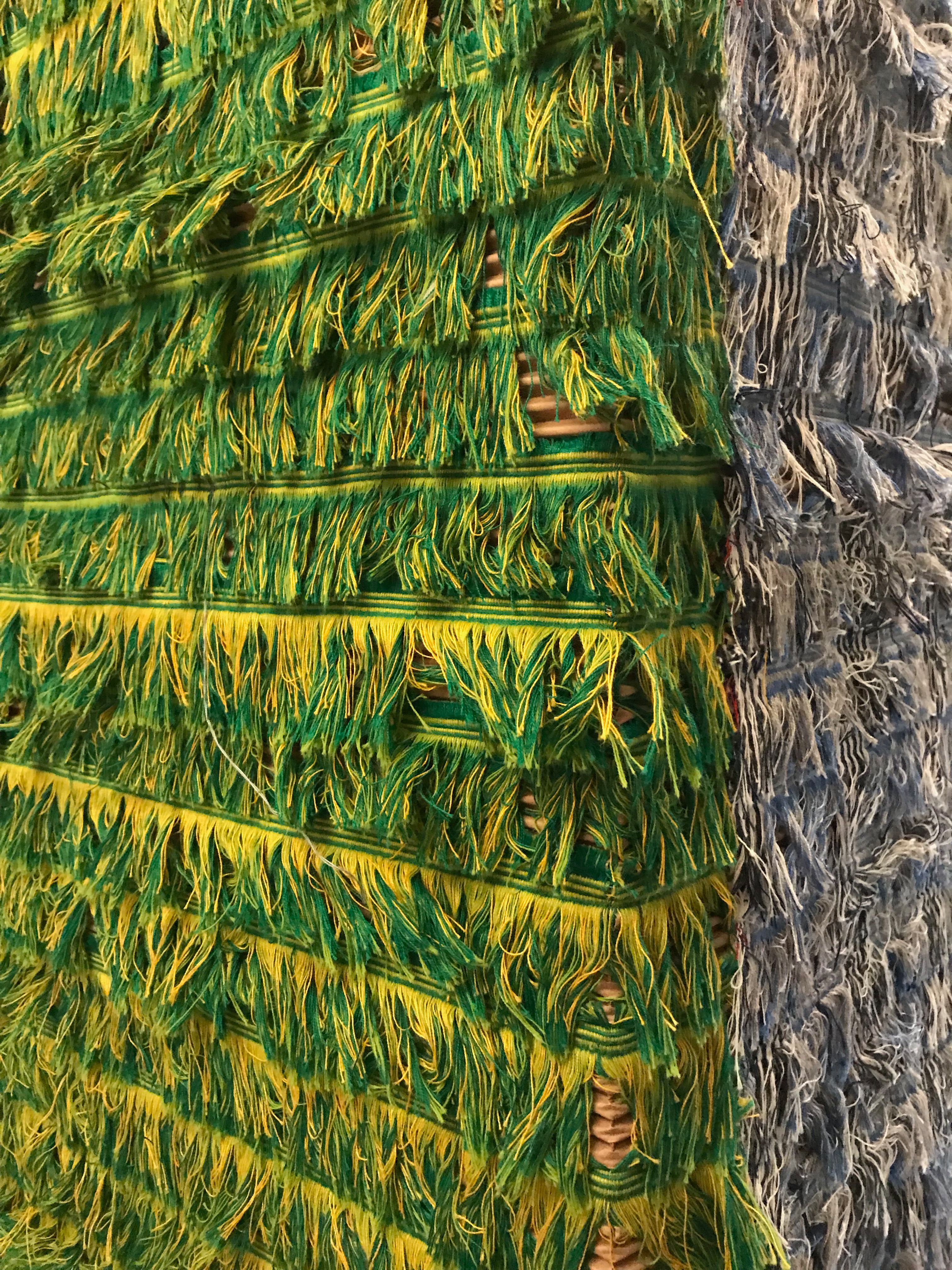
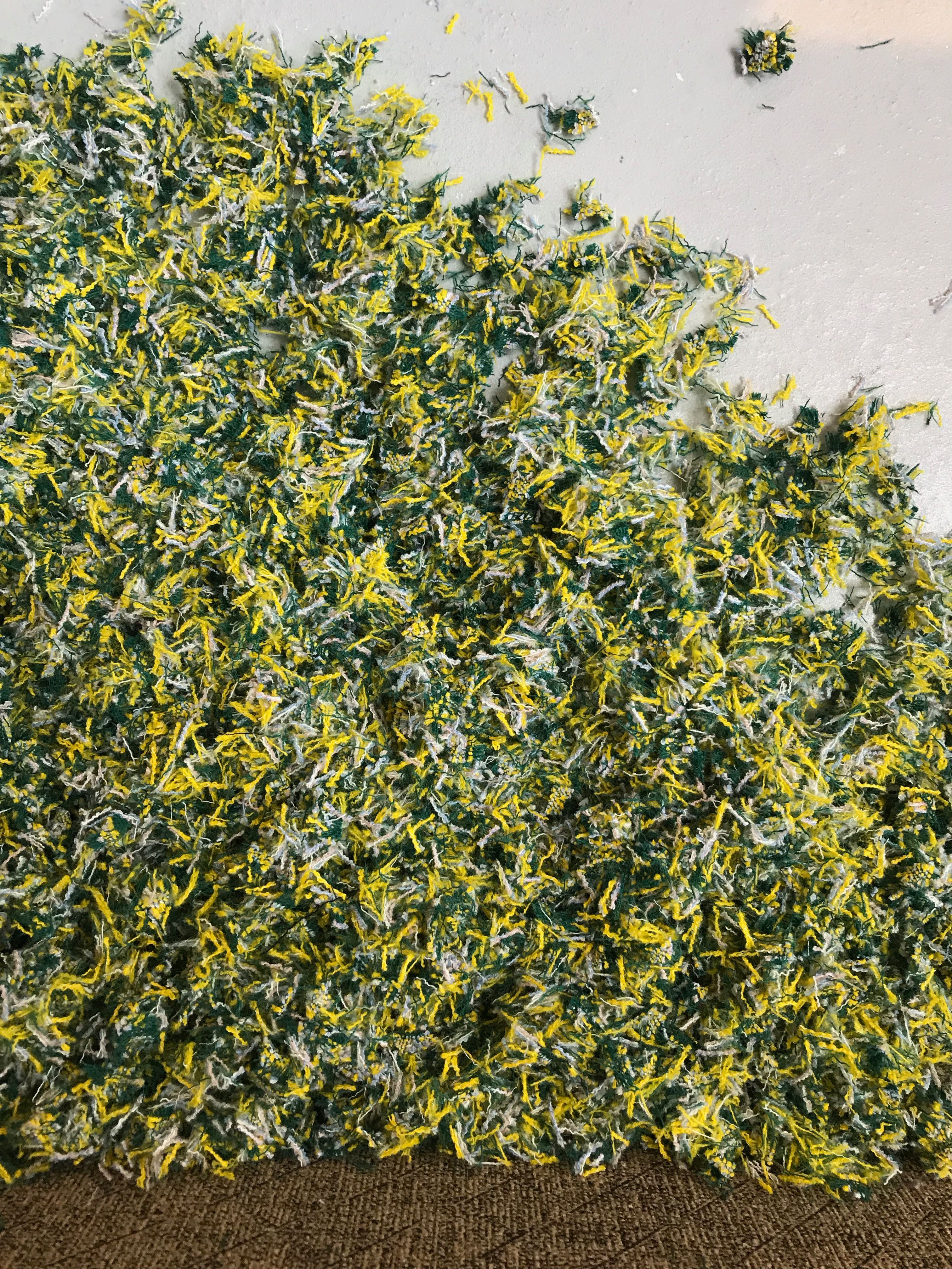
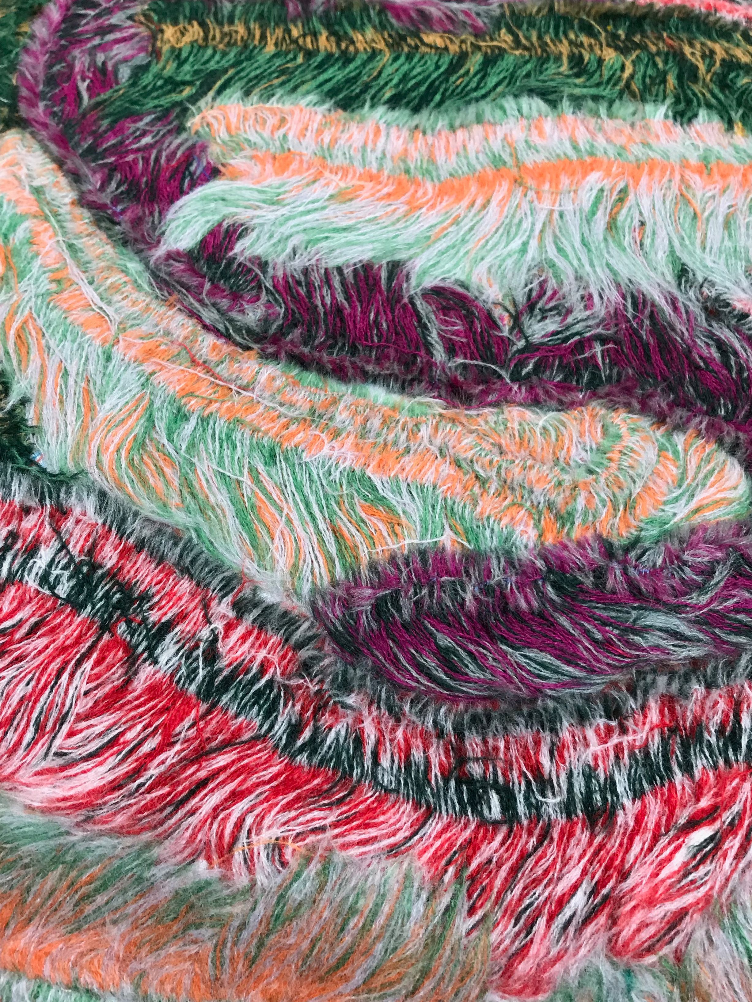
The fabrication and deconstruction of textiles popped up across Salone and different neighborhood exhibitions. Celebration of the “whole” textile, especially selvages, was presented at Sunbrella’s collaboration with textile artist Liz Collins. Yuri Himuro also explored the use of selvages in tandem with needle punch to create unique upholstery. Marie Schumann’s weavings explored textile construction by emphasizing long wefts exposing fragile floats.
University of Milan
Liz Collins for Sunbrella
Liz Collins for Sunbrella
Kvadrat Raf Simons
Yuri Himuro
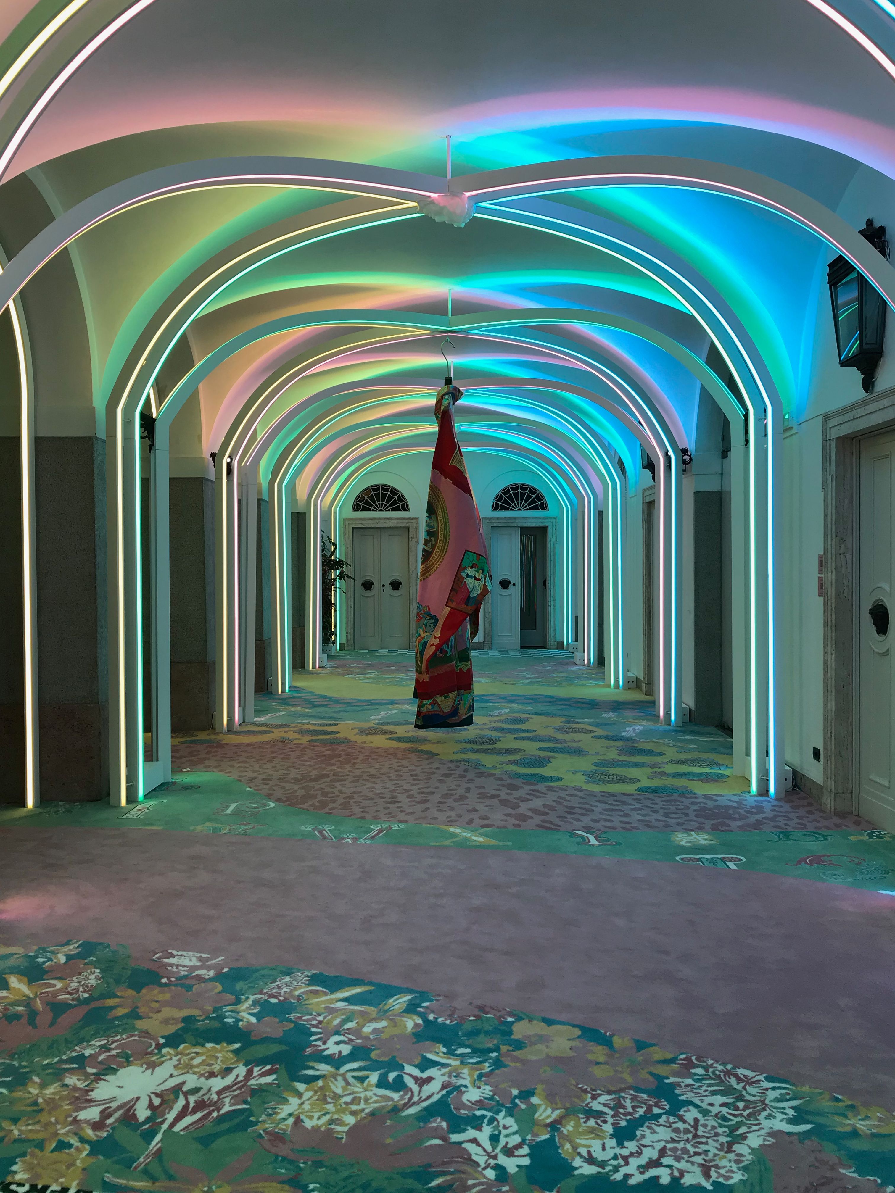
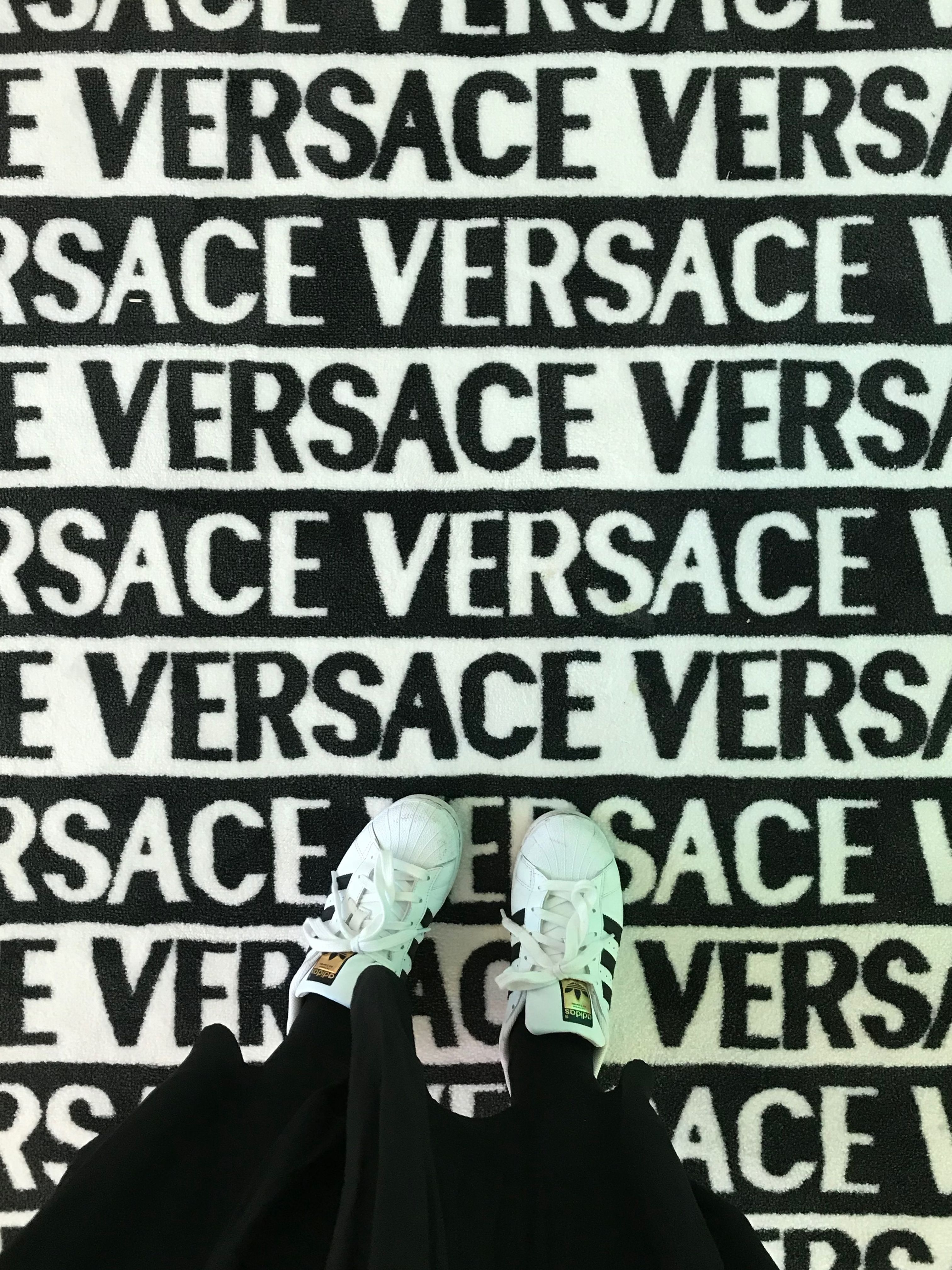
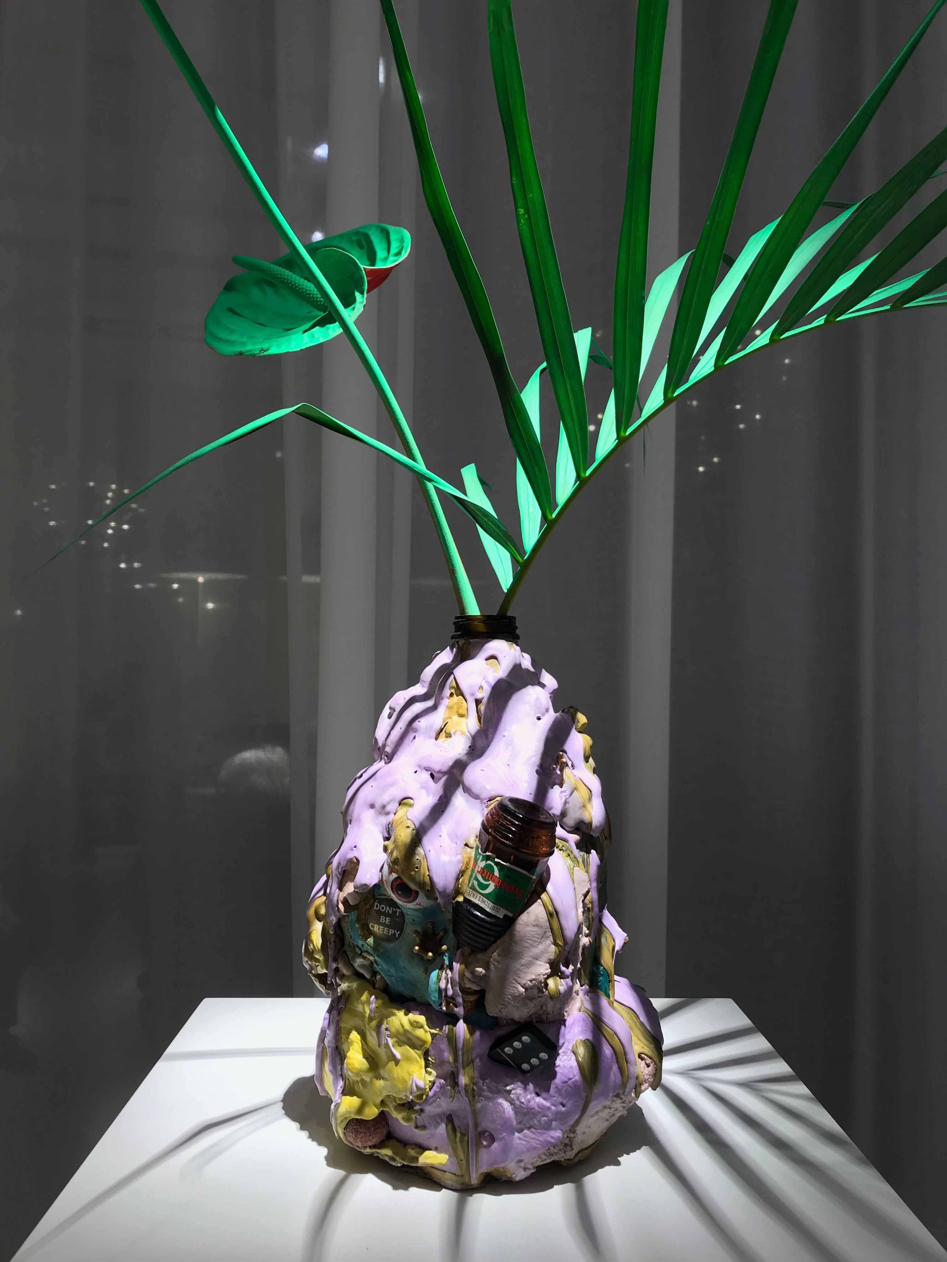
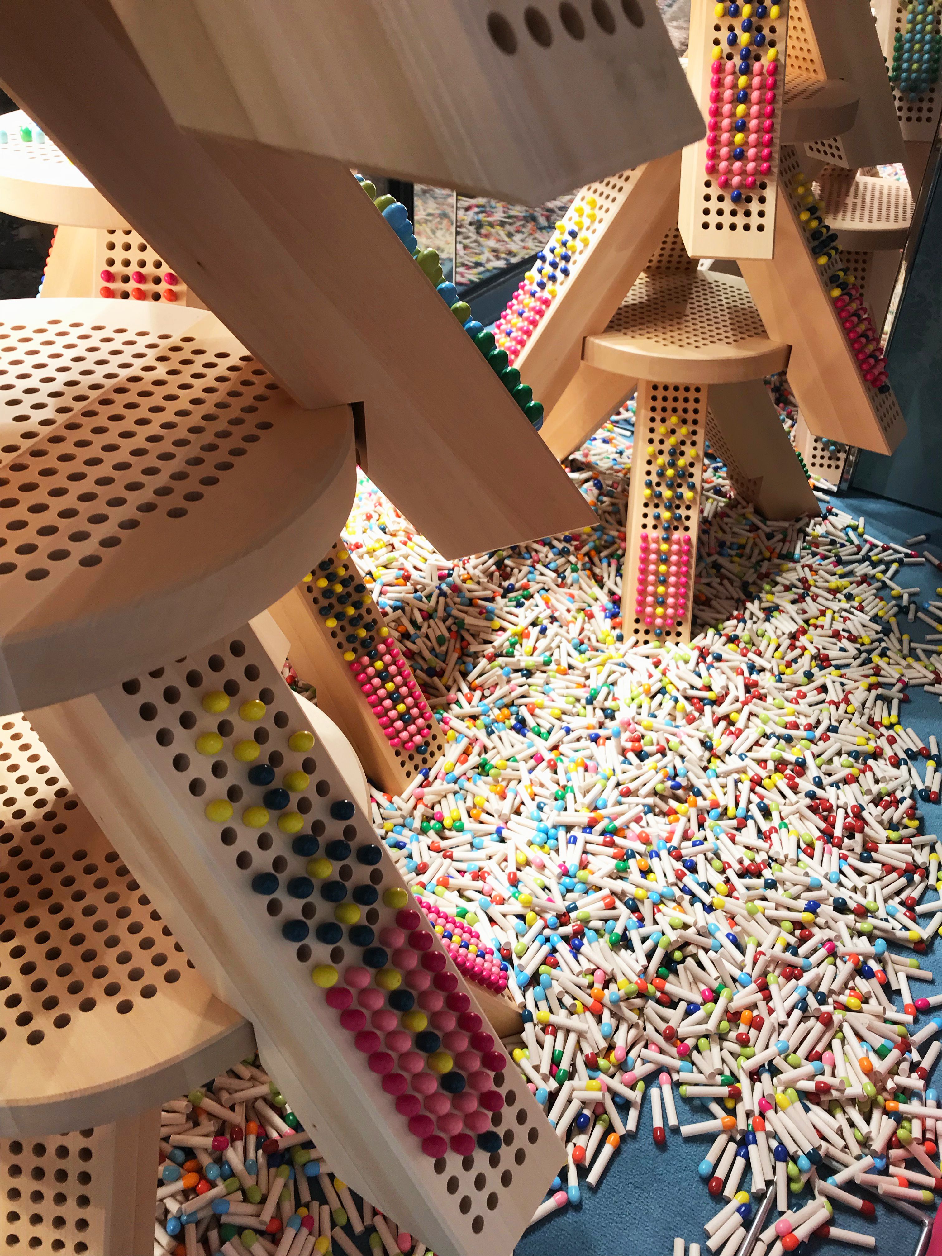
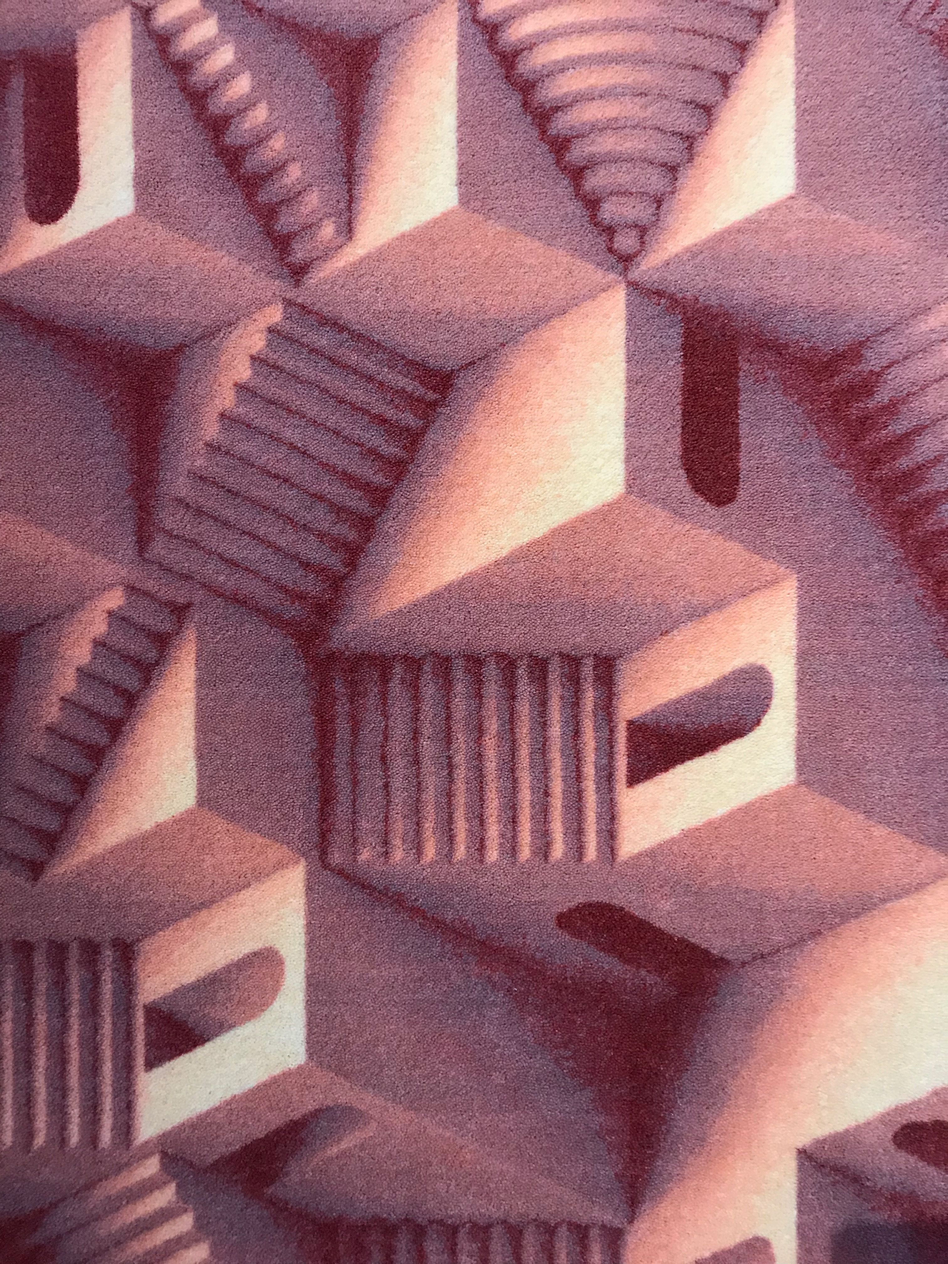
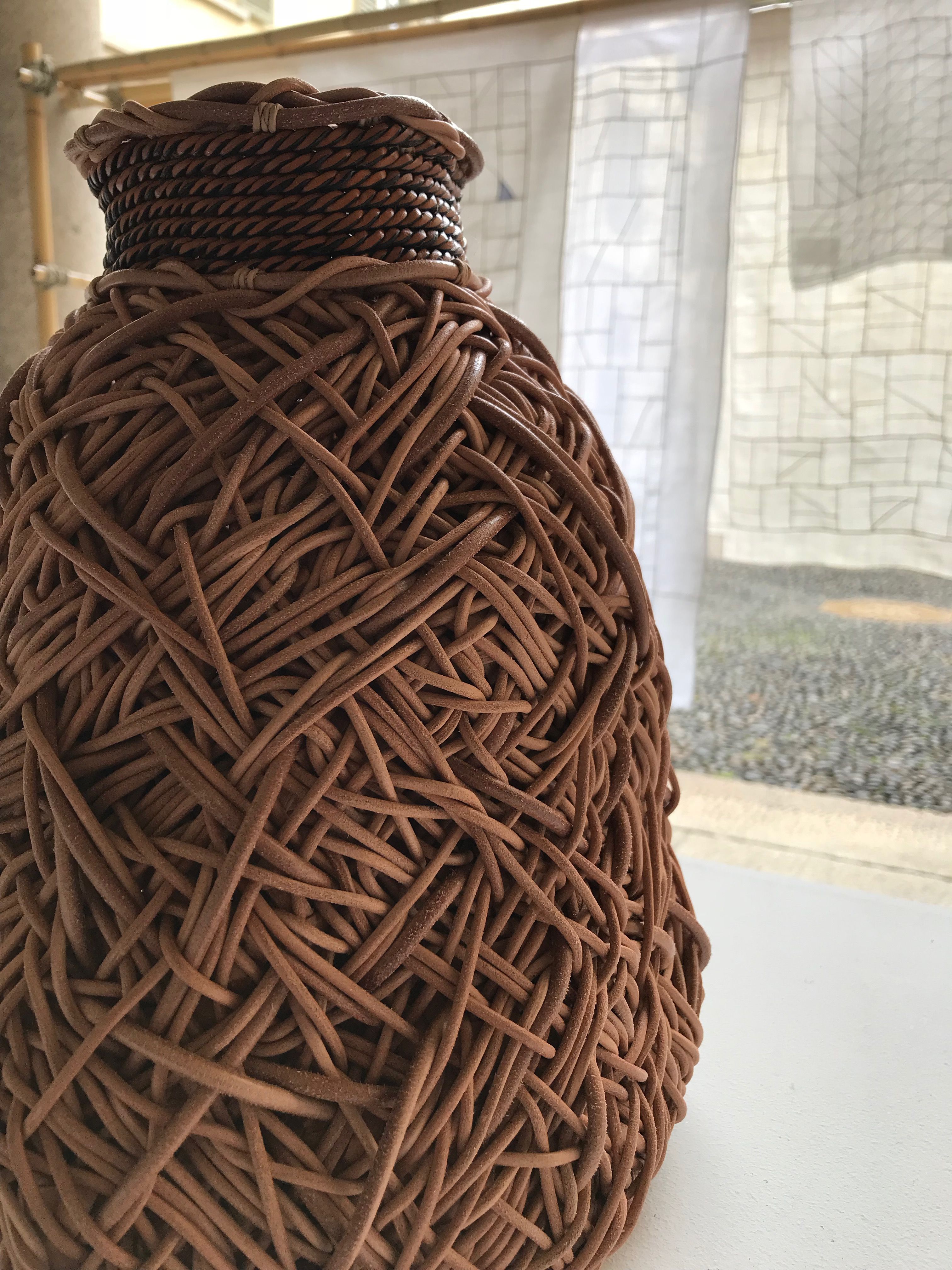
Playful and often absurd uses of pattern, color and materials continue to present optimism and joy as a leading agent of design. Miu Miu introduced perforated stools that invited users to place colorful wooden pegs randomly or in organized patterns. Artist Vincent Dermody created vases from a mix of found materials and concrete. And lastly, Versace took the trifecta (color/material/pattern) to the highest level, exhibiting mini vignettes of metallic leathers and ostrich feathers in an array of Barbie-inspired brights.
Versace
Versace
Vincent Dermody at Normann Copenhagen x Brask
Miu Miu
Kristell Laurits
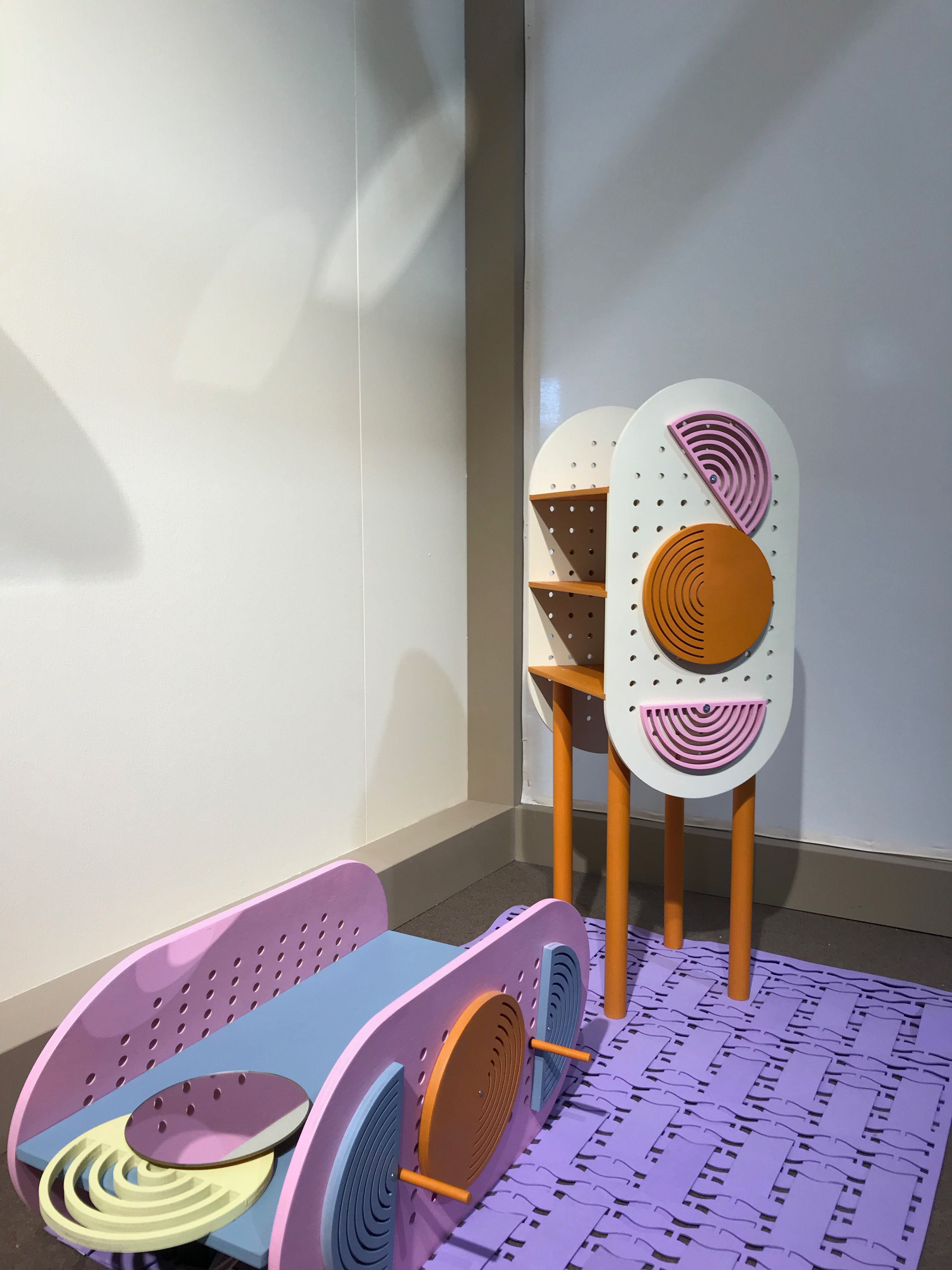
Most notably, smooth geometry and archways permeated what felt like almost every showroom, which drew an inevitable comparison between the modern and historical architecture throughout the city. These curvilinear forms and forced perspective are popping up as temporary architectural elements on finishes throughout the design world.
Ceramiche d’Italia
Studiopepe
Moooi
Studiopepe
Kartell
Experiences
People don’t travel to Milan during Design Week to be crowded on the metro or wait in long queues to shuffle through showrooms in the Salone. They are there to experience the temporary exhibitions around the city that will impact the design world for the remainder of the year.
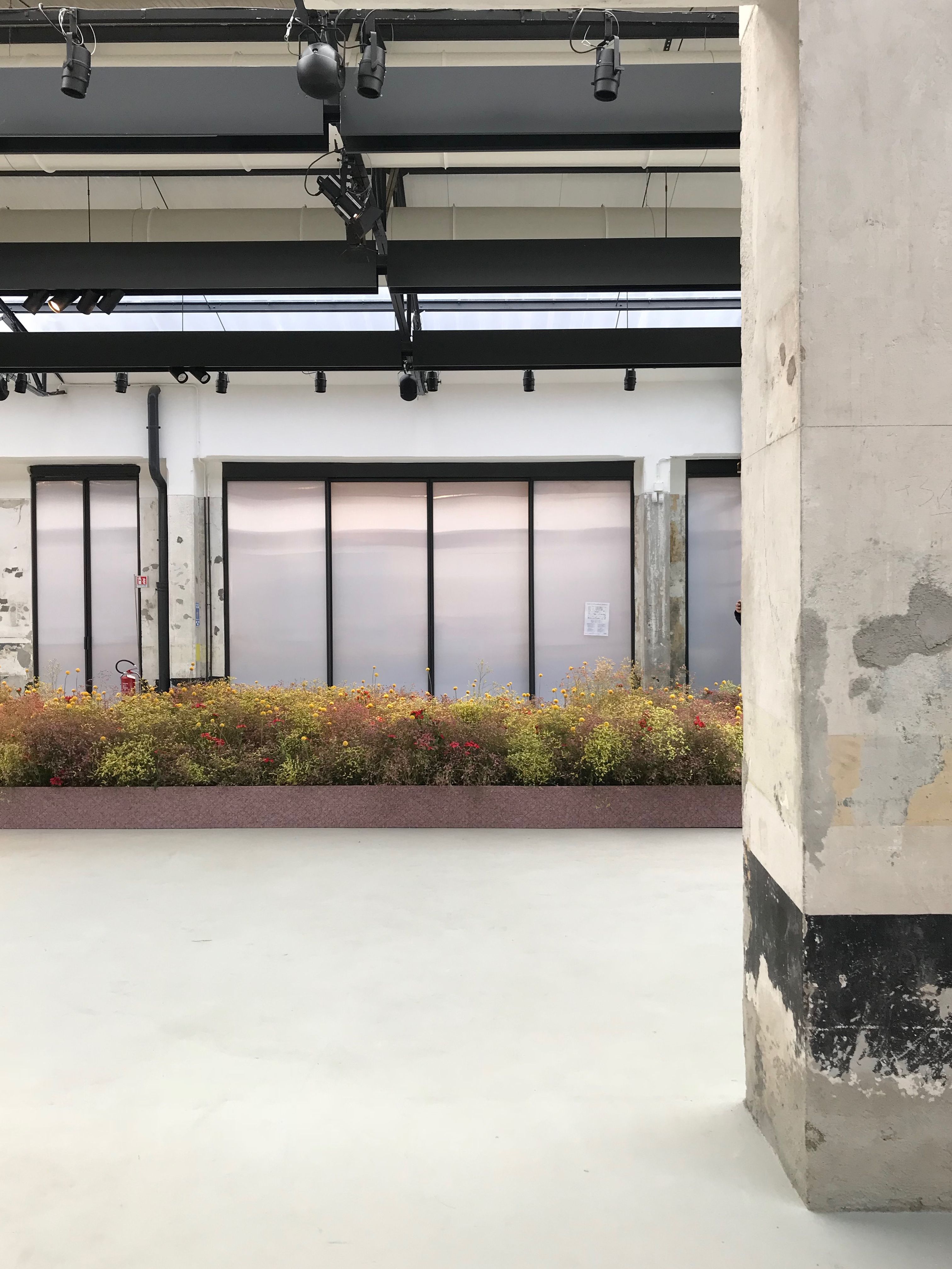
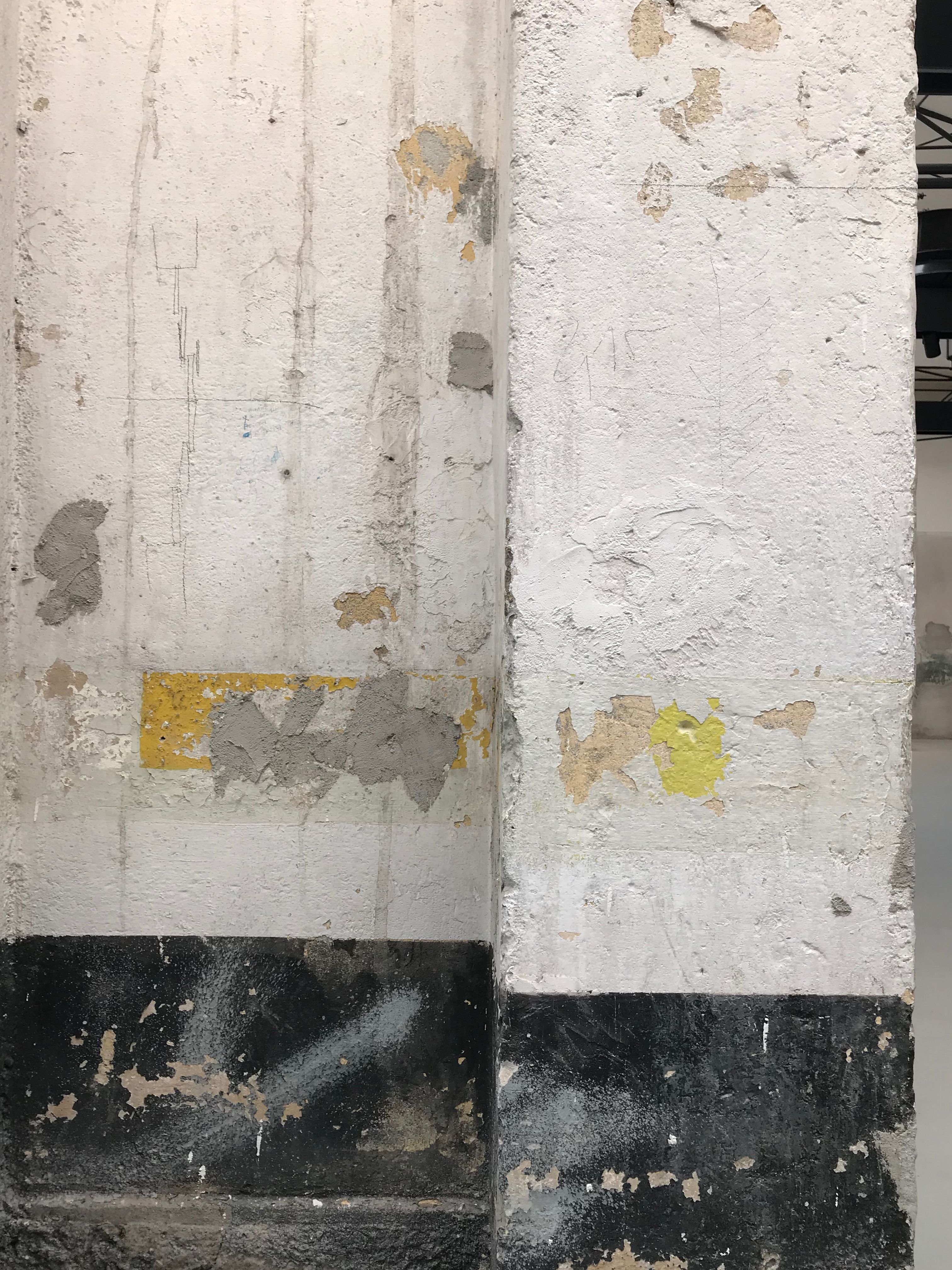
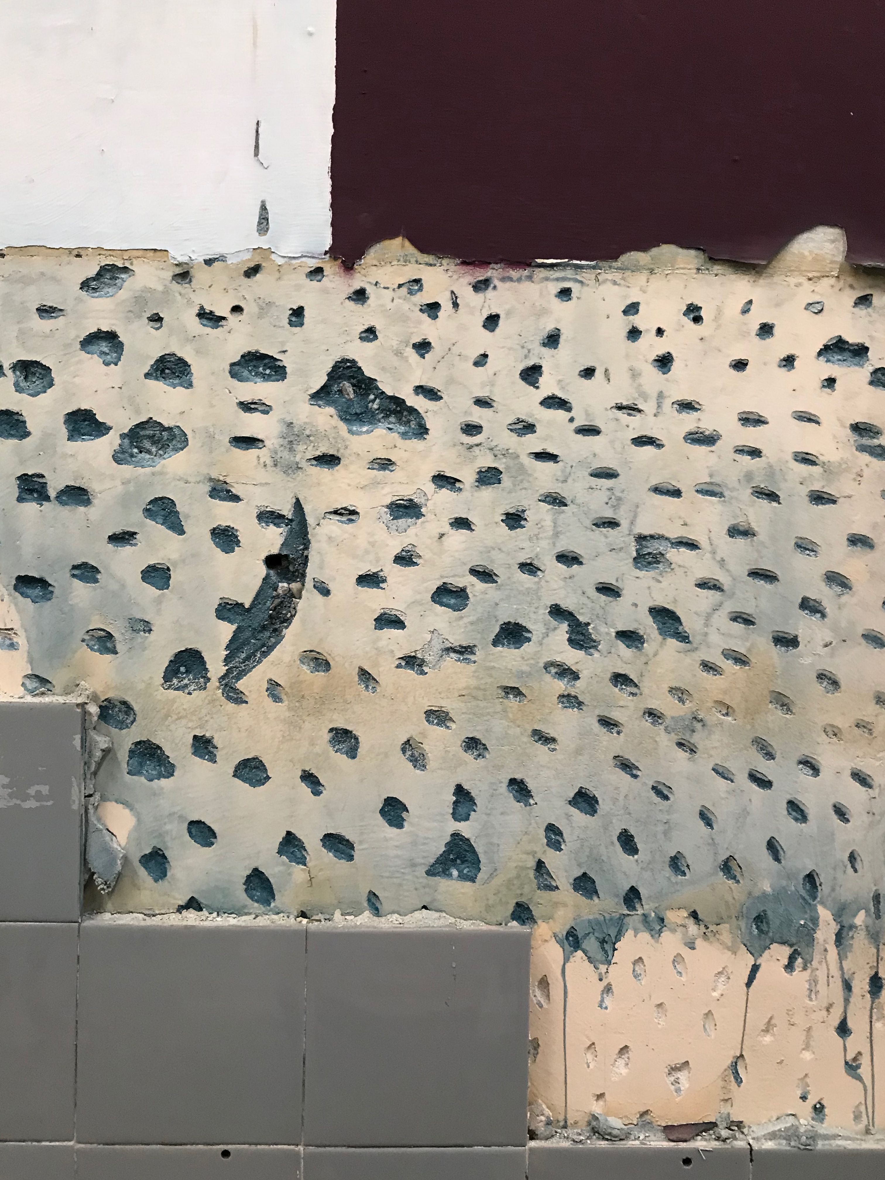
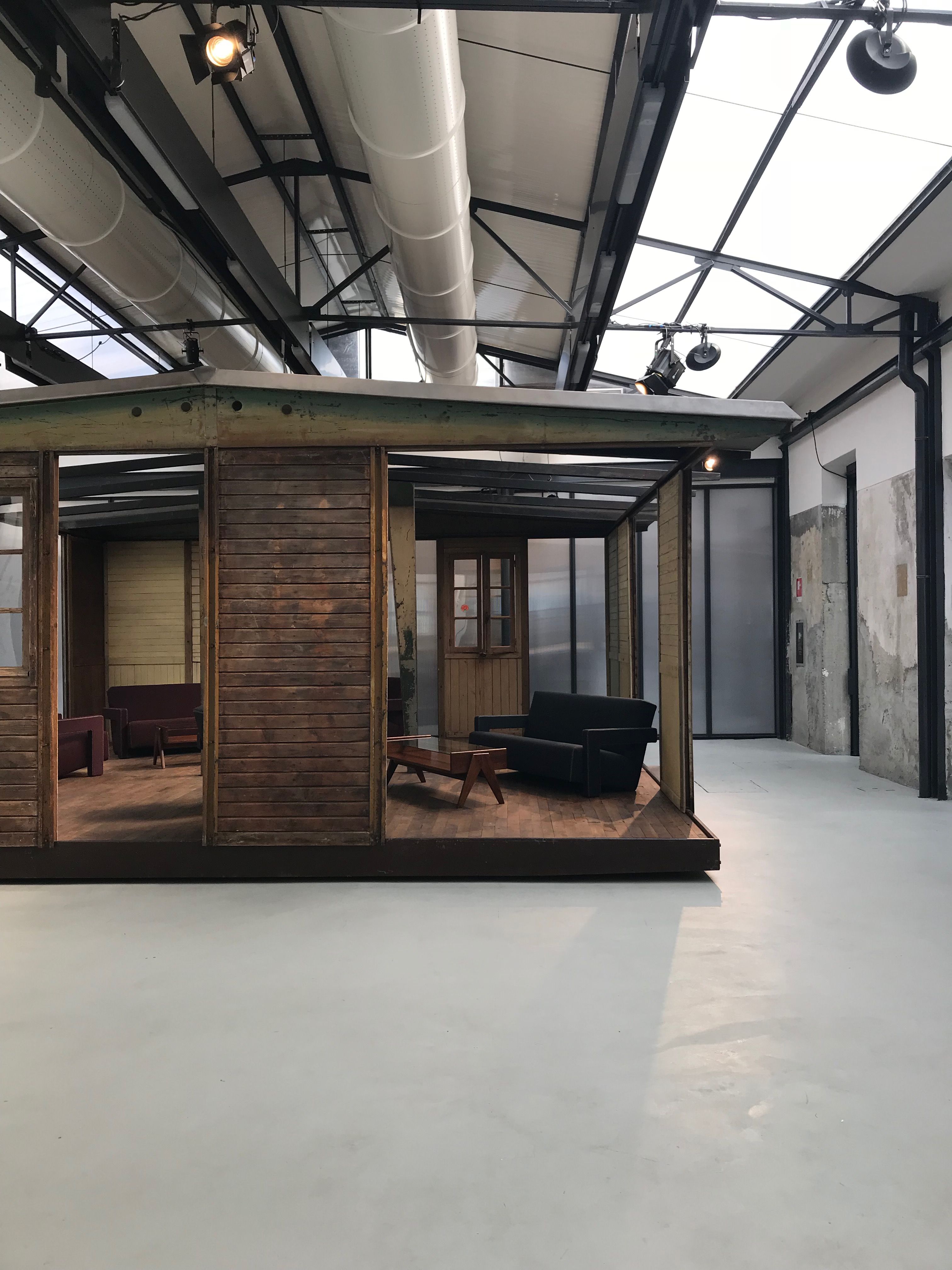
The biggest theme within these experiences? The use of deconstructed environments. Studios presented their refined projects and new products in somewhat abandoned and dilapidated-looking spaces. This allowed for the raw elements to contrast and dialogue with the curated styling around them.
Favorites in this category: Studiopepe’s presentation “Les Arcanistes, the Future is Un/Written,” a temporary exhibition in a former gold manufacturer which played with the ideas of divination and alchemy. Rough material palettes juxtaposed against beautiful lighting and furniture in a mix of earthy yet bright palettes. It set the stage for one of the most memorable and intriguing shows of the week.
Likewise, Dimore Studio presented their latest textile collections in what looked like an abandoned school with broken tile and scattered concrete. Paired with a bass-pumping Talking Heads soundtrack, the entire space embodied what I can only imagine is a truly authentic “punk” experience.
In addition to the experiential elements of the show, almost every brand has adopted an ingenious approach to styling and flow within their showrooms. Queues inched along at Kartell, Vitra, Dimore Studio and Moooi (the list goes on and on) to snap the perfect Instagram moment of their expert curation and styling.
Cultural themes
The biggest theme we noted throughout the show was the idea of Nomadism. Highlighted by temporary or pre-fab architectural elements (as seen at COS x Mamou Mani or Kvadrat Raf Simons), rapid material prototyping, recycled material explorations, craft-based design, occupation of abandoned space and lastly, modular furniture and finishes that are easily assembled.
Kvadrat Raf Simons
Kvadrat Raf Simons
Kvadrat Raf Simons
Studiopepe
Hermés
Carlo Zauli
Hemma Gone Wild
Loewe
Dimore Studio
Kvadrat Raf Simons
I consider this a commentary on the transient nature of society as a whole – but also as a potential reaction to the mass-migrations of people across the world. Nomadism presents an opportunity to talk about the temporary and transient nature of design and its ever-evolving landscape.
Milan Design Week 2019 couldn’t possibly disappoint – I look forward to catching you up on the latest shows and trends throughout the rest of this year.
XOXO,
Gretchen
