There’s one event in a designer’s calendar that generates a great deal of anticipation and spurs excitement for the year ahead – Colour of the Year releases. And in a year where people have returned enthusiastically to commercial environments, designers have been bringing the outside in with projects inspired by the natural environment.
The colours of 2023 released so far, by Dulux and Pantone, suggest biophilic design is as strong as ever, and that the coming year will see it embraced further for its impact and versatility. Pantone’s Viva Magenta and Dulux ’s Wild Wonder are both inspired by nature, but they’re strikingly different tones and present different opportunities for commercial spaces.
Here, Natalie Makowski, Product Design Manager EMEA, gives us her thoughts on these two releases and where we can expect to see them appear in 2023.
Viva Magenta certainly made an impact on the design community, taking many of us by surprise and demonstrating Pantone’s eagerness to celebrate the ‘vim and vigour’ of the natural environment. The tone stands out, both from more traditional biophilic-inspired colours but also from the larger red family, and Pantone presents it as a ‘new signal of strength’ in what for many is a difficult time. It was chosen to represent a ‘joyous and optimistic celebration’, one which encourages people to experiment and express themselves in new and exciting ways.
There is a real sense that the handbrake is off with this colour, particularly from an interior design perspective. You can see the influences coming through from fashion and makeup, and it’s easy to imagine it taking centre stage in a residential interior, drawing the eye to feature spaces.
From a commercial perspective, it presents more of a challenge. We need to take care when including such a bold colour in commercial or workplace design, but Viva Magenta is about pushing the boundaries and we expect it to help create new spaces and encourage new ways of working in these environments. It could be used to empower a breakout or project area, one where people have permission to abandon a corporate style and be braver and more creative.
The colour could also be toned down and paired with shades of brown to ground it, giving it a more biophilic feel.
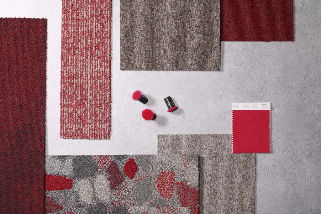
Pantone Colour of the Year 2023 Viva Magenta paired with Composure colour Berry, Composure Edge colour Berry/Solitude, Stone Course colour Red/Stone, Employ Loop colour Salsa and noraplan uni colour 6178.
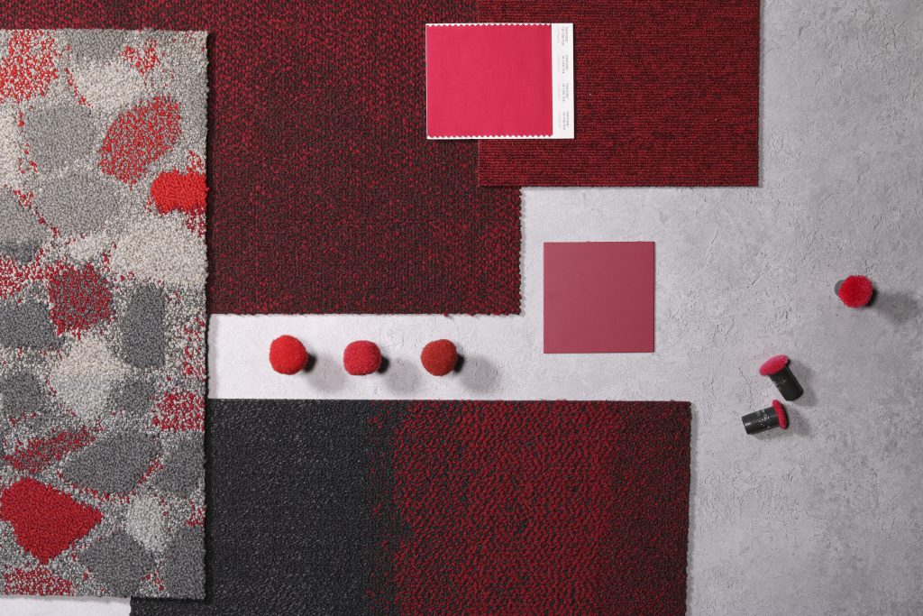
Pantone Colour of the Year 2023 Viva Magenta paired with Sashiko Stitch colour Poppy, Composure colour Berry, Stone Course colour Red/Stone, Employ Loop colour Salsa, Nutmeg and Truffle.
Sitting carefully in the space between green and beige, Dulux’s Colour of the Year is also one which celebrates the natural environment, bringing with it an organic ability to lift a space and immediately give it a wellbeing focus. While Viva Magenta achieves this by standing out from the crowd, Wild Wonder is focused on connecting and lifting the space as a whole, drawing on the power of nature to bring people together. It celebrates how biophilia can help foster connections not only between humans and nature, but between individual people, too.
In the design community, we experienced this in the conversations that Wild Wonder started – about how it was hard to pin down and looked very different on screen compared to how it did in reality. To get your head around it, you have to engage with it in person. It’s no surprise that Dulux described how a broad and flowing conversation led them to choose the tone: ‘We host a Trend Forecast and ask a panel of international design expert to share their insights about what will be influencing the way we live over the next few years.’
Wild Wonder sits very well with the grounded colours that Interface has been predicting would dominate commercial design. The Flow colours palette that Dulux has promoted as part of the release contains pastel blues and greys and purples, which are similarly connected to the natural environment but are all lifted by Wild Wonder. In the snapshots of interiors showcased by Dulux, the tone is used as a flood fill colour, and this is how we expect it to appear in commercial spaces.
In every example shared by Dulux, the tone seems to change slightly, showing its versatility and ability to adapt to the colours and design philosophies that it sits alongside. The terracotta, red, brown and forest green trends that we have seen this year are unlikely to disappear in 2023, and Wild Wonder falls perfectly in step with these movements.
Viva Magenta and Wild Wonder are two different sides of the same coin. They demonstrate how designers are ready to push the boundaries of biophilic style and apply nature-inspired tones in a fresh way. This comes at a time when we continue to break new ground for commercial design and expand the potential of these environments. We’re looking forward to exploring how these colours can contribute to the commercial spaces of 2023.
Want to talk about the design of your new space? Get in touch.
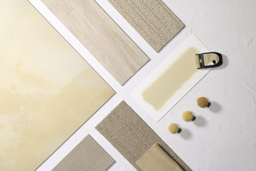
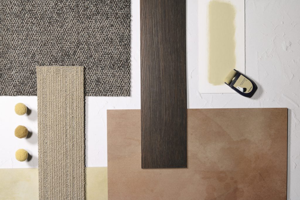
Dulux Colour of the Year 2023 Wild Wonder paired with Textured Woodgrains colour Rustic Oak, Drawn Lines colour Topaz, Online colour Dune / Biscuit, Iridescence colour Golden.
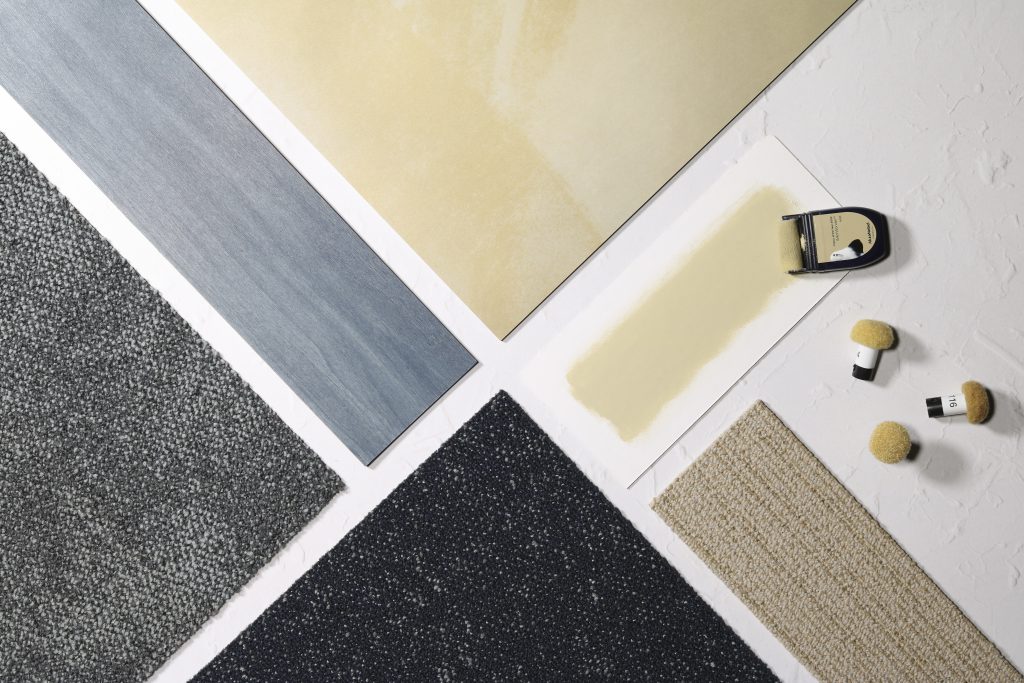
Dulux Colour of the Year 2023 Wild Wonder paired with Online colour Dune, Iridescence colour Golden, Composure colour Reserved, Studio Set colour Slate, Step It Up colour Indigo.
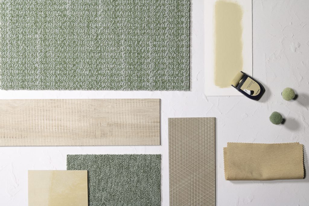
Dulux Colour of the Year 2023 Wild Wonder paired with Textured Woodgrains colour Rustic Oak, Drawn Lines colour Topaz, Iridescence colour Golden, WG100 colour Sage, H530 II colour Sage.
