This blog series explores the colour trends that will be driving commercial interior design over the next 12 months. Here, Natalie Makowski, Product Design Manager, takes a look at how the rich browns of the 1970s are making a comeback.
Origins
Inspired by crafts and natural materials, the rich browns trend stems from the growing use of exposed brickwork and natural materials throughout both commercial and residential spaces. The design world quickly took inspiration from this warm, rustic look and translated these rich earthy tones into accessories and finishes – allowing terracotta to become the new neutral colour of the moment.
-
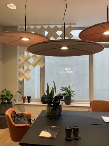
- Abstracta @ CDW 22
-
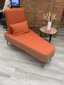
- Connections @ CDW 22
-
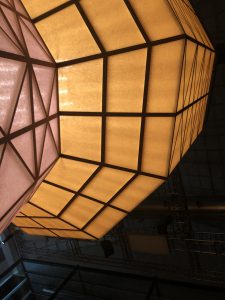
- Hermes @ Milan DW 22
Introducing rich browns into the workplace
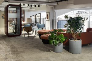
Similar to nourishing greens, these rich brown tones are often used within breakout areas to make a bold design statement while creating a sense of comfort. Styles like Woven Gradience Terracotta can be complemented by soft neutrals or LVT in natural finishes like Woodgrains to create a warmer finish in social and wellness spaces.
Here at Interface, we have taken inspiration from the trend by incorporating terracotta yarns into our new collections such as Works Effect Canyon and Works Element Canyon, pairing the colour with deep browns and neutral tones to make impactful flooring solutions for both floor fills and rugs. The use of terracotta within terrazzo styles has also grown and features within our latest nora 926 pado collection.
-
- Barry Callebaut, Turquie
-
- Reitan Convenience, Suède
-
- Oracle, Hongrie
-
- De Bijenkork, Pays-Bas
Bringing browns up to date
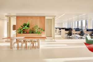
When rich browns are used within flooring design, the space can be elevated by using brick and terracotta coloured furniture and soft furnishings. The resurgence of these retro shades from the 1970s is seeing a modern twist with the use of matt black finishes to bring out the warmth of the brown shades, helping to soften formal spaces.
These tones also complement earthy textures and finishes such as clay and woodgrains to introduce an element of biophilia.
For advice on how to incorporate rich browns into your designs, get in touch for a consultation with our concept design team.