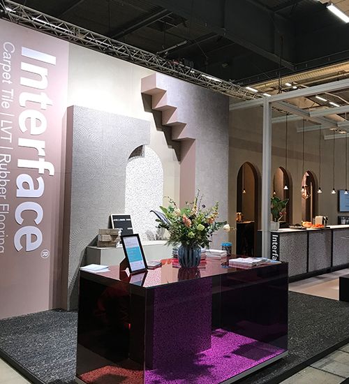
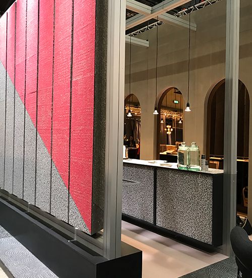
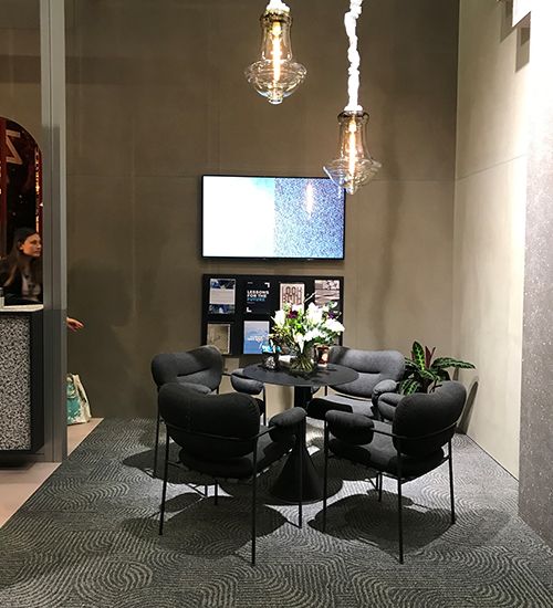
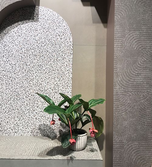
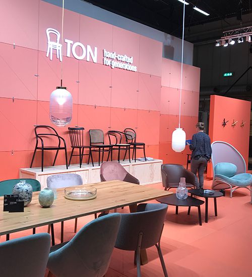
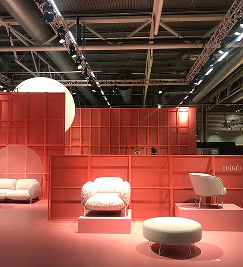
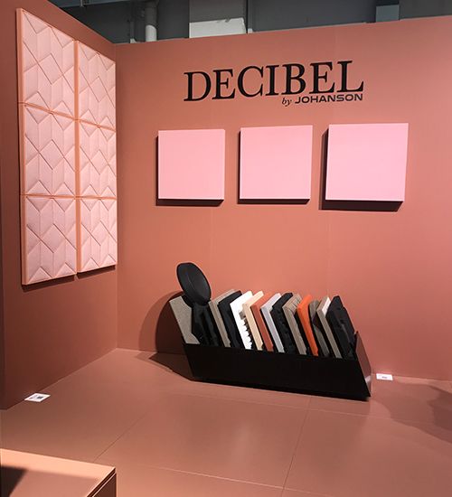
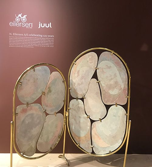
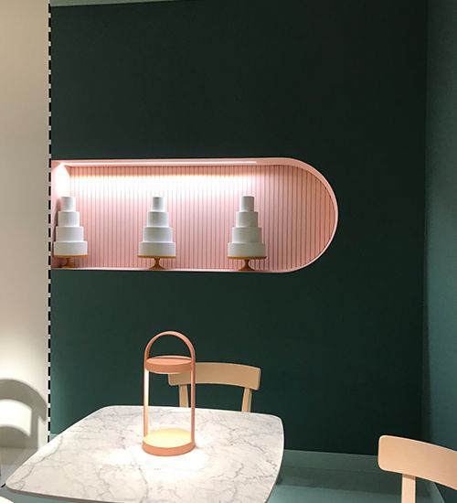
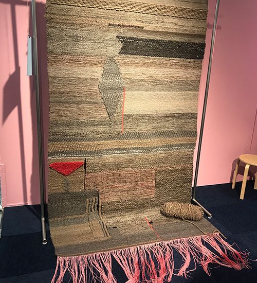
Perhaps not so surprising, this year’s Stockholm Furniture Fair (SFF) featured plenty of minimalism, natural elements and muted colour. It was a smooth transition from last year’s fair, which included shades of coral (aligning with the 2019 Pantone Colour: Living Coral). For 2020, we still saw coral tones, but with powdery pink, beige and more intense brown and terra-cotta – as well as dark forest green.
We expected to see heavier use of the current fashion trends toward purple and lavender, but it could be that those of us who “survived” the 70s aren’t ready to go back to those overdone colours. However, some of fashion’s lavender leanings were featured in natural, gardenesque ways at the Greenhouse section, which highlights up-and-coming designers.
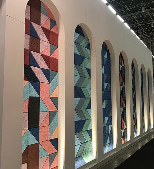
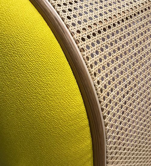
Also unexpectedly, Pantone’s 2020 Colour of the Year: Classic Blue was not at the forefront. While a few companies did take an all-over blue approach to their exhibit, it may have been too big a jump from last year’s coral colour for most. Fussy colour and pattern was nowhere to be found. Designs were clean and streamlined, with the focus on monochromatic colour and texture.
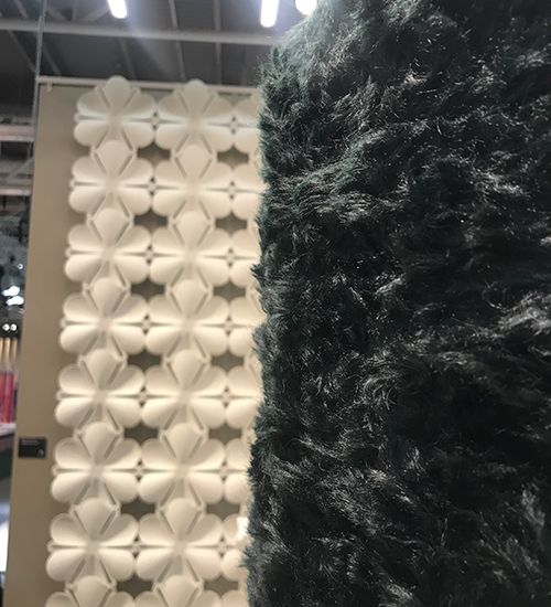
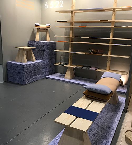
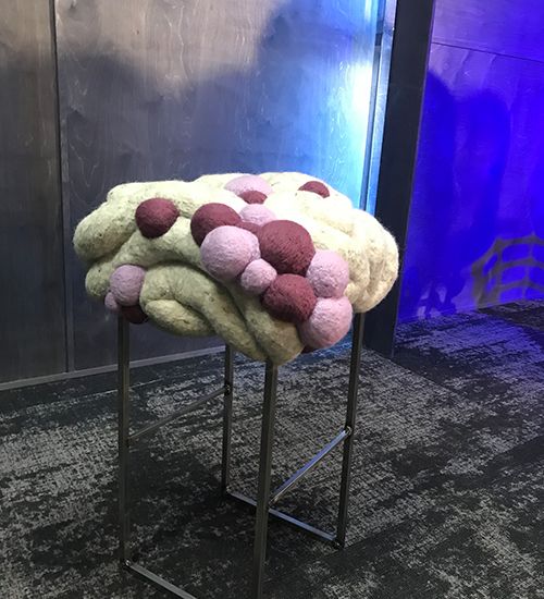
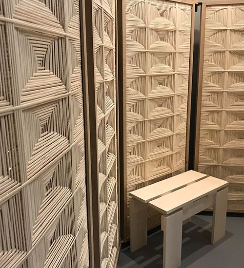
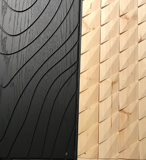
We saw lots of wood, including light tones ever-present in Scandinavian design, along with “naked” materials. Exhibitors seemed eager to be transparent and show off their materials – from foam mattress filling as wallcovering to discarded wool used for rugs. In lieu of experimental design, the focus leaned toward honesty and practicality.
For Interface, our Look Both Ways collection was right in step with trends at SFF, featuring muted warm colours and mineral tones, combined with a textural touch. And of course, sustainability and transparency are always part of our products and business. Out of the 700+ exhibitors at SFF, only Interface and a handful of others focused on sustainability. Let’s hope that’s because sustainability is now just a natural, expected part of business and product development. It certainly is at Interface!