Trend longevity has become unpredictable in our fast paced, high tech world. In fact the most marked change in trends over the years is the speed through which they cycle. For that we can thank advances in communication, production, transportation and the evolution of social media.
But even with these advancements, more often than not, our trends are still inspired by repeating history, the current overall mood of the world, and new consumer demands. Trends evoked from these factors tend to hang around a bit longer. For example, by allowing history to repeat, it gives us a basis to reflect, tweak and revisit past generations. If the mood of the world is in a recession, then it brings out insecurities which, in turn, trickle down into design in the form of safe choices, like a prevalence of neutral safe tones. Currently, the quick paced evolution of technology has consumers demanding “the latest & greatest” products with a keen awareness of their environmental impact.
So what trends did I find at the 2015 HD Expo?
All that glitters is gold
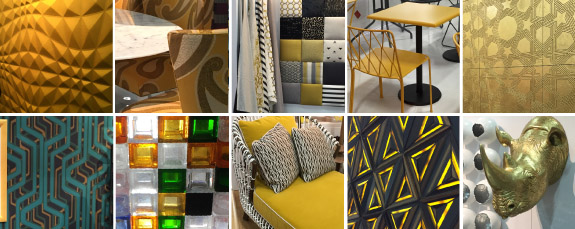
At the 2015 HD Expo, all the glitz of Vegas shone bright! The hospitality color of the year was gold in an array of shades, leaving Marsala, Pantone’s 2015 Color of the Year, just a memory. While there were considerable pops of orange accents with warm grays, gold stole the show. Beaming gold metal finishes, fabrics, wall covering, furniture, lighting and accessories filled the exhibition hall. The mixture of warm gold tones and greens was a popular partner for an eclectic sense, while gold, black, grey and cream had a classic feel.
Overall, the mood of the color gold is one of success, achievement and triumph. It’s associated with abundance, prosperity, luxury, sophistication and elegance, indicating times are good in the world!
Geometry abounds
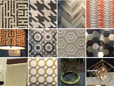
Getting their fair share of the limelight were geometric shapes in a myriad of products. In conjunction with the classic mood found in the gold tones, classic shapes such as the Greek key, herringbone, octagon, hound’s-tooth and zigzag emerged both in true form and in abstract interpretations. Geometrics were on the floor, on the walls, in the furniture, in the fabrics and in the lighting forms. From the Greco-Roman use of simple zigzags and triangles to cover surfaces to the mid-century modern use of bigger, bolder shapes with less intricacy, geometric patterns have dominated for centuries.
Today’s geometrics are bolder in scale than ancient Greek and Roman applications and have a more classic, sophisticated feel than the mid-century modern forms, giving the shapes a clean renewal with strong lines and simple colors.
Enticing textures
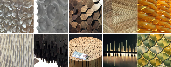
Multi-level dimension was found throughout product offerings. Surfaces had depth, whether they were carved, layered, molded, twisted or tufted. You wanted to touch them and examine the texture. In most instances these products came from natural, flat materials that were manipulated into 3-dimensional surfaces, allowing designers to develop spaces that reflect our continuing desire to bring the outdoors inside.
Surfaces possessed both the warmth and variation that we are attracted to in nature. Whether they were clay abstract sting-rays or solid pieces of oak charred and layered to create sculptural character, the textures created the connection with nature and the world around us.
At the core
Looking a little deeper into nature and the awareness of our environment, manufacturers and designers continue to find ways to reduce their carbon footprint. Other hot topics included biophilic design and the use of alternative materials that change the way we design. For example, RH Contract featured tables manufactured from reclaimed Douglas Fir while Phillips Collection showed the Seatbelt Chair made of scrap material.
Innovations and products discussed included temperature sensitive glass, translucent concrete, electronic paper, magnetic ink, solar paint, wallpaper that charges your phone and transparent alumina that’s three times stronger than steel. The consumer demands on the market are supporting nature and sustainability as a hallmark of design as opposed to what many thought was just a trend 15 years ago.


