There is so much evidence about the advantages of biophilic design elements being incorporated into office design. So, we thought we’d share some inspiring examples of office interiors that are putting theory into practice; creating spaces that are teeming with vitality where workers can feel inspired and thrive.
Ljubljana Chamber of Commerce and Industry
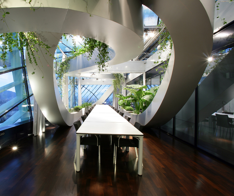
The Ljubljana Chamber of Commerce and Industry in Slovenia was designed by Sadar+Vuga Architects.

Ljubljana Chamber of Commerce and Industry in Slovenia, Photo: Zare Modic
Here, a winter garden with panoramic views of the city was created in a second design phase by glazing the existing summer banquet terrace. This glass encased indoor garden has an abundance of natural light. A cleverly designed external lattice-work structure based on the cross-section of a plant leaf prevents glare from too much direct sunlight whilst casting a green glow into the space. A ribbon of planters winds around the interior space at different heights offering dramatic views of trailing and large leafed tropical plants from every aspect and framing views out across the city.
The adaptable space which is used for a range of purposes from meetings to functions has become the favourite part of the building for some employees because of the relaxing atmosphere and expansive views.
McCann Erickson
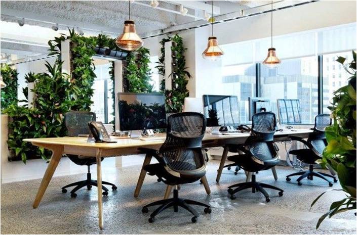
Tom Dixon’s design for McCann Erickson’s office in New York demonstrates how biophilic Design can be incorporated into an office space without too much in the way of costly structural overhauls: positioning desks to take advantage of the natural light and maximising the number of people who have a view to the outside, using materials like wooden desks, copper and glass lighting to bring natural textures and references to nature into the office.

Tom Dixon’s design for McCann Erickson’s office, Photo: Tom Dixon
In this design, the clever use of plants to create living wall partitioning has several advantages for the workers – as it can improve the air quality, create more privacy in the open plan setting and provide passive acoustic insulation by sound dampening – all of which can aid greater focus and productivity.
Selgas Cano Architects
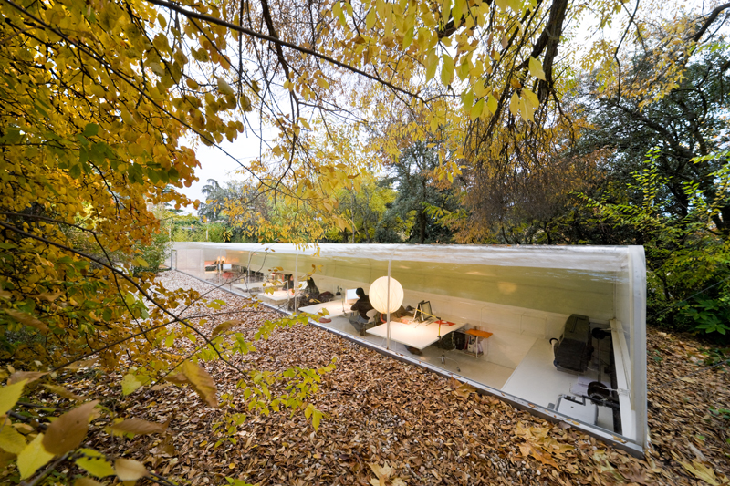
The architects at Selgas Cano obviously understand the benefits of biophilic design. They designed their own Madrid studio to literally immerse their employees into a woodland setting.

Selgas Cano architects, Madrid office, Photo: Iwan Baan
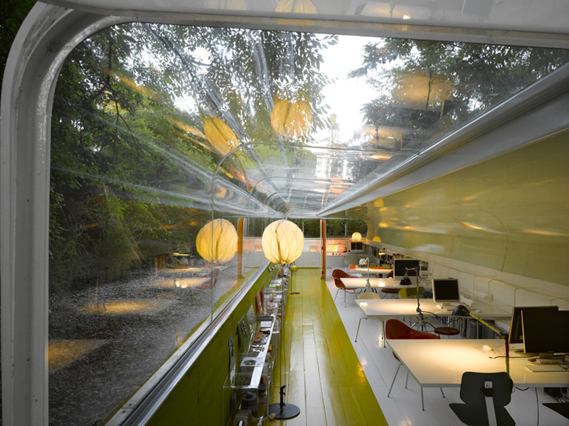
The semi-submerged structure is reminiscent of a train carriage. In fact, to get the curve of the roof, parts were produced by a Danish manufacturer alongside some German railway carriage. It affords horizontal views through the natural surroundings. To maximise the amount of natural light whilst preventing overheating and glare the north side of the structure consists of transparent plexiglass whilst the south side is opaque. A hinged opening at one end of the tunnel shaped space allows for natural ventilation whilst the ground offers heat insulation from the high summer temperatures of Madrid, preventing the need for air conditioning.

Selgas Cano architects, Madrid office, Photo: Roland Halbe
Whilst being located on the outskirts of the bustling city, this office space encourages contact with nature as access to the building requires walking through the woods experiencing the seasonal changes plus the natural surroundings that are ever present all around this inspirational work space.
Do you work in an office that has biophilic elements? If not what changes would you implement to make it a more productive and inspiring environment to work in?
One response to “Incredible Examples of Biophilic Offices”
Website Development Services In Udaipur, WordPress Web Design Company Udaipur,E-Commerce Web Development Company Udaipur,Magento Shopping Cart Development And with this we will also learn about the initial web designing course learning in the subject of K ede.