Rapid Advance was growing in more ways than one. The company’s original headquarters was the quintessence of corporate design—traditional, muted, and safe—but that space didn’t represent the changing company culture or allow for team growth. They needed a space that reflected the vibrancy of their culture and allowed for current and future expansion.

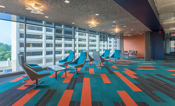
Rapid Advance needed a corporate design to reflect the vibrancy of their culture. Interface products featured: On Line™ and Ground Waves™.
This team of business lenders moved to a new space in a new building, marking a fresh start for the company. Rapid Advance became the first tenant of the first LEED Platinum building in Bethesda, Maryland.
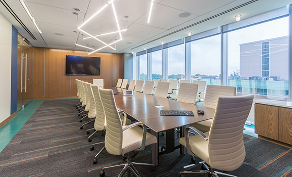
Spearheaded by Lead Designer, Kristin Kostrzewski, the corporate design of the new 22,433 square foot space was the perfect tabula rasa—a space that could be designed from scratch to accommodate the team of 190 members with room for a mix of professional, executive, recreation, and collaborative areas.
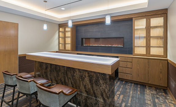
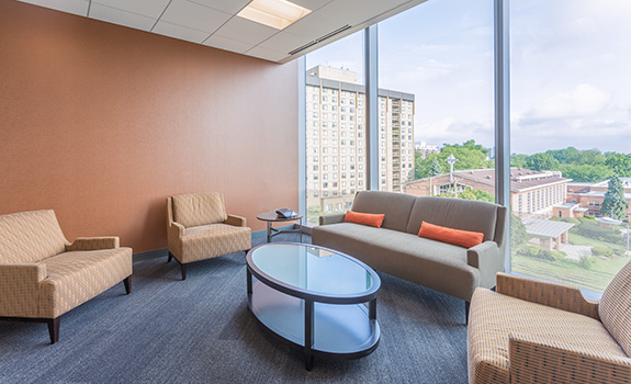
Our efforts focused on representing not only the company’s professionalism and work ethic, but also their culture and personality. We broke down the walls of traditional corporate design by creating a workspace that is open and uplifting. We installed work surfaces with low cube walls, which opened the space and allowed for more natural light. We designed areas specifically for recreation and breaks to establish an equal balance in the new office space. The layout incorporated a “Whiskey Room” for entertaining clients and celebrating successful deals complete with flooring taken from actual whiskey barrels, a Ping-Pong table, and Foosball.
Carpet served as a powerful design element in our work. Our partnership with Interface designers ensured that the flooring would stand the test of time and complement the space’s personality. By using saturated colors in open areas and subtle colors in private spaces and offices, we were able to incorporate subtle bursts of color without overwhelming the design.
Overall, the entire design offers a space where Rapid Advance’s culture can flourish. “The original space was dull. It was such a stark contrast to the softball-playing, whiskey-drinking, karaoke-singing, high energy of the Rapid Advance team. It was exciting to create an environment that reflects their thriving culture and attracts great talent,” said Melissa Price, CEO of dPOP.


One response to “Maximizing Space, Boosting Culture”
Great article! Sounds like a beautiful, enticing work space!