After a year of fun, rambunctious maximalism – think “Brat Summer” and “Wicked Winter” greens – Pantone’s 2025 Color of the Year is here, and it’s a warm, delectable brown.
In contrast to more, “of the moment” shades, Mocha Mousse emerges as a timeless neutral, offering grounding familiarity after a year of bold, rebellious colors; revolving micro-trends; and heightened cultural tensions.
Leatrice Eiseman, Executive Director for the Pantone Color Institute, calls Mocha Mousse, “sophisticated and lush” and an “unpretentious classic.” In many ways, it’s an ode to the richness of darker neutrals. Pantone says the brown is “an appeal to our desire for comfort” and “a growing movement to align ourselves more closely with the natural world.”
We spoke with Interface designers from around the world to get their perspectives on this soft, earthy tone. Here’s what they had to say.
Warmth and Comfort
Warm neutrals began gaining traction in the Americas in 2021 as a response to society’s desire for comfort and stability. Mocha Mousse’s selection as Color of the Year shows the lasting power behind this need.
According to Jacob Martinson, Interface’s Design Studio Manager in the Americas, the color serves multiple functions. “Mocha Mousse can act as a neutral foundation for layering pops of colors or metallics. Or it can be paired with complementary neutrals to create a more monochromatic look.”
Martinson adds that the brown, creamy tone “can play a role in an office setting in addition to healthcare, living, and hospitality spaces that want to ramp up that residential feel. In the United States, we’ve seen this through increased use of browns, rusty terracotta, greige, and wood tones.”
Overall, Pantone’s nod to “treat culture” highlights the color’s sense of comfort and familiarity while inviting designers to experiment with fresh elements and colors that act as mood boosters – a welcome theme in the Americas for 2025.
“Summer cleaning is intense, top to bottom,” Rourke explains. “But with these floors, all it takes is a scrub and a high-speed buff to make them look brand new. It’s nice to have a standard that makes the floors look fresh and inviting, especially when you’re responsible for maintaining them.”
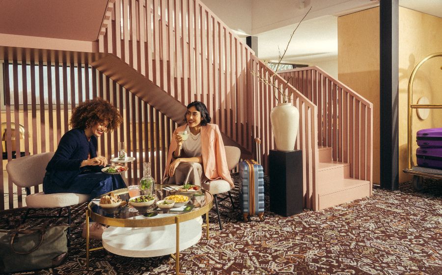
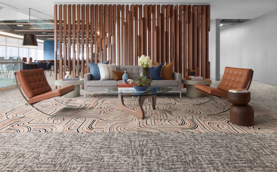
Designers can find earthy, Mocha Mousse-like colors throughout Interface’s portfolio of carpet tile, LVT and nora® rubber products.
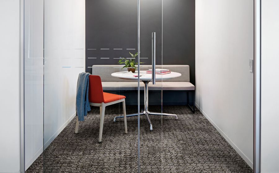
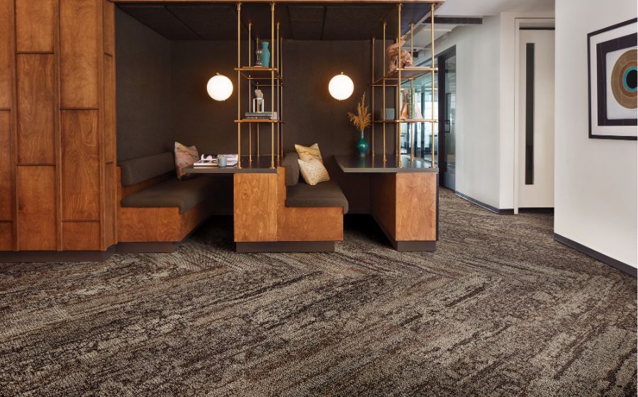
Designers can find earthy, Mocha Mousse-like colors throughout Interface’s portfolio of carpet tile, LVT and nora® rubber products.
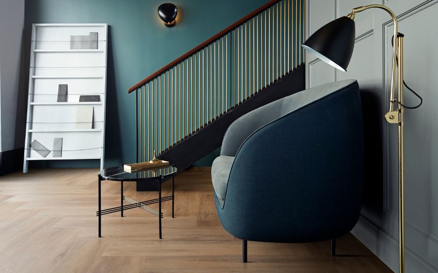
Designers can find earthy, Mocha Mousse-like colors throughout Interface’s portfolio of carpet tile, LVT and nora® rubber products.

Depth and Freedom
Warm neutral tones like Mocha Mousse also resonate throughout Europe, but the extent can vary from country to country. While brown is already a welcome and emerging color in the United Kingdom, German designers are more likely to lean into warm grays and beiges rather than coffee or chocolate tones. And although France began embracing warmer shades three to four years ago, these shades are just now gaining traction in countries like the Netherlands.
Mathieu Paton, Interface’s Team Leader for Concept Design in Northern and Southern Europe, recognizes that color shifts occur over time. “In 2024, we saw colors evolve slightly in Northern and Southern Europe, going to caramel or raffia,” Paton says. “Mocha Mousse is a step further, so I think it will mainly apply as an accent tone and in interior accessories – at least to start.” These elements can add depth to interiors without overpowering a space.
Mocha Mousse’s selection as Color of the Year reinforces that warm neutrals are here to stay. In fact, it gives designers from all corners of the world freedom to use similar colors in different ways.
“It is hard to guess where the trend will go and each project is different,” Paton says. “In this regard, the color is perfect because it is quite versatile.”
Harmony and Connection
Pantone shared that it considered society’s never-ending “quest for harmony” when choosing the 2025 Color of the Year. Mocha Mousse reflects this idea by bringing a serene and grounding ambiance to interiors.
According to Interface Designer Katrina Manila, Mocha Mousse strikes a balance that works well in today’s design projects. “Mocha Mousse hits a modern note without being too bold, which makes it easy to use within a space,” says Manila. “It has a warm, versatile appeal that fits well with the earthy and natural palettes designers in Australia and New Zealand often gravitate toward.”
Manila predicts that designers in the region will initially employ Mocha Mousse as an accent through cushions, throws, rugs, and feature pieces. However, it also holds potential for larger applications. “It’s a great shade for color drenching, or you can introduce contrast by pairing it with oceanic blues and teals,” says Manila. “However, I believe many designers will opt to use Mocha Mousse with terracotta and autumnal shades to complement its warm tones.”
Luxury and Versatility
In North Asia, creamy browns like Mocha Mousse are already a popular choice for residential spaces. The warm tone introduces a sense of luxury and helps create a homey feel – a nod to Pantone’s appeal for comfort. And while earthy browns are rarely seen in office settings, designers can envision shades like Mocha Mousse in reception and lounge areas, which are more like relaxation spaces.
Hilda Wang, Interface’s Design Studio Manager in North Asia, praises Mocha Mousse for its ability to match well with striking colors. “Deep purples, teals, and sage green continue to be popular in China,” says Wang. “Thankfully, Mocha Mousse’s pink undertones make it a versatile choice that works with many palettes.”
The color’s flexibility is also great news for Southeast Asia and India, where designers love infusing color into spaces. Brighter accents, often in warm shades like orange-reds and yellows as well as inviting pastels, are increasingly common in countries like Malaysia and Singapore, while earthy tones of green, terracotta, and purple are frequently paired with warm neutral bases in India.
“Asia is a continent with a range of design preferences, and Mocha Mousse provides the perfect backdrop to tie together dynamic color trends across the region,” says Wang.
Unpretentious. Sophisticated. Earthy Elegance.
Mocha Mousse clearly resonates with designers worldwide. While regional applications of the color may differ, its shared appeal lies in its adaptability and grounding presence. Pantone describes Mocha Mousse as a “versatile foundation” for “enhancing a wide range of palettes” – and it truly is.
By providing a cohesive and sophisticated foundation that suits both modern and traditional spaces, Mocha Mousse answers a global call for balance, comfort, and creativity.
Looking for more inspiration? Check out Pantone’s Mocha Mousse color palettes here.