After a turbulent 2020, it seems like everyone is looking for the new year to provide stability and optimism. And this desire is certainly reflected in Pantone’s choice for its Color of the Year 2021. This year, not only do we have one color but two – Ultimate Gray and Illuminating!
Pantone determines its annual Color of the Year following an extensive analysis of color influences from around the world that range from trends in art and fashion to socio-economic conditions. For 2021, it selected two stunning shades that combine together to convey feelings of strength and hopefulness, creating positivity for the future. This is a perfect theme to inspire us all going into a new year, so thank you, Pantone.
Sunshine and Strength
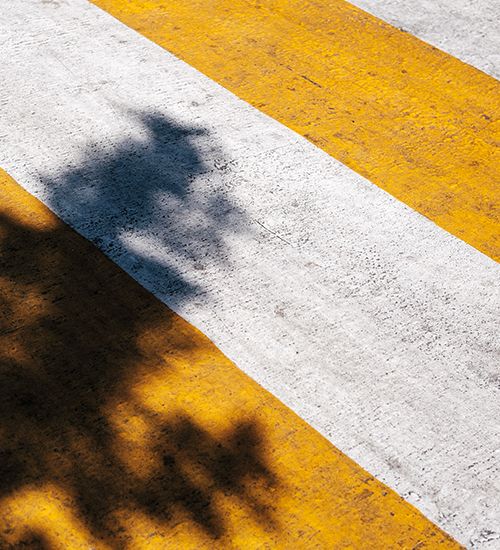
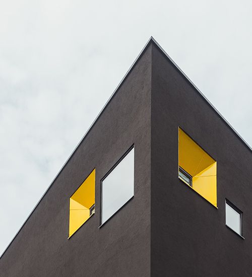
Following the uncertainty of 2020, people are now looking for ways to make themselves feel better, and, as they look to the future, they crave energy, clarity, and hope for what is to come. Illuminating, a cheerful yellow, delivers on this desire for happiness and offers a sense of reaffirmation and welcoming warmth. The sunny shade pairs perfectly with Ultimate Gray as the tones balance one another to create a zen vibe.
Ultimate Gray takes its inspiration from solid elements, like natural stone and granite, which often feature a weathered appearance that emphasizes their enduring nature and dependability – attributes that resonate especially well during times of unpredictability. Gray hues traditionally symbolize intelligence and wisdom, and Pantone’s selection of Ultimate Gray provides a steady foundation that reassures.
According to Leatrice Eiseman, executive director of the Pantone Color Institute, “The union of an enduring Ultimate Gray with the vibrant yellow Illuminating expresses a message of positivity supported by fortitude. Practical and rock solid but at the same time warming and optimistic, this is a color combination that gives us resilience and hope. We need to feel encouraged and uplifted, this is essential to the human spirit.”

Creating Balance in the Workplace
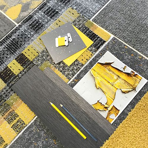
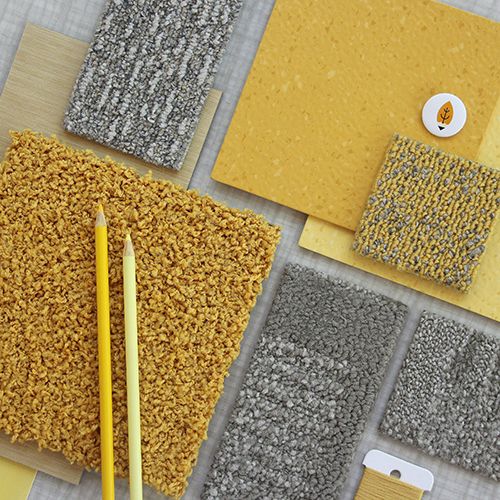
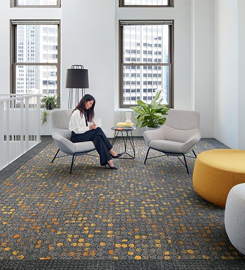
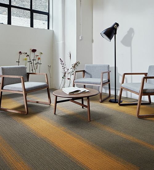
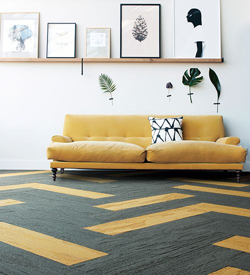
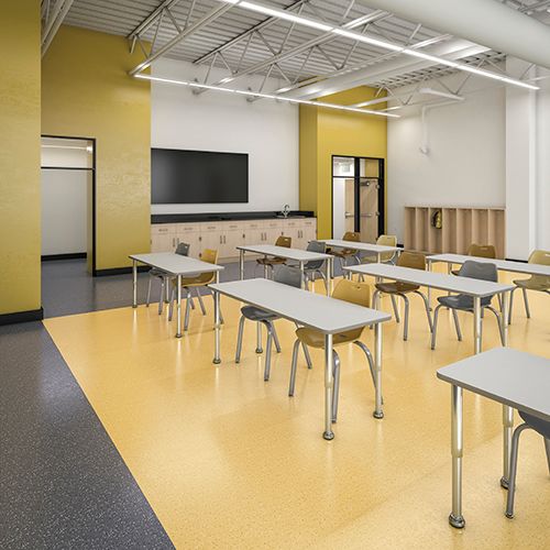
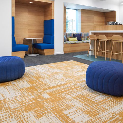
The marriage of yellow and gray in the workplace is an interesting combination to consider as there are endless opportunities to integrate both tones into an office environment. These colors pair wonderfully together, and in flooring, they can be used for wayfinding or to delineate specific spaces – it is easy to visualize how Ultimate Gray might serve as a foundational hue while Illuminating could highlight and zone key areas. You can also bring the pairing to life by incorporating bright yellow accessories within your interior scheme via fabrics and wall coverings.
Illuminating and Ultimate Gray offer a fresh palette for 2021 to accompany a fresh start after a challenging year. We look forward to seeing how you embrace these two colors in your 2021 designs!
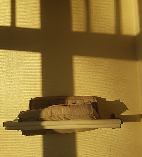
Product: Broome Street, Color: Yellow Glass
Product: Off Line, Color: Canary
Product: UR501, Color: Granite Gold
Product: norament grano
Product: Dappled Daylight from FLOR; Color: Marigold
3 responses to “Pantone Color of the Year 2021: Ultimate Gray and Illuminating”
May I know more ?
Nice colours
could you give me to product Interface Trapeze 50×50