For a guy like me who has teams of people working on two showrooms and a massive party venue, the Friday before NeoCon isn’t a good time for a boondoggle. That is unless the talented and convincing guys that produce the highly entertaining “Lunch and Learn” for Designer Pages call you to hang. Then it’s time to lean on your interns and turn the cell phone off.
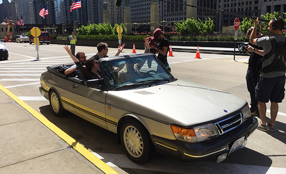
So, I agreed to be the non-thespian foil for their band of pseudo designer participants in a NeoCon-themed episode titled “NeoCon’d.” The set up was for me to play myself, the design guy from Interface, and tour the memorable, misfit band around Chicago, exposing them to some unique, inspirational venues. These would be places near to my eccentric, designer heart. Places that most out of town conventioneers wouldn’t know existed, and if they did, they’d only go there on a dare.
Consistent with the jag Interface has been on about the power of +Positive spaces, I noodled on a range of spots from the ridiculous to the sublime. The kind of joints that can shake the cobwebs loose in your noggin after you’ve been on back to back conference calls for the better part of a day. Our subtext for Interface’s product focus this year is creating flooring systems that can help designers create interiors that have variable, spatial moments that bring a full range of experience. Imagine your office legitimately surprising you, inspiring you and conversely calming you down just when you need it. I pondered the places I go to be as far from my regular inputs as possible. Inputs that can come romantically from nature or perversely from something you’ve found stuck on your shoe. Then, with three places in mind, we set off.
Tour Stop #1: The Odd
The first location on the tour was a crazy ass, retail emporium called Woolly Mammoth Antiques and Oddities.
Woolly Mammoth Antiques and Oddities
It was started in 2010 by a young couple who were inspired by a set of teeth that had been passed down to them. The shop has continued to collect medical oddities, preserved animal fetuses in jars, and other bizarre relics that now crowd every inch of shelf space. Countless bones and skulls are spread throughout the store, as well as biology manikins, outdated medical equipment and manuals, and copious amounts of strange taxidermy. The two-headed calf shares merchandising duties with an alligator that has been turned into a lamp with the bulb in its mouth.
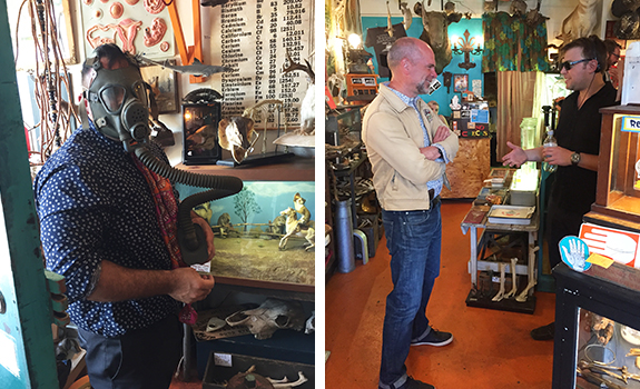
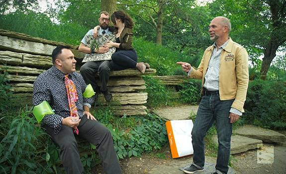
(Left) Actor Jamie Campbell examines the merchandise; (Right) Designer Pages CEO Jake Slevin gives Chip some pointers between takes.
Every inch is filled with interesting, one of a kind finds. Each solitary baby doll arm and vintage set of artificial eyeballs begs investigation and demands consideration. You become absorbed within the complexity of the goods presented, part of the composition, both staring and being stared at. Whatever was clogging your head is forgotten, giving you space for something new. Many an aspiring artist frequents this establishment for materials to use in their work, and original art by the owner is also available for sale. The Woolly Mammoth is a popular stop for Chicago locals who enjoy sifting through the overwhelming collection to unearth unique cultural fragments. The store even offers classes for anyone who wants to make taxidermy of their own, although philosophies on death are not included.
Tour Stop #2: The Peaceful
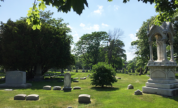
My tour group was just starting to breathe normally when we pulled up to the gates of our second stop, Graceland Cemetery. Though this choice seemed equally unorthodox at first glance and is full of the remains of dead people, it is a beautiful and serene oasis in the center of the city.
Graceland Cemetery
Founded in 1860, Graceland was a new type of cemetery. It wasn’t just a utilitarian place to bury the dead. Lush, sculptured, pastoral landscapes with sweeping vistas and carefully designed plantings create a park like atmosphere. The natural beauty surrounds grand mausoleums commissioned by wealthy patrons, designed by the best of the day. Many of the landscape designers and architects who shaped the cemetery are themselves buried there. This type of “rural cemetery” offers dignity to the dead and pleasure to their living visitors. So, many years later, the vibe is one of stepping into a textbook of the significant architecture and landscape design of the twentieth century. The bonus is your ability to talk to the authors, albeit it may be a one way conversation.
Graceland is sometimes called the “cemetery of architects” because so many esteemed members of the profession have been laid to rest here.
The list of significant contributors to modern architecture and design seems incomprehensible. Daniel Burnham, one of the city’s planners and head of the 1893 Columbian Exposition, is buried there on his own private island on Graceland’s placid lake. John Root and his partner William Holabird, Louis Sullivan, Ludwig Mies van der Rohe, David Adler, Bruce Graham (architect of the Willis (Sears) Tower), William Le Baron Jenney (father of the American skyscraper), Marion Mahoney-Griffin (one of the first female licensed architects in the world) and many others who designed the Chicago we know today can also be found here. The architects’ and designers’ graves reflect in one last expression the ethos of their lives and practices.
Additionally, there’s no end to the names of famous Chicagoans that you’d recognize as you walk amongst the monuments, like Goodman, Palmer, Getty, Marshall Field, McCormick, Pullman, Wacker, the Cubs’ great Ernie Banks, Jack Johnson, and Medill, just to name a few. Their tombs and mausoleums range from magnificent opulence to surprising simplicity, and there’s plenty to explore away from the much-visited graves of the famous. Louis Sullivan’s design for Carrie Eliza Getty’s tomb has been called “the beginning of modern architecture in America.” It’s a testament not only to Sullivan’s imagination, but also to the way that such an environment can accommodate and even inspire a design that forever altered the world of architecture.
Perhaps the best thing about Graceland is that it’s just what a cemetery should be: peaceful, contemplative and rich in spirit.
Tour Stop #3: The Sublime
When we turned into the parking lot of the Lincoln Park Zoo at Fullerton and the Lake, my co-conspirators thought they were going to hang out with the gorillas. But I had something much more sublime in mind.
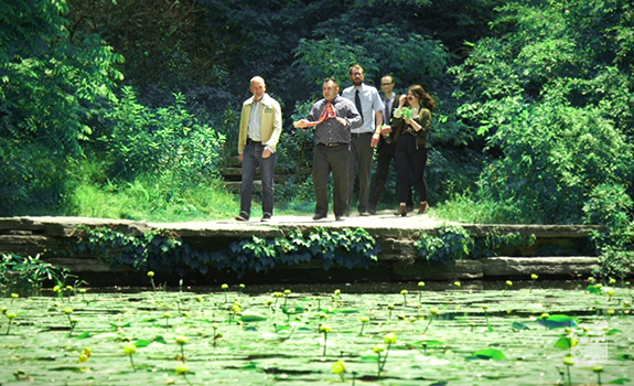
The lily pond is an example of transcendent space. It’s difficult not to sit down, slow your breathing and take time.
Leaving the busloads of kids and the din of expressway speed traffic on Lake Shore Drive, we passed through a Prairie School style gate into an overlooked garden of unmatched beauty. Magically, only bird songs and the sound of a gentle waterfall break the restful silence. Interestingly, this pond is on the migratory path of over 5,000 songbirds. Follow the limestone walk encircling the lily pool and discover a pavilion, council ring, and diverse native plantings. This is the vision of landscape architect Alfred Caldwell: a hidden garden for the people of Chicago designed to resemble a river meandering through a great Midwestern prairie.
The Alfred Caldwell Lily Pool
The site of the Alfred Caldwell Lily Pool was originally part of a Victorian garden built in 1889 that displayed tropical lilies and other aquatic plants. When the Victorian-style garden fell out of popularity, the hour-glass shaped pond and its environs had fallen into ruin and disrepair. the Lily Pool fell into disrepair until 1936 when Alfred Caldwell redesigned the pool and its surrounding area. By the 1930s Landscape architect Alfred Caldwell was hired by the Works Progress Administration to completely redesign this area of Lincoln Park. Caldwell realized that the Lily Pool presented him with the unique opportunity to realize his poetic symbolism and design theories and philosophies.
Small in scale, it was designed to bring the Midwestern prairie natural planting vocabulary to a lily pond. Niagra limestone lines the walk, and once you stop and view the pond, depending upon where you are standing, you may view it as a running brook or as a pond. The stunning, small, pergola-like buildings in Prairie style are often mistaken as a work of Caldwell’s friend Frank Lloyd Wright.
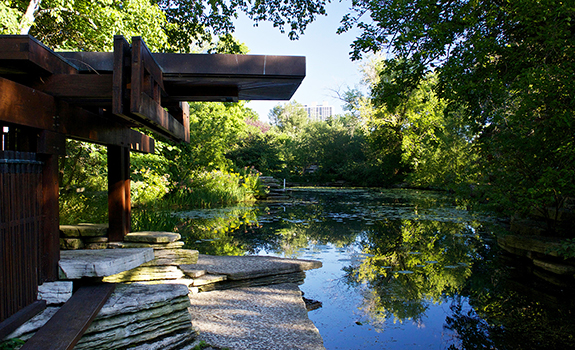
The small, pergola-like buildings are often mistaken as a work of Caldwell’s friend Frank Lloyd Wright.
In 1938 the project was nearing completion and the park district decide to cut a major expenditure for wildflower plantings. Caldwell cashed in his $5000 life insurance policy for $250, bought thousands of plants and transported them from Sauk County, Wisconsin. The next day he planted them all around the lily pools with the help of four others.
Ironically, the history of the pond and the small park that surrounds it has had cycles of decay and rebirth, not unlike the prairie that it attempts to emulate. In the early 1950s, the pool was transformed into a water exhibit featuring exotic birds and water fowl and came to be known as The Rookery. Overgrazing by zoo birds had a devastating effect on the lily pond. A lack of landscaping management (allowing invasive plants and “weed” trees to take over the understory), heavy human foot traffic, uncontrolled erosion and the introduction of plant materials that were invasive to the existing lilies substantially damaged the garden. In 1997, the Chicago Park District, with the help of private donations, created a Master Plan to restore Caldwell’s historic landscape and improve accessibility.
The lily pond is an example of transcendent space. It’s difficult not to sit down, slow your breathing and take time. My message to my band of design padawans was that the job of designers is to create spaces that engage and enrich the user. Not in a specific, linear, programmed way, but rather by giving people the opportunity to experience the ridiculous to the sublime in their every day. To mimic the magic, wonder and even fear we experienced in both the designed and organic environments we sampled on our travels is to create enriching, positive spaces.
For inspiration with a side of laughs, watch our episode Neocon episode of “Lunch and Learn.”
One response to “Shake the Cobwebs Loose: A Design Tour of Chicago”
Dear Chip:
WHY?
Class of ’98
Thanks for the Chicago insight!