When travelling at home or abroad, I’m often struck by that first moment of stepping into a hospitality space. Where am I, what’s on offer, where next? With an abundance of choice, this can be overwhelming and disorientating in unfamiliar territory. You might be meeting someone in the lobby, heading to the restaurant, winding down in the lounge, or going straight up to your room. All too frequently, these spaces are designed as a first impression to excite, but with little thought into creating a sense of calm following an often-exhausting day or journey.
The reason hotels have such a diverse range of spaces is due to the wide array of needs of different guests. If designed well, all atmospheres and desired moods can be catered for within a short distance from one another. Whilst implementing a number of the key Biophilic Design patterns – such as prospect, refuge, natural light, acoustics and access to greenery – can dramatically help with this, I’d like to investigate the essential role that colour has to play in improving guest experience.
The ‘ecological valence theory’ proposes that certain colours evoke emotional states, stemming from our evolution and personal experiences in nature. Our emotional response to colours in nature can be recreated in the built environment. The carefully considered use of colour can have such an immediate impact on a space and those who use it, supporting choice, orientation, and creation of atmosphere, yet it is often underutilised. So, how can we use colour in a way that enhances the myriad of hospitality activities and appeals to the varied clientele, to create a positive human-centred experience rather than an expression of brand identity?
Navigating through the space
Let’s follow a typical journey; upon entry, we would like the lobby and entrance to be welcoming. Brighter colours such as yellows and whites remind us of the warmth of summer sunshine and flowers. They add a lightness to the space and evoke feelings of sociability and happiness – a perfect first impression that invites guests to explore further.
Now, if we’re thinking about heading to a café or restaurant, this would ordinarily be buzzy and energising. Reds and oranges remind us of ripe fruits and berries; this promise of nutrition – added as pops of colour around the space – can enliven the senses.
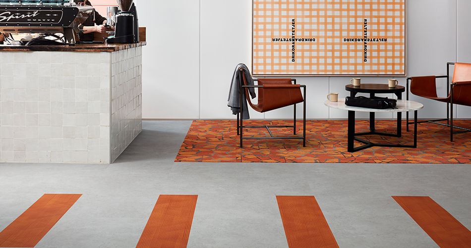
Using orange accents to energise in a hotel cafe. Products: Level Set – Light Concrete, Drawn Lines – Amber, Human Connections Rue – Orange
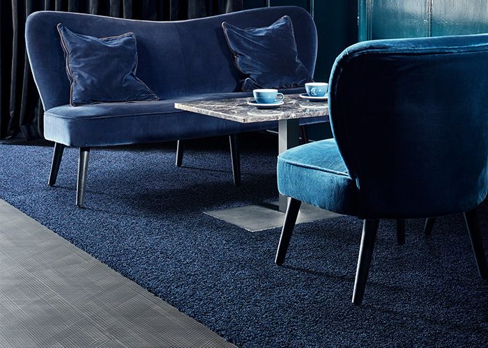
If we simply want to decompress and unwind in the bar or lounge area, a more sophisticated and soothing atmosphere would be ideal; think deeper, darker, richer shades of colours such as purples and blues to create a relaxing feel, reminiscent of summer dusk and warm evenings. The lighting in here is usually warmer and softer, so consider how this interacts with the colours you use. Why not test different shades out over a 24-hour period to see how the colour changes with natural light throughout the day before fully committing; if the walls, floors, furniture and furnishings are all too dark, you risk the space feeling small and oppressive rather than safe and warm.
The use of darker shades to create a relaxing, cosy feel to the lounge area in a hotel. Products: Drawn Lines – Onyx, HN830 – Cobalt
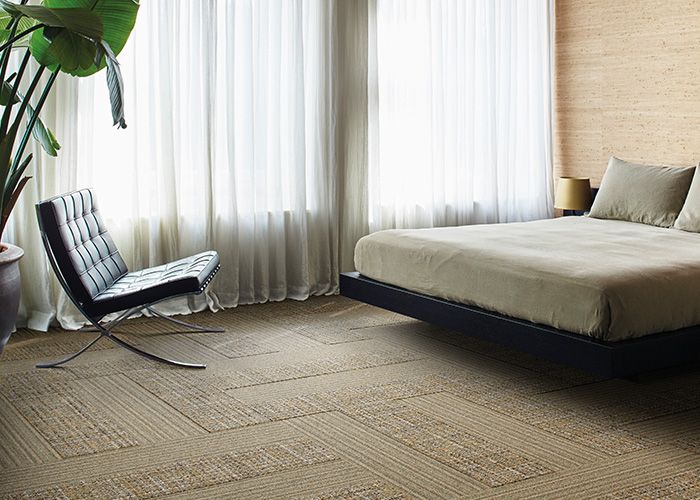
Natural light bringing a warm feel to a neutral space. Products: Level Set – Antique Light Oak, Dark Oak, WW890 – Natural Dobby
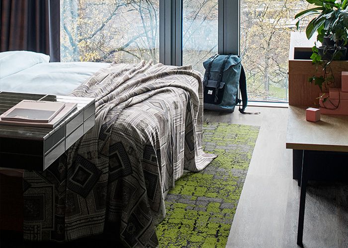
Finally, it’s time to go up to your room. Here, we want the space to feel clean, uncluttered, and relaxing. This means there shouldn’t be too much going on; yes, we want plenty of natural light to stimulate the senses in the morning, however other than this, with guest wellbeing in mind we would recommend keeping the colour palette calm and neutral. Soft blues and greens are associated with the water and vegetation of healthy landscapes, which – from an evolutionary standpoint – would have made us feel comforted and calm through the suggestion of survival. Adding these into the flooring, furnishings, or sections of walls can add character to the room without overwhelming the senses.
Adding character to the room with greens to complement the natural light. Products: Level Set – Grey Dune, Human Connections – Moss, Flint Moss
A neutral palette helps bring comfort and calm to the room. Products: WW865 – Dale Warp, WW895 – Dale Weave
Colour in hospitality
A further thought for using colour in hotels would be to take inspiration from the local ecology and surrounding nature. The colour palettes that reflect local stone, timber and vegetation can all be brought in to aid placemaking and help guests to reorientate as they arrive at a new destination. You can also use colours to aid wayfinding around the hotel. For instance, choosing a particular colour scheme for each floor’s corridor can help guests locate their rooms. You could even incorporate these ideas into one and use different areas of surrounding nature to inspire the design scheme of each floor.
Hopefully we have given you plenty to think about here! Next, we will apply the same thinking to both working and educational environments, so ‘watch this space’ for more on how to tailor the use of colour effectively to different sectors.