Over the years, Pantone’s Colour of the Year has reflected a cultural alignment with a specific colour’s meaning. Every year is pivotal, but the significance of 2017 lingers as we open 2018 with new intentions.
Ultra Violet is a unique selection from the Pantone Colour Institute. It’s a manifestation of cultural, political and social elements rather than a forecast of design trends for the year to come. Translation: the overall impression of a colour and its multitude of interpretations has a far greater impact on the world of design than who wore it best.
2018 is trending toward individual and collective awareness that will lead to an optimistic blending of ideologies. The selection of a brightly saturated secondary colour feels apropos. Ultra Violet is a naturally hopeful colour, but more intriguingly, it represents mystery, creativity and spirituality. All these subjects are appropriately tied to 2018 forecasts – we divulge our most intimate details through technology at the same time we search for greater spiritual connection with nature.
A Sign of The Times
Our culture is focused on connectedness, brought on by the rapid maturity of technology and its implied freedom at our fingertips. With these advancements in tech, we find ourselves on the brink of explosions in creativity, imagination and spirituality.
In this age of information, we have all become seekers. We seek independence. We seek power. We seek asylum. We seek balance. The role of the seeker is both vulnerable and empowering, but at its core, it reflects an openness to possibility and a resolve to move forward in the face of difficulty.
The luminous quality of Ultra Violet mimics the glow from our devices, taking us to other realms while simultaneously imitating the vast cosmos. It has us contemplating the mystical nature of our own world. It’s a dichotomy unique to our time: As we fall deeper into an intimately tangible bond with our personal technologies, we find ourselves pulling just as strongly in the opposite direction toward the embrace of nature and its simplified wonders. A subtle balance between vision and introspection emerges.
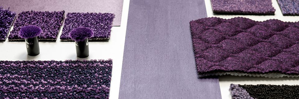
Composing With Ultra Violet
Consider variations of Ultra Violet by shifting depths of shade and tone to form new distinctions within the same colour family. This approach can drastically alter its impression within a space and help you find unexpected ways of incorporating violet.
For instance, you can blend inky violets with deep indigo blues, rich browns and dark emerald to create moody, lush palettes. Complement this with organic textures of plush velvets and glossy lacquers to create captivating spaces that offer moments for mysterious discovery.
Product shown: Composure
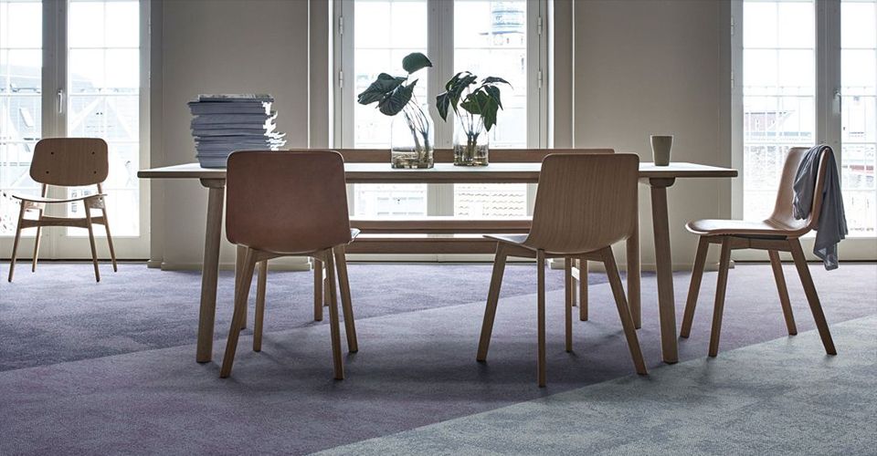
Or, you could opt for lighter and more modern colour harmonies by pairing lavender with natural mineral tones of lapis, terra cotta and rust with chalky and matte finishes. These softened pastels pair down the noise from innate overstimulation and distraction to create subdued and soothing interiors with a focus on spaces for mindfulness and creativity.
Take Ultra Violet on a journey through the spectrum, ranging from deeply saturated to pale and airy. Or, view it as a reminder of what is yet to come. Best used by 2018.