Colour choice can evoke mood, communicate subtle messages – even boost productivity. Where warm colours excite and cooler hues are calming, neutrals can provide a canvas for either, giving designers a wide array of options.
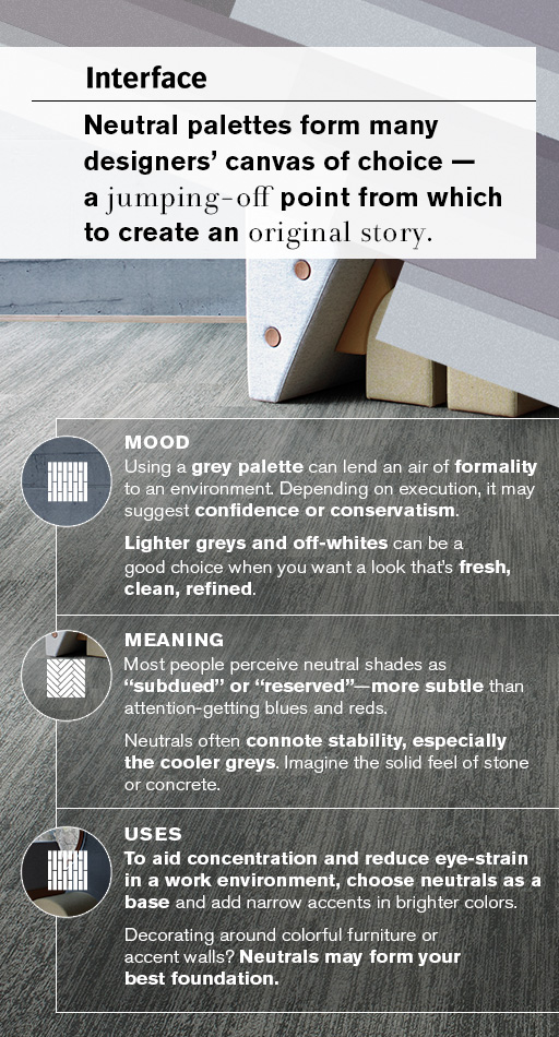
Meaning
Most people perceive neutral shades as “subdued” or “reserved”– more subtle than attention-getting blues and reds. Neutrals often connote stability, especially the cooler greys. Imagine the solid feel of stone or concrete. Depending on what’s around them, some neutrals (like beige) are chameleons, taking on characteristics of neighbouring warm or cool colours.
Follow Interface’s board Colour | Warm Neutral on Pinterest.
Mood
Neutral colours evoke different types of moods. Using a grey palette can lend an air of formality to an environment. Depending on execution, it may suggest confidence or conservatism. Lighter greys and off-whites can be a good choice when you want a look that’s fresh, clean, refined. If a calm, relaxed vibe is desired, neutrals with warmer hints from the orange or yellow family may do the trick. At the cool end of the spectrum, notes of blue add an air of elegance, especially the darker hues.
Uses
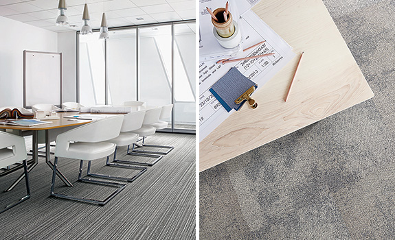
To aid concentration and reduce eye-strain in a work environment, choose neutrals as a base and add narrow accents in brighter colours. Use neutrals as the foundation when designing around colourful furniture or accent walls. Neutrals in the darker grey family can form a sophisticated backdrop if not overused. Mood-lighteners may include whites, warm hues or both. Warmer-temperature neutrals (taupe, ecru) impart the organic feel of the natural world. Use them to instill a space with calm and quietude.
Use neutrals to instill a space with calm and quietude.
Palette
The neutral colour trend shown in this palette is calming and peaceful. Shades are chalky and light in texture, creating a watercolour effect and resulting in colours blending and merging together. Neutral colors may be used in a tonal manor. In commercial spaces, neutrals can flood fill or zone off particular areas.
