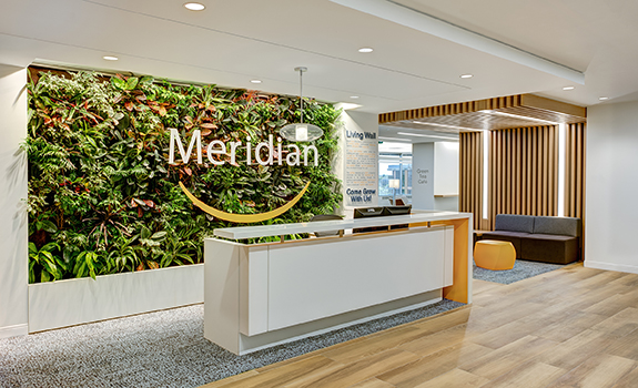
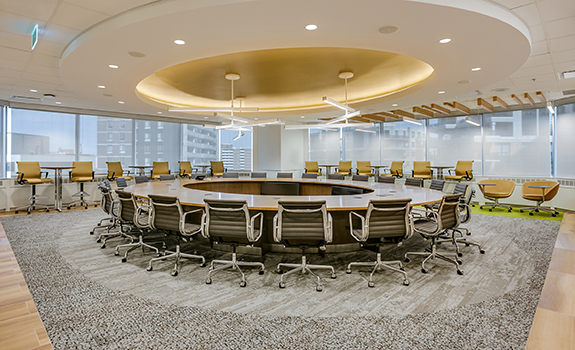
In the relocation of its Toronto corporate office, Meridian Credit Union’s transition team worked closely with designers Bullock + Wood and Interface to craft new offices that emphasise and support the well-being of its employees.
As Ontario’s largest credit union, Meridian knows well what it takes to help its members grow. And in the process of supporting more than a quarter of a million people enriching their lives and their businesses from Windsor to Ottawa, the community-centric credit union has also grown and now employs more than 1,500 people in several branches and various commercial and corporate offices throughout the region.
Envisioning a new space
When the employees who worked at its Toronto-based corporate office began to outgrow their space in a building in the downtown core several years ago, Meridian applied the same business ethos it relies on to support its members as the driving force behind the design of a new office environment that would reinforce the well-being of its employees and help them to function effectively.

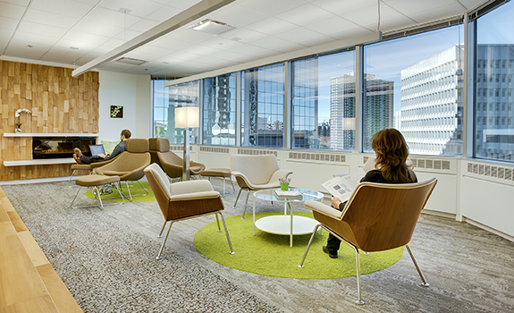
The Meridian team chose a mix of nature-inspired Interface carpet tile as the launching point for the entire design of the office space.
“As we undertook a location search five years ago, we made the decision that moving out of the core was more aligned with who we were as a community credit union,” says Sandy Brown, vice president of real estate and property management for Meridian.
As a result, the company relocated this corporate office to suburban Toronto West to be closer to the community it serves as well as to its sister corporate office in St. Catharines. “Our functional goals included creating an environment that linked to our evolving business, supporting our employees’ well-being from a social and physical perspective, and reflecting our leadership and cultural values,” says Claudine Chess, senior human resources business partner for Meridian.
An office with a view
Among the plus points of the new light-filled 33,000-square-foot space the company chose for the 150 Toronto corporate office employees were expansive views of the nearby surroundings, including greenery, Lake Ontario, and the Toronto skyline in the distance. Situated on the 6th and 7th floors of a 1980s LEED Gold certified building, the offices were also in a place where Meridian “could stake claim” says Chess, noting that “Meridian was founded on the idea of neighborhood banking” and the new setting would allow easy access to the people who lived in condos or worked in small businesses or for commercial developers nearby.
Purposeful design
Recognising that the extended commute to the new office setting would likely meet with resistance among many of the employees, the transition team involved in spearheading the design of the new offices was keen on creating spaces that would inspire a sense of comfort and well-being for the employees—especially those who would have to travel an hour or more to get to work. So designing an appealing environment with varied spaces and tools to ease various work-related tasks was critical.
“We wanted them to have choices with equipment like headsets or sit-stand workstations, because in today’s work environment sitting is thought of as the new smoking and we wanted employee well-being to be front and center,” says Chess.
Since many of the company’s mobile workers often work from home as well as the office, they also wanted to include characteristics that would echo a home environment. “From a wellness perspective we relied on an analogy to inform the design, which offered a choice of spaces that you’d intuitively use for different kinds of tasks in a home,” says Chess. “A dining table for concentrated work, for example, or a comfortable chair for reflective reading, or room to pace around during a conference call.”

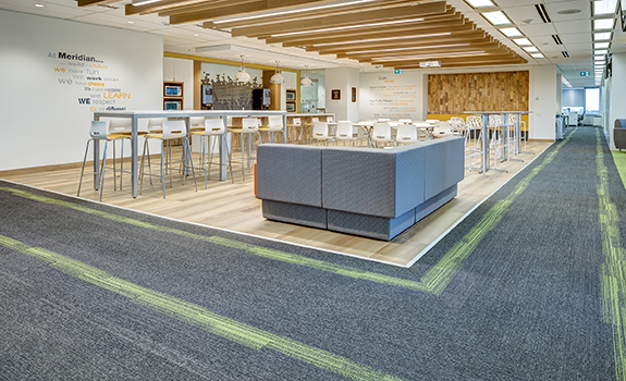
Employees are encouraged to walk the “Meridian Mile,” outlined throughout the office by Interface Off Line carpet tile.
Well-being and biophilic design
Another essential ingredient for the team, who worked with Toronto-based interior designers Bullock + Associates on the design of the new offices, was to support a sense of well-being by embracing the uplifting influence of nature beyond the light, greenery, and inspiring views. Interestingly, the team had been introduced to Interface products and the underlying point of view that drives its designs, and they chose to rely on a mix of its nature-inspired carpets as the launching point for the entire design of the office space.
“Early on in the design phase we were presented with Interface’s Human Nature™ collection of products and we fell in love with the sustainability story behind the line and used it to inspire the look of our whole office,” says Brown. “We also saw it as an opportunity to demonstrate our commitment to communities,” adds Sarah Rea, Meridian’s senior manager of corporate social responsibility, noting that the building’s LEED Gold environmental standard and the materials choices in the office align to the goals the company aims to achieve..

