2017 is finally here and with it comes the long anticipated opportunity to turn over a new leaf. In keeping with traditions it is also the time to celebrate Pantone’s 2017 Colour of the Year, Greenery.
Throughout all seasons, Greenery is a reminder of vitality and prosperity; youthfulness and energy.
Greenery hinges on the development of well being and self care trends that have been rising to the forefront of our minds while we contemplate the differences between health and healing, the group and the individual.
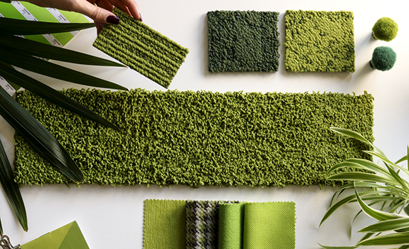
Shades of green are ubiquitous in nature. You can find Greenery nestled as a pop of colour among soft pastels or paired with bolder shades of jewel toned orchids in an effort to transition us out of Winter. Root Greenery with deep mineral and rust tones for the perfect earthly balance and blur man made versus nature made by bringing the outdoors inside.

Ultimately, Greenery is about embracing our inherent connection to nature and the beneficial qualities that we absorb when surrounded by it. So as we transition and grow into 2017, remember to breathe deeply, enjoy matcha lattes and sliced avocados, barefoot walks along moss covered trails and cultivate some greenery in that urban apartment of yours.
Check out our Green Pinterest board below. Until next year my colour loving friends.