A feast for the senses, one of the biggest events on the interiors calendar returned last month for its annual celebration of design.
Taking place from 18 to 23 April, Milan Design Week (MDW) saw no fewer than 262,608 visitors (from 173 countries!) pass through its doors – and here in the second part of our two-blog series, we’re sharing with you our team’s key insights from the event.
If you haven’t already, read our thoughts on the patterns taking over MDW, but for now, let’s discover what our team made of the colour trends on display.
Sorbet Colours Have a Moment
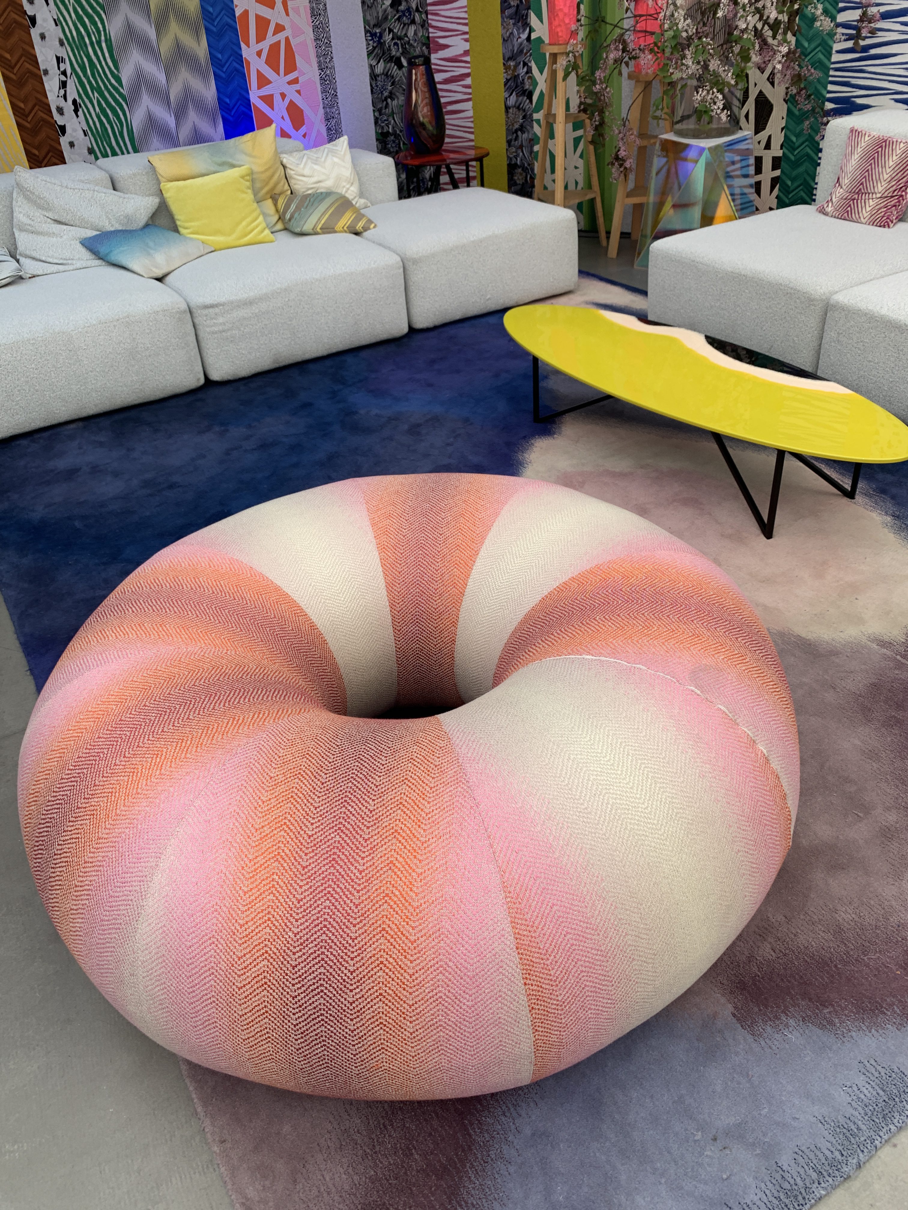
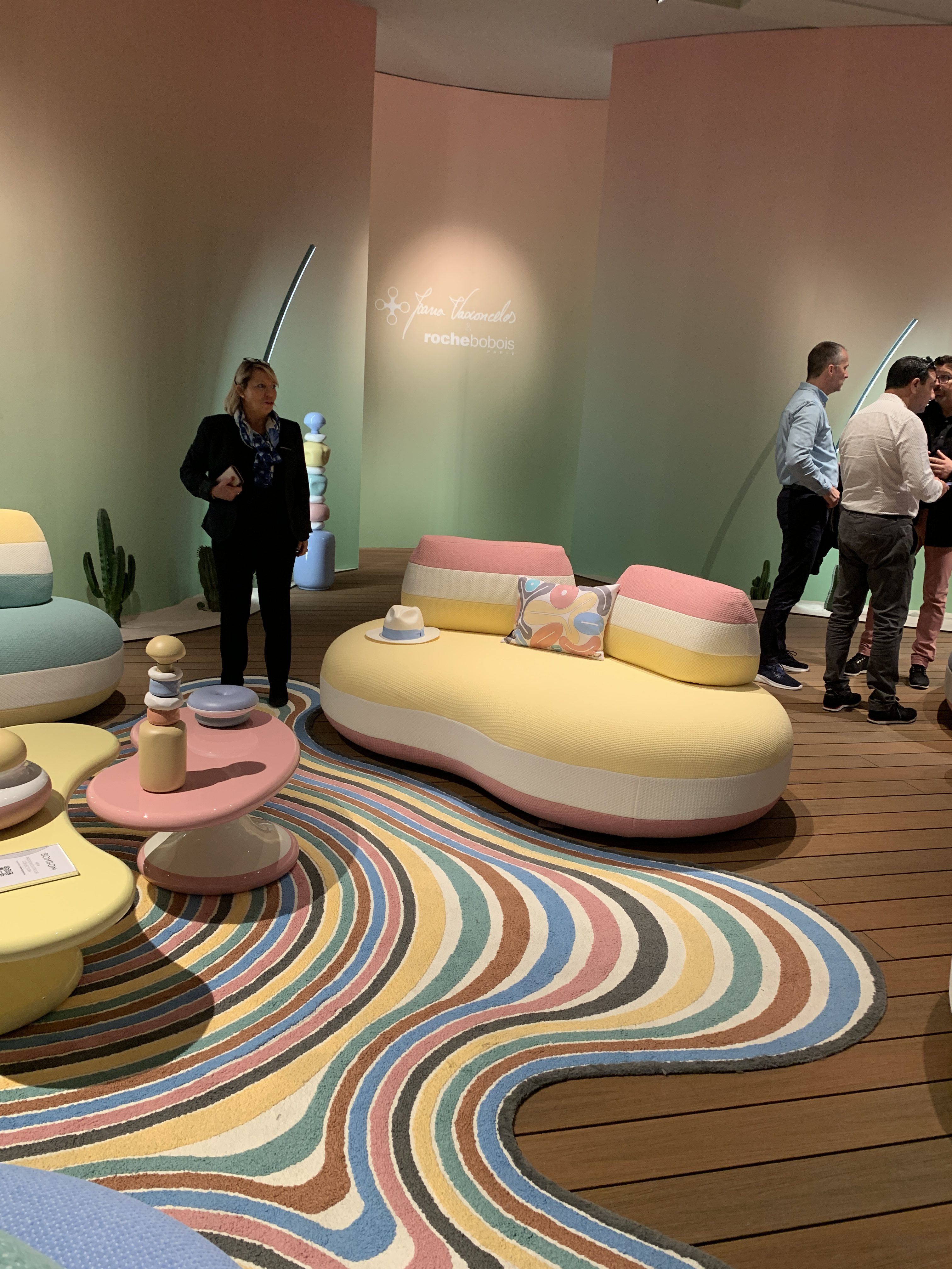
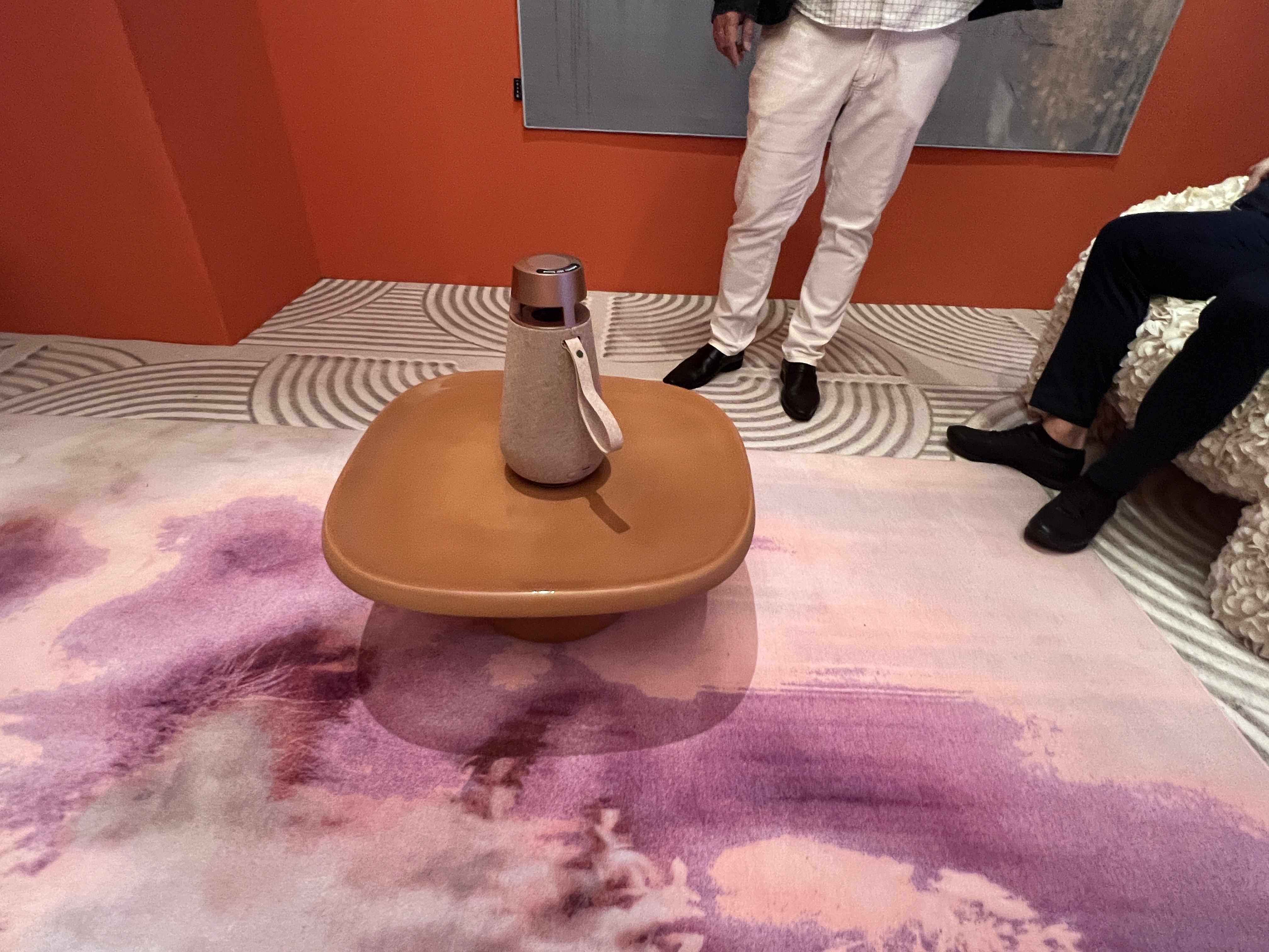
From Marshmallow for Roche Bobois and Citrus for Muuto, Mathieu Paton, Interface Concept Design Team Leader says a delicious array of ‘sorbet’ shades were showcased at MDW, with the emphasis on ‘pastel and accent colours’. Other companies showcasing all things sorbet were Missoni, and Mydriaz, amongst others.
In previous years, neutral tones and earthy shades like green were doing the rounds, but since the pandemic, Flavia says there has been a move towards making the most of both exterior and interior areas.
Missoni at Milan Design Week 2023
Blå Station at Milan Design Week 2023
Kvadrat at Milan Design Week 2023
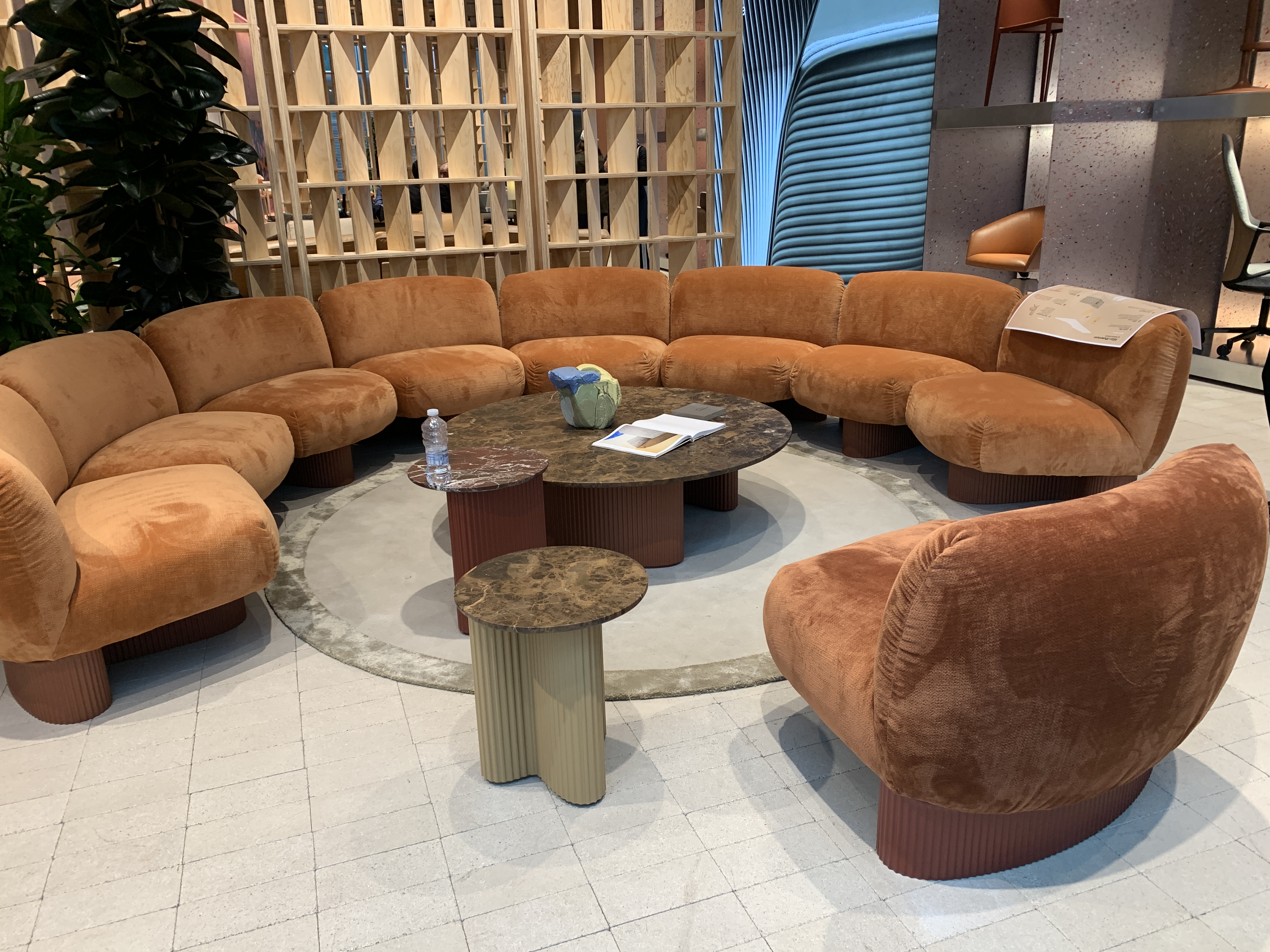
Roche Bobois at Milan Design Week 2023
Kartell at Milan Design Week 2023

Monochromatic Pieces Vs Neon Colour Palettes
While taking in the event – both in its main hub and in several areas dotted throughout the city – Katherine Cohen, Interface Associate Creative Director, Americas, noted the prominence of ‘monochromatic’ pieces.
“It [the trend] was everywhere, from the walls, to the floors…and the furniture!” she said. “For example, [pieces showcased] varying shades of one colour – such as yellows or browns. It’s a really big trend currently.”
Neon colour palettes on otherwise-unexpected surfaces were also championed, says Katherine. Eye-catching shades like neon green were painted on pieces crafted from wood to create an interesting juxtaposition.
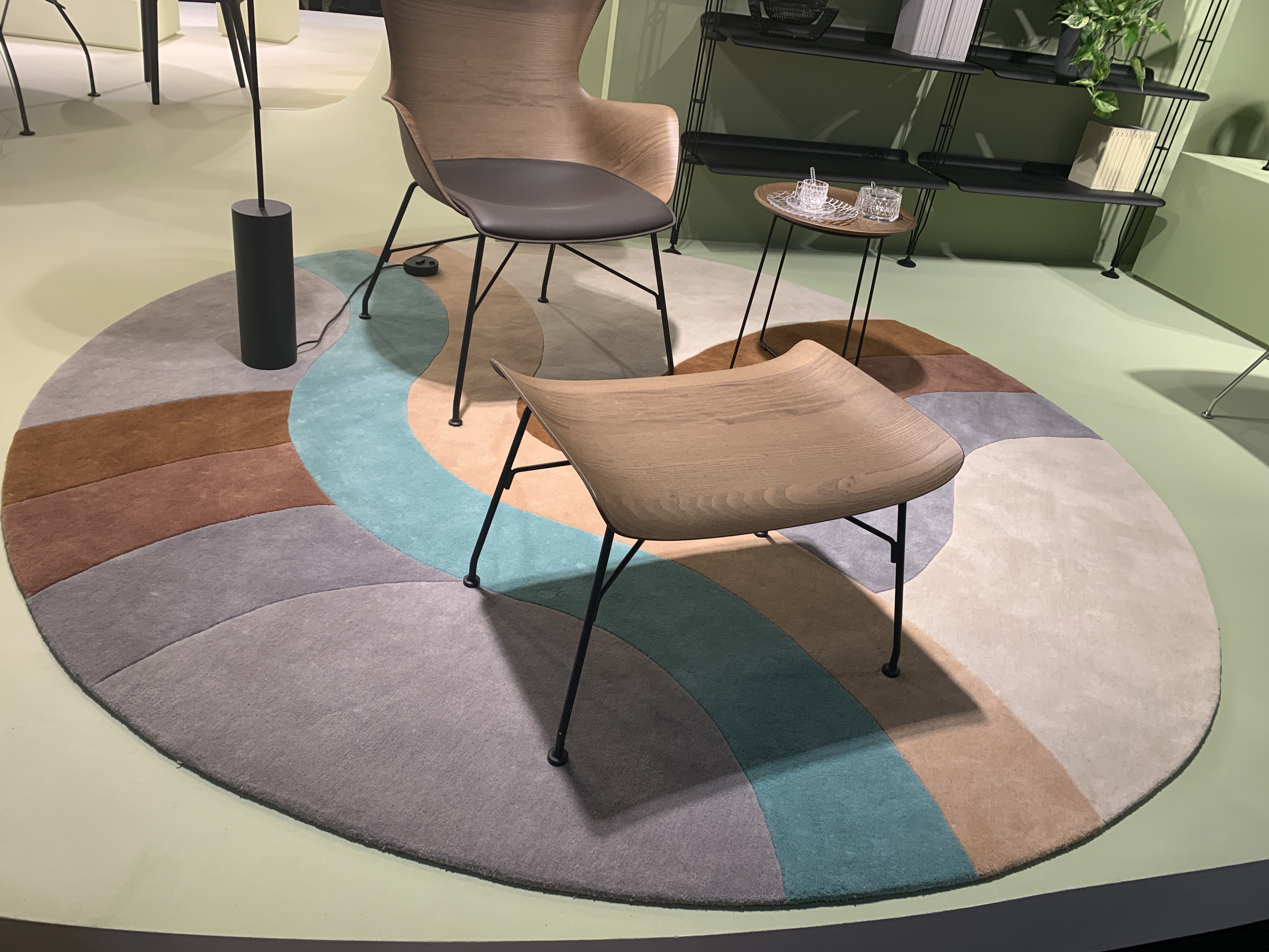
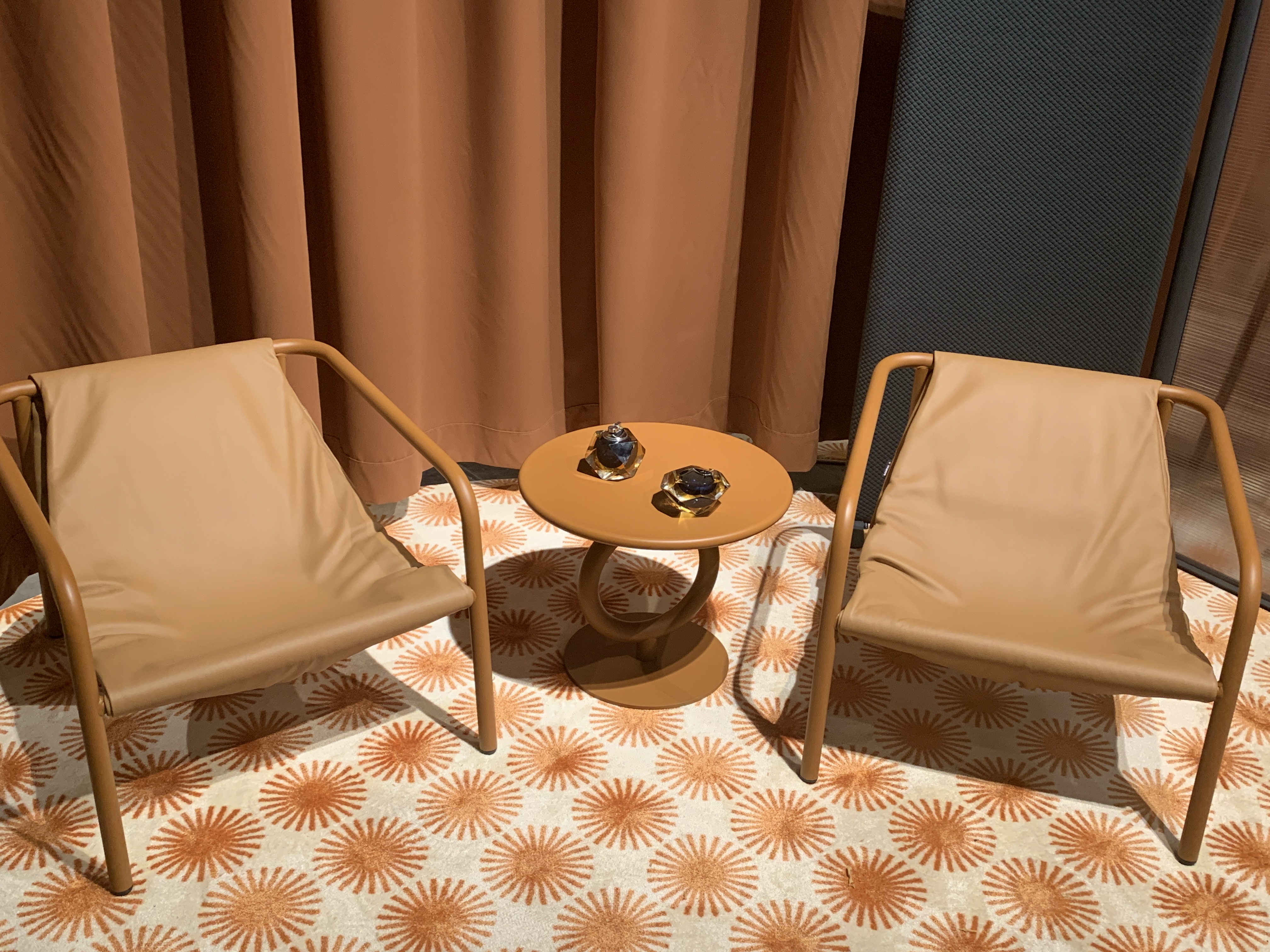
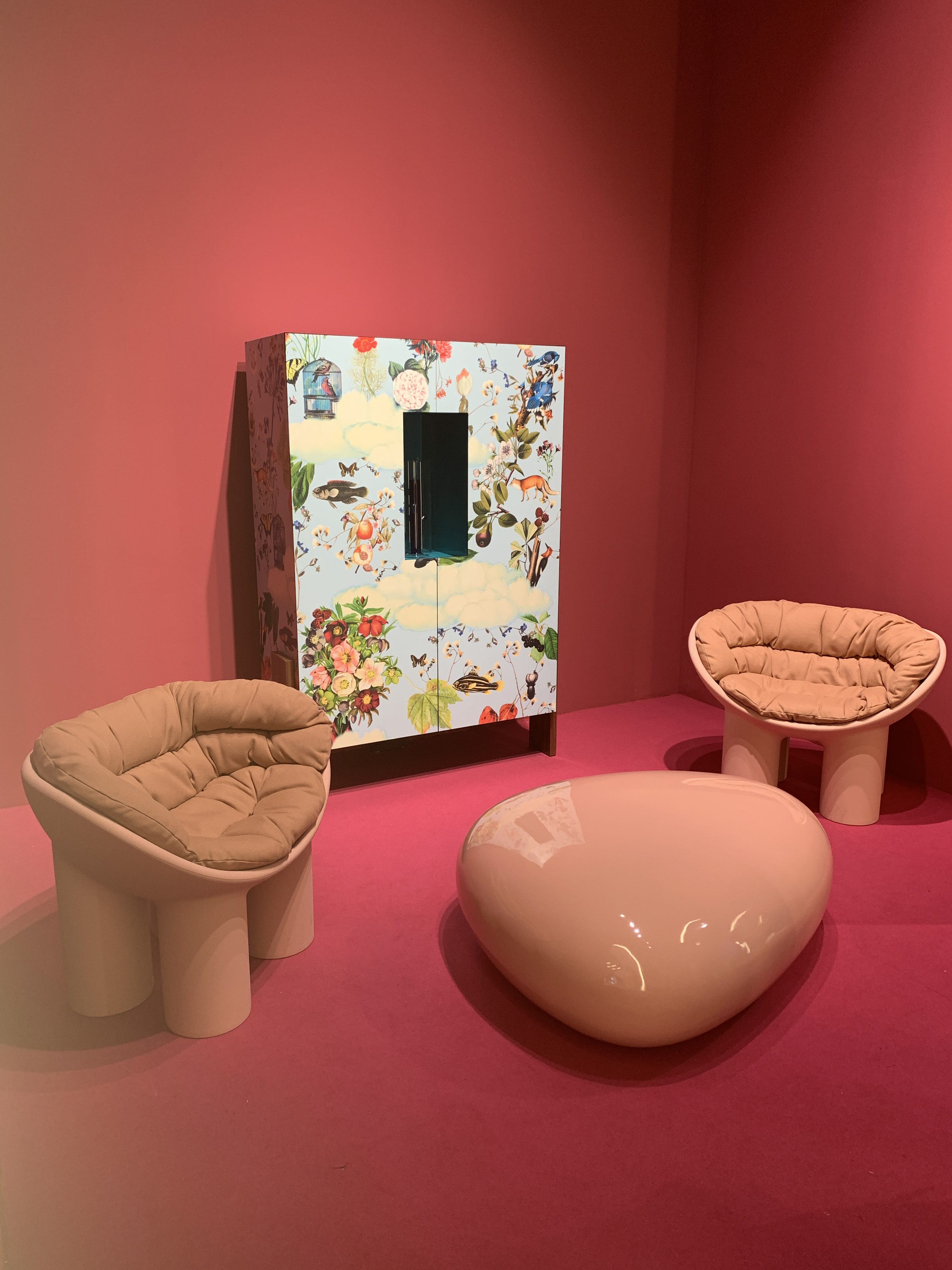
Warm Neutrals
Displayed amongst textures including boucle and cane, warm neutrals are still making waves in interiors.
“They [neutrals] certainly aren’t going away in upholstery.” says Katherine. “Cane-style furniture brings the outdoors in, too.”, she adds, saying one big trend she noted was a move towards pieces that looked like they could work just as well in a garden or yard as they would in an office, thereby ‘blurring the lines’ between interiors and exterior design.
Andreu-World at Milan Design Week 2023
Atelier_Vierkant at Milan Design Week 2023
Golran at Milan Design Week 2023
Loewe at Milan Design Week 2023
Sancal at Milan Design Week 2023
Ceramiche Coem at Milan Design Week 2023
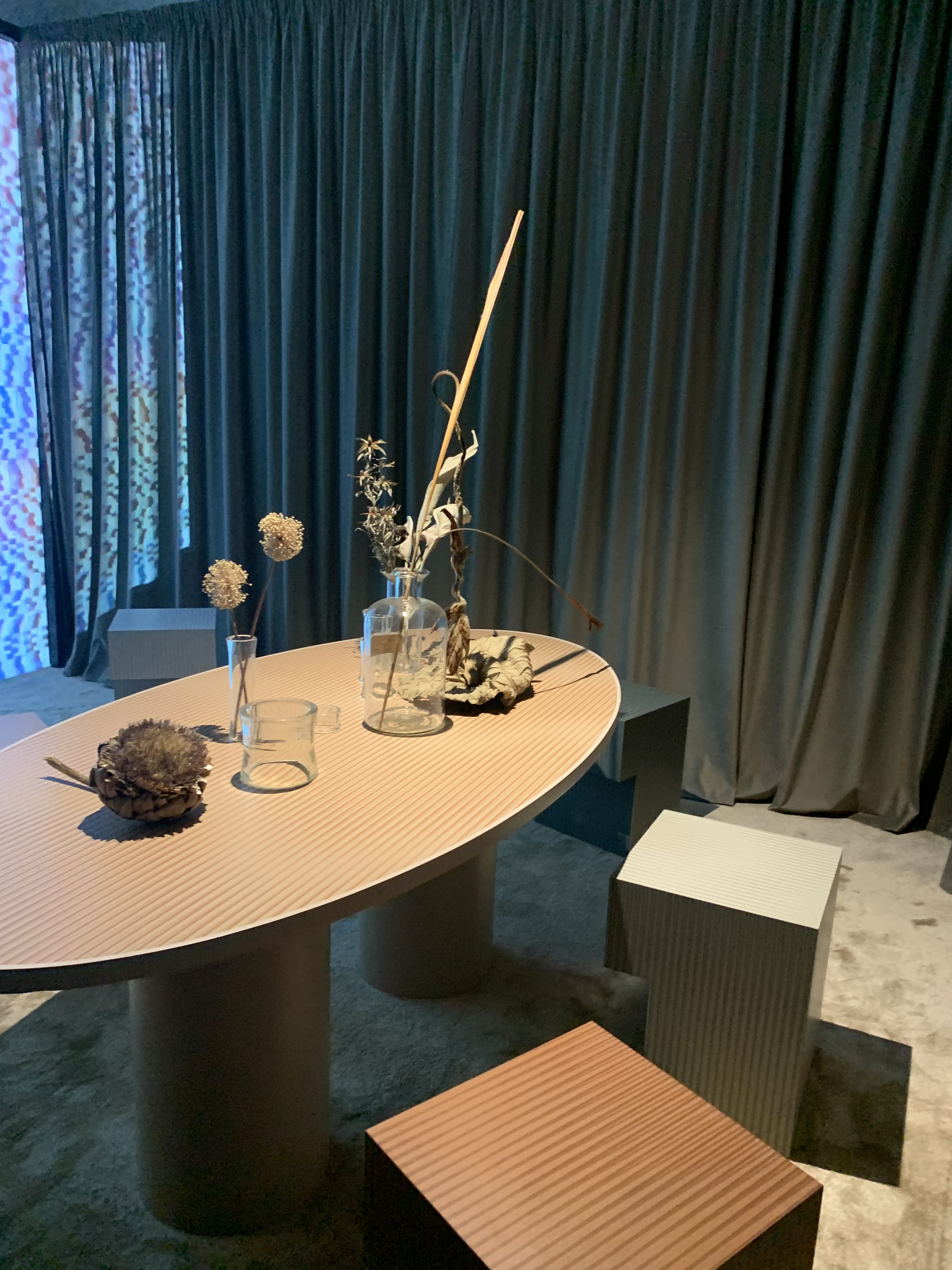
‘Ombre Airbrush’, ‘Rust Salmon’ and Wine/Burgundy Colourways
Another big trend on the horizon is ‘Ombre Airbrush’, which combined pastel colours in rainbow palettes and was seen, says Katherine, across furniture, rugs, and paint.
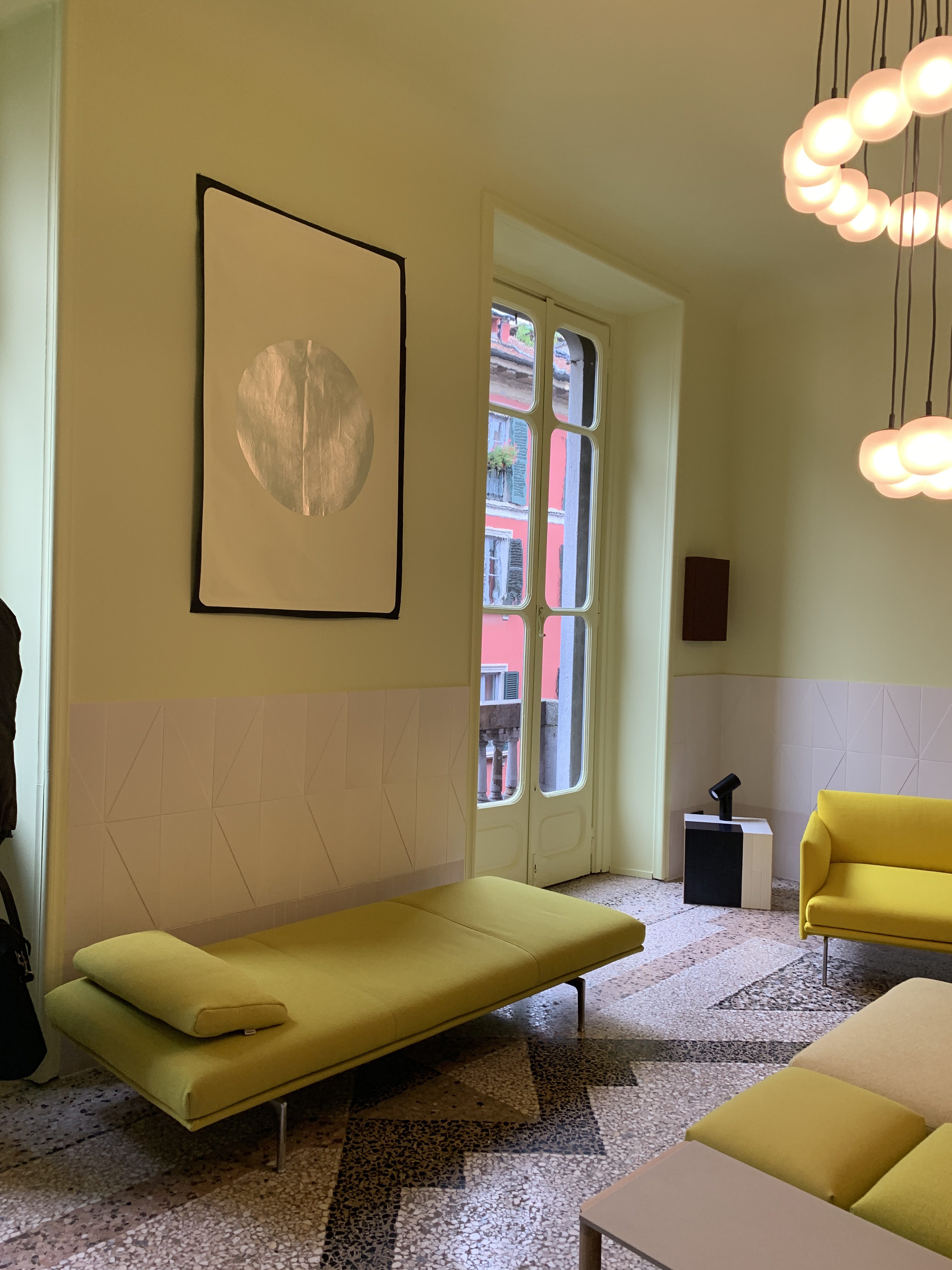
Sophisticated Pastels and Mellow Yellow
Alongside ‘Airbrush Ombre, ‘Sophisticated Pastels’ brought together a gorgeous array of powdery blue and purple shades, for example, but combined with ‘a more sophisticated and a little less sweet’ colour – like ‘grounding grey’ or mauve, with lilac or pastel pink.
Mellow Yellow continues to gather pace too, says Katherine, with plenty of stands presenting pieces featuring bright and cheery colour palettes.
H+O at Milan Design Week 2023
Driade at Milan Design Week 2023
Moooi at Milan Design Week 2023
Driade at Milan Design Week 2023
Multicoloured Archways
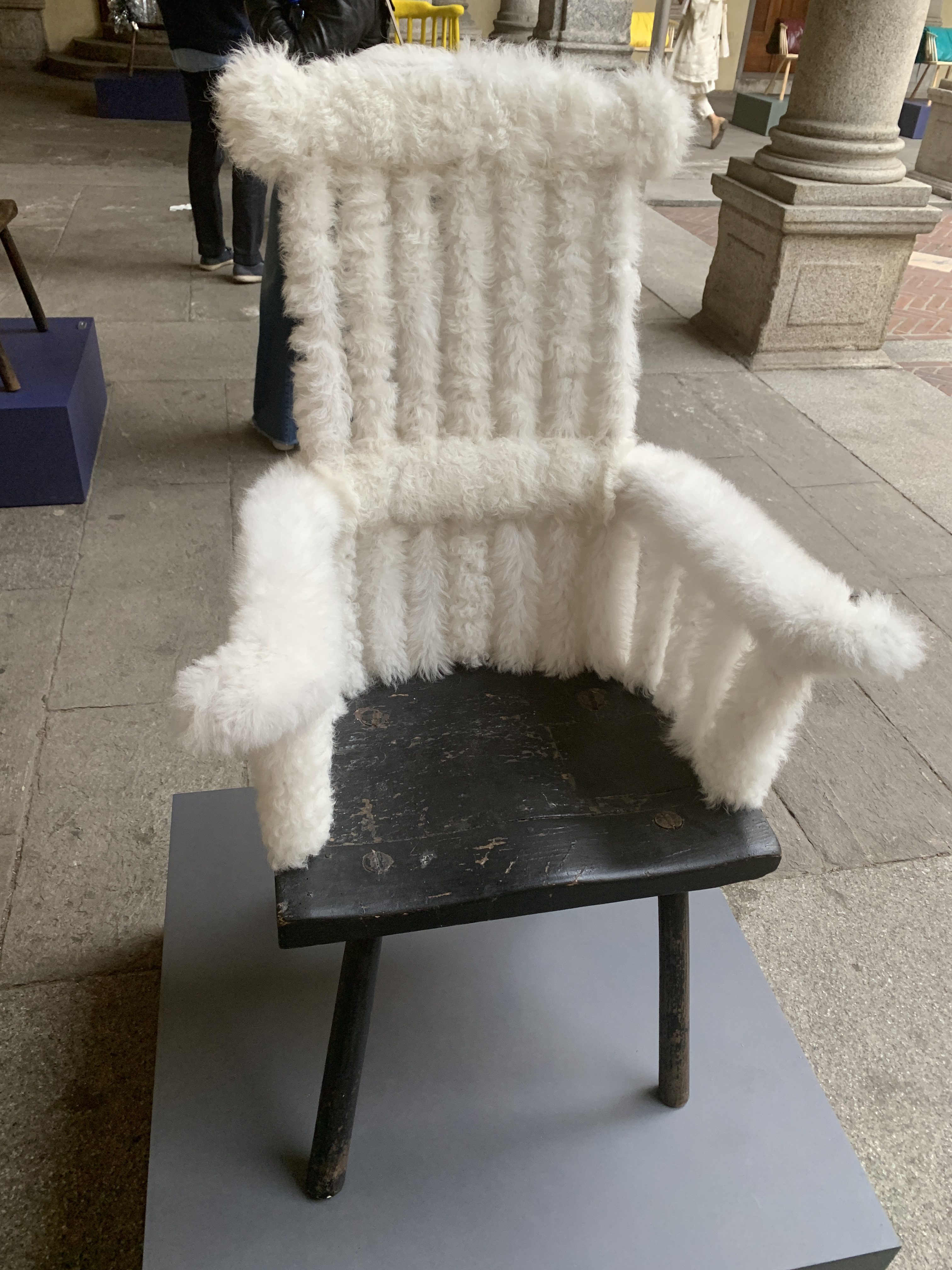
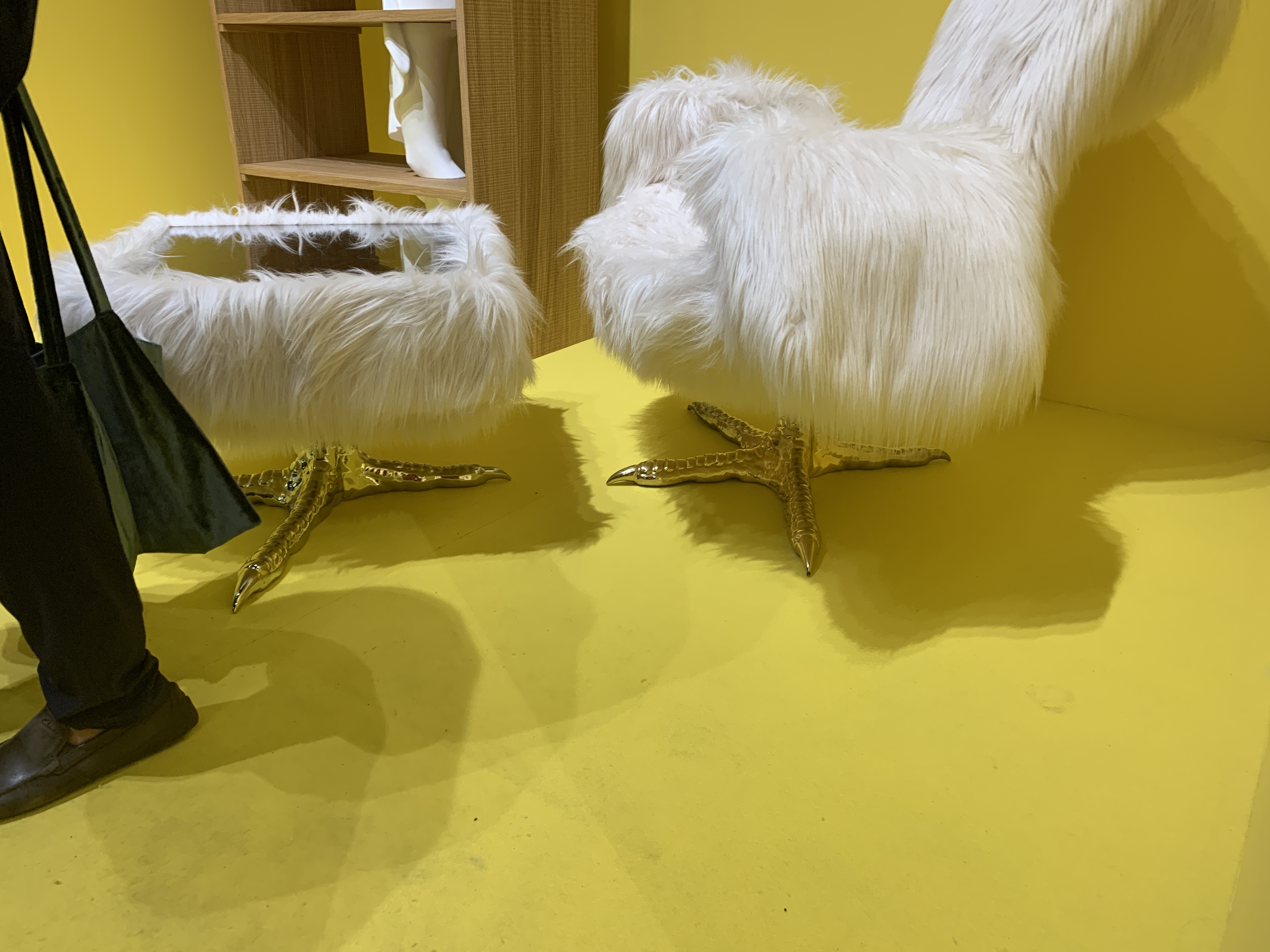
We noted some key trends at the event, including earthy textures and geometric shapes for atelierliervierkant, and ‘playful, animate-inspired’ and fluffy, ‘animal-inspired’ chairs for driade.
Focusing on colour, primary brights were the order of the day for driade. The company also utilised another key trend (curved structures and designs), via multicoloured archways.
Soft corals paired with sage and gold offered a romantic aesthetic for dimore, noted Kari, while ‘Spiced Neutrals’, such as mauve and cinnamon helped golran show off its collection.
Delighting the senses via a range of colours and experiences, this year’s MDW certainly lived up to expectations, with far too many trends to mention in just one article. For more trends and insights from the Interface team, keep your eyes peeled on our blog – and don’t forget to check out our piece all about pattern at MDW.