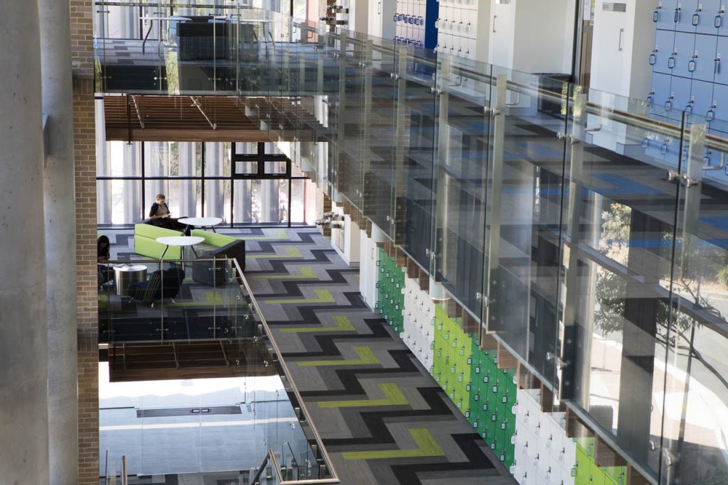
With the success of their recent architectural and interior project – the University of Wollongong Science Teaching Facility – Graham Bell Bowman (GBB) Interior Designer, Rene Deoberitz, reflect on the science of wayfinding, and the importance of flooring within the space.
What were the overall design objectives for the Science Teaching Facility at UOW?
The Science Teaching Facility is a world-class undergraduate teaching facility with an emphasis on providing analytical and practical laboratory experience for students, access to state of the art technology and facilities for team and problem-based learning.
Incorporation of best practice WHS, sustainability, energy efficiency, flexibility and adaptability were also critical requirements.
How did you approach the execution of your concept?
The design of the building needed to adopt a simple and consistent functional layout on each level to maximise the effectiveness of structural and vertical services infrastructure systems.
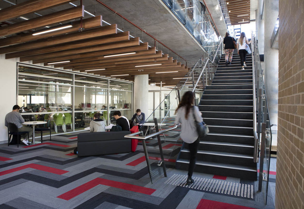
The student circulation and informal learning spaces were grouped on the south side of the building and linked with an open stairwell. The access spaces are naturally ventilated and have extensive views to the parkland character of the campus.
The ground level includes a technology-based teaching area to support the laboratories and linking with team/problem based write up and meeting areas.
How did the Interface Carpet Tiles contribute to this?
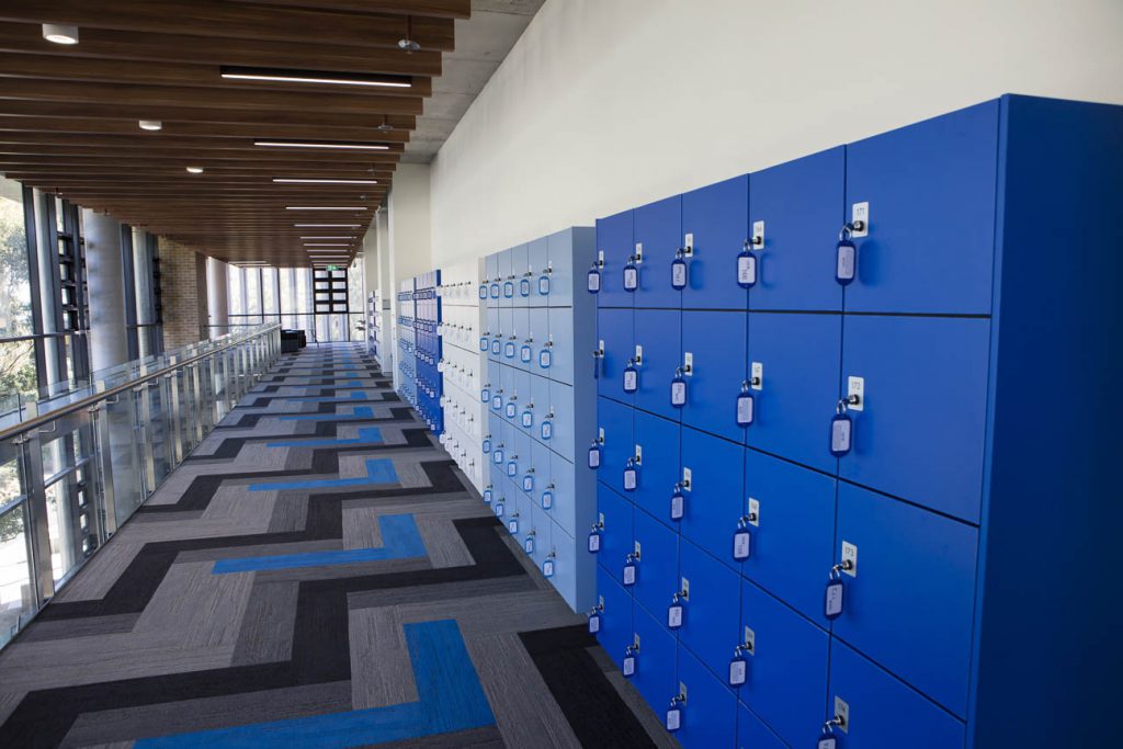
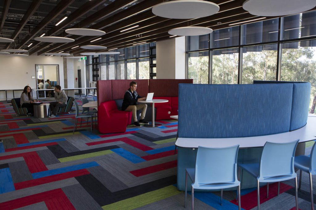
Interface Carpet Tiles assisted in the implementation of brightly coloured interiors, visible through the transparent façade, and aided in creating a distinctive colour identity for each level.
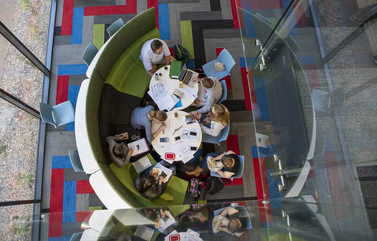
Although the building layout is simple and functional, Interface Carpet Tiles have enabled us to create spaces that communicate engagement, collaboration, informal learning and also emphasise the linking of the different levels and spaces. We wanted to stimulate, inspire and enrich the daily activities and learning that take place within this building. It is a place of coming together, discovery and evolution.
How did you find designing with the Skinny Plank/Square tile format?
The Interface Skinny Plank Tile format was so much fun to work with! The plank tile allowed us to easily create an interesting herringbone pattern, which made ordinary circulation spaces come to life with pattern and colour. The Interface Design Team were so helpful in making our herringbone concept real.
