In the higher education market, competition for the best students is fierce. And once those students get on-campus? It’s all about keeping them.
While there are endless strategies around student retention, what is clear is that students need to be engaged beyond just academics. The growing importance of social integration through activities, organisations and support services highlights the need for colleges and universities to offer ever more amenities for their student populations. Experience becomes a key part of student engagement. And with the increased emphasis on the whole student experience, schools have to think about whether their campus facilities are keeping up.
Tackling retention with design
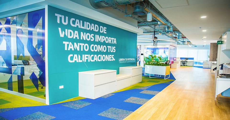
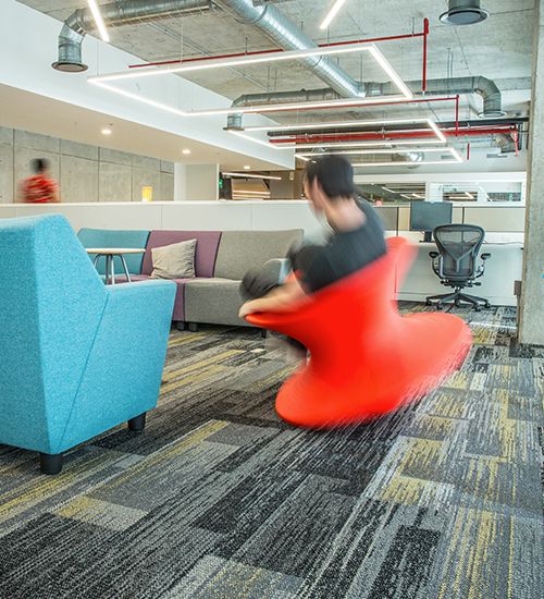
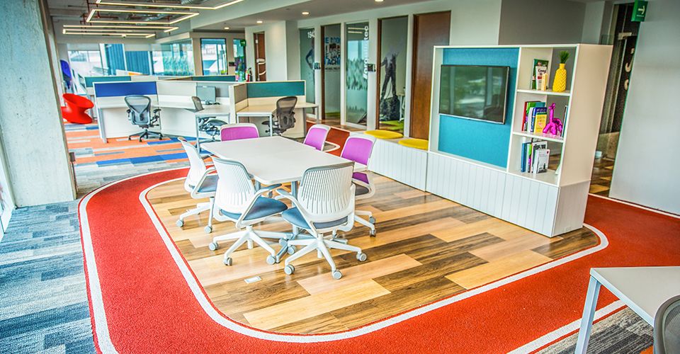
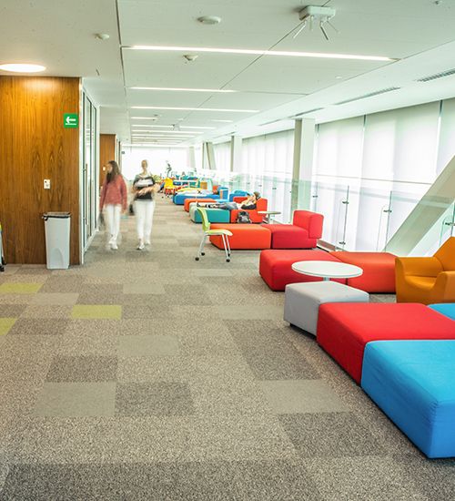
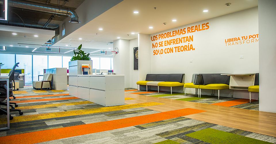
The Monterrey Institute of Technology (known as Tec) is a private university based in Monterrey, Mexico. As one of the most academically-recognised universities in Latin America, Tec consists of 31 campuses in 25 cities throughout the country. However, the university knew it needed to modernise its facilities in order to attract and retain the next generation of learners and innovators. With that in mind, Tec launched a new mission to update its spaces with design that was fresh and colorful – a far cry from its corporate-feeling image.
Photo: Berny Flores
Photo: Berny Flores
Photo: Berny Flores
According to Hernán García, Tec’s Vice President of Culture and Experience, “We decided that we wanted to have very flexible, collaborative spaces. And what we wanted from these spaces is that they become places where people want to stay, gather, and spend time working with others as a team. Because of that, we designed spaces keeping people in mind.”
Matching a partner to the mission
Tec chose Interface as a flooring partner on this overall project because of a shared vision on biophilic design, well-being, and sustainability. As student needs were changing, it was important that the university’s built space reflected and accommodated those needs. Tec felt that Interface was the right partner to implement this vision on the floor.
Implementing biophilic design
Biophilic design is the practice of using textures, materials, and patterns reflective of nature within interior spaces. Bringing the outside in has two distinct benefits: it blurs the boundary between inside spaces and the external environment, and it enhances the mental and emotional well-being of those who work and navigate within these spaces.
Tec embraced the concept of biophilia as part of its design philosophy and wanted to incorporate biophilic design in its facilities projects. Several spaces featured obvious biophilic elements such as green walls and floors that were representative of natural textures like wood, stones and grass. Rene Sanchez from the Interface Design Studio had this to say about the approach: “[We] sought to apply Interface’s standards of biophilic design and +Positive spaces, with a lot of natural light, nature elements and colours, and above everything else, carpet tiles that could merge with all of this.”
Photo: Berny Flores
Photo: Berny Flores
Photo: Berny Flores
Thinking sustainably
For Elsa Romero, Tec’s Director of Spaces, “the most important part of working with Interface was its commitment to the environment, recycling and sustainability.”
Several years ago, Tec adopted a mission around sustainable development. With this new mission, Tec has implemented not only more education and research on sustainable development but also adopted university-wide sustainability initiatives. This includes energy efficiency improvements, material recycling and water usage, as well as updated criteria for new building construction and retrofitting existing buildings. Because of the university’s concern about the environment, it was important for them to choose partners and suppliers that aligned with its sustainability mission. Interface was an easy choice.
The first project is a ‘go’
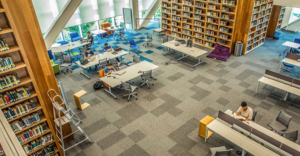
One of the first big campus projects undertaken was the library on Tec’s flagship Monterrey campus. Each of the building’s six floors has its own purpose, with an open design that allows spaces to be dynamic. University officials wanted to encourage student collaboration, so the furniture is reconfigurable, and the layout is open. Likewise, they wanted the floor design to be just as dynamic, while still adhering to a common theme.
“When it came to the Library specifically, [Tec] already had a defined colour scheme and a very modern concept and image. What we tried to do here, together with them, was to regionalise the concept of what Mexico is; to borrow the concept of papel picado and convey it in the floors,” says Interface’s Rene Sanchez.
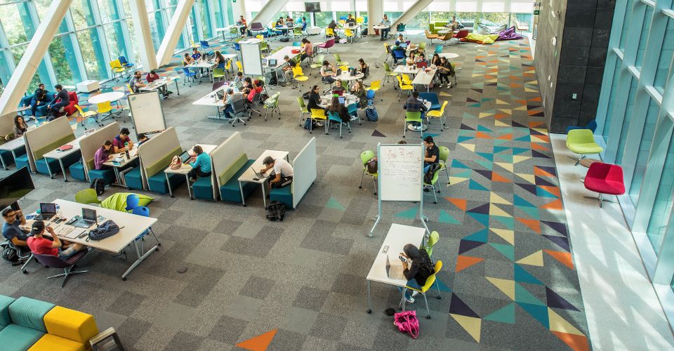
Photo: Berny Flores
Papel picado, or confetti, is the brightly-coloured paper used during celebrations like Cinco de Mayo. Throughout the Library are pops of vibrant blues, yellows and oranges that call back to the university’s Mexican roots and invite people to linger and enjoy. Keeping to the open concept, Interface created floor designs that allow for many possible uses – no space is strictly defined for only one purpose, just as Tec had envisioned.
Evaluating mission success
Overall, Tec officials feel its evolution has been good both for the university and its students. “The transformation of these spaces has given us many good results. The most important result is that we are increasingly seeing more people working in teams, communicating and sharing resources,” according to Hernán Díaz.
Tec knew that its outdated facilities were a weak point in being able to attract and retain students. Ultimately, it wanted to create spaces that were comfortable and that would encourage students and staff alike to feel ownership of how they worked. By improving its built environment and partnering with manufacturers that align on the university’s design and sustainability missions, Monterrey Institute of Technology is moving rapidly into the modern era.
