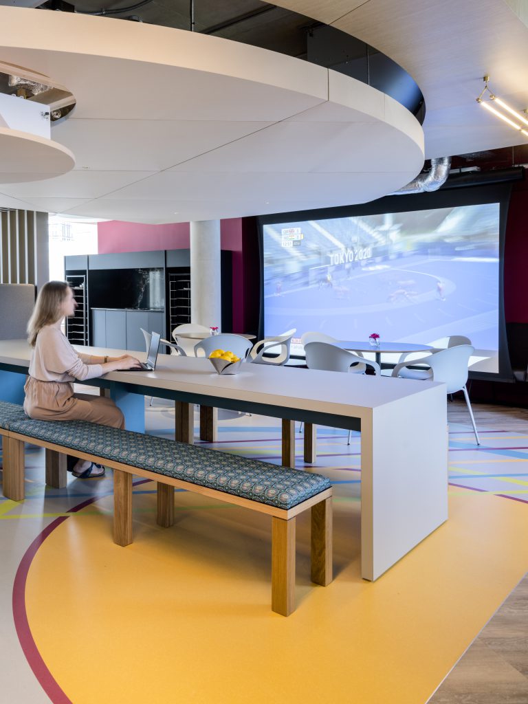
When you’re feeling blue, there’s nothing quite so powerful as a dose of vibrant colour.
In our Colour Spotlight series, we’ve focused on a host of hues on the Interface blog. Today, it’s the turn of ‘Amber Glow’ a golden yellow hue. The colour group, says Natalie Makowski, EMEA Product Design Manager, “has connotations of positivity and provides an uplifting mood.”
A Sense of Calm
“Amber Glow shades look great paired with terracotta and brown tones,” continues Natalie.
Such is the popularity of these mood-enhancing colours that, over on TikTok, the hashtag ‘yellow paint’ has received over eight million views, and #Amberglass currently has 3.5 million views, signalling this warm colour group’s appeal to younger generations.
Enriching a space, Amber Glow also works well with burnt orange and spiced tones. “Lending itself to decorative elements and accessories within a room”, says Natalie, the colour group can be infused in home or office environments to mimic the sense of calm that we experience when we’re out in the sunlight, at one with nature.
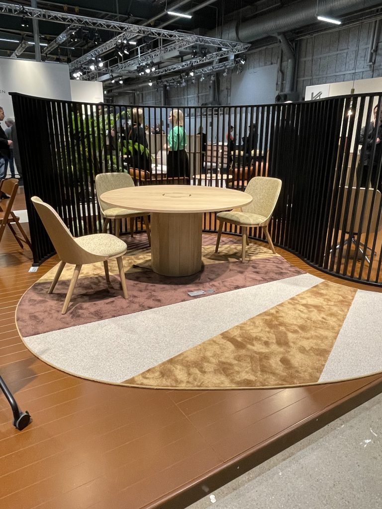
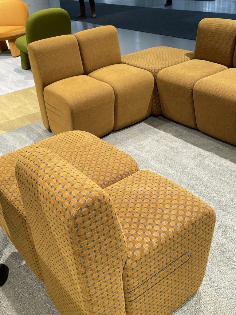
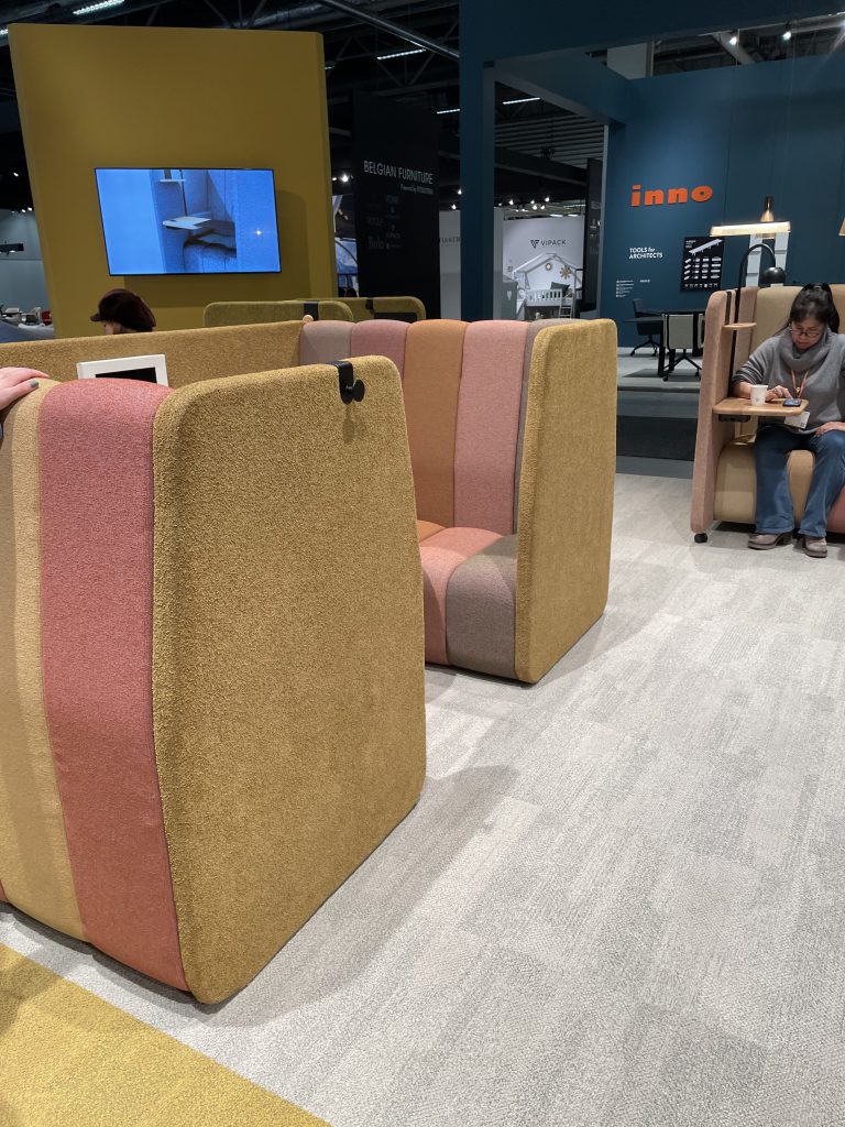
Muted spring/summer 2023 colours ‘gain complexity with warmer tones like terracotta’, says Natalie, who says these poppier shades were championed heavily at February’s Stockholm Furniture Fair (SFF), including Amber Glow.
Horreds at Stockholm Furniture Fair
Inno at Stockholm Furniture Fair
Inno at Stockholm Furniture Fair
Yellow Colour Evolution
The colour group can be used to “revitalise a wide range of home furnishings, including throw pillows, area rugs, and upholstered furniture designs”, continues Natalie, who says Amber Glow really came alive at SFF.
For those considering adding vibrant hues like Amber Glow to their space, be bold and strategic in your application of them, urges Natalie. “This will ensure your home accessories remain approachable and inviting.”
In any space, Natalie advises using saturated yellows for decorative items like photo frames, vessels and catchall trays. Include “rich, rust tones to elevate contemporary furnishings, and use gold hues to intensify dynamic surface dimension”, she explains.
Remaining robust for autumn winter 22/23, yellow will be reimagined in buttery yellow, or ‘honeycomb’ shades, with warmer, golden yellows on the agenda of interior designs in autumn/winter 23/24.
In evolutionary terms, “yellow is becoming softer”, as we move through to 2024/25, yellows are much richer, with a gold hint.” says Natalie.
By spring/summer 24, calming yellow shades will be doing the rounds, as will be grounding shades like mustard.
How our customers are using the colour
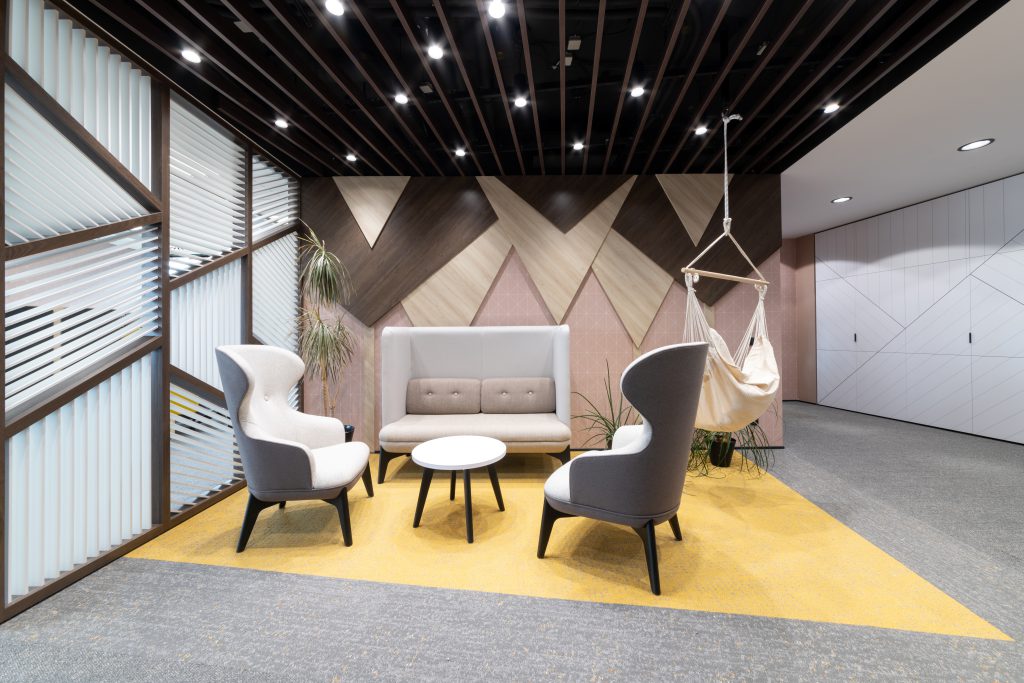
Iberdrola, Spain
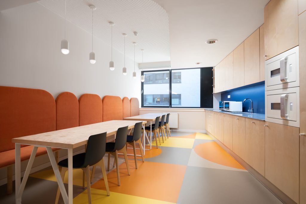
Zebra, Czech
Vital Business Centre Office Building, Hungary
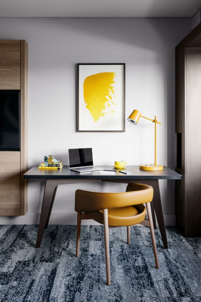
VOCO Hotel Brisbane
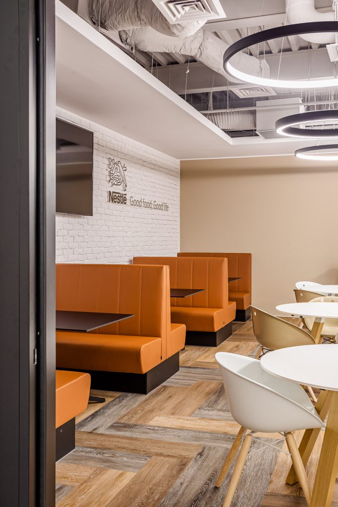
Nestle, Romania
Kingsley Napley, UK
Colour and Wellbeing
Touching on the notion that colour is intrinsically linked with wellbeing, there’s no denying the role of yellow in boosting our mood.
Sunlight is proven to impact both our physical and mental wellbeing – and as we are still dealing with the aftermath of the challenging early 2020s, says Natalie, introducing some more sun to our space is ‘an important way to offer respite’.
“Using light to infuse spaces and products with much-needed visual and tactile warmth will be paramount”, continues Natalie, who says you can create a harmonious space around Amber Glow shades.
“Bring in complementing shades in varying intensities to envelop surfaces with a golden, warm glow.”, Natalie adds. “Use white and touches of gold to enclose and offset their luminosity, which also works well for styling in contract environments, such as lounges, hospitality and healthcare settings.”
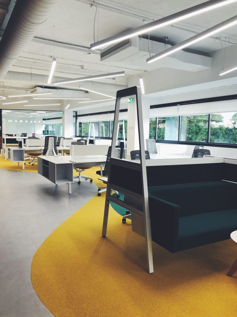
In office environments specifically, yellow tones can be used in a playful way. Zone off areas or create a rug area in spaces designed to relax in but also to add impact. Amber Glow is an easy colour group to use in interior schemes – in small amounts to add highlights or in large rug areas to create a bold and interesting aesthetic.
Providing interest and excitement to a room, “yellow is best used in small amounts,” says Natalie. That said, you can make a big impact by using it as a highlight colour, she states – via well-chosen accessories.
The future of interiors is bright. The future is yellow.
Until next time…
