An interview with David Oakey, product designer.
In 1982, as the clunky Commodore 64 home console hit the market and once-and-future technology giant Sun Microsystems was only opening its doors, trend forecaster John Naisbitt radically predicted that computers would ingratiate themselves completely into work and play. His book Megatrends even envisioned a backlash to this absolute digitisation, stating, “We must learn to balance the material wonders of technology with the spiritual demands of our human nature.”
David Oakey, global product designer for Interface, says that Naisbitt’s “high-tech, high-touch” concept is more prescient than ever. Whereas engaging with computers until recently was a this-or-that proposition – you logged screen time at your desk or stepped away from it – technology is now thoroughly integrated into our lives. What’s more, some makers of technology have begun giving their gadgets a warmth and tactility that humanises their constant presence. David Oakey’s latest global collection for Interface, Visual Code™, “celebrates technology and handcrafted products” in that vein.
Within the Visual Code collection, Circuit Board epitomises the joining of the virtual and the sensorial. While the dynamic lines in this pattern evoke electronics, its low pile softens a circuitry image. In fact, thanks to that texture, the pattern can be more reminiscent of Aztec motifs than a silicon chip. Oakey also observes that available colourways support ancient desires of human nature: Circuit Board’s vivid reds and other hues resemble springtime blooms that energise and inspire people after grey wintertime.
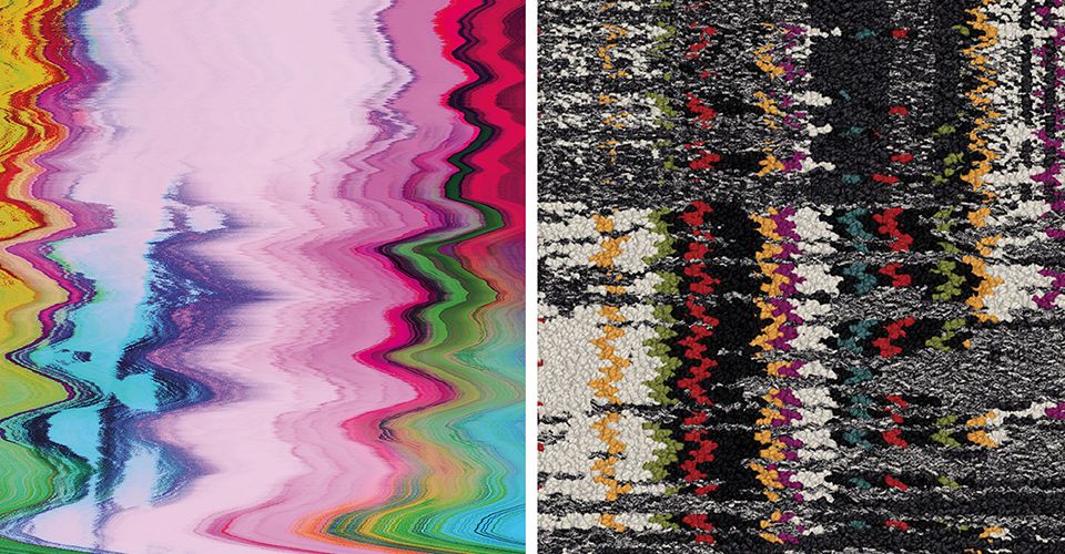
The Visual Code patterns called Static Lines and Hard Drive also fuse the analogue and digital, by combining traditional garment patterns with glitch art – an aesthetic treatment that references distorted electronics and corrupted data. If Circuit Board is Visual Code’s most balanced combination of high-tech and high-touch, then Static Lines and Hard Drive demonstrate a slight shift toward handcraft.
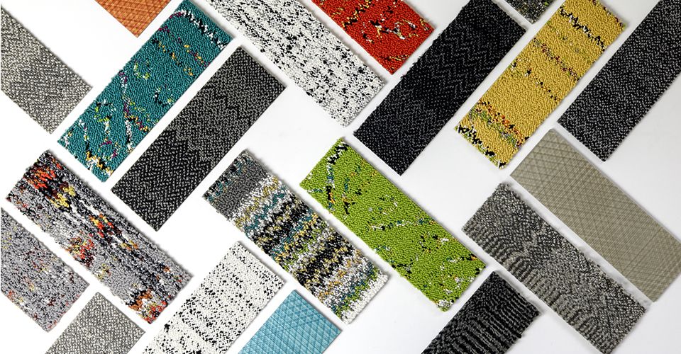
The seven remaining patterns in Visual Code redistribute that balance even more toward age-old textiles, with Plain Stitch, Stitchery, and Stitch Count representing tight weaves while the four-product Black & White series features graphic streaks and nubby surfaces. “We may have clients who want to lean toward simplicity and calm, and others who want to be more playful and optimistic,” Oakey says of the range of interpretations, “it really depends on the company.”
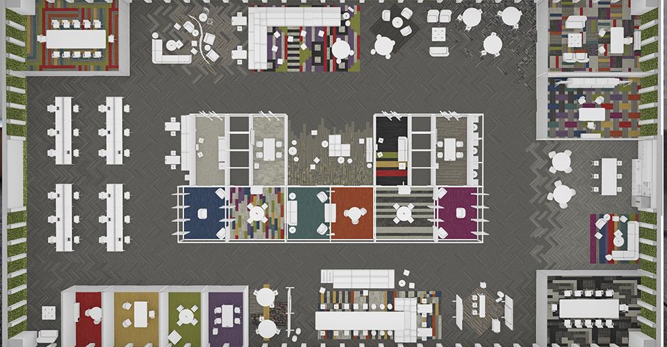
He also stresses that Visual Code’s diversity can be useful in a single space. “There is a base product that could cover 60 or 70 percent of an interior, such as the surface area for workstations, but this collection is also thinking about all the meeting rooms, the collision spaces, private offices, the places where you go and get solitude, which all require something a little special,” Oakey explains.
The designer says that Visual Code’s diversity reflects up-to-the-minute research by Microsoft and Steelcase reporting that 72 percent of workers think their future success hinges on creativity, and that “hosting moments of individual exploration, cognitive resting, social connection, co-creation and evaluation” help define a creative workspace. Oakey believes that the aesthetic variety in Visual Code also is an analogue for Megatrends’ decades-old vision of contemporary life. “Just as different people can meet anywhere in a space, because their technology is not connected to a cord anymore, we’re now seeing spaces where numerous kinds of activities are happening at once,” he notes. “This collection brings all of that together.”
Click here to view the full Visual Code Collection.


