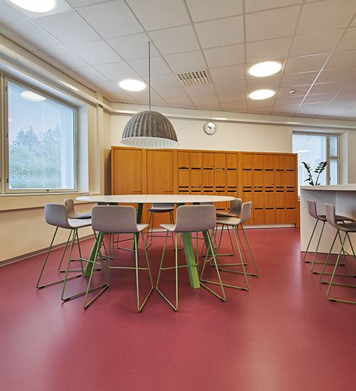
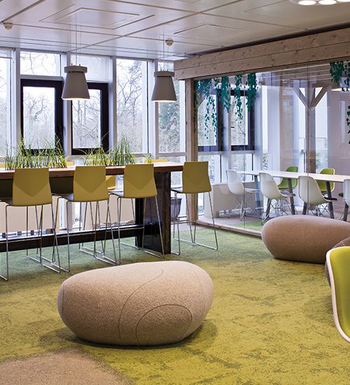
There is perhaps no more important space to harness the power of good design than in that of education. When children have a positive experience of education at an early age, it inspires and stimulates them, and can ignite a passion for learning. Once engaged, it can encourage them on to further education and to ultimately take this passion and knowledge out into the wider world – benefitting the child, the education establishments, and even the wider national economy.
But with budgets often stretched and opportunities limited, how can we best influence both the way a space looks, and how it feels? When talking impact, colour on walls and floors can offer the biggest bang for your buck.
So, what colours can actually enhance creativity, focus and concentration? Of course cultural and social influences will affect this, but when looking for colours that have universal appeal those drawn from nature can tap into positive experiences shared by all, and this is best explained through the Ecological Valence Theory.
Green is known to be the easiest colour for the retina to perceive and, as such, is the best for long-term concentration. In fact, a research study found that students who viewed a green roof after a tiring task versus a concrete roof made fewer errors and had better overall concentration.i Studies have also shown that green can enhance reading abilityii.
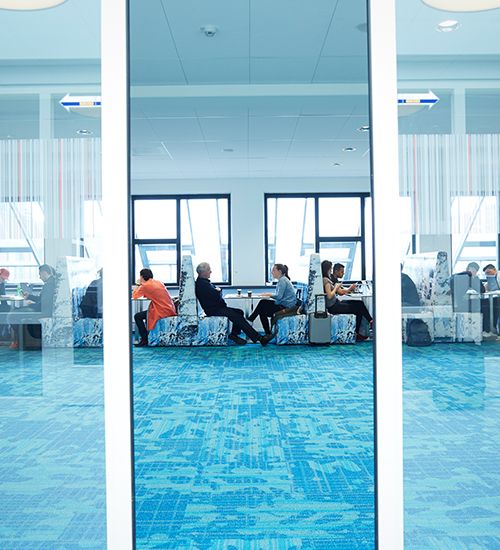
Avans Hogeschool, Netherlands
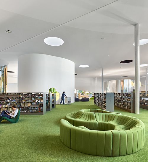
Médiathèque Le Puz, France. Photo: Eugeni Pons / David Romero-Uzedazle
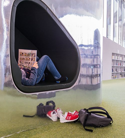
Médiathèque Le Puz, France. Photo: Eugeni Pons / David Romero-Uzedazle
University of Hertfordshire, UK
Juteinikeskus in Parola, Finland. noraplan sentica. Photo: Jukka-Pekka Juvonen
INSEAD, Fontainebleau. ©INSEAD
In another study looking at cognitive performance, blue was found to boost creativity and enhance participants’ ability to think ‘outside of the box’.iii It is thought that the association with water and the sky makes us open and calm enough to be explorative and creative. Blue has also been linked with improved productivity. Therefore, in a learning environment, it would be useful to use blue where difficult subjects are taught or students may ordinarily experience stress.
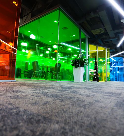
However, to avoid the colour scheme becoming too monochromatic, let’s look at some warmer shades on the other side of the colour wheel. Combining blues and greens with yellows, oranges and reds can help to create a more lively and cheerful atmosphere.
In terms of learning:
- Red has been found to enhance attention to detailiv
- Orange is thought to be welcoming and mood enhancing, which improves neural functioningv
- Orange is also believed to increase the oxygen supply to the brain, and is recommended for use in exam rooms to stimulate studentsvi
- Yellow increases creativity, attention and positivityvii
As with anything, we want to use these bolder colours in moderation, particularly for younger students who are already prone to over excitement and over stimulation. Add pops of colour onto flooring, walls, pictures, furniture and furnishings to enhance attention and mood, rather than painting all the walls red, which can cause anxiety.
To further student wellbeing, consider the value of the patterns we display within these artworks, materials and furnishings. We have a preference for viewing natural patterns (also known as biophilic fractals) and have developed a ‘fractal fluency’ for them. These have been found to reduce stress by 60%viii and have a restorative and relaxing effect.ix In the Hackney Garden School, for example, fractals were introduced into the space as a forest landscape wallpaper in calming shades of green. Displaying colourful images or artworks of natural elements in this way can be an exciting way to bring the benefits of pattern into the classroom.
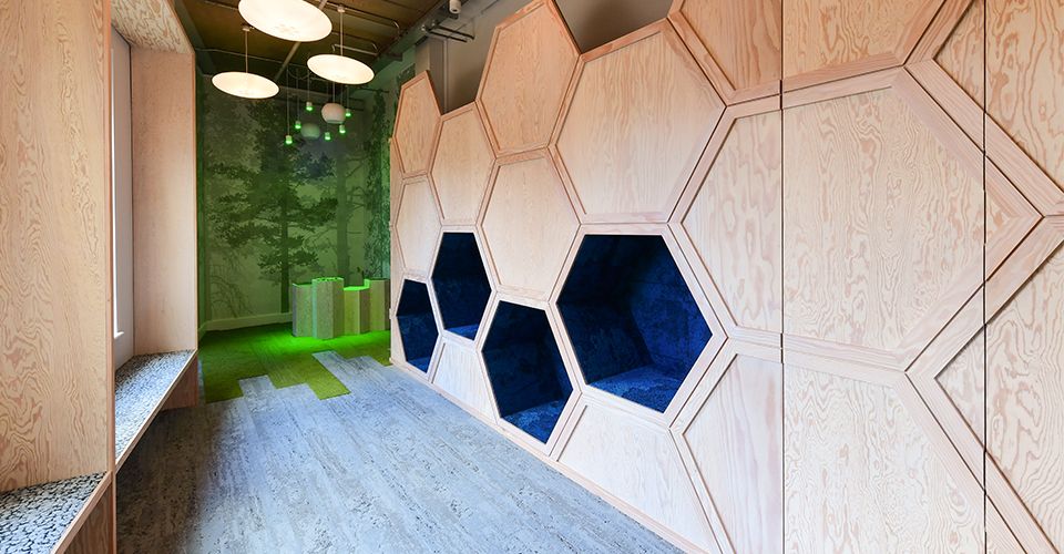
Hackney Garden School
Overall, colours can be a cost effective and impactful way to create uplifting, energizing and stimulating education environments. They can be pure and playful and don’t have to be mixed with blacks or greys to be toned down as you might find more often in sophisticated hospitality, domestic or working environments. Cooler colours are good for calm, focus and concentration, whereas warmer colours help students to stay happy, alert and attentive, and add a youthful touch. Even better, these colours can be added into artworks displaying natural patterns for an extra wellbeing boost. It’s time to get the colour chart out!
References
i http://www.smh.com.au/technology/sci-tech/seeing-green-boosts-your-concentration-research-shows-20150525-gh8udh.html
ii https://www.shiftelearning.com/blog/color-psychology-elearning-part2
iii https://www.sciencedaily.com/releases/2009/02/090205142143.htm
iv https://www.sciencedaily.com/releases/2009/02/090205142143.htm
v https://www.shiftelearning.com/blog/how-do-colors-influence-learning
vi https://www.shiftelearning.com/blog/how-do-colors-influence-learning
vii https://www.kaplanco.com/ii/using-color-to-enhance-learning
viii Taylor, R. (2006). Reduction of physiological stress using fractal art and architecture. Leonardo, 39(3), 245–251. http://doi.org/10.1162/leon.2006.39.3.245.
ix Hagerhall, C., Laike, T., Taylor, R., Küller, M., Küller, R., & Martin, T. (2008). Investigations of human EEG response to viewing fractal patterns. Perception, 37(10), 1488–1494. http://doi.org/10.1068/p5918
