Once a year, our design team puts our heads together to discuss colour trends. We are constantly observing endless sources of colour to inspire us for the next 12 months. Inspiration comes from colours that have emerged on fashion runways, stood out in contemporary art installations, or caught our eye in creative magazines and publications. Then, we delve deeper into a huge amount of research visiting international trade shows, reading trend reports from forecasting agencies and studying the overall cultural climate. Armed with this research we can anticipate 12 colours that will move forward as a trend – here are some of my favourites.
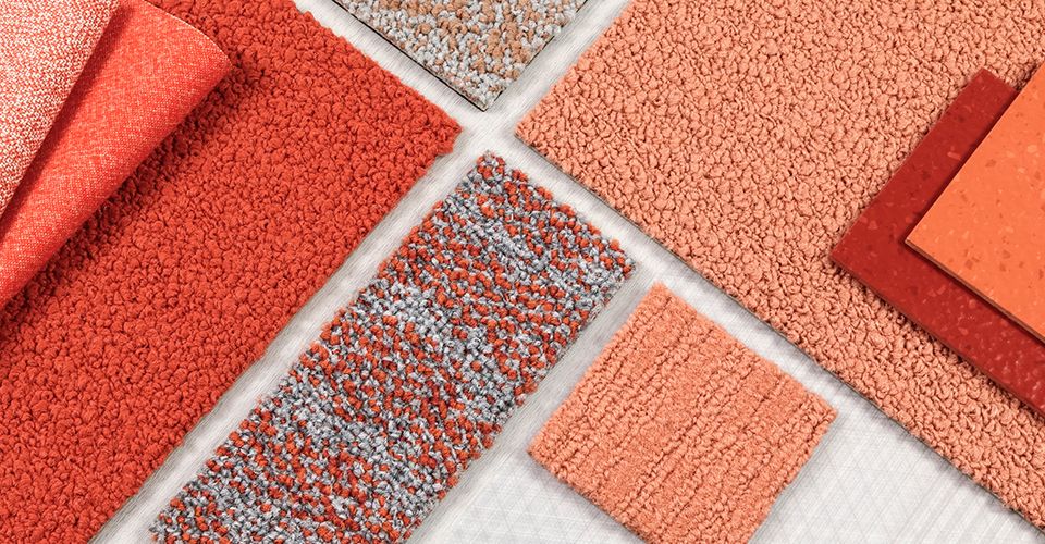
Living Coral
It has been almost a year since Pantone revealed Living Coral as their Colour of the Year for 2019. The Colour of the Year traditionally influences product development and purchasing decisions in multiple industries, so 2019 was always going to be a good year for this vibrant shade.
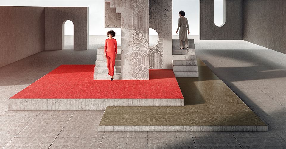
Interface was definitely inspired! Our new global collection Look Both Ways features an enduring shade of Coral with Step it Up, Coralite. The launch of this product injected fresh, energising colour into our portfolio and proved that striking shades can be put to good use within an interior.
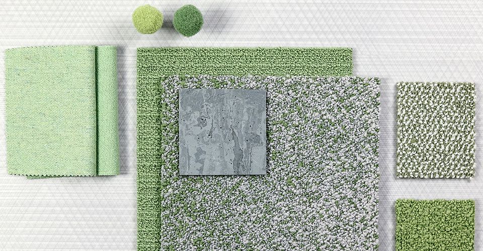
Mint
Shades of green were not up for debate, after all we have seen the popularity of green surge over recent years. There are many shades of green out there, from vibrant botanical inspired greens, to bright teals and rich emeralds. However, we focused on the calming shade of Mint. This fresh pastel tone has been dominating both catwalks and interiors, and we are predicting that Mint will continue to flourish well into 2020.
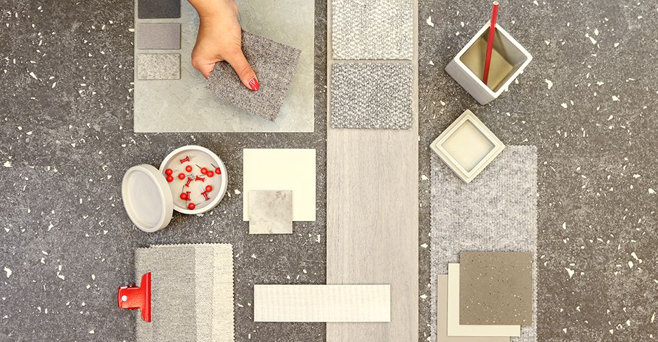
Understated Grey
Elsewhere, neutrals weren’t going out of fashion anytime soon. Our choice of Understated Grey proved that there will always be a need for calmer tones to help form the backdrop of a space. Neither too warm nor too cold, Understated Grey can lend room to more dominant colours and features. The whole grey palette lets brighter colours shine, and it allows you to be adventurous with decorative patterns and texture.
So, what will be different next year? Perhaps we will be surprised by new emerging colours, or maybe we will see a continuation of the natural green shades that have dominated previous years. We will kick start our colour trends of 2020 in January with PANTONE’s yet-to-be-announced Colour of the Year, so stay tuned!


