Held annually, Milan Design Week (18 to 23 April, 2023) is one of the most important dates on the calendar – for our own team specifically and within the interiors industry.
Showcasing a host of trends for 2023 and beyond, the event is the largest of its kind globally championing the very latest in furniture and design.
Some key members of the Interface team were amidst the hustle and bustle of the trade show, keeping their ears to the ground to discover which trends will be on everyone’s agenda.
In our first of two, trend-led blog posts, we look at just some of the overarching patterns we spotted at the event, as well as general trends – including installations made from denim, and jungle-inspired backdrops. Read on…
The ‘Euroluce’ Year
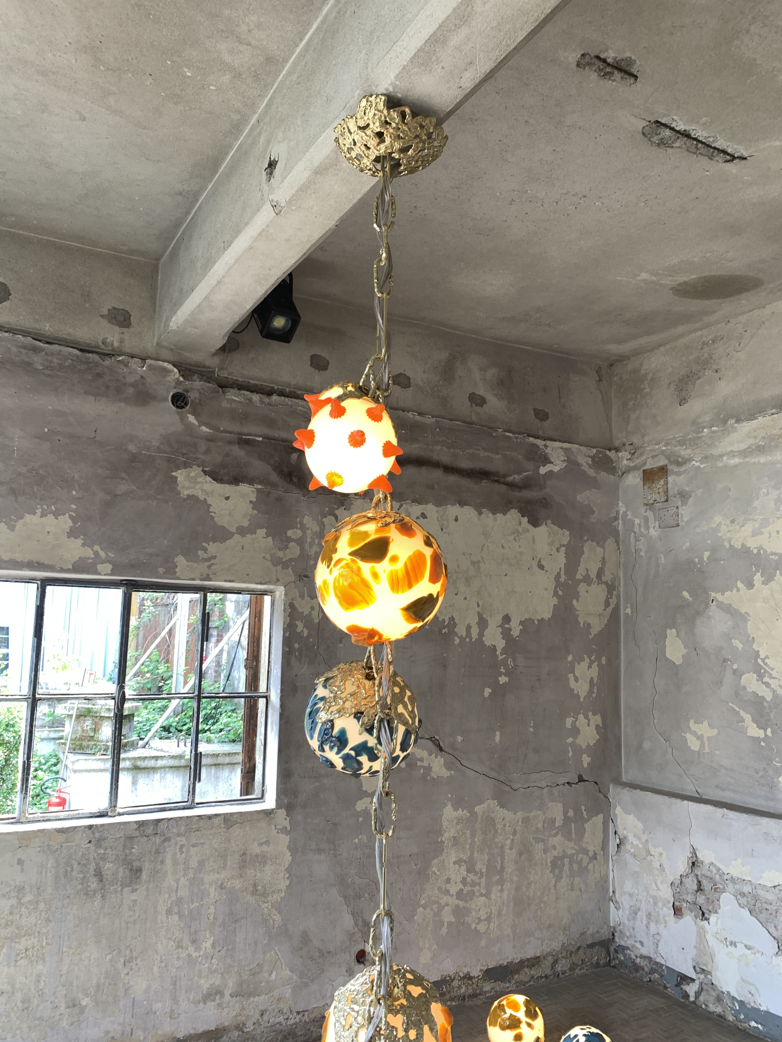
In a ‘maximalism’ movement that began to gather pace last year, ‘blown, melted and ‘bubble’ effect glass were key trends across many furniture items’ at Milan Design Week 2023, says Interface Concept Designer Team Leader, Mathieu Paton.
The event, which promoted ‘Euroluce’ (an international lighting exhibition), promised a plethora of striking lighting displays – and it most certainly delivered, says Mathieu.
In particular, oversized lamps had something of a moment – and while this particular trend was prominent amongst younger/smaller designers this year, it was highlighted in the work of more renowned companies, too.
Mathieu was joined by fellow Interface Concept Designer, Flavia Aprilini, who also enjoyed taking in a myriad of trends.
“La DoubleJ – a wallpaper brand that makes eye-catching bathrooms all over the city,” presented a standout display, Flavia tells us, adding that Dolce & Gabana’s collection of gold furniture installations was also a hit.
“G-star with Marten Baas also made a nod to the maximalism trend, but with its own ‘ironic’ twist, adds Mathieu. “They have proposed cabinets shaped like jeans and made with some recycled denim board material, next to a plane installation also made with this recycled material.”
‘Living the Event’
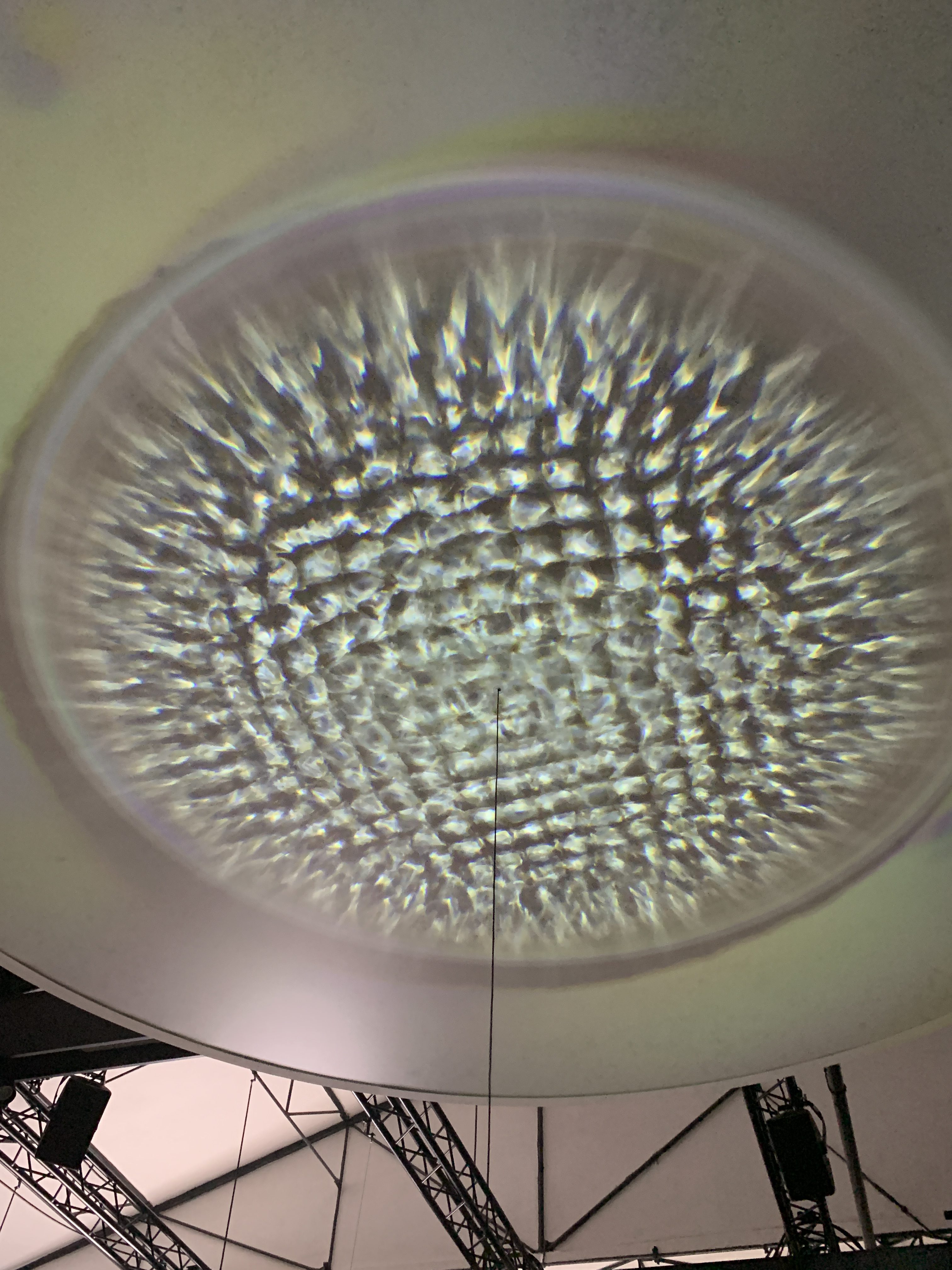
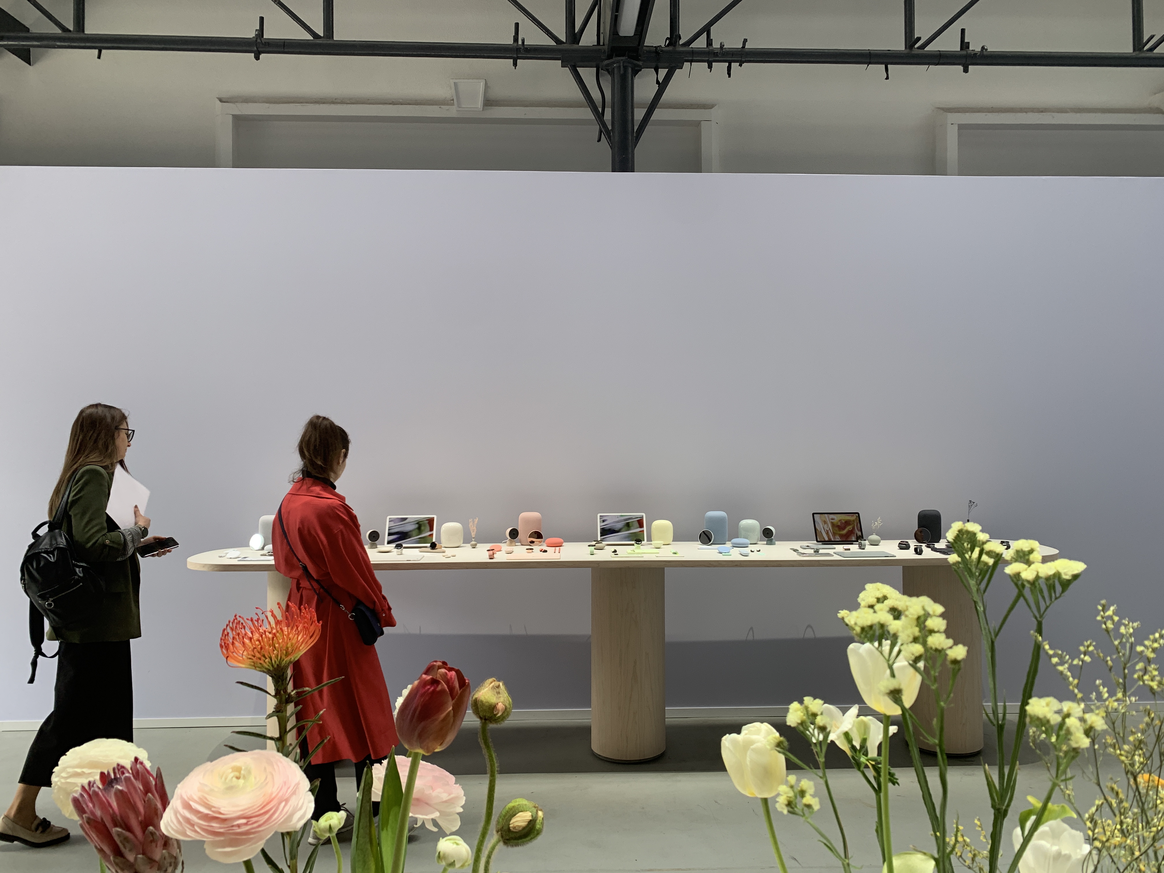
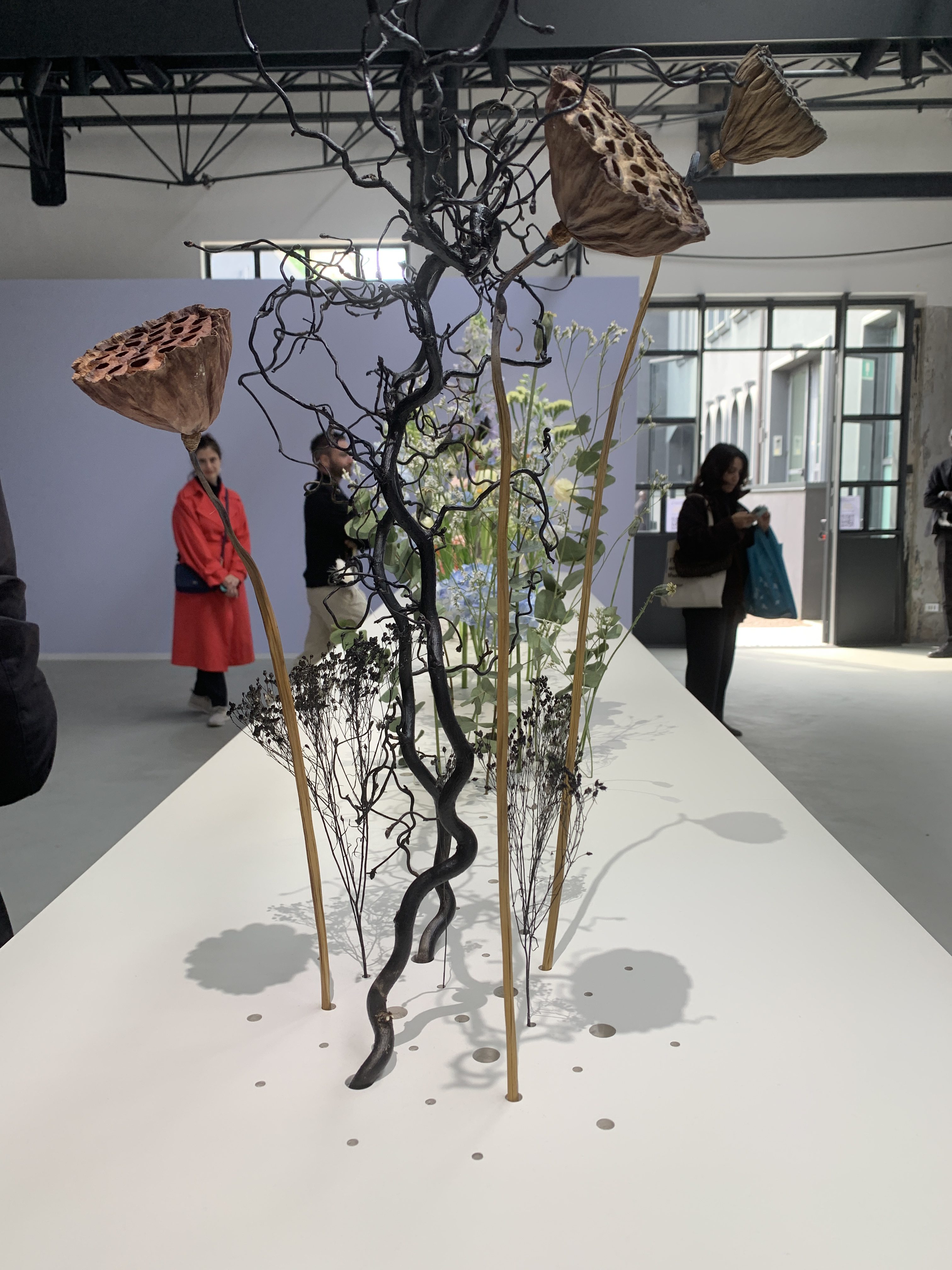
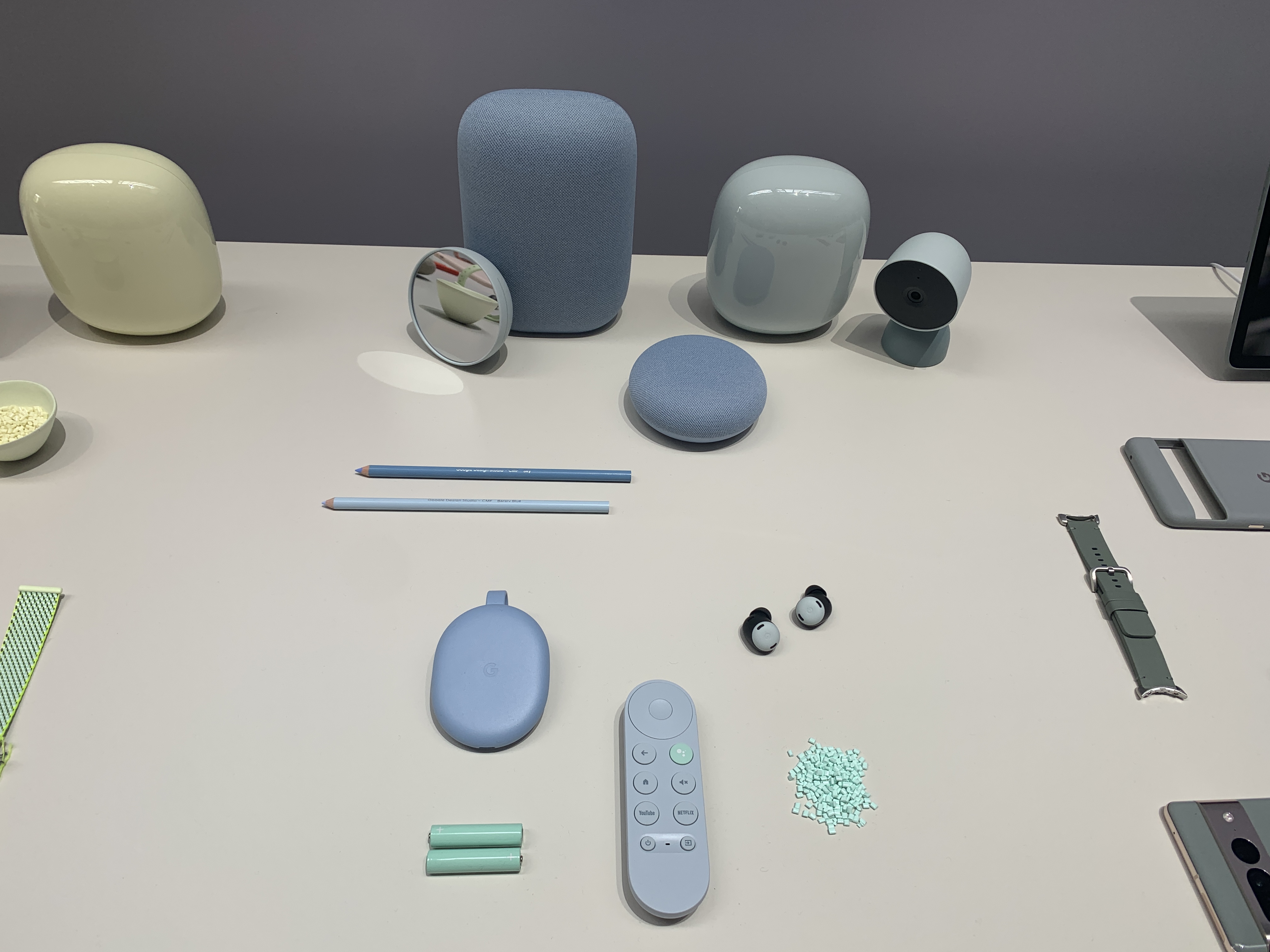
“What we noticed is that there were less outstanding installations compared to last year, but more companies proposing ‘experiences’, says Flavia. “It was less ‘Instagram’ but more about living the event.” Google offered a great example of this, he says, with a stand that provided visitors to the event with an almost-theatrical experience.
Google at Milan Design Week 2023
Google at Milan Design Week 2023
Google at Milan Design Week 2023
Focus on Sustainability
At the Salone del Mobile section of the fair, companies showcased their work on circular stands.
“Using lightweight, modular and re-usable items made from wood and recyclable carboard, they adopted an approach utilised back in 2021 – when the fair centered around sustainability”, says Mathieu.
“All the display material was made-out of chipboard panels, made of 100% recycled woods.” says Mathieu, who has been instrumental in helping MAST Design (a Dutch design company that presents exhibition with recycled materials salvaged from industry), add to its stand at ISOLA 2000. MAST Design will be showcasing design products with a sustainability focus, with Interface collections making an appearance.
‘Vegging’ Out
“Also at the fair, fruit and vegetable shapes were represented”, says Flavia.
“Robert Stadler for example, proposed furniture as OMG-GMO – in line with the main theme for Fuorisalone “Laboratorio future,” she adds.
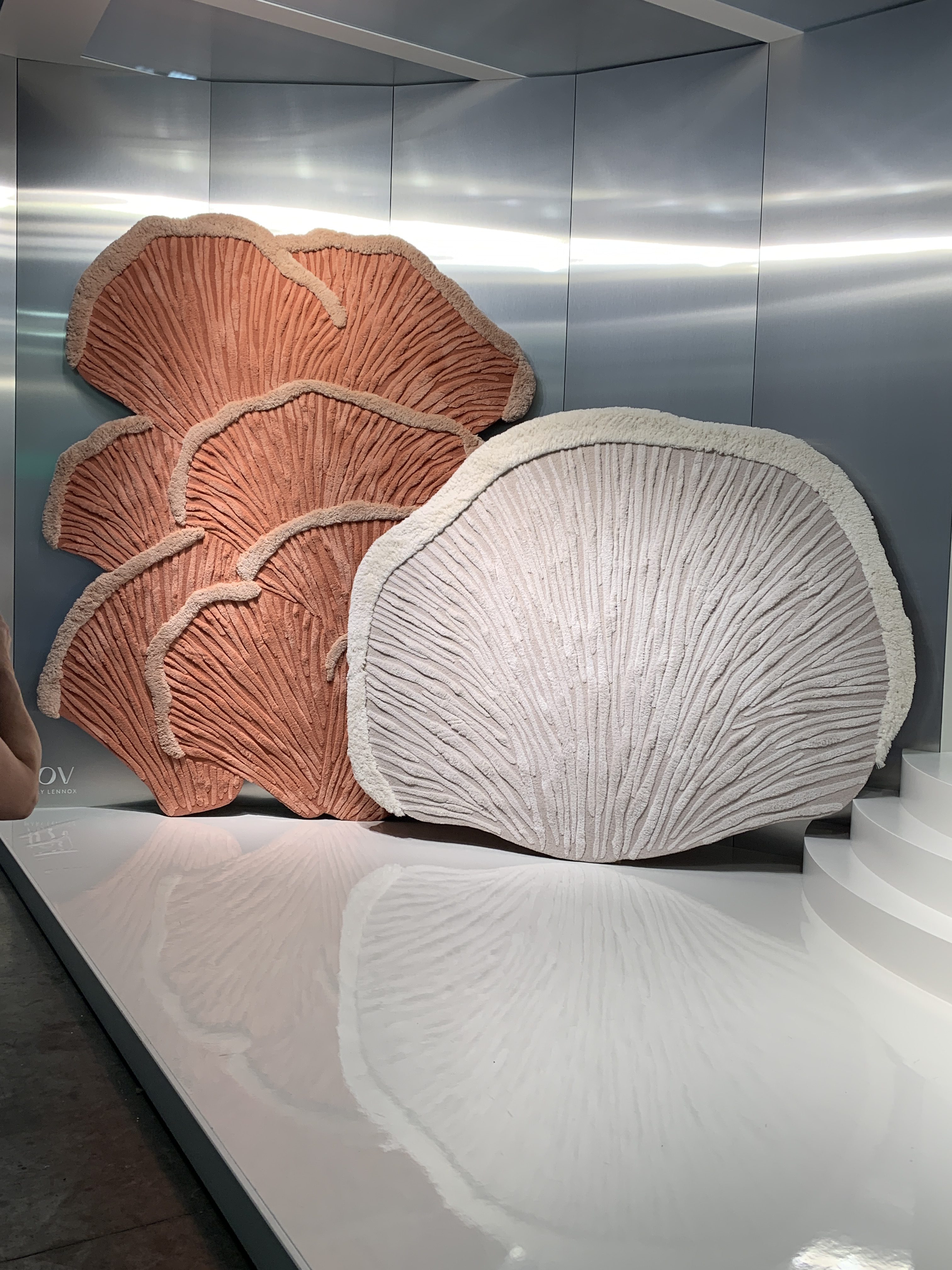
Another example was Basketclub at Alcova place. The theme of the fair, says Mathieu, “allowed designers and companies to mix nature with digitalisation to give more ‘true natural’ aspects to items and patterns.”
With some vendors displaying stands with countryside flowers, greenery and forest shades, Mathieu says there was also a focus on jungle/tropical scenes, via design pieces which were more ‘grounded’.
“An example of this is Buccellati; Lily Kwong proposed in a Michele de Lucchi installation some jewellery pieces surrounded by carnivore plants.” he says.
Emerging Trends
Katherine Cohen, Interface Associate Creative Director, Americas, looking at patterns specifically, ‘cerused wood’ – wood which displays its beautiful and individual, natural veining – was a key focus at Milan Design Week, with the effect even seen across textiles.
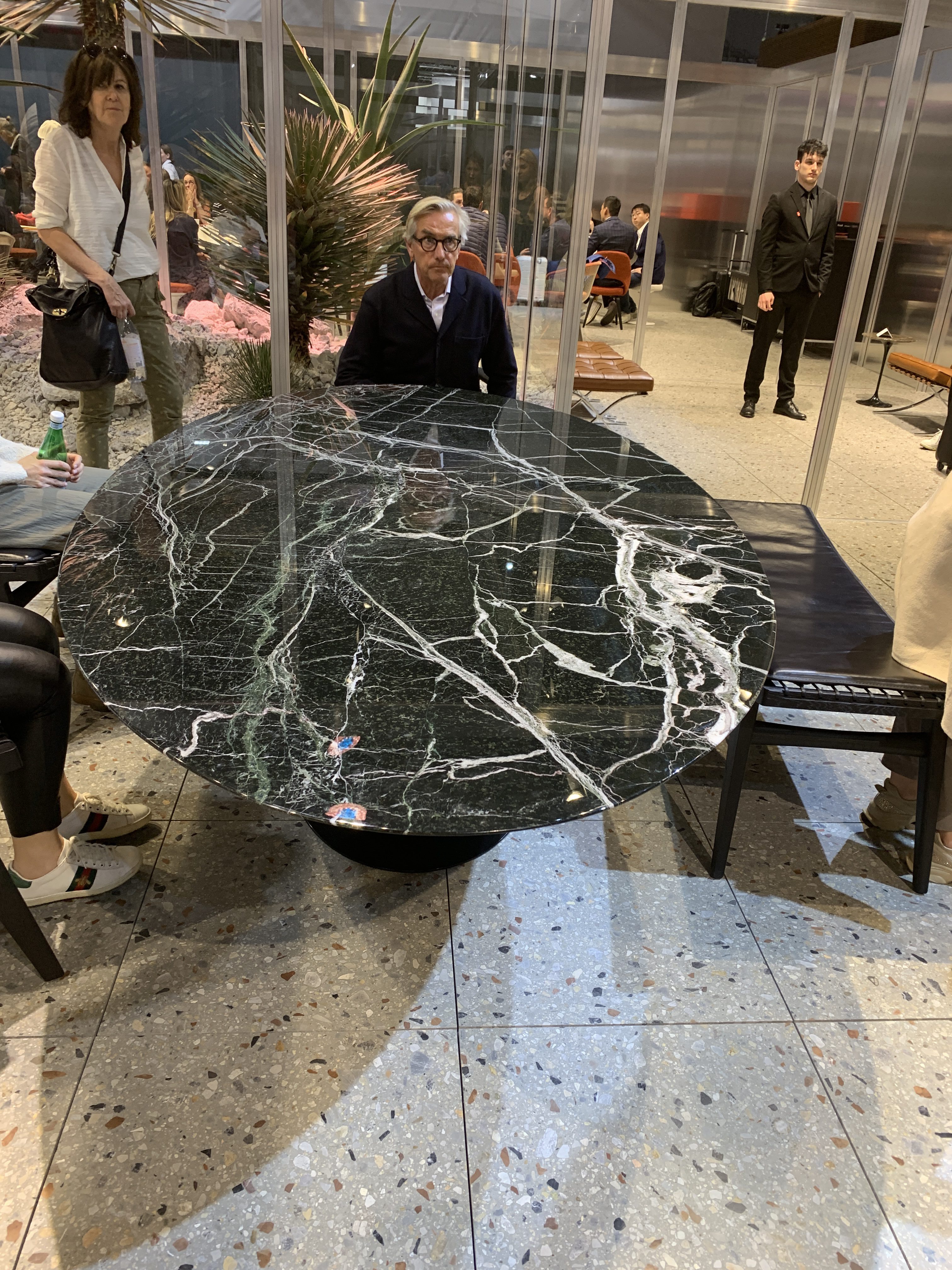
“The next iteration of cerused wood will be a bold, marble trend,” continues Katherine, who adds that the ‘veining’ aesthetic was also seen across striking marble pieces.
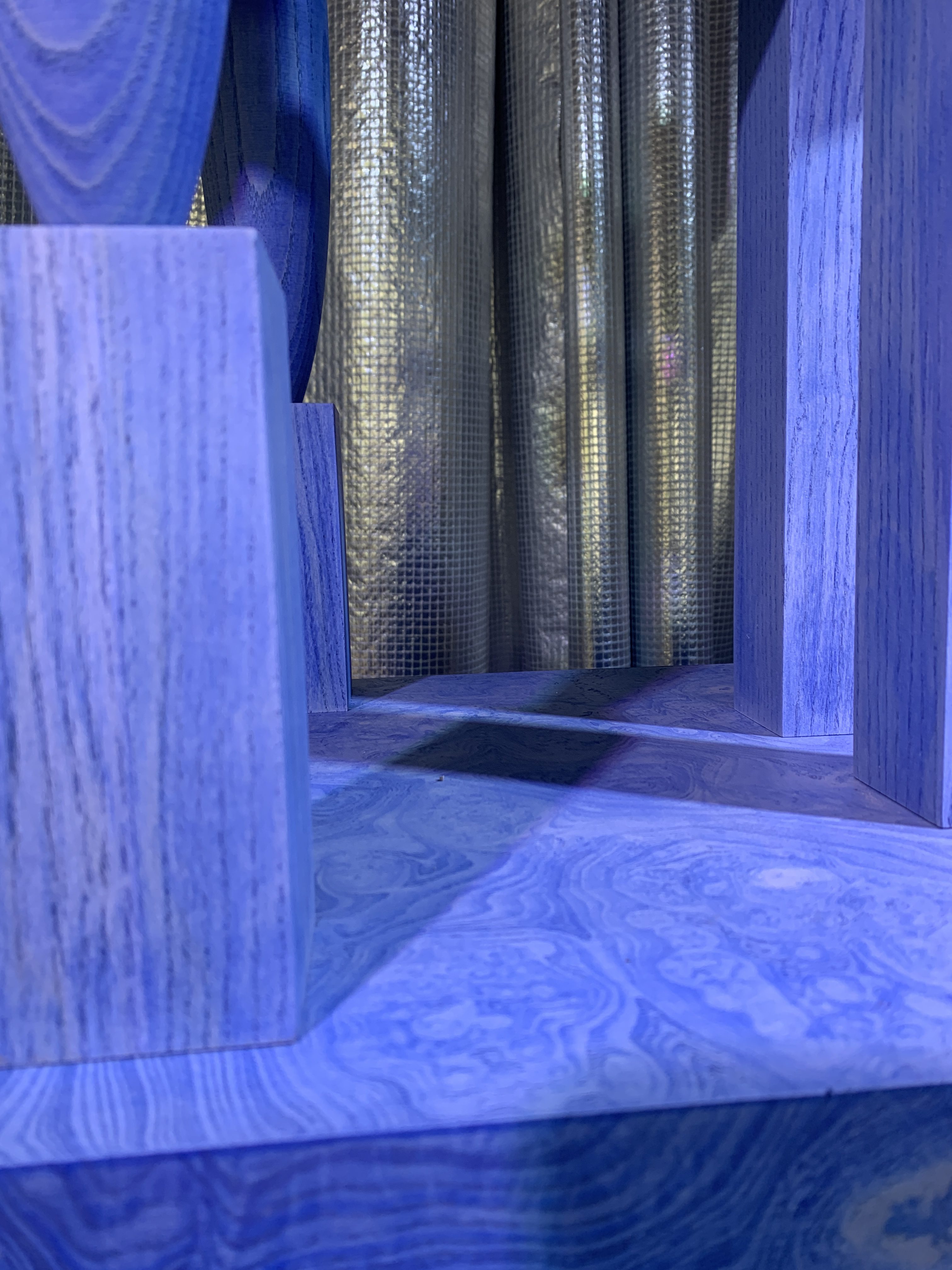
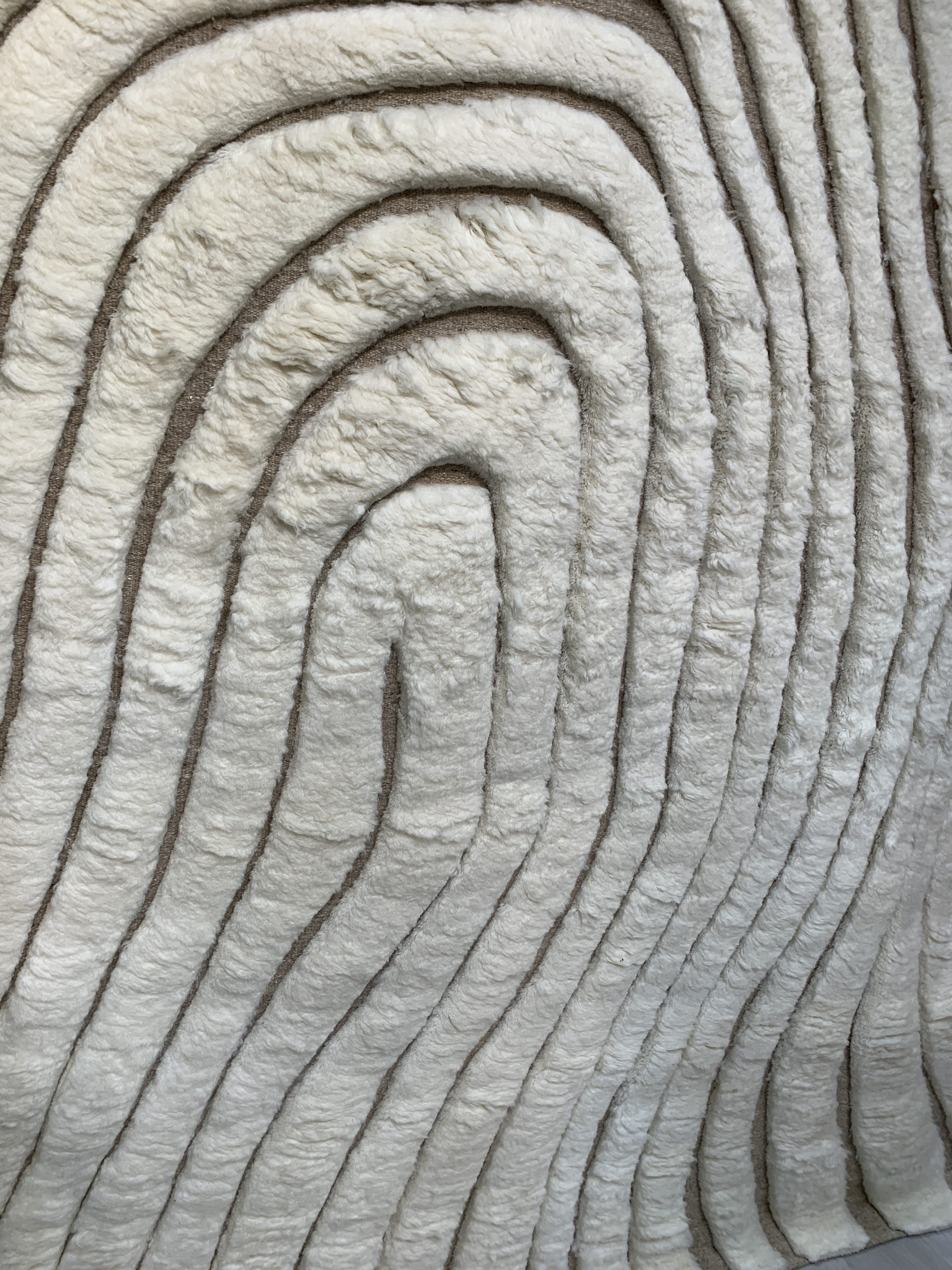
Elsewhere in pattern trends, natural wood that had been painted a vivid shade (neon colours, for example) was also on display, as was boucle. Or at least a new iteration of traditional boucle – one that was more ‘unfinished’, and ‘chunkier’ and that you could ‘sink your fingers and toes into’.
Bringing the Outdoors In
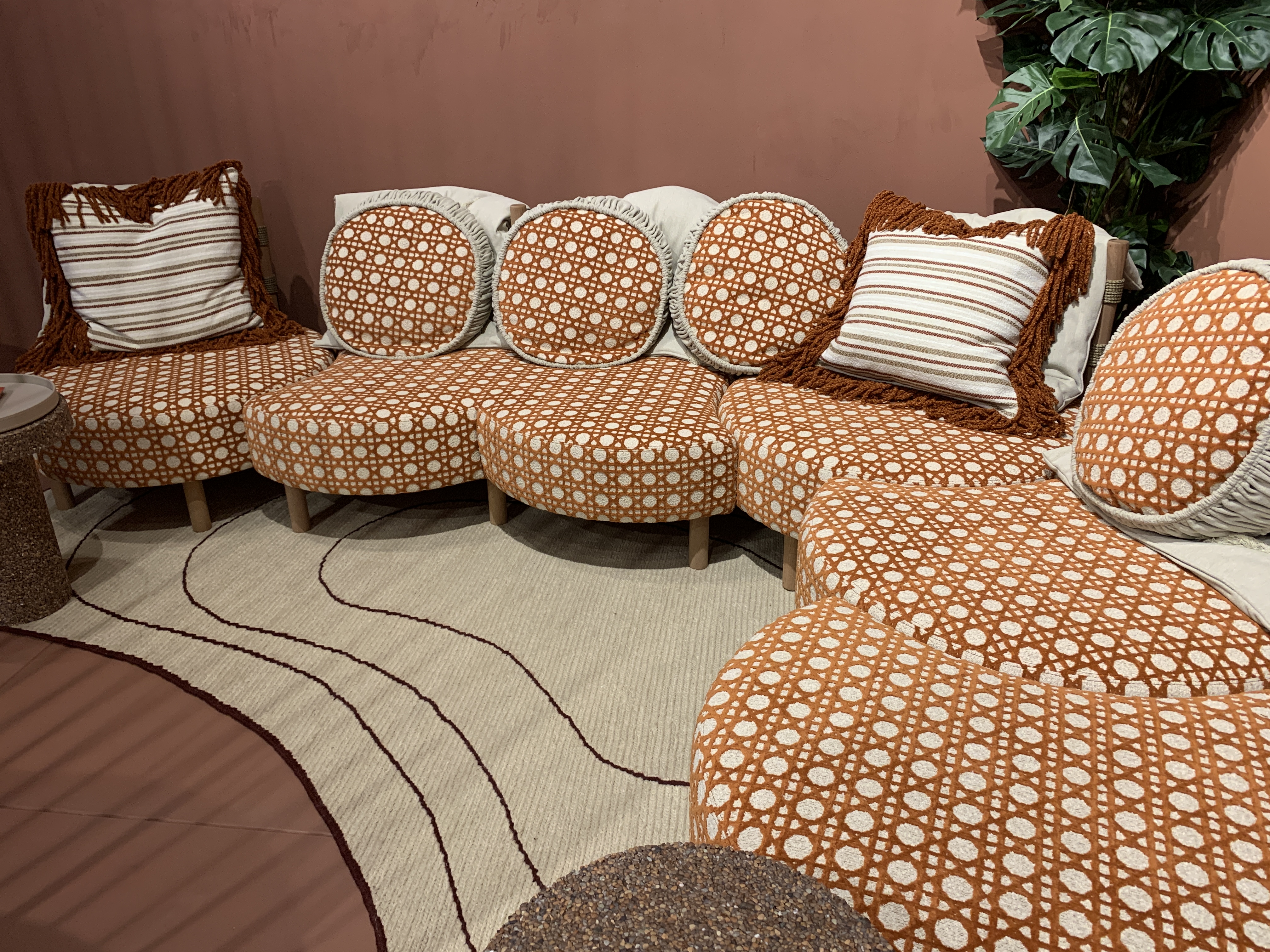
Furniture made from cane also dominated the fair; pieces that looked as though they could be used either inside or out, and therefore blurring the lines between interior and exterior trends. Such pieces looked like items you’d see in someone’s living room and ‘not necessarily like they would be in an office’, said Katherine, who says the overall effect worked well.
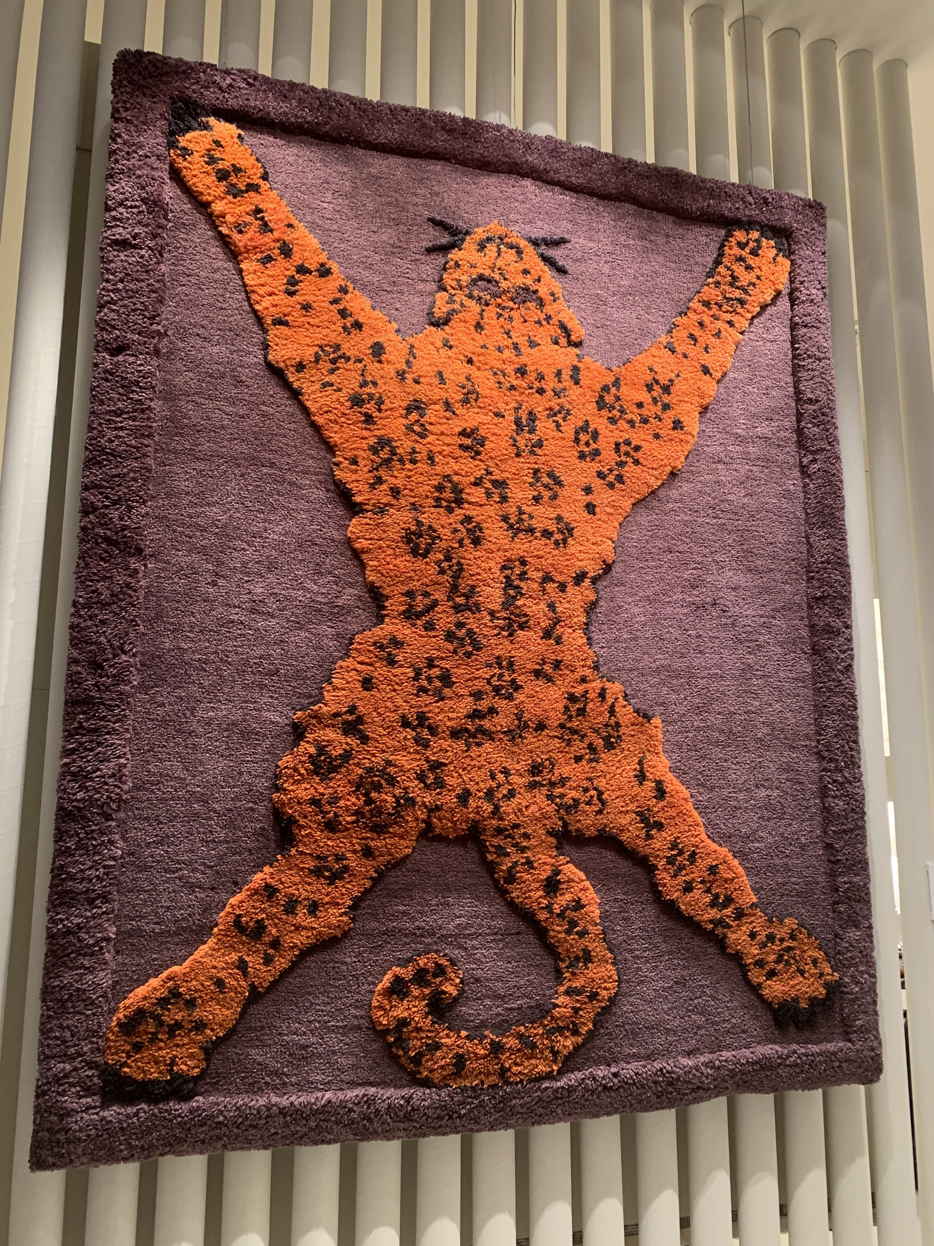
Circles and dots was a key trend too, while ‘Tibetan Tiger’ – also spotted by Katherine – featured rugs and pillows displaying bold tiger motifs.
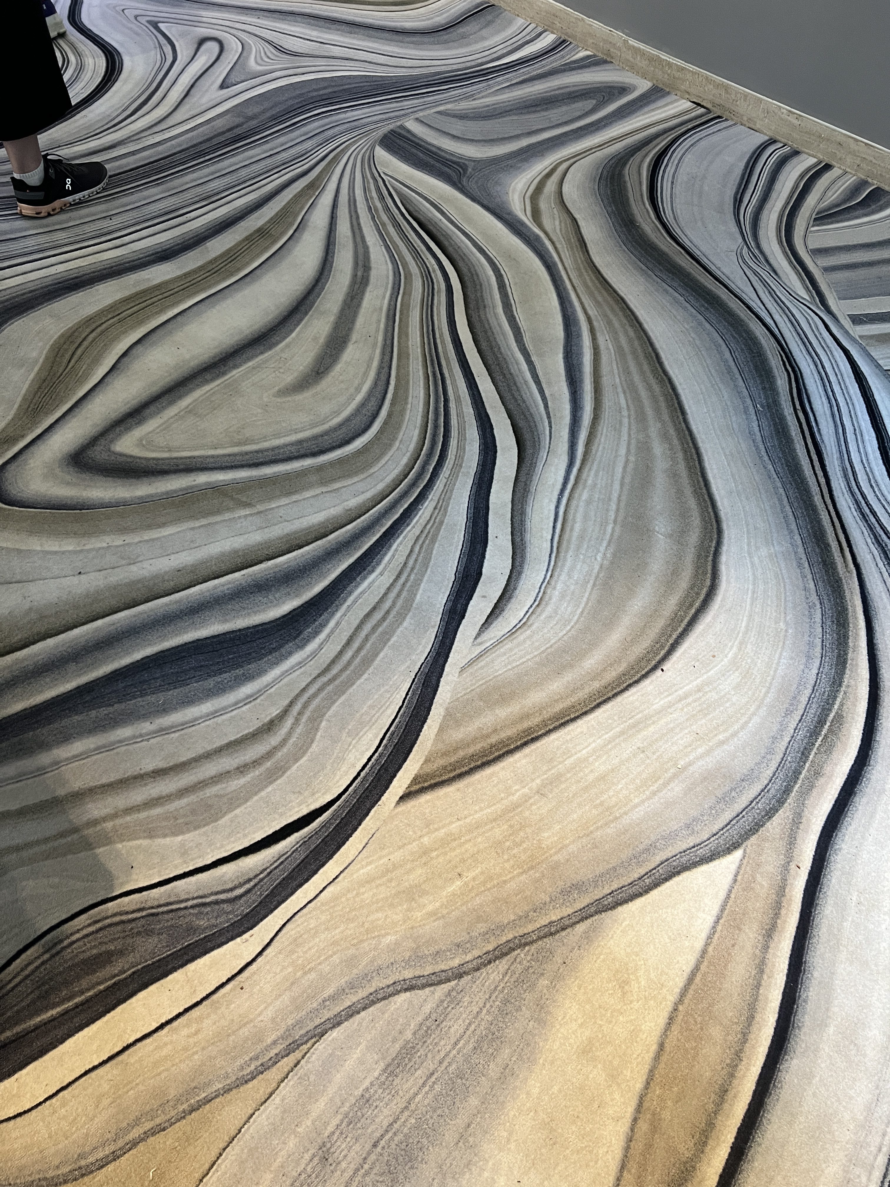
Terazzo ‘isn’t going anywhere either’, says Katherine, while moons, suns and eclipses gave a nod to the 90s. High-lacquer/high-gloss finishes were also in abundance, alongside velvet solid rugs (and rugs with a ‘walked-on’ texture).
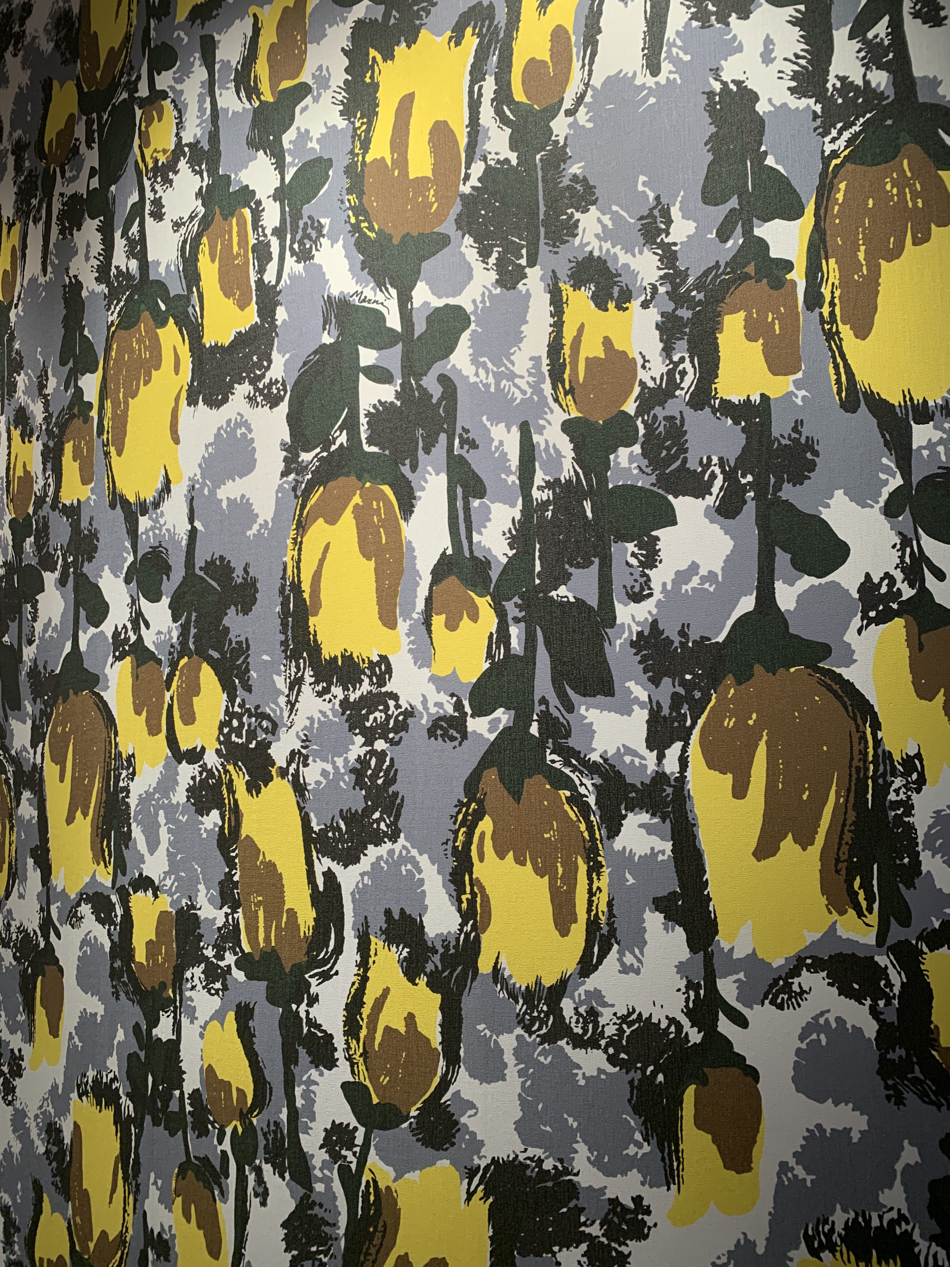
There were tribal and wavy prints aplenty too, as well as pieces featuring curves and arches, and melange fabrics. In short, this year’s Milan Design Week was a veritable riot of textures, prints and patterns – an absolute feast for our team’s eyes.
Stay Tuned for Part Two: Colour…
Want to discover our insights relating to colour? Stay tuned for our second blog, featuring all the latest trends from the global capital of design.
Tibetan Tiger from Aimore Isola, Guido Drocco, Luciano Re and Roberto Gabetti
Blown glass at Dario Buratto
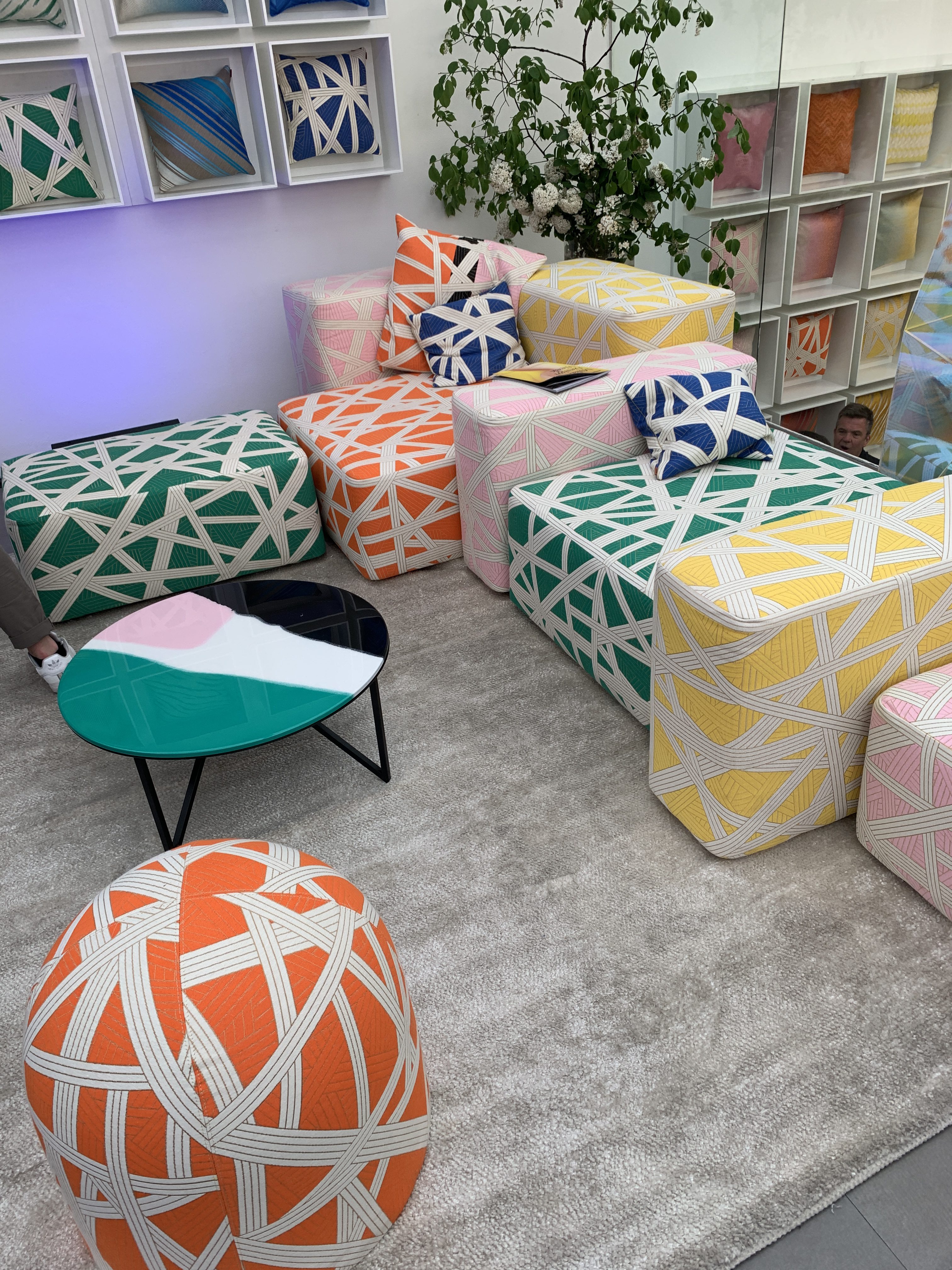
Woven prints at Missoni
Woven print at Evolution 21
‘cerused wood’ from Jiri
Terrazzo and marble at Knoll
Bold prints at Marni
Natural forms at Moooi
Natural forms at Mary Lennox
Textured rugs at Linie Design
