Geometry is an integral part of design from start to finish.
Just think about it. Architects use geometry to study and divide space as well as draft detailed building plans. Builders and engineers rely on geometric principles to create structures safely. Designers apply geometry (along with color and scale) to make the aesthetically pleasing spaces inside. Applying geometry in design is unavoidable.
We have plenty of examples of creative applications of geometry, from the elaborate patterns found within Islamic architecture to the complex fractals in Pollock’s drip paintings to the clean lines of modern interiors. Why is geometry such an enduring foundation of our work? How can we apply it in ways that not only appeal to our senses but also to our sense of well-being?
Short answer — look to nature.
Natural geometry
Pattern can be found everywhere in nature: tree branches, snowflakes, zebra stripes, nautilus shells. We’ve been studying these natural patterns since ancient times, and only recently have we really been able to explain them with mathematics, physics, and chemistry. Perhaps it’s this mystery and complexity that draws us to geometric patterns in the first place.
The most commonly-found natural patterns are:
- Symmetry – the near-repetition of a pattern element by reflection or rotation
- Spirals – a continuous and gradually widening (or tightening) curve around a central point
- Fractals – similar patterns recurring at progressively smaller scales
- Tessellations – patterns formed by repeating tiles on a flat surface
Flowers have a natural symmetrical structure.
Bee honeycombs are a natural tessellation of small hexagons.
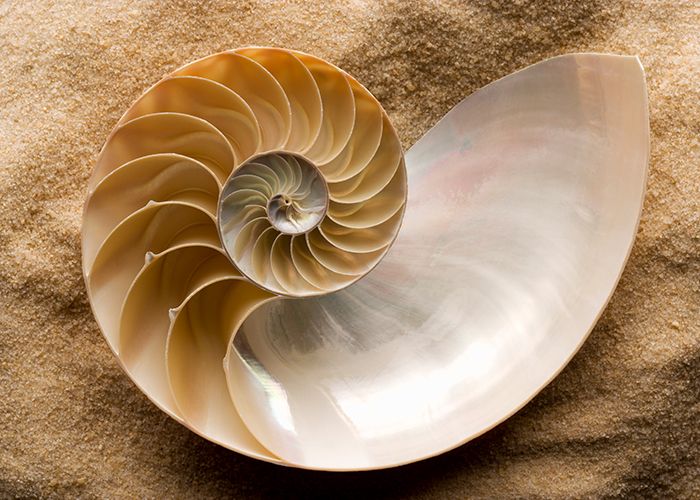
This bisected look at the inside of a nautilus shell show the spiral inside – a perfect example of the Golden Ratio.
Romanesco broccoli has a distinct spiraling fractal pattern.
Geometry in Design
Bringing the outside in with biomorphic patterns
Research shows that views of nature have an impact on our psychology and physiology. Likewise, natural elements and even representations of them using Biomorphic Forms & Patterns create spaces that are “comfortable [and] captivating…”1
Connecting to nature in this way allows us to draw on geometric design patterns for inspiration. Avoiding right angles and straight lines for more organic movement within a space or using the Fibonacci series to create proportion are two examples of applied geometry in design.
From large, 3-dimensional structures that evoke honeycombs to cosmetic details that mimic vine growth, Biomorphic Forms & Patterns bring nature to life and reduce stress within our environment. And, it works at a large or small scale.
What are some easy ways to apply this biophilic design pattern?
- Pathway and hallway design
- Fabrics, carpet, and wallpaper designs based on Fibonacci series or Golden Ratio
- Arrangement of the structural system (columns shaped like trees, railings like branches)
- Furniture shape
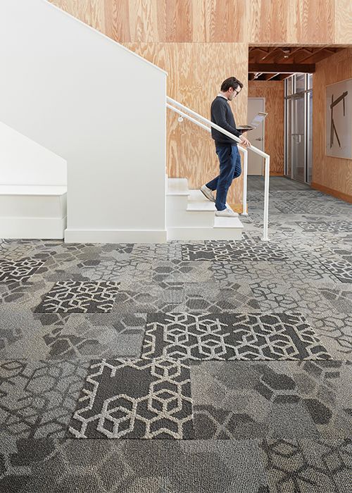
Biomorphic patterns (such as honeycomb-like hexagons) create interesting spaces through the application of tessellations. Product shown: Let It Bee collection
Where geometric patterns and biophilia meet
Geometry also comes into play through the biophilic design pattern of Complexity & Order. Rooted in research on fractal geometries, Complexity & Order concerns our responses to fractals in nature, art and architecture.
In spaces that utilize Complexity & Order, we tend to feel less stress and more engagement. This is because they reveal rich sensory information similar to what we encounter in nature – the sweet spot between uninteresting and over-stimulating.2
How do we apply Complexity & Order to a space?
- Exposed structures or exoskeletons
- Modular systems such as carpet tiles, multi-purpose furniture or the incorporation of flexible, multi-use areas within a larger layout
- Architectural ornamentation and wall art
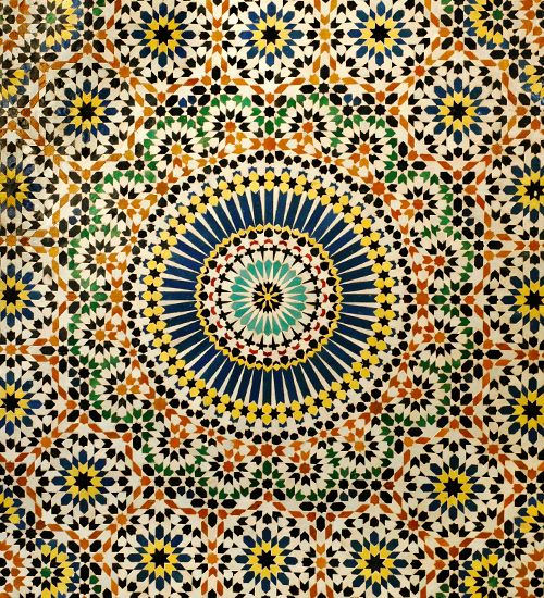
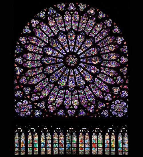
An obvious application of geometry in design (and Complexity & Order) can be found in Islamic art and architecture. Think: bold-colored kilim carpets, Moroccan tilework and star-covered mosques.
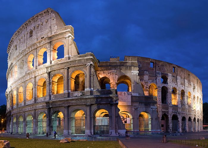
Fractal patterns seen in the archways of the Roman Colosseum. Photo by David Iliff, via Wikimedia Commons
The north rose window of the Notre-Dame de Paris. Photo by Julie Anne Workman, via Wikimedia Commons
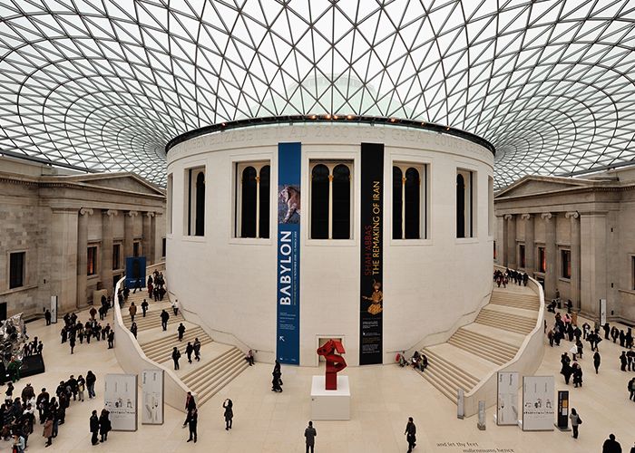
The open court and glass dome of the British Museum features a symmetrical layout and exposed glass framing in a geometric pattern. Photo by Eric Pouhier, via Wikimedia Commons
The goal of designing with this pattern is to create an enriching environment based on an understanding of the symmetries, fractal geometries and spatial hierarchies found in nature. The more complex a system is, the more ordered it becomes. The more ordered it is, the more at-ease we feel.
Humans instinctively gravitate to visually interesting spaces. By understanding the mathematics behind complex design and using nature as a guide, we can bring more of what’s outside into our built environment.
References
1 2 Browning, W.D., Ryan, C.O., Clancy, J.O. (2014). 14 Patterns of Biophilic Design. New York: Terrapin Bright Green, LLC.
Additional Reading
Hägerhäll, C.M., T. Laike, R. P. Taylor, M. Küller, R. Küller, & T. P. Martin (2008). Investigations of Human EEG Response to Viewing Fractal Patterns. Perception, 37, 1488-1494.
Joye, Y. (2007). Architectural Lessons From Environmental Psychology: The Case of Biophilic Architecture. Review of General Psychology, 11 (4), 305-328.
Kaplan, S. (1988). Perception and Landscape: Conceptions and Misconceptions. In J. Nasar (Ed.), Environmental Aesthetics: Theory, Research, and Applications (pp. 45–55). Cambridge, England: Cambridge University Press.
Salingaros, N.A. (2012). Fractal Art and Architecture Reduce Physiological Stress. Journal of Biourbanism, 2 (2), 11-28.
Stevens, Peter S. (1974). Patterns in Nature. Little, Brown & Co.
Taylor, R.P., (2006). Reduction of Physiological Stress Using Fractal Art and Architecture. Leonardo, 39 (3), 245–251.



2 responses to “Why Do We Rely So Much on Geometry in Our Designs?”
Hello! Gooday!
We’d like to ask your permission to provide a direct link to the following content on your website as part of our Learning Initiative on RoundGlass Learn Collective worldwide, in perpetuity. It would be included in one or more of our courses with proper attribution and credit to the original author/publisher.
We found this content incredibly useful and feel it will enhance the learning journey of our users while also providing a wider audience for your content.
Title: Why Do We Rely So Much on Geometry in Our Designs?
Link :https://devinterfaceblog.azurewebsites.net/geometry-in-design/
About Us
We’re RoundGlass, an organization founded on the aspirational goal of providing solutions which enable every individual to put wholistic wellbeing at the core of their life’s journey.
The RoundGlass Learning Initiative is a strategic program that works to reimagine the future of education and learning for wholistic wellbeing. To do so, we are creating a series of MasterClasses led by a global team of experts in the fields of History, Play & Movement, Nature Learning, Mathematics and more.
While these courses are offered free, RoundGlass is a for-profit entity and there may be future courses which require payment/subscription to access.
Would you permit us to link the material above? And may we have blanket permission to link to other content from your site in the same manner? If so, please reply to this email and include your name and title within your organization.
We look forward to hearing from you.
Warmly,
Anushi Rajguru
Learning Initiative
Mobile: +91 9900793932
A picture containing drawing
Description automatically generated
RoundGlass | LinkedIn
Of course, please feel free to link to any of our resources.