As our natural and digital worlds collide, artists and designers are taking note. The polarised trends of technology and craftsmanship were on display at Milan Design Week, as well as the Stockholm Furniture & Light Fair. We expect them to stick around throughout 2018 and beyond.
Technology + Craftsmanship
Technology and craft could not be more separate, but it’s in the combination of these elements that the magic truly happens. This mix represents the push and pull society faces today: while technology is ingrained in our lives, we desire a more localised, high-touch experience.
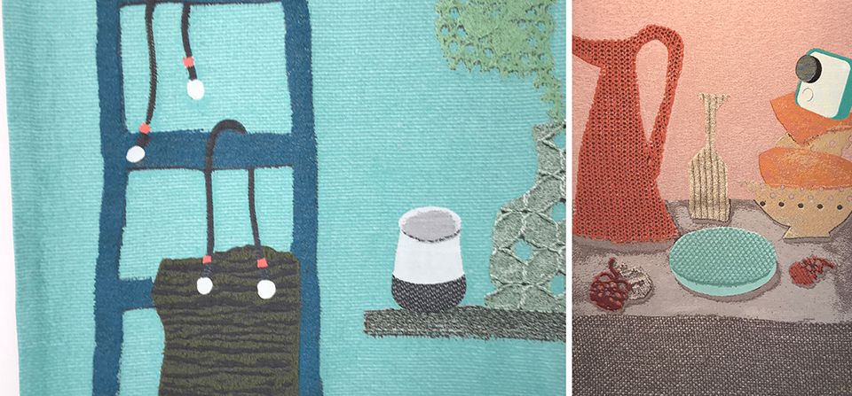
In recent years, craft has emerged as a stakeholder in the world of design, with an emphasis on handmade details, unique imperfections and irresistible textures. Li Edelkoort curated an incredible exhibition titled “Softwear” for Google, showing how effortless our digital tech can mesh itself into the natural comfort of our lives. Equipped with tapestries by Kiki & Joost.
On the technology side, we have a modern, digital and industrialised focus. On its own, this can become dull and redundant, but when balanced with craftsmanship, the results are perfectly imperfect. The two ideas lend themselves to interesting design solutions. Think bold colour, hard lacquers, mixed materials and guerrilla art marks countered by soft pastels, plush accents, velvet upholstery, knits and warm ceramics.
Saturation and symmetry
From a styling perspective, bold colour and unique compositions are taking center stage. Emphasizing impermanent design, guerrilla and graffiti style artworks popped up throughout Milan. Manufacturer Nitoms presented an exhibition at Milan Design Week titled, Haru Stuck-On Design that featured large scale temporary artworks and installations using tape as a medium. Overlapping saturated bands of colours created complexity and depth in a mix of thicknesses and scale.
More saturated colour and symmetry created artful installations. As seen at Hermes’ Wes Anderson inspired Moroccan tile showroom.
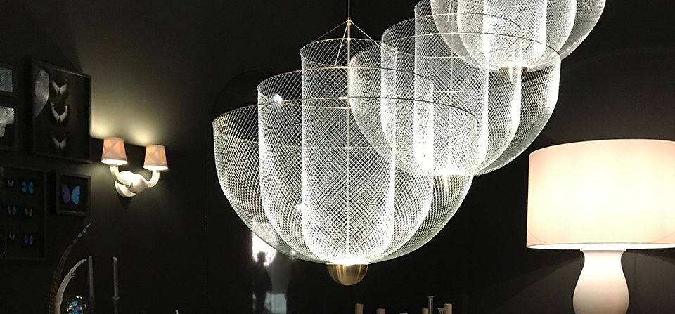
We’re also picking up on some unusual mixes at it pertains to spirituality in combination with futurism. In this case, lighting at Moooi was both soft, ethereal and entirely mesmerizing. COS x Phillip Smith created a humbling showcase for nature and architectural lovers alike with an outdoor reflective mirror installation. Without a doubt, every year I’m looking forward to what COS has in store for us at Milan.
Fresh palette
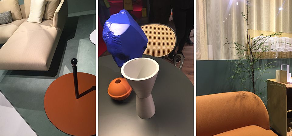
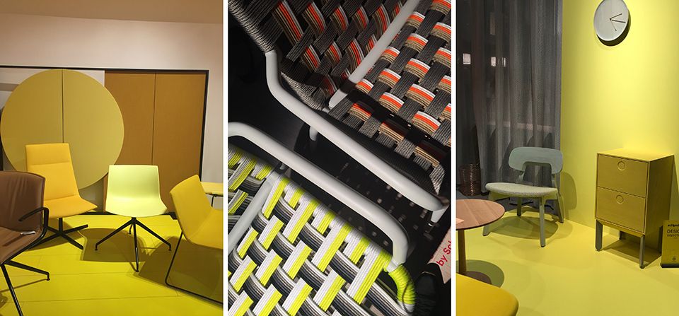
The juxtaposition of tech and craft is also represented through colour palettes. Sporty and zippy vs. soft and ethereal. Monochromatic palettes have gone way way over the top with the use of the same colour (mauve makes an interesting resurgence, looking so refined and of the moment) in different tones and saturations, which makes for an exciting visual landscape of texture. For that fresh feeling, include some key colours: Yves Klein Blue, terra cotta, heavy sunken slate green and acidic yellows.
Building stronger connections
This woven mix of colours, styles and mediums reflects today’s global discourse. For a more unified approach, we’re building stronger connections with one another around the world, while still maintaining a micro-focus that allows us to “keep it local.” Technology may connect us all, but it’s ok to go offline once in a while.
Ciao!


