From Milan to New York to London to Chicago, spring and summer mark some of the busiest months of our calendar. We sent designers to the Milan Furniture Fair, NYCxDesign, Clerkenwell Design Week and NeoCon this year! So in an effort to capture the essence, I’ve compiled our most notable design moments and trends of the season below.
Well-intentioned and thoughtful approaches to design and colour seemed to be at the front of everyone’s mind. Attention has been directed toward creating experiences within environments versus focusing on output, the result being well-designed furniture pieces in delicious materials and color palettes that are simple, beautiful and functional.
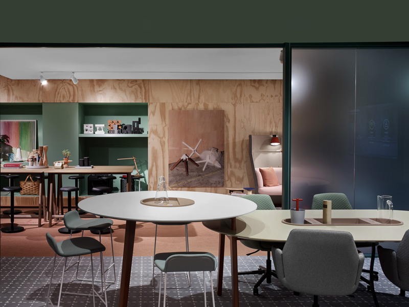
Moving Beyond the “Corporate” Look
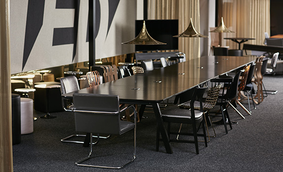
We continue to see a blending of environments when it comes to commercial interior trends. The boutique hotel and corporate office look more similar than different these days. Neighbourhoods for different work styles continue to be the focus of major brands, while smaller brands drive attention toward bespoke and limited production pieces.
Office space configuration at the Haworth Showroom at NeoCon 2017
All of this rolls up into a common theme of work choice, providing options for the quiet introvert and the social extrovert. Office furniture has moved well beyond the workstation to incorporate lounge seating and low surfaces. Furniture as interior architecture is delineating space with high backs and collaborative configurations. Systems are designed to match an intended function; not the other way around.
Courtesy of BuzziSpace. Photographer: Chris Bradley
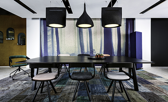
Embracing Colour
After Milan, I thought it was something in the Italian air, but both NeoCon and Clerkenwell showed an overall deepening of colour palettes. The omnipresent neutral wash to which we’ve grown accustomed has shifted into emotional rich shades of colour that quickly approach black, often shown as monochromatic settings. These deeply saturated darks, in malachite, garnet, inky indigo and rust, create a moody palette that compliment neutrals rather than accent them.
Courtesy of Knoll, Inc.
This earthy palette is bringing about a wide range of textures and natural materials. Everything from brassy bronze and oxidised metals to smooth marble and velvety upholstery. The overall tone, showed an affinity to luxury finishes and material palettes in yummy colours.
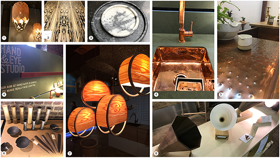
Emerging Trend: Natural Materials
1. Louise Tucker, 2. Pinscher, 3. Friends Founders, 4. Hand Eye Studio, 5. Devol Kitchens, 6. Par-avion Co, 7. Lozi, 8. Resound by Camilla Lee
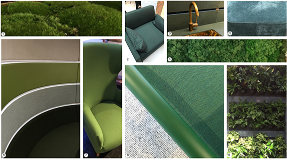
Pantone Color Spotting: Kale
1. Moss, 2. Connection, 3. Hand and Eye Studio, 4. Moss Wall, 5. Poliform, 6. Connection, 7. Dare Studio, 8. Connection, 9. Urban Live Picture
We are about to dive head first into our favourite Fall shows, so stay tuned for trend updates from design weeks around the world. Next up, London Design Festival, Maison Objet, Fashion Week’s around the globe and BDNY.
XOXO