At a time when many people are finding comfort by embracing the past for comfort, Pantone brings the nurturing warmth of nostalgia to the forefront of interior design with colour trend Peach Fuzz, the 2024 Color of the Year.
Just as Interface celebrated its 50th anniversary by pairing vintage-inspired patterns with modern design thinking in the new Past Forward™ collection, Peach Fuzz commemorates 25 years of Pantone’s Color of the Year Program with a velvety gentle peach that Pantone says “reflects the past yet has been refashioned with a contemporary ambiance.”

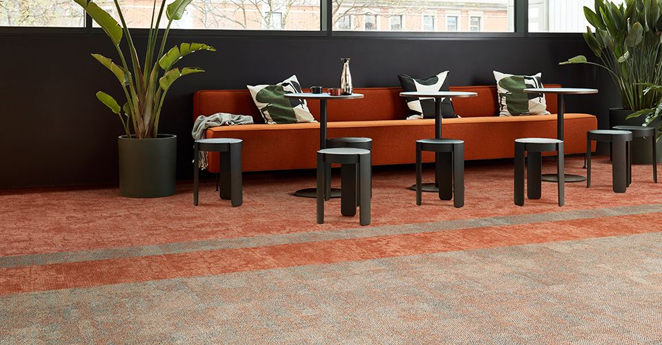
Products: Dry Bark – Desert Sands │ Escarpment – Desert Sands
To select its annual Color of the Year, Pantone tasks their team of global colour experts to search for colour trend influences around the world, an analysis that ranges from trends in art and fashion to social and economic conditions. According to Pantone, Peach Fuzz is a wonderful accent that conjures the feelings of welcoming and cosiness, and the team chose it to “capture our desire to nurture ourselves and others.”
Cocooned Warmth

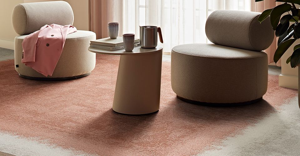
Products: CE100 – Consider, Escape | CE200 – Consider/Escape
Interface Product Design Manager Natalie Makowski reflects, “The overall Peach Fuzz colour trend has a peaceful sense to it. It’s quite heartfelt, and it brings a stillness and a softness to an interior space — it is calming and healing. One of the buzzwords that Pantone uses with Peach Fuzz is ‘Cocooned Warmth,’ and I think that comes through.”
Fluffy textures, soft fabrics, and warm tones can be used to introduce a sense of peacefulness and healing into interior spaces – feelings that can be enhanced with Peach Fuzz-inspired colour choices. While pale orange and coral tones can be combined in residential spaces, they also complement neutral shades.

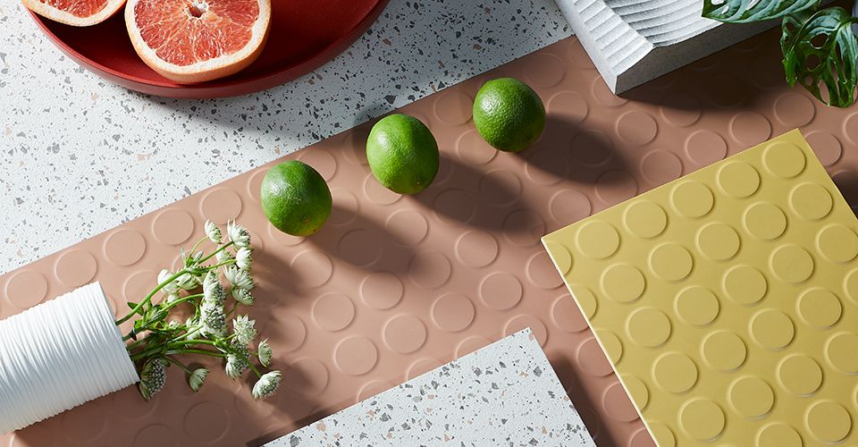
Rubber flooring products: norament 926 pado and norament 926 rubber flooring from nora® by Interface
For commercial use, Makowski says, “Peach Fuzz would look good paired down using grey tones to give it a more corporate feel. To bring the warmth back in, you can pair the colour with a neutral palette such as oatmeal and beige; Peach Fuzz would then act as a highlight colour. A combination of warm neutrals and this little pop of peach is how Interface would use our products and this colour together to create an interior scheme.”
Pantone’s Color of the Year is a perfect featured accent that can be integrated into interior surfaces through furniture, or through accessories. In flooring, calming Peach Fuzz can elevate the tenderness of broader neutrals, and we’re excited to see how designers incorporate this engaging shade into their projects.

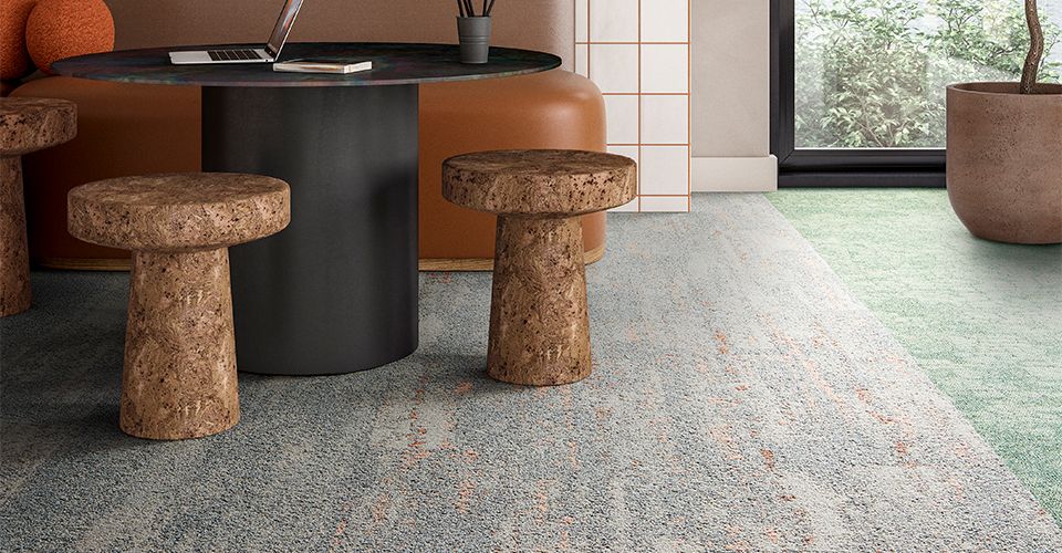
Products: Upon Common Ground carpet tile collection from Interface