As we celebrate our 50th year, it’s natural to look back at aspects of our journey that have helped Interface become what it is today. Colour, pattern, and material are all key design elements that have helped define interiors over the past five decades. Focusing on everything from fashion to homes and commercial spaces, let’s delve into the impact of such trends – from the 1970s through to the present.
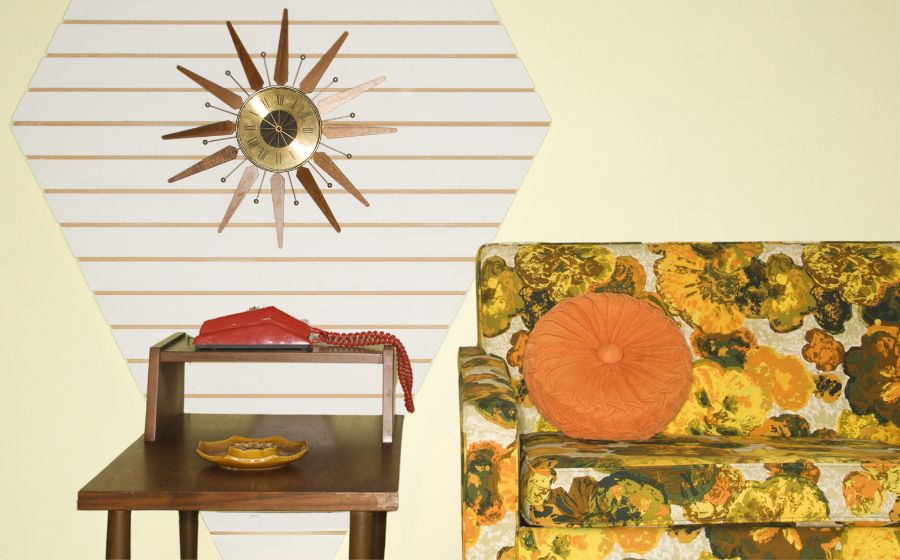
Shades of yellow, orange, and green and floral patterns were popular during the 1970s.
1970s – Design to the Max
If the 1970s were to be summed up in one word, it would be “groovy.”
This is a thought echoed by Interface Director of Design Purpose Chip DeGrace, who recalls the uniqueness of the decade. “I was born in the ‘60s, but was a child of the ‘70s,” says DeGrace. “Back then, colours were bold and patterns were big. People were not holding back – think avocado greens, yellows and oranges along with geometric designs.”
According to Interface Associate Creative Director Katherine Cohen, designers during this time embraced nature and handmade looks – think earthy colours, flower power, crochet, macrame, shag carpets and rugs, and organic waves.
“When you look at those times with a critical eye, you have to admit there was some unfortunate stuff going on but there were brilliant things, too – no matter what, design in the ‘70s was definitely not boring,” DeGrace continues.
Pastel tones — especially mauve — were common in the 1980s.
1980s – A Spectrum of Design
The next decade ushered in a time when designers were viewed as true celebrities. DeGrace was beginning his design career then, and he remembers the influence of Phillipe Starck and Michael Graves, amongst others.
The 1980s were also a decade that thrived on extremes, and this was apparent in fashion, hairstyles, design and more. “I recall there were some crazy derivative architecture and interiors in ’80s, says DeGrace. “You had hyper-elegance and punk co-existing; plus, the Memphis movement and post-modernism were taking hold. Pastel colours like mauve and ‘seafoam green’ were popular, and there was A LOT of grey.”
The 1990s was a return to the traditional, with warm woods and classic colours.
1990s – Classic Comfort
After the complexity of post-modernism, colour and pattern in the 1990s leaned a bit more traditional, fostering a sense of comfort and stability. “The ‘90s saw a surge of interest in classic colours like burgundy and hunter green and in warm wood tones,” said Cohen. “When it came to flooring, historic looks reigned – berber carpets, black-and-white harlequin tile, and border details were common.”
Gingham, floral, and geometric patterns were everywhere in the ‘90s – from furniture to wallpaper. However, they featured muted colour palettes that prevented the designs from overwhelming interiors. “If 1980s design was an exploration of excess, the 1990s was a study in restraint,” said DeGrace.
The 1990s featured industrial elements, like concrete floors, in both residential and commercial spaces.
2000s – Copycat Chic
As we entered the new millennium, what’s old became new again. Developers were renovating factories into loft apartments and offices, and industrial elements like exposed brick and concrete floors, were on trend. Even new construction projects incorporated such features to mimic the look of adaptive reuse projects.
Meanwhile, animal prints and faux fur were also having a moment. “Looking back, the 2000s was an interesting time – ‘fake it till you make it’ applied to both fashion and design,” said Cohen. “You saw celebrities wearing leopard print and pleather on the red carpet, while faux finishes invaded residential spaces. Thankfully, designers took a thoughtful approach to how they integrated these ideas into commercial projects.”
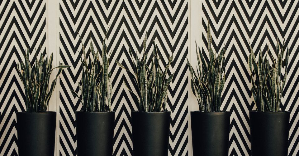
Chevron and other graphic patterns were all the rage in the 2010s.
2010s – Statement-Making Accents
As the 2010s began, patterns grew bigger and bolder, with large, graphic shapes becoming the norm for upholstery, rugs and window treatments. “Ten years ago, fabrics were all about making a statement through bright colours like teal and tangerine and designs like chevron and ikat,” said Cohen.
These patterns accompanied a revival in mid-century modern looks as well as modern farmhouse styles. “You often saw colourful accents balanced by grey or white surfaces,” said Cohen. “Wide-plank flooring was big, and as farmhouse looks grew more prevalent, buffalo plaids began resurfacing.”
Warm colours like rust and terracotta are the new neutrals of today.
2020s – A Shift Toward Warmth
Four years into our current decade, it’s clear that designers are embracing warm tones and softness in interiors.
“Today, the rust/salmon colour combo is really being used as a neutral,” said Cohen. “I think this salmon upholstery has taken over where ‘greige’ used to once live. Designers are layering it with darker shades of rust and lighter peach tones. We’re also seeing a lot of rounded shapes and organic lines like those found in Kelly Wearstler’s Graffito pattern.”
Interface Design Director Mandy Leeming agrees that earthy colours are the order of the day: “In recent years, we have seen soft neutrals and pastels be important shades with tones such as terracotta, browns and even Matcha green being popular and trending through Pinterest searches. Now we are seeing a strong direction to soft muted tones of milk, chalk, and clay.”
Interest in maximalism translates to the incorporation of more colour and pattern into interiors.
Colour, Pattern + Material: The Outlook
While DeGrace acknowledges that no one really knows what’s on the horizon, he thinks commercial design will continue to be driven by a space’s intended use and ambiance. “Colours, patterns and materiality will be hyper specific and may make the overall mood board a bit fragmented; however, this diversity ultimately benefits occupants because there’ll be choices in space types, sizes and technologies,” explains DeGrace.
According to Cohen, a lot of design ‘rules’ have gone out the window. “Maximalism has come back in a big way, which made people less fearful about mixing patterns, says Cohen. “The reemergence of wallpaper also provides another opportunity for elaboration. I’m excited to see where we go next.”