In this series of blog posts, we have already looked at the use of colour in hospitality spaces and education spaces. Now, it’s time to explore beneficial ways to use colour in the workplace. We are all familiar with the concept of companies relying heavily on their brand colours within workplace design schemes to be instantly recognisable. But does this use of corporate identity really provide human benefit? Using colour in a more considered way can have huge benefits on the productivity and wellbeing of their staff (and, of course, looks a lot more sophisticated!).
As with other sectors we’ve spoken about, fulfilling the diverse needs of all individuals that occupy a space is crucial. The design of offices and its effect on the wellbeing and productivity of staff has a direct impact on a business’ success. Architects and designers have a responsibility to achieve this diversity and wellbeing – trying to focus in a busy office is no easy feat if you have a low threshold for sensory stimulation. Equally, creating your best work in a silent space might not be possible if you thrive in the hustle and bustle of a livelier setting.
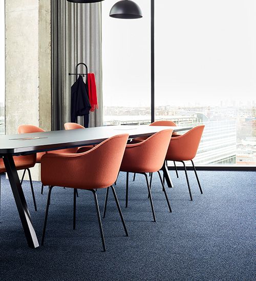
So, we know we need to design different spaces for different needs. And there are various ways we can do this by zoning using colour. Colour can have a large impact on our emotional responses; research has found that when we view different colours, there are changes in neurotransmitters such as serotonin (the ‘happy chemical’), melatonin (the sleep hormone) and norepinephrine (the stress hormone).i
Touch & Tones II – Gold & Sapphire
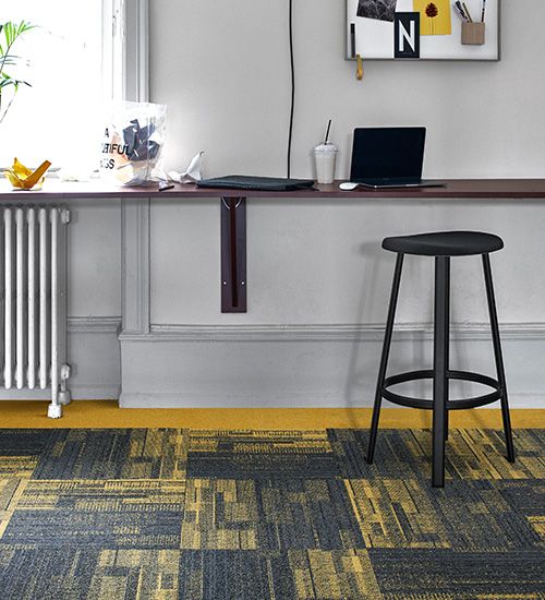
Works Geometry – Canary
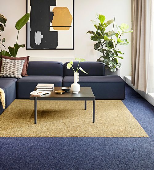
Dolomite – Lapis Lazuli
Studies have also shown that:
- Yellows are considered to be cheerful and uplifting,ii and have a positive effect on mood and wellbeing when used in spaces aiming to excite and energise.iii
- Blues can aid digestion and sleep due to their calming effect.iv
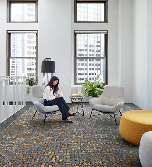
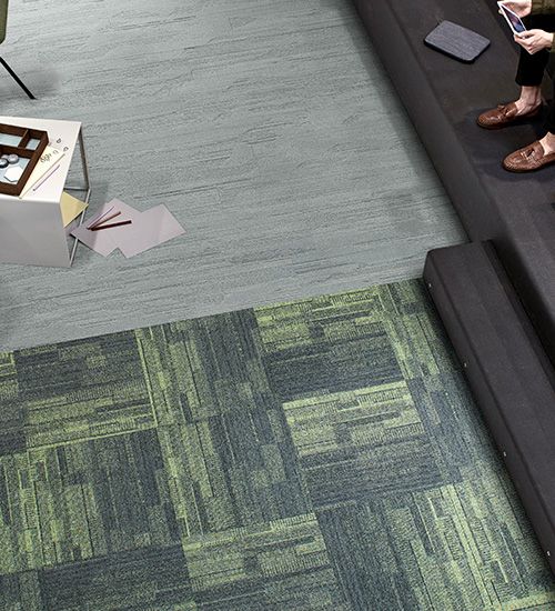
- Green is the easiest colour for the retina to focus on and so is a great colour for concentration.
- Green is also the least likely colour to cause a migraine, according to the Migraine Trust and Dulux, so would be beneficial in areas where the most occupants spend a lot of time.
Broome Street – Yellow Glass
Works Geometry – Lime
Touch & Tones II – Biscuit, Olive
Broome Street – Blue Glass
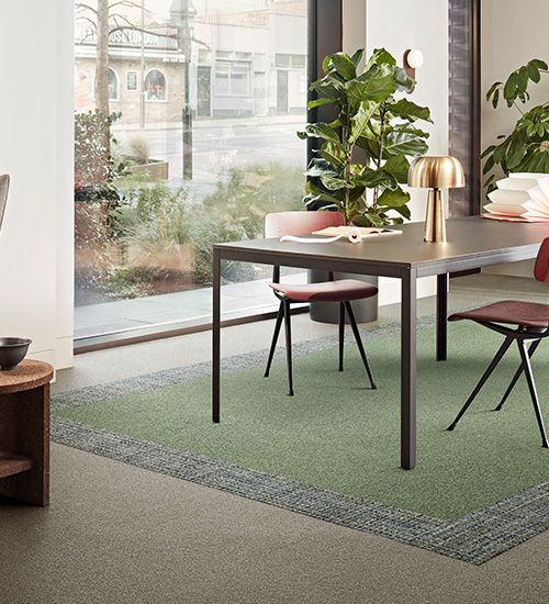
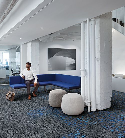
Given this, for a fully inclusive approach to using colour within design, it would make sense to choose colours carefully to separate places of focus and concentration from social areas, creative spaces, and restorative zones. Follow research findings and the Ecological Valence Theory to help to create the desired atmosphere, such as blue for calm, green for focus, and yellow for social. Zoning spaces using colour can signal to occupants what the space is intended for and allows them to pick and choose spaces depending on their preference, activity, or mood. Finally, considering the placement of these colours so that they have a more natural configuration as found in nature, (e.g., lighter colours or shades overhead and richer colours or darker shades towards the ground) can aid visual comfort and reassurance.
The use of colour in the workplace can provide numerous human centered benefits in the post covid age; from defining circulation routes, and aiding distancing in the use of flooring tiles, delineating zones of activity and enhancing mood.
It is time to think of workplace colour schemes as less about defining identity and more about enhancing human wellbeing and performance.
References
[i] http://www.klinghardtacademy.com/images/stories/color_therapy/color_therapy_through_eyes.pdf
[ii] https://www.pminj.org/14-smp/files/ckirby-ho.pdf
[iii] https://www.tibb.co.za/articles/Part-3-The-Physiology-and-Psychology-of-colour.pdf
[iv] https://www.ncbi.nlm.nih.gov/pmc/articles/PMC3188868/