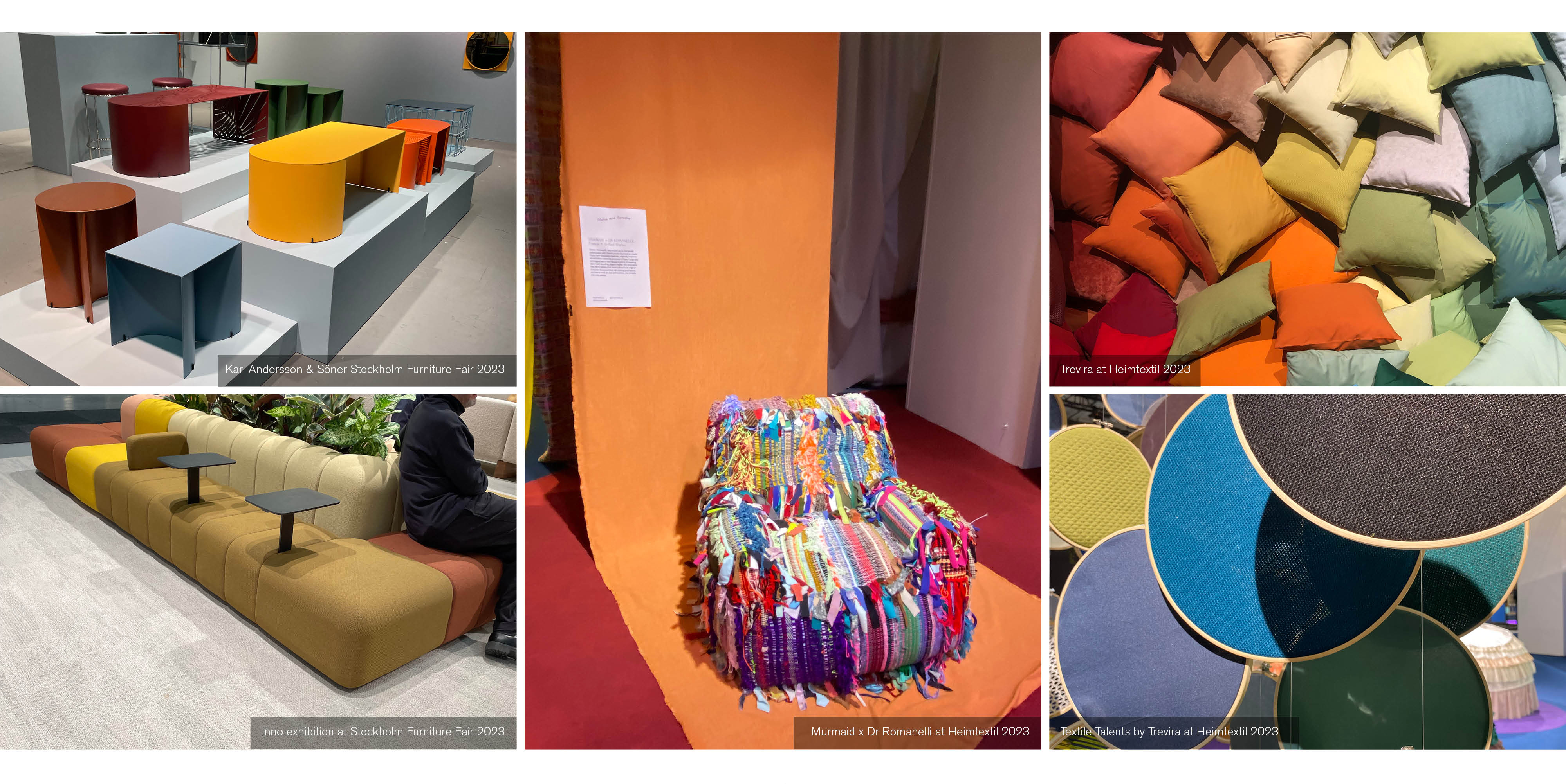
Energetic, animative, vibrant and, above all, fun. ‘Hyper brights’ are dominating the interior design landscape – and we’re thrilled about it.
Following a myriad of orange/yellow shades via ‘Amber Glow’, and a trend that focused on all things blue, we’re sharing with you the latest hues on the block. Described as ‘dopamine-producing tones’, this collection of colours can make everyone feel happy.
Adding life to a host of spaces, hyper brights look set to make a statement in 2023/24 and beyond. Read on to discover what Interface Product Designer, Emily Hammond, makes of the colour craze…
“These warm, candy hues are trending currently.” says Emily. “They’re a brighter take on pastels and they are a real mood-booster.”
Going back to basics, hyper brights are a natural evolution of the original primary colours, creating a rainbow of variating, mid-tone pigments.
Control the Colour Scheme
For those who’d like to adopt the trend, Emily advises that you ‘use transparency to control the contrast or tone of your colour scheme, and variate accordingly.’
Incorporate brighter and contrasting, darker hues to create a ‘colour-blocking statement’. Pinks, oranges, yellows, greens and reds are just a few colour groups you can gradually implement into any space – or all at once.
“Colour-blocking can be versatile, continues Emily, who adds: “choose flow with more subtle colour-blocking with saturated shades, or clash brighter, bolder hues for mood-boosting interiors.”
Pattern and composition are vital for colour-blocking to perform well, says Emily. “The palette should be carefully considered, including the quantity of colours you wish to use and the level of contrast between them.”
Colour Harmony
Want to go all-out? Be brave with touches of neon, adding ‘acid brights’ to a mellower space.
Hyper Brights are ideal for ‘zoning’ within interior design, allowing you to separate sections of your room to create the illusion of space, or to simply make different areas of business premises work harder.
“Varying colours can be blocked within separate palette groups and can lend themselves to different areas, including meeting rooms and wellness spaces.
Feelgood colour schemes are apace worldwide, with Coffee & in Ukraine showcasing a playful space – via glass, colour-blocked walls and bold upholstery – imagined by YUDIN design studio.
Meanwhile, bold, eye-catching colours breathe life – and joy – into home furnishings, too, via bright shades that give everyday items a boost.
Above all, though, if you’re embracing hyper brights, do it in your own way. That’s the advice from Emily, who says adding colour to any space is largely about self-expression.
Near-neon hues of pink and yellow are stand-out shades for spring/summer 23/24 and these can be teamed with other vibrant tones or used against a more neutral backdrop. It’s up to you. (Hyper) bright days are most certainly ahead.