Ah, blue! If we were to assign an adjective to the much-loved hue, it would most certainly be ‘powerful’. Whether we’re talking about regal-looking royal blue, the unashamedly bold electric blue, or the beautiful blue-green hybrid, teal, there’s no denying that each and every version of the primary colour has an enduring appeal.
In our latest ‘Colour Spotlight’ post, Emily Hammond – Interface Product Designer – shares why blue is set to dominate commercial interiors in 2023 and beyond.
Blue: Colour Evolution
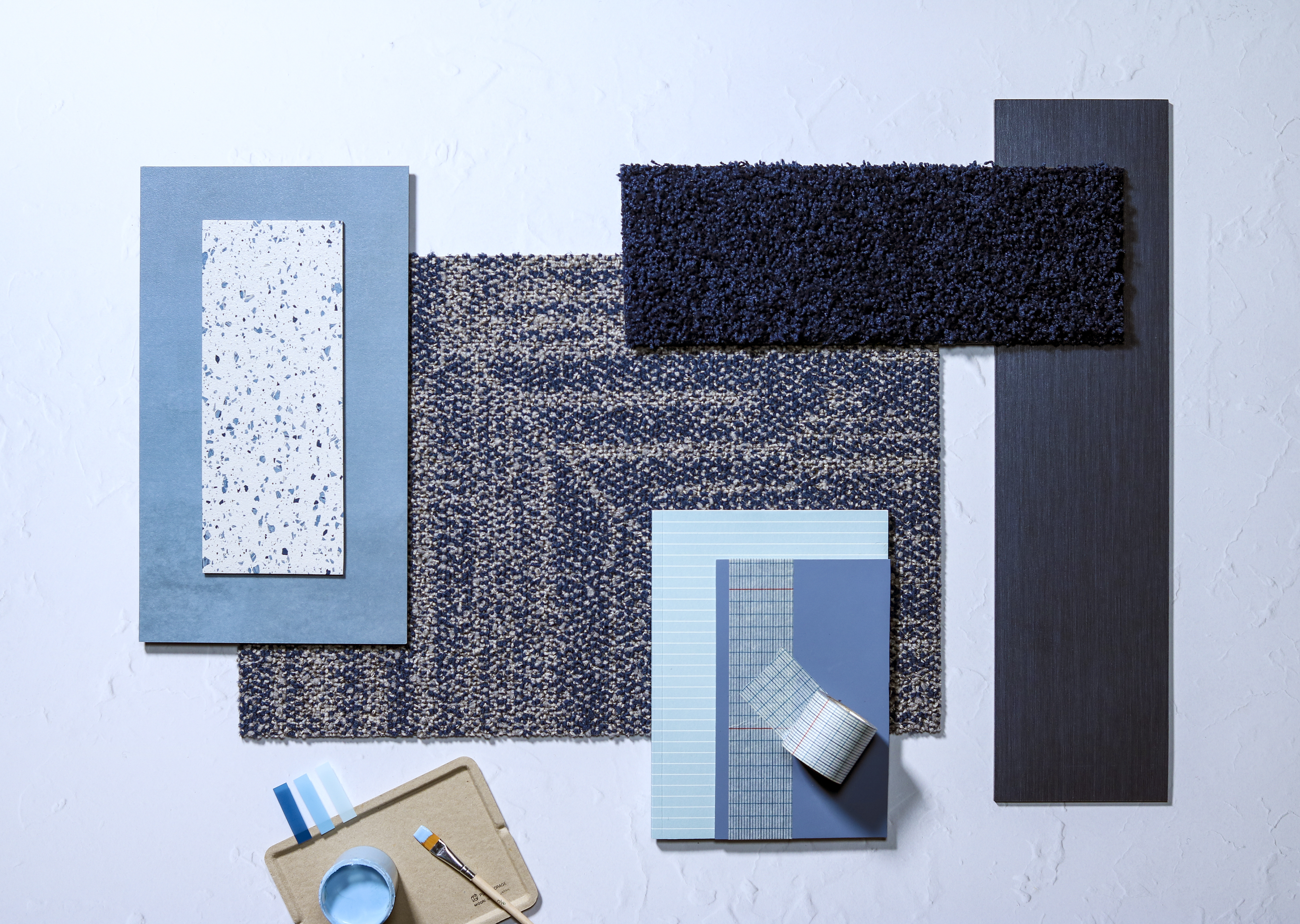
How has – and will – blue evolve in the months and years to come? Making its foray into everyone’s hearts and minds in autumn/winter 22 were Arctic Blue and Atlantic Blue, with the shade becoming broader and brighter in the first few months of 2023.
“Turquoise Blue and Tranquil Blue will both make the strongest statement”, says Emily, “with the darker tone of cobalt carrying forward from autumn/winter 2022 into spring/summer 2023.” In comparison to the pastel, sky blues seen last year (and shown in ‘Bright Skies’ – the Dulux Colour of the Year 2022), bolder shades are set to make their mark.
As we move into the later part of the year, we will see darker, more saturated blues, as well as mid-level blues.
While pastels – offering a light and calming aesthetic – were very much on the agenda in 21/22, designers are now edging towards mid-toned blues. “It’s still quite subtle, but it’s darker.” says Emily, who adds: “It’s interesting to see how blue has evolved since our last blog post in 2020, proving its longevity and adaptability to current trends.”
Back in 2020, we focused on blueberry and lavender tones, before cobalt shades began doing the rounds. Towards the end of 2023, though, predictions within the interiors market suggest ashy blues will take centre stage, in a move which is much ‘bolder and braver’ than what came in 2022.
Mid-toned Blues Offer Stability and Moderation
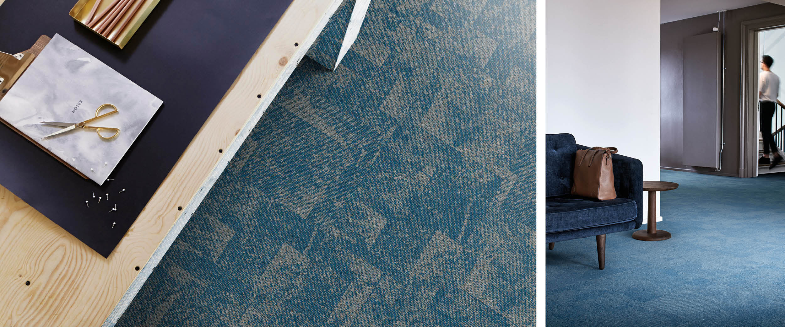
“For now, though, it’s more mid-toned blues; these are thriving within interiors, offering stability and moderation.” explains Emily. “It’s subtle – and not too .
“The vast range of blues showcased last year is encouraging designers to be more playful: to create interior schemes that are both tonal and varied.”
Blue is taking more of a subtle mid-tone, which means it provides an alternative, neutral base for brighter colours to come into fruition. “Pair with highly contrasting tones to promote a fun space,” says Emily, “Or continue with other neutral mid tones for a soothing, focused interior.”
Trend Predictions: 2024 and Beyond
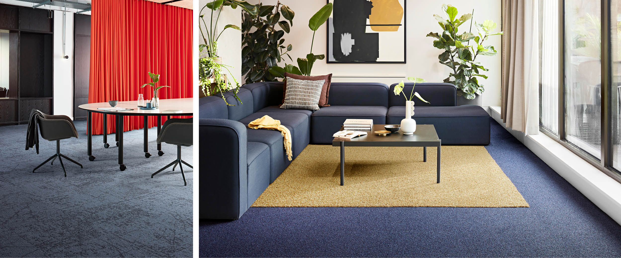
For those looking to inject an element of calm into the workplace, blue is the colour of choice, says Emily.
“It’s becoming a staple within interiors; it’s perfect in environments which centre around the ethos of wellbeing.”
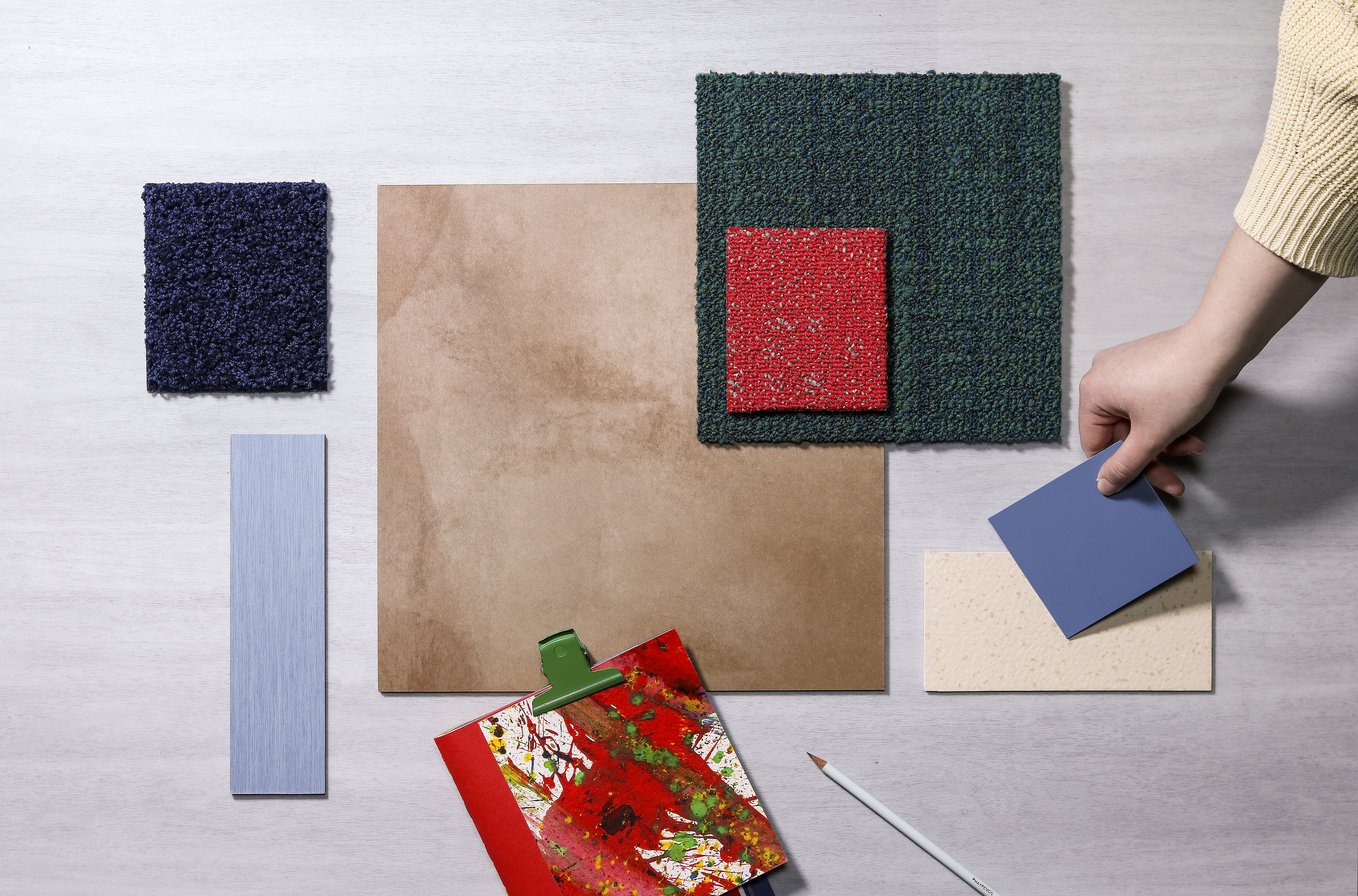
Trade shows anticipate trends in years to come, with key event, ORGATEC 2022, revealing calming, mid-tones – such as powdery blues – will be the shades to watch, not just in 2023 but beyond.
“They imitate the peacefulness of the ocean and the sky and draw the calm of the outdoors indoors”, says Emily, adding that these shades bring a sense of serenity to any interiors scheme, while also being contemporary.
Biophilic design – an approach which aims to ‘bring the outside in’ to boost employees’ happiness, is becoming more prevalent within commercial workspaces, while trend predictions for later this year suggest darker, bolder hues (including electric blue) will be hot in 2024 onwards.“Key colours for work and commercial spaces, they bring a fresh and uplifting look to often high-traffic areas”, continues Emily, who is also incorporating the shade into her home office.
Are you embracing blue and its varied hues in 2023? Let us know by commenting on this blog post.
Until next time…