An extensive period away from campus during the pandemic meant that university students developed different expectations from their working spaces. Home comforts and routines became interwoven with learning in a remote environment and were tailored to support the needs of individuals. Now, to promote wellbeing and ensure they’re helping students reach their full potential, universities are turning to designers for guidance on how to refresh campus spaces to incorporate those changes that students were able to implement.
Now we have taken this one step further, developing a resource that inspires designers to create education spaces to support individuals diverse needs and preferences. Based around the thinking in our whitepaper Designing for Cognitive and Sensory wellbeing, we have curated themed palettes to support the creation of spaces that reduce anxiety, provide comfort and encourage creativity and collaboration. This resource covers four key spaces across a typical campus: social, public, learning and living and showcases how this approach can be brought to life using products from our carpet tile, LVT and nora® rubber flooring collections.
Taking a bespoke approach
Every person has a different sensory threshold that determines how they react to particular working environments. This has an effect on how productive they are, and whether they feel comfortable within a particular space. Designing for cognitive and sensory wellbeing means considering how the end-user experiences a space and how neurodiversity impacts this.
We receive around 11 million pieces of sensory information per second – but we can only consciously process a small portion of those. There are seven recognised sensory systems that are continually transmitting or receiving sensory information: visual (sight), auditory (hearing), tactile (touch), olfactory (smell), gustatory (taste), vestibular (balance and sense of gravity) and proprioception (position of the body in space). It’s important that designers look at how people experience spaces and work to accommodate differing needs.
Historically, bold colours have been top choices for education spaces to create energising, inviting settings – however, designers now need to push universities to consider students with neurodivergent needs and how low and medium sensory thresholds can be just as important as bright, high sensory spaces.
Accommodating different sensory thresholds
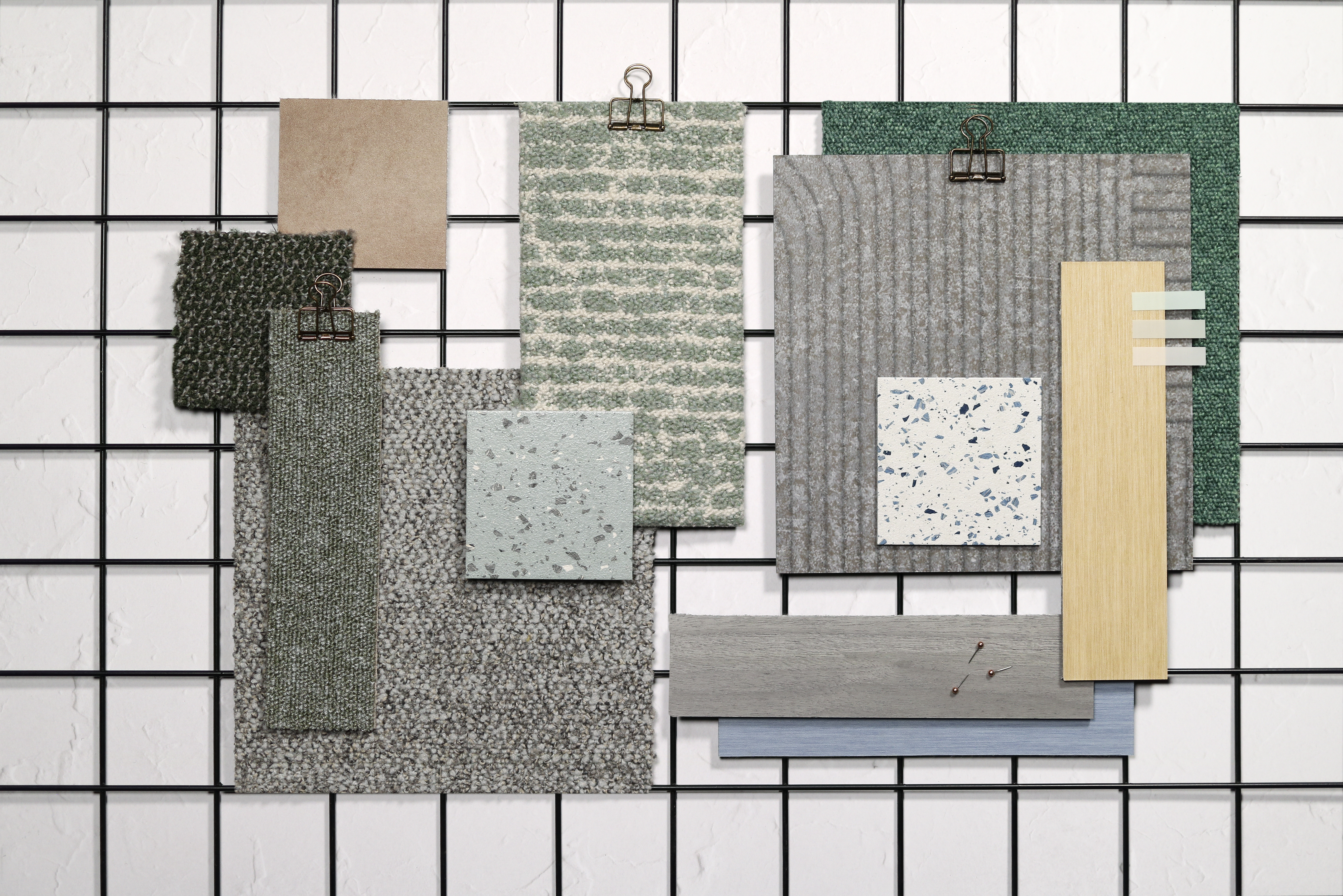
Low sensory palette
Low threshold spaces are designed for those who can feel overstimulated by high levels of activity such as talking, music, people eating and increased movement. These areas need to be carefully selected as they should be the furthest from walkways, entrances or exits to reduce distraction and create a calming environment for those who require quiet conditions to focus. Within education settings, this approach may suit library areas, quiet focus workspaces across campus and study rooms within accommodation blocks. The inspiration boards created by our concept designers use neutral tones and subtle textures to ensure a welcoming and relaxed feel.
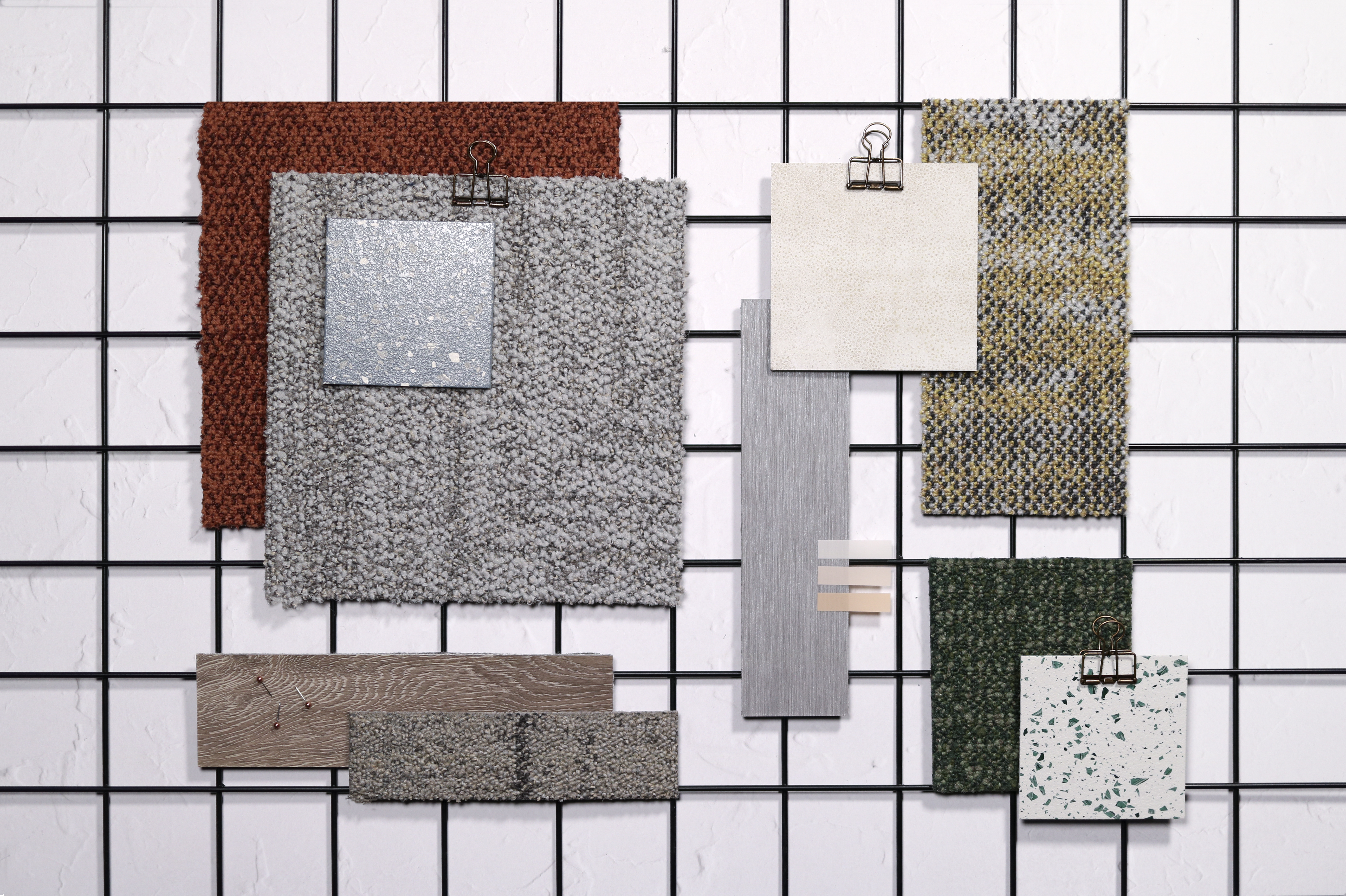
Medium threshold palette
Medium threshold zones are ideal for collaborative workspaces, such as relaxed meeting rooms or working areas with comfortable seating. They encourage slightly heightened senses through normal conversation levels, rather than much quieter low threshold spaces. Our concept design team has created harmonious colour palettes with warm colours and subtle patterns to create interest and introduce more energy into these design schemes.
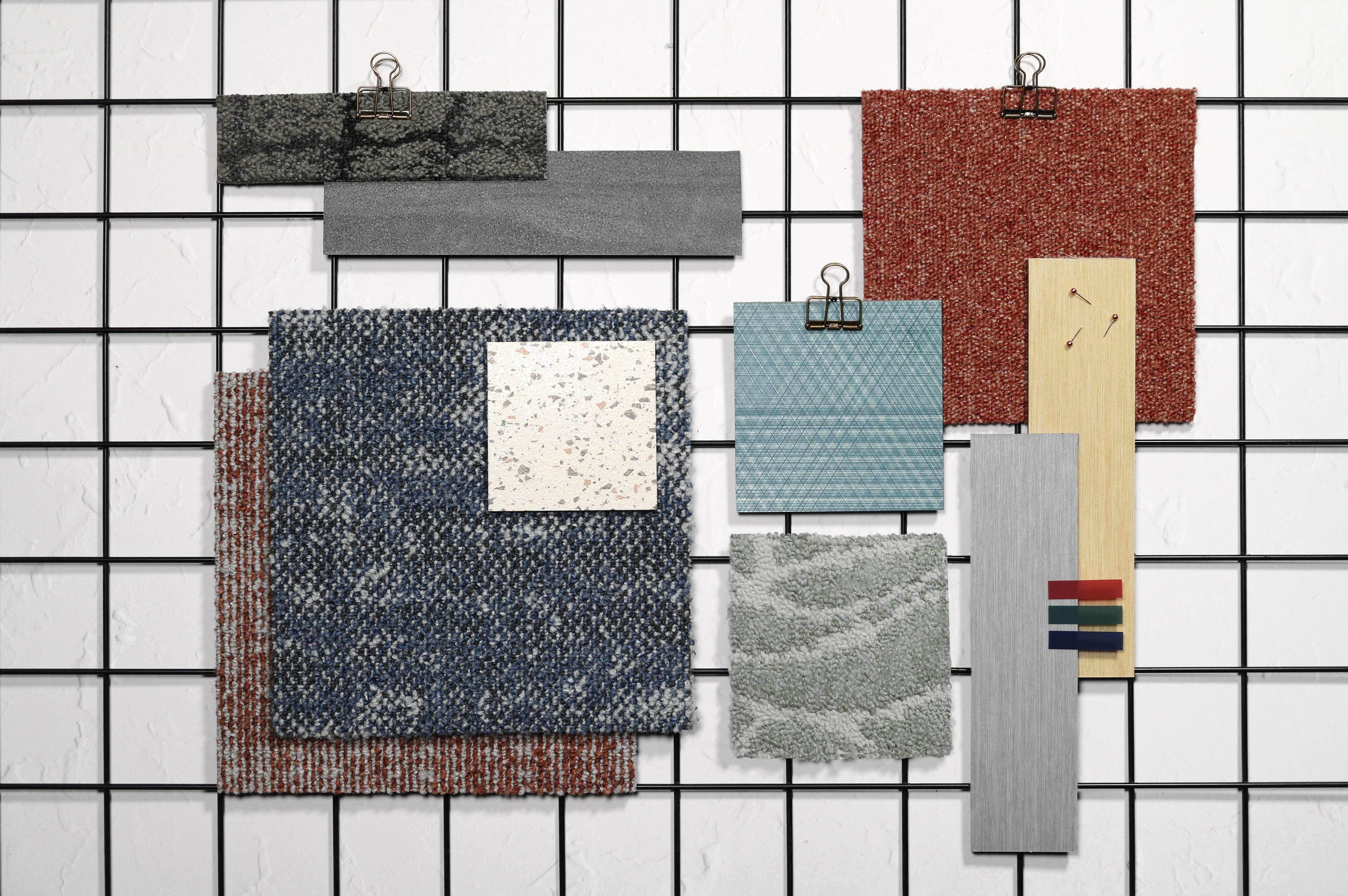
High sensory palette
High threshold spaces can be created for those who thrive off busy, stimulating environments. The palettes within the folio use increased amounts of bold colours, textures and patterns to create more visual stimulation within working and social areas. These designs are typically used where senses are heightened, such as where food and drink are served or busy thoroughfares such as entrances and walkways.
All palettes and mood boards curated by our concept design team are designed to be used across a floorplate for different needs. Using different products, textures and colours to zone your space, creating sensory journeys throughout the day. If this is considered within your design, the changing needs and activities of individuals can be supported whilst enhancing the zoning of spaces and wayfinding at the same time.
All palettes and floorplans can be viewed in our interactive PDF, allowing you to browse different colours, textures and styles, including our latest collections Recreation, Open Air and Fresco Valley.