The reveal of an influential brand’s Colour of the Year is always hotly anticipated in designers’ calendars. But, after an unpredictable and turbulent 2021, there was perhaps more excitement than ever amongst the interior design community over what colour trends they can expect to see gracing moodboards over the coming year.
From purple, to green, to blue, this year brings a variety of different colours, some tones designers have been embracing for many years and some hues that are completely new, refreshing additions. But what do they mean for the design of commercial spaces in 2022?
Here Natalie Makowski, our Product Design Manager for EMEA, shares her take on the colours of the year and explores how to best embrace the latest shades in commercial environments.
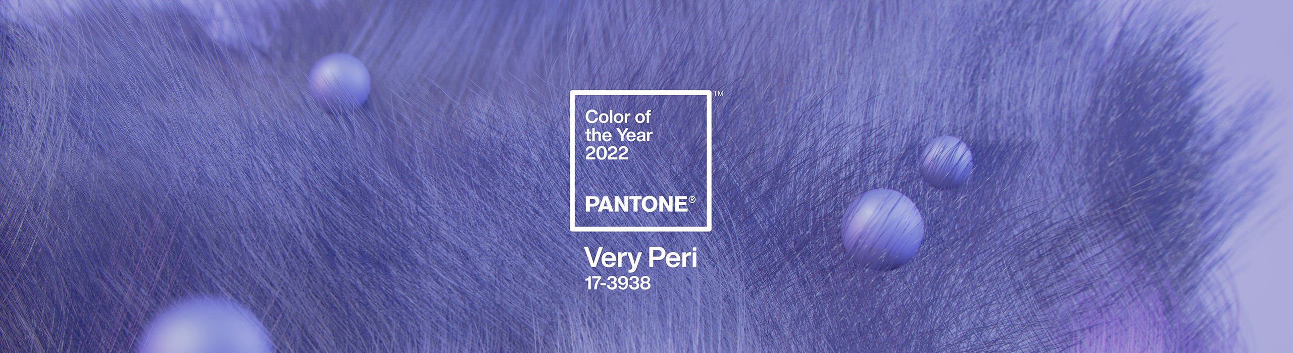
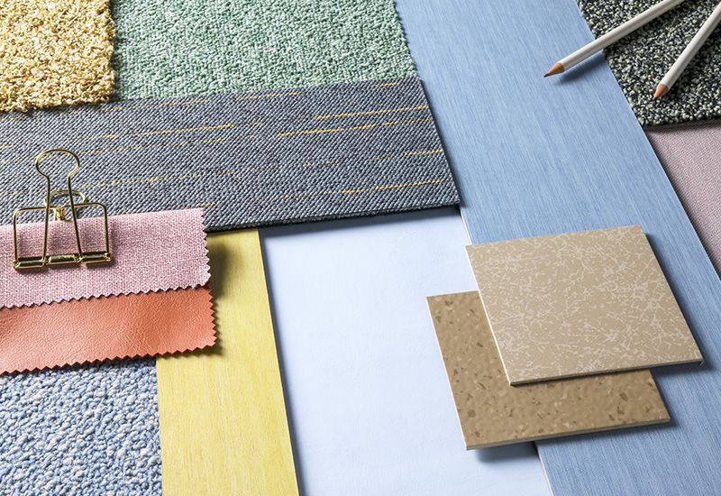
Pantone’s Colour of the Year, Very Peri, came as a surprise choice to many designers. The vibrant purple shade was chosen to display ‘a carefree confidence and a daring curiosity that animates our creative spirit, inquisitive and intriguing’. According to Pantone, the colour symbolises ‘transformative times’ and ‘illustrates the fusion of modern life and how colour trends in the digital world are being manifested in the physical world and vice versa’.
On first impression, it’s difficult to imagine such a bold colour being integrated into an office environment tastefully, but pairing it with other colours to calm the vibrant tones could work to give it a commercial edge. One palette that Pantone presented was The Star of the Show – here, the neutral warm tones create a sense of grounding, which stop Very Peri from being quite so overwhelming. In this context, it instead provides a pop of colour that creates interest and engagement, and could imbue commercial spaces with a much-needed playful twist.
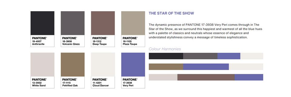
Image credits: Pantone
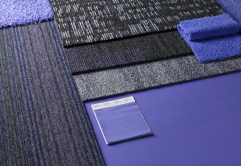
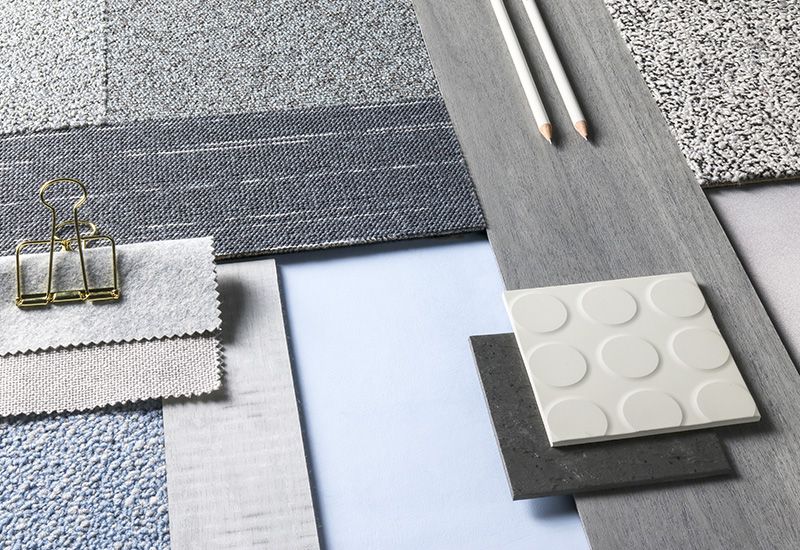
Interface has been inspired by the Very Peri palette, we mixed and matched standard and customised products to create 2 tabletops.
The first includes products that pick up on those purple tones within the palette to combine with one another. This can be used in a variety of product categories which create a visually creative space.
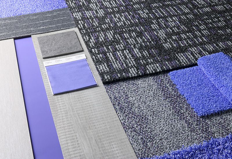
This tabletop is inspired by the palette The Star of the Show. Here we have combined standard and customised products in the Very Peri tones, but then paired with warm grey neutrals. This provides a grounding to the Very Peri tones and gives this palette a more commercial edge.
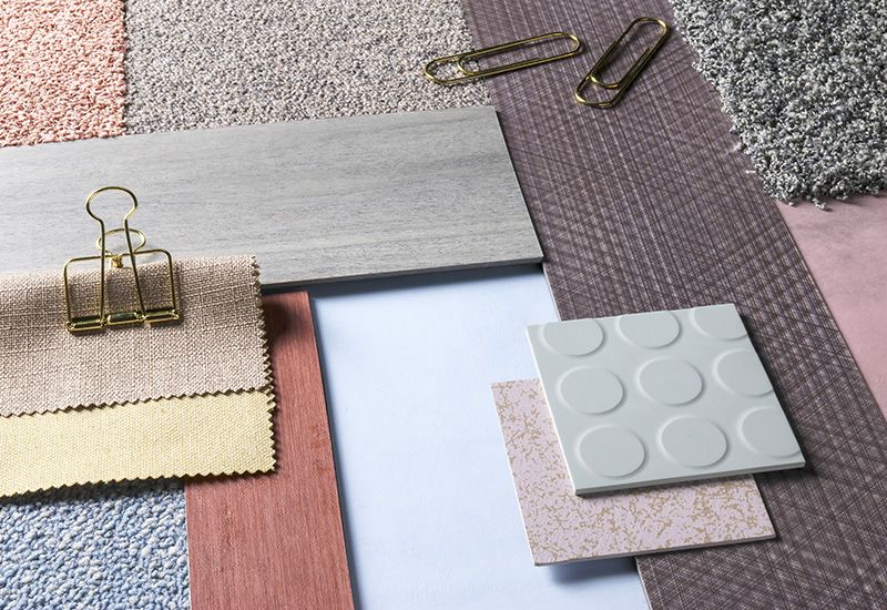
Following uncertain times, paint brand PPG revealed its colour of the year as Olive Sprig. The soothing grey-green shade is described as ‘elegant, grounded, versatile and highly-adaptable, representing regrowth and mimicking nature’s resiliency’.
The colour is based on the concept of a horizon – symbolising both reflection and looking forward to what might change over the next 12 months.
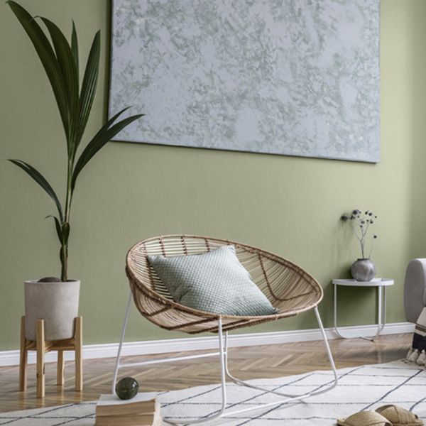
Image Credit: PPG
With green continuing to rise in popularity in interior design in both commercial and residential spaces, it may be one of the less surprising choices in the list, but a strong one that has bags of versatility. Working almost like a neutral, Olive Sprig is a flexible hue that can be adapted to most environments, styles and usages, brightening any space with an organic liveliness. Of course, biophilic design continues to play an important part within commercial spaces as companies focus on elevating employee wellbeing, and Olive Sprig embodies these principles beautifully.
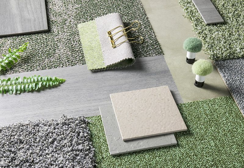
Here we see how green can balance out the warm neutral products in our product selections. The pairings of products here are soft in texture and pattern, the key here is to be subtle and create a sense of sophistication.
Sherwin Williams: Evergreen Fog
With strong similarities to PPG’s Olive Sprig, Sherwin Williams has chosen a very calming, versatile green shade with grey and blue undertones, called ‘Evergreen Fog’, to represent new beginnings. The colour complements neutrals very well and was chosen to help designers create a ‘modern, organic’ feel within the spaces they create.
Encapsulating the resimercial trend we’re continuing to see, where aspects of home design are brought into the workspace to maximise comfort, Evergreen Fog is extremely adaptable. This means you can use it as an overall tone in an interior space or pair it with a palette of similarly homely and comforting colours.
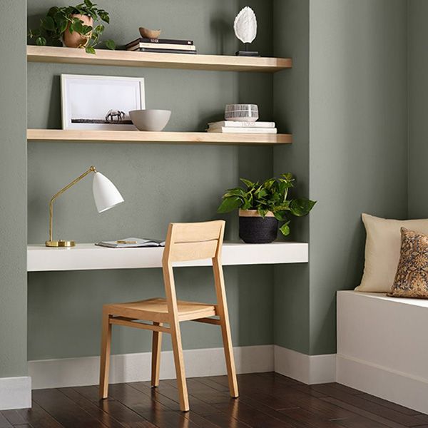
Image Credit: Sherwin Williams
This trend for earthy, nature-inspired greens is something we’ve been embracing in our product palettes for years. The colours from PPG and Sherwin Williams also resemble Dulux’s Colour of the Year for 2020, Tranquil Dawn, which reflected a shared desire to embrace nature – something that has provided an escape for many of us over the last two years. These particular colours also represent the growth in the use of sage and olive tones as we move away from vibrant limes towards more subtle shades of green.
One of my favourite tones, this mix of products sums up Olive Spring brilliantly. The soft mix of green tones paired with light grey tones brings a sense of calm and relaxation. This combination of products provides that feeling of escape we have been craving of the past few years.
Finally, Dulux has chosen a sky blue shade named Bright Skies as its Colour of the Year for 2022. The colour is fresh and airy, making it the perfect for those wanting to introduce subtle hints of colour into commercial spaces.
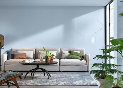
Image Credit: Dulux
Similar to PPG and Sherwin Williams’ choices, Bright Skies is an uplifting shade that supports biophilic design, and can be easily woven into a space to create a sense of positivity.
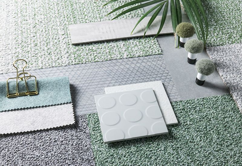
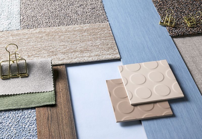
Another firm favourite is the mix of blue tones here to create a soft and relaxing feel of product mixes.
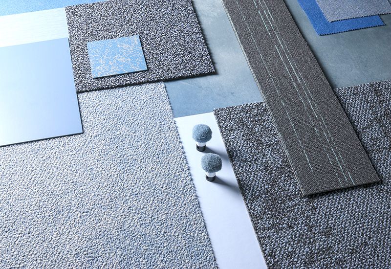
These additional tabletops pick up on this blue tone as a highlight tone. It is clear to see how versatile the Blue Skies tone works with other colours so easily! Here we have been creative with the coordination products, which in an interior setting will all provide interest and a unique twist to your interior scheme.
2022 and beyond
Looking at the 2022 colour selections en masse, it’s clear that the trend towards soft, versatile, earthy shades that support our connection to nature are here to stay. However, we cannot dismiss the growing popularity of more powerful tones that represent our transformed way of living and working. It’s important that we’re not put off by these more intense shades; in fact, we should embrace them as an opportunity to introduce pops of colour and inject a sense of vibrancy and life to commercial settings.
We’re looking forward to seeing how these colours evolve this year and beyond, and how we can continue to integrate the latest trends into our products.
Find out more about our Design Studio here.