In the first of our new colour blog series, we take a look at terracotta: a colour that radiates warmth and happiness, combining the energy and stimulation of red tones with the happiness of yellow. The palette offers emotional strength and is known by designers and space users to provide soothing flections in healing environments. It’s emerging with importance as we come out from the pandemic situation and work toward creating a new normal.
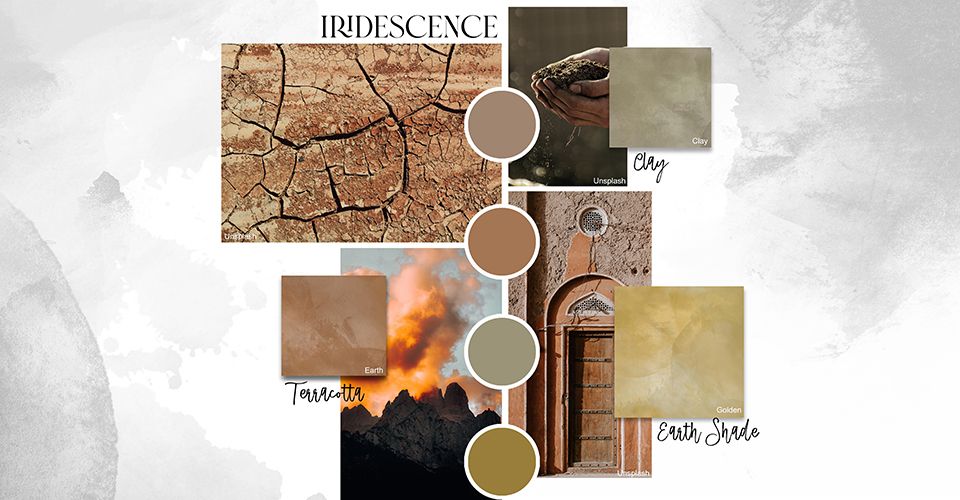
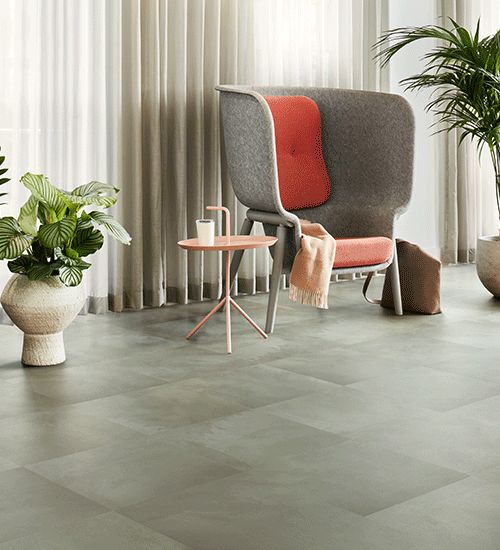
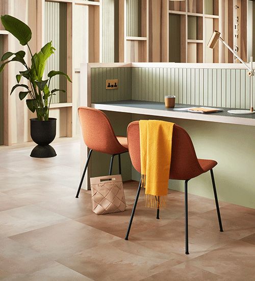
Terracotta tones have been rediscovered over the past year and still prove to be a key colour for the future. Organic and earthen shades of terracotta and clay give a feeling of familiarity and depth. As this colour is derived from a natural material, the shade lends itself to be used in diverse spaces, including commercial spaces and home interiors.
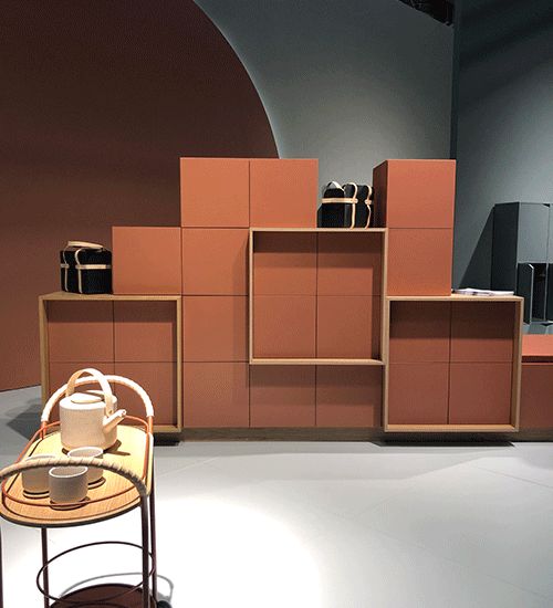
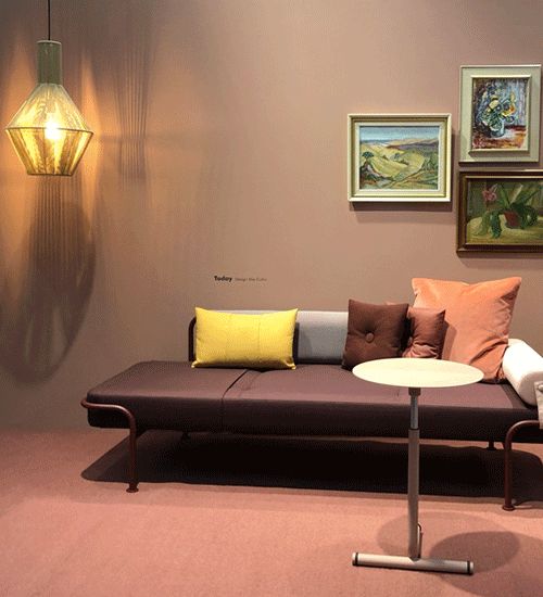
Rich clay hues and sun-baked yellows are shades that are being paired, these tones provide a sense of calm and comfort. These warm undertones together with terracotta suggest a down-to-earth vibe that create a sophisticated aesthetic that is colourful without being brash.
During one of the last design events before the pandemic took hold, Stockholm Furniture Fair 2020, we saw decadent shades of chocolate brown paired with terracotta and dark stained wood to create 1970’s inspired interior spaces. Recently the colour has exploded into residential design paired with blue ascents to provide that 1980’s earthiness to calm our spaces.
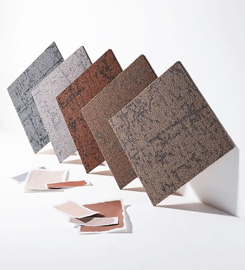
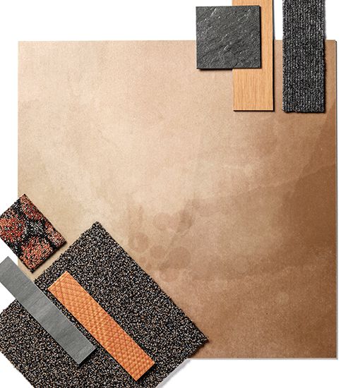
As we move back into our workspaces, our latest collection, Ice Breaker provides this natural earth quality through our Drylands, Dune, Sandstone and Iridescence Earth, Golden and Clay colourways. Each pick out these natural tones to create harmony in the interior scheme and ground the space. They can be used well with one another, or solely on their own to create depth.
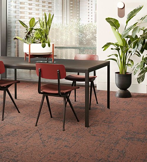
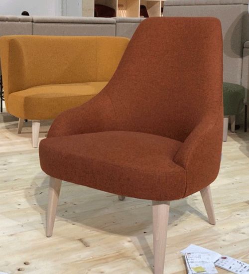
Terracotta is clearly experiencing a renaissance. It’s effortless simplicity, ability to be paired with vibrant accents and deliver warm, safe spaces we crave provides a solid foundation for space design. We think this colour is set to stay in our palette for many years to come.
Next up in our colour trends series we have: Designing with Green, Hospitality Colour Mood and the Colour Valance Theory.