We predict that our love affair with pink will continue to unfold with the emergence of warm and nurturing shades like berry and rose blush. The natural, heart-warming qualities of this color palette deeply resonate with people seeking the antidote to their hectic digital lives.
Here we explore the origins and influences of Subtle Blush and discuss how to apply these delicate shades to workplace interiors to ensure you set just the right tone.
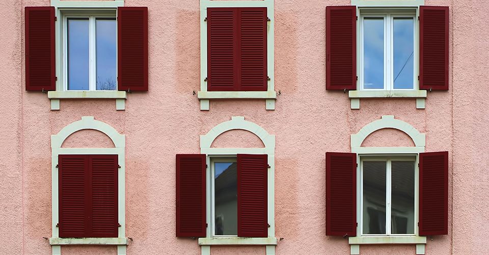
New beginnings & nostalgia
Collectively, the Subtle Blush color palette creates spaces that feel both uplifting and nourishing. A calm and serene mix of pale plaster-like pink, salmon and rose blush bring a sense of revitalization. Sumptuous, earthy colors including red clay, terra cotta and russet evoke a sense of nostalgia for simpler times.

Origins & influences
When we compile our color trend predictions, it’s often not so much the color itself that goes in or out of style, but the shade and intensity that gradually shifts and evolves. It’s a transition into something new with a gentle nod to what has gone before. Just as our eyes grow tired of one shade, another shade comes into play. This is certainly true of the move towards Subtle Blush.
With the seemingly unstoppable rise of Millennial Pink, Pantone’s selection of Living Coral as their Color of the Year in 2019 further amplified the popularity of feminine shades. For 2020, we see a natural evolution of these vivacious hues towards a more grounded collection of muted, chalky berry tones.
So where are we seeing Subtle Blush pop up?
The fashion catwalks of London, Paris and New York were ablaze with rich, burnished shades of terra cotta and muted clay, as many of the most influential designers shared their AW20 collections. Two of the most luxurious and iconic hotels in London — The Berkeley and The Connaught — recently unveiled new restaurant and bar concepts enriched with shades of salmon and dusty pink. In retail, we couldn’t help but notice the ‘Le Cube’ skate bowl installation in Le Bon Marche, proving to the local Parisians that pink isn’t just for girls!
Uplifting & nourishing interiors
As always, the recent global design fairs have been a vital reference point as we tracked the emergence of Subtle Blush. During Milan Design Week in 2019 we spotted many references to this light-spirited palette—not only in the design of the furniture on display, but also in the set-design of the exhibits and installations.
And when London Design Festival rolled into town in September, the color theme continued. Our stand-out favorite was Roksanda Ilincic’s penthouse apartment inside King’s Cross’ Gasholders, filled with berry tones, cherry red walls, and a burgundy framed bed.
It seems that residential interior designers are falling for these colors too. In fact, they’re beginning to embrace shades that for many years were banished from kitchen and bathroom design.
There’s no doubt that Subtle Blush’s warm and nurturing color palette creates a welcoming and familiar working environment. We expect that even workplace interiors with a more masculine edge will begin to soften. We anticipate that designers will embrace the palette of Subtle Blush to create a calm, tactile experience where stressed workers can retreat and recharge.