As we welcome in a new decade with open arms, we begin 2020 with our crystal ball at the ready! Behind the scenes, we’ve been curating our colour predictions for the year ahead and we have a whole host of shades in mind. Over the coming months we plan to share our thoughts and inspiration with you here on our blog, and it feels appropriate to begin our colour story with blue.
When Pantone recently announced Classic Blue as Colour of the Year for 2020 we had to smile, as the ink was barely dry on our own colour prediction. Blue is a colour with universal and timeless appeal, and it’s a shade we’re naturally drawn to in uncertain times. Blue is a sure sign of trust and stability, when all around may seem chaotic. It’s also a colour that naturally makes us feel safe and secure.
In our homes and our workplaces, we’ve noted many of the most influential designers and future-focused brands embrace blue in their latest creations and concepts. Here we explore how it’s being used to brilliant effect, transforming workplaces into havens of concentration and calm.
Soothing shades of indigo, denim and lavender blue
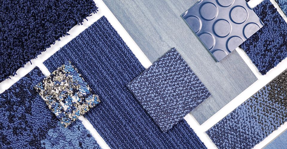
Taking a deep dive into the soothing shades of blue, our colour palette spans dark, rich mid-tones and soft, pale hues. Rich, intense tones emulate the velvet inkiness of the deep pacific ocean, while crisp, light and bright shades of powder blue remind us of expansive clear blue skies and the wonder of cloud formations. Frosted lilac and blueberry tinged with lavender also signal a significant shift, moving away from the true blues that have dominated in recent seasons.
Timeless appeal
While so many shades go in and out of vogue, it seems our love of blue stays true. The world over, blue is agreed to be the most popular colour and often described as the most accessible shade of all.
This could be because blue has so many positive associations in the natural world. It’s also said to imbue a sense of peace and tranquillity, with indigo often referred to as the ‘third eye’ because it inspires contemplation, mindfulness and calm. It may also be because it’s one of the only shades that is truly timeless. These deep inky and stonewashed hues are bringing the everyday beauty of denim into interiors. And much like our most cherished pair of jeans, it’s a look we’ll never tire of.
Blending comfortably into this palette are subtle, chalky shades of purple, mixed with blue and grey for intensity and depth.
These paler hues represent the transition from Ultra Violet, which was Pantone’s colour of the year back in 2018, towards these cooler, paler and more liveable shades. It’s always interesting to understand how these colours translate into the retail world, so we loved to see the iconic beauty brand Aesop embracing subtle purple tones in its latest London store.
Filtering into our homes
We first began to note the prevalence of these shades during our recent trips to the design fairs in Stockholm, Milan and London. Many of the most influential designers and furniture brands used indigo, denim and lavender in their collections. We particularly loved the Indigo Experience by Moooi in Milan that celebrated the beauty of denim in all its glory!
As peoples’ affection for this colour strengthens, we’re beginning to see these hues filter into our homes. Ripples of blue have become a recurring theme in bathroom design, as watery and inky tones create deeply relaxing and luxurious spaces.
Bolder blues are adding character to kitchen design too, as designers opt for variations in these shades, combined with a mix of materials in the same tone. Flashes of bright white and metallics shine particularly well when backed by blue.
Expanding our minds & concentrating our thoughts
Given all of its positive associations, blue is an incredibly effective choice in the workplace. When Pantone described the rationale behind their nomination of Classic Blue as their Colour of the Year for 2020, they spoke of the associations with communication, introspection and clarity. Suggesting that the colour naturally aids concentration and helps to re-centre thoughts, particularly in light of technology’s accelerating developments.
“Classic Blue encourages us to look beyond the obvious to expand our thinking; challenging us to think more deeply, increase our perspective and open the flow of communication,” Leatrice Eiseman, executive director of the Pantone Color Institute.
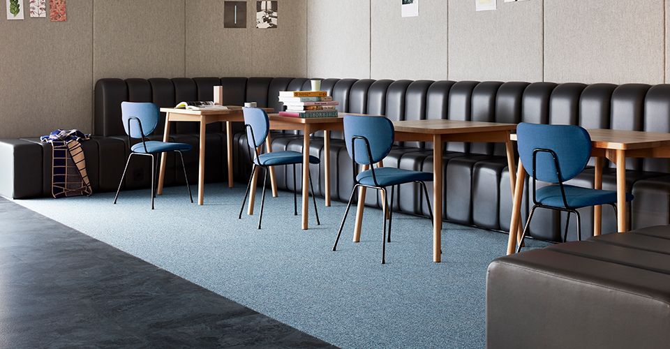
Depending on the shade and intensity of the colour you select, its possible to create a very different mood in a workplace environment. Brighter, lighter shades of blue awaken our minds and pave the way for fresh thinking. In contrast, warm inky tones naturally aid concentration and focused discussion.
Providing a new and unexpected shade to see in the workplace, shades of lilac and lavender combine with pewter and neutral tones to create a tranquil working environment.
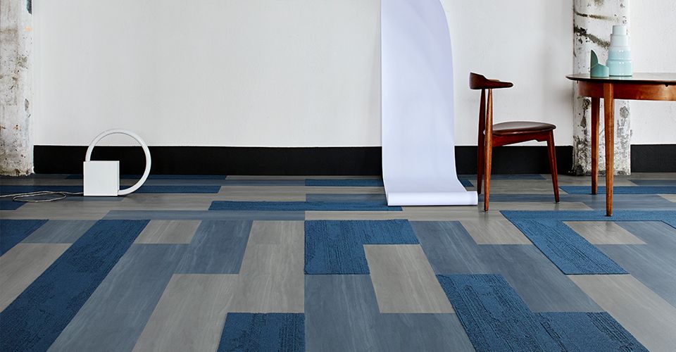
It’s also worth experimenting with accents of these shades. Playful pops of these colours can transform working environments into striking statement spaces. For example, when IKEA Space 10 traded in its open plan office for a partitioned space, we were inspired by how the design team used vibrant coloured panels to animate the space. The inclusion of deep cobalt blue serves to ground the overall palette of brights.
In Part 2 of our exploration of this colour trend, we will inspire you with ideas about how to use our flooring collections to create workplace environments that embrace these shades of blue to brilliant effect.