Given the uncertain times we all live in, it’s perhaps not surprising that we find ourselves drawn to optimistic colors.
Here, we revel in the gleaming palette of Golden Ochre. These buttery tones are an instant way to energize our interiors and lift our spirits. Explore the origins and influences of this color trend and consider how to apply the palette to your workplace interiors—it’s guaranteed to take the edge of a stressful working day.
Golden age revival
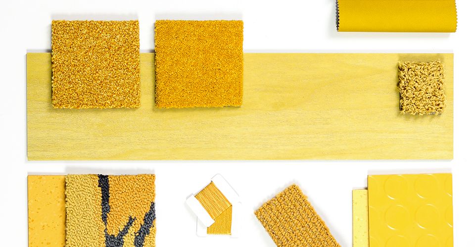
Yellow remains a key color for interiors in 2020 and beyond. However, tones are moving away from the pure yellows of previous seasons towards a palette of more muted shades.
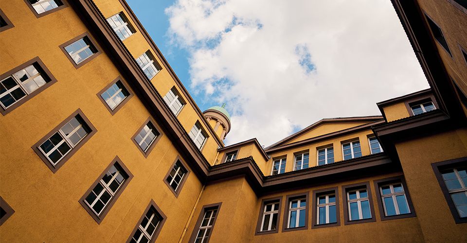
In many ways, Golden Ochre is a subtle nod to the 70s revival we are witnessing in interior design—this palette contains nostalgic shades which evoke a deep, timeless quality. In architecture, the burnished bronze hues of Thomas Heatherwick’s ‘The Vessel’ perfectly reflects this color trend.
It’s fascinating to see how many of these shades are recreating the golden age of the department store in its most literal sense. We particularly loved the story behind the painstaking renovation of Harrods’ food hall, where designers salvaged remnants of the original tiles to recreate the exact shades of yellow and terra cotta.
Golden Rule
As we searched for inspiration at Milan Furniture Fair, the ‘Life in Vogue’ exhibition really captured our imagination. We loved J.W. Anderson’s unflinching use of a vibrant shade of yellow adorning the walls of Vogue Italia.
Since Milan, we’ve noted many other designers opting for a single shade and using it consistently over as big a space as they dare. This works well when paired with neutral accents or when picking out the same bright hue on patterned tiles. It’s also clear how popular these complementary tones of mustard, ochre and burnished bronze are in furniture design—particularly seating.
Sunbeams of golden tones add a burst of brightness to workplace environments and can zone areas in a playful, energetic way. Whether used in moderation or embraced in its entirety, our Golden Ochre palette has the potential to create an upbeat workplace.