Building on our colour trends of Subtle Blush and Into the Blue, here we revel in the gleaming palette of Golden Ochre.
Given the uncertain times we all live in, it’s perhaps not surprising that we find ourselves drawn to optimistic colours, and these buttery ochre-based tones are an instant way to energise our interiors and lift our spirits.
Here we explore the origins and influences of this colour trend and consider how to apply the palette to our workplace interiors in ways that are guaranteed to take the edge of a stressful working day.
Golden age revival
The zesty yellows of previous seasons make way for calmer, ochre-based tones, as yellow remains a key colour for interiors in 2020 and beyond. This is a deviation away from pure yellows towards a palette of more muted shades.
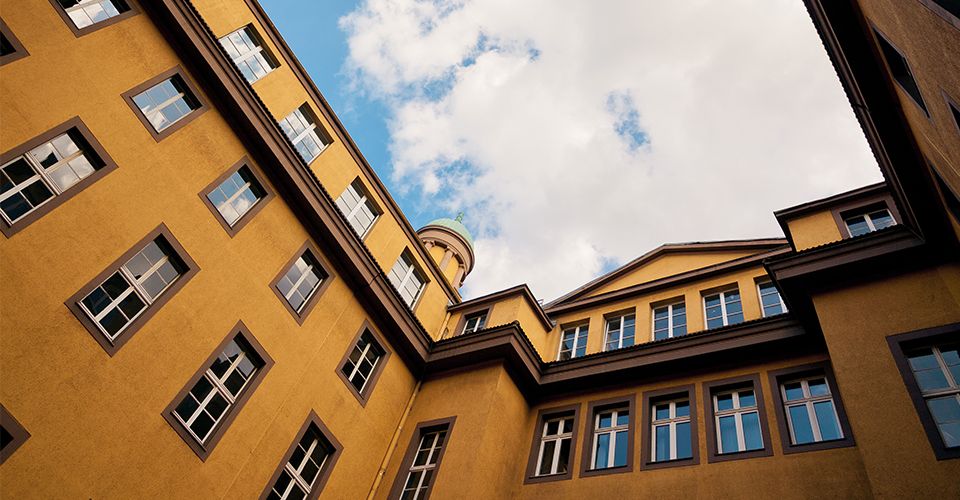
In many ways, these colours provide a subtle nod to the 70’s revival we are witnessing in interior design today – bringing back nostalgic shades which evoke a deep, timeless quality. In architecture, the burnished bronze hues of ‘The vessel’ in New York by Thomas Heatherwick perfectly reflects the trend.
It’s fascinating to see how many of these shades are being used to recreate the golden age of the department store in its most literal sense. We particularly loved the story behind the painstaking renovation of Harrods’ food hall, whereby designers salvaged remnants of the original tiles to recreate the exact shades of yellow and terracotta.
It’s clear that these golden shades are instilling a sense of light-heartedness in retail interiors too. We see precious yellow onyx and inserts of gold leaf adding glimmers of warmth to the Forte Forte store in Chelsea, and homely pastel tones infused with bursts of sunshine yellow in the Ganni store in Soho. Both areas of London with very distinct stylistic environments.

Golden Rule
As we searched for inspiration at Milan Furniture Fair, the ‘Life in Vogue’ exhibition really captured our imagination. We loved JW Anderson’s unflinching use of a vibrant shade of yellow, typically found in British stately homes, adorning the walls of Vogue Italia.
Since Milan, we’ve noted many other designers opting for a single shade and using it consistently over as big a space as they dare. This works well when paired with neutral accents, or picking out the same bright hue on patterned tiles.
It’s also clear how popular these tones of mustard, ochre and burnished bronze are in furniture design, particularly seating, with many of the most notable brands introducing these colours.
Energising & uplifting workplaces
Whether used in moderation – with just a dollop of spice or a burst of bright – or embraced in it’s entirety, our warming palette has the potential to create an energising and upbeat workplace.
Sunbeams of golden tones add a burst of brightness to workplace environments and zone areas in a playful, energetic way.
When Galatea, a custom software developer for the financial sector, created a new office space in London they were keen to create a relaxed work atmosphere. Two yellow arches became the focal point of the communal space, forming cosy meeting and dining booths, perfect for hanging out.
Reflecting the more earthy and neutral shades of our colour palette, the pared-back workspaces for Cobild in Melbourne and Kinfolk in Copenhagen perfectly illustrate how a lightness of touch can create a calm yet uplifting environment.